Thursday, 4 February 2021

5 Ways to Use Search as a Growth Channel for B2B in 2021

Posted by Victor_Ijidola

Unlike B2C brands, B2B businesses are often characterized by:

  • low search volumes on Google.
  • high competition on scarcely available keywords.

And there’s evidence to support this — usually, where a seven-year-old B2C company is getting 500K visitors per month from SEO, a B2B brand the same age could be seeing only 15K visitors per month. (This is assuming all other things are equal.)

Check out the example below comparing Zola.com (a B2C brand) and Yiedify.com (B2B):

These two sites were founded around the same time (2013) and have been publishing lots of content. Yet, the difference in their traffic numbers makes it look like Yieldify hasn’t been doing much SEO, but that’s not the case.

For instance, when I used the MozBar to analyze the on-page optimization they did on their article about trust badges, I could tell they’re at least following basic SEO principles, like having focus keywords in their URL, page titles, headers, and meta descriptions:

I’d say they’ve not been terrible at optimizing their content for SEO — if they do optimize all their content like they did this one on trust badges.

My point here is: B2C and e-commerce businesses (usually) have way more opportunities in SEO than B2B, especially in terms of search traffic.

But while that is true, it’s also true that no matter how few the search visits, there are still a lot of opportunities in SEO for B2B businesses.

Most of the time, what B2B brands lose in search traffic, they make up in revenue — since their products/services are usually more expensive than those in B2C.

Long story short: there are opportunities for B2B companies in search, and here’s how to capitalize on them in the year ahead.

1. Start from bottom (not top) of funnel

Every funnel begins at the top, but if you want to generate results as quickly as possible, you should kick off your B2B SEO strategy targeting customers at the bottom of the funnel.

Ready-to-buy customers are already at the bottom of the funnel (BoFu), searching for information that’ll help them make a purchase decision. They’re often searching with keywords like:

  • “[industry] software”
  • “[industry] tools”
  • “[competitor] alternatives”
  • “Is [competitor] a good product/service?”

As a smart marketer, your strategy should be to prioritize reaching them with the bottom of funnel content they’re looking for.

You probably know what BoFu content looks like, but just so we’re on the same page as to what it really is, see these examples of BoFu content from SocialPilot ranking on page one:

I’m not affiliated with SocialPilot, so I don’t know if they kicked off their SEO content marketing with these BoFu topics (search terms).

But if they did, chances are they experienced quick success (in terms of relevant product awareness and sign-ups), since the articles are ranking on Google’s front page for searchers looking for “Buffer alternatives”.

Bottom line is, as a B2B brand, you’ll be better off prioritizing BoFu topics in your SEO strategy. It’s a much better approach than starting all the way at the top of the funnel, which would be targeting searchers who aren’t ready to make a purchase (or sign-up) decision.

But shouldn’t you start with top of funnel content, since that’s where buyers start their journey?

If you think your strategy should be to first target visitors at the top of the funnel (ToFu), you’re probably assuming that your prospects will first consume your ToFu content before ever getting to the bottom.

That’s hardly ever the case in real life. What often happens is:

  1. A prospective customer knows they have a problem
  2. They search Google for a solution
  3. Google shows them multiple solutions on page one
  4. They read reviews and supporting information to help them make a purchase decision
  5. They make a decision to either buy or not buy

If you think back to the last purchase decision you made, this was probably the route you took.

So it’s not all the time that buyers will start reading your top of funnel content, discover your product, and then decide to start consuming your BoFu content. Sometimes they’re already at BoFu and all it’d take to convince them to buy your product is the right BoFu content.

2. Make your content t-shaped (for demand and lead generation)

You’re probably thinking, “what’s t-shaped content?”. Allow me to explain.

At my agency (Premium Content Shop), we use “t-shaped content” to describe the type of content that performs two functions at the same time:

  • It provides real value to your ideal prospects

AND

  • Generates relevant organic traffic, demand, and quality leads for your business.

This little illustration below should help you better understand what our “t-shaped content framework” means:

In practice, this is an example of t-shaped content from Mailshake:

Right after the fifth paragraph of the article, they introduce a CTA:

This is a t-shaped content piece because:

  • The guide is focused on helping Mailshake’s potential customers — “cold emailers”
  • The guide is designed to use the CTA to generate demand and leads for Mailshake

I often advise clients not to introduce anything about their product/service until readers have scrolled about 40% into the content they’re consuming, just to avoid coming across as overly promotional. And I’m not saying putting your CTA that early in an article could never work — it could — but your readers should feel like you're prioritizing them getting value from the content over trying to sell your own stuff right off the bat.

In any case, creating and ranking t-shaped content helps you achieve two objectives:

  • Build a brand that people trust.
  • Create awareness and generate leads for your product.

3. Don’t just rank content — rank “from-field-experience” content

One reason SEO gets a bad rap, especially among B2B marketers, is the sheer amount of low-quality B2B content that’s ranking on page one in the SERPs. And that’s because, while Google’s algorithm is able to determine search-friendly content, it’s currently not able to see if a page is relevant for a searcher, at least from a human perspective.

So, it ends up ranking content on page one that meets Google’s ranking standards, but not always the searcher’s standards.

As a B2B marketer, you don’t just want to meet Google’s requirements and rank on page one. You need your content to rank AND impress your audience well enough to convert them into leads.

How do you do that? You need to write like professionals speaking to professionals.

Usually, this means you need to see what other industry professionals are saying or have published on any given topic and spell out:

  • What you agree with
  • What you disagree with
  • What you want to change about how something is currently done
  • How you want it to change or change it

Derek Gleason of CXL mirrors the same idea in a recent tweet:

And as an expert in your field, this is a no-brainer: you’ll almost always have a different opinion to share about popular topics in your industry.

For instance, as an SEO expert, you most likely have fact-based opinions about topics like Google ranking factors, B2B marketing, technical SEO, etc. This knowledge you have about all the topics in your industry is “from-field-experience” ideas that’ll help you connect with customers on a deeper level.

And when you’re creating content based on your original opinions, experience, thoughts, or convictions, you won’t be sounding like everyone else and your content will stand out. Even if it’s similar to other competitors’ content, it’ll still have your original ideas.

But how do your original ideas impact revenue or growth?

Your clients aren't all at the bottom of the funnel. While I’ve advised kicking off your SEO marketing strategy by addressing BoFu topics, many of your potential buyers are still at the top and middle of the funnel.

This means, at the stage where they’re reading your “from-field-experience” content, they’re not even thinking about your product at all. But with the right type of content — with your original thoughts and ideas, you can move them from the top/middle to the bottom of the funnel.

So, if they’ve been consuming your ToFu content for any amount of time, your brand will get their attention better when it’s time for them to consider making a purchase decision.

And yes, they’ll ultimately make a decision based on reviews and other BoFu content, but your ToFu and MoFu content will help you develop authority and trust with potential customers. This will often give you a leg up on your competitors when it’s time for ToFu/MoFu prospects to make a decision.

For example, Dom Kent of Mio once shared how people in the collaboration industry keep finding Mio whenever they search for anything related to their industry; that’s one example of what ToFu and MoFu content does for your brand.

It's like when you Google something about sales management, and Close’s content keeps showing up. When it’s time to buy — or even just recommend — a sales management tool, guess which product you’ll think of? That’s right, Close. It doesn’t always mean you’ll sign up for Close, but that’s at least one of the brands you’d think of first.

4. Avoid covering too many basic topics

Often in B2B, your ideal buyers are experienced professionals. This means that most of the time, they don't need content on the basic topics that entry-level employees might.

If they're sales leaders, for instance, they seldom search for content on basic topics like "what is a sales script" or "how does CRM work?".

You're better off covering more important and sophisticated topics — regardless of whether those topics have high search volume or not.

For instance, CRM provider Copper currently ranks for “cold call script to get appointment”.

It’s a long-tail keyword with only about 500 searches per month.

The low search volume may look unattractive on the surface, but Copper’s target customers are the ones searching for it, and that’s more important than them ranking for a high search volume keyword like “what’s a sales pipeline?” that doesn’t frequently get searched by those customers.

During your keyword research phase, it’s easy to get distracted by high search volume keywords that your target audience barely ever searches for on Google. Move past that distraction and focus on creating content for keywords your target buyers need content on — even if those keywords have low search volumes.

5. Take care of your technical SEO

In my first four points, I covered things you need to know about high-quality content creation and the content strategy side of SEO, but I haven’t forgotten about the technical side.

You need to pay attention to technical SEO as well, as it can make or break the opportunities any B2B website can get from search. :

Here are the most important parts of tech SEO that you should get in the habit of checking:

  • HTML tags: Your HTML tags help search engines understand what’s on your page. See it this way: you understand English (and any other language you speak), search engine algorithms understand HTML tags (plus human language).

  • Meta descriptions: These help search engines understand the content of your web pages even more. It’s basically the summary of your content, showing searchers and search engines a quick overview of what’s on your web pages.

  • SEO-friendly URL: This one is often considered a “minor Google ranking factor” by many (if not most) search marketers. But even if it increases your chances of ranking by .5%, it’s still important. So optimize your URLs to make them SEO-friendly. This means you need to make sure they contain the target keywords you’re trying to rank for on any page.

  • User experience (UX): This includes site speed, navigation, accessibility (for visitors from PC and mobile devices), and everything else that makes your content and web pages easy to use for searchers. Google’s algorithm has been built to be powerful enough to determine which pages have good UX, so you need to make sure your pages are easy to use, navigate, and access.

  • Backlinks: They may be last on the list here, but backlinks are easily one of the most important ranking factors you need to pay careful attention to. As you know, the more backlinks you get, the stronger your chances of ranking.

In conclusion

There are a lot of opportunities in SEO for B2B companies — even though the search volumes are often low. I’ve covered what you’d need to use search to your advantage as a B2B marketer.

To recap, you should kick-off your SEO and content marketing by targeting BoFu prospects. And make your content T-shaped, so that it benefits your audience and business at the same time.

Also, don’t just rank content for organic search traffic, rank with “from-field-experience” content/ideas; this will help you generate demand and quality leads as readers will be drawn to your expertise.

And then avoid covering too many basic topics, especially when your target buyers are experienced professionals or C-level decision-makers. Finally, pay attention to the technical side of SEO, too; it can make or break your entire search engine optimization efforts.


Sign up for The Moz Top 10, a semimonthly mailer updating you on the top ten hottest pieces of SEO news, tips, and rad links uncovered by the Moz team. Think of it as your exclusive digest of stuff you don't have time to hunt down but want to read!


from The Moz Blog https://ift.tt/3rm0hhP
via IFTTT

Wednesday, 3 February 2021

Some Performance Blog Posts I’ve Bookmarked and Read Lately

  • Back/forward cache — I always assumed browsers just do fancy stuff with the back/forward buttons and us developers had very little control. Philip Walton tells us it’s critical that we understand “what makes pages eligible (and ineligible) for bfcache to maximize their cache-hit rates.” For example, if you use the unload event, the page is instantly disqualified from the cache.
  • Big picture performance analysis using Lighthouse Parade — Lighthouse only tests one page of your site. Lighthouse Parade tests all the URLs of a site, and aggregates the results.
  • Beyond fast with new performance features — Jake Archibald gets into the CSS content-visibility property (and a few other things) and how it can lead to incredible performance boosts (you use it to tell the browser that it’s straight-up OK not to render things). Right this minute, content-visiblity makes me nervous as it has issues with scrollbar jankiness and accessiblity problems. I found it a smidge confusing at first glance, and Tim Kadlec has reservations.
  • Image Decode & Visual Timings — Image performance isn’t only about the size of the image. Different formats take different amounts of time to decode and render. GIF never wins.
  • How to increase CSS-in-JS performance by 175x — The trick, readers, is shipping CSS. You can still use CSS-in-JS as you author, and have the build process create the CSS. They call that “Zero-Runtime” like Linaria.
  • Testing Performance — Kelly Sutton: “The best approach that I have found to preventing performance regressions is to employ qualitative assessments of the code.” Performance is such an unwieldy beast, that only in production will you truly know what happens.
  • Front-End Performance Checklist 2021 — If you’re going to get serious about performance this year, you’d do well to dig into Vitaly’s guide.
  • We rendered a million web pages to find out what makes the web slow — HTTP/2 is a huge indicator of good performance.

The post Some Performance Blog Posts I’ve Bookmarked and Read Lately appeared first on CSS-Tricks.

You can support CSS-Tricks by being an MVP Supporter.


from CSS-Tricks https://ift.tt/2MoqxJP
via IFTTT

Going From Solid to Knockout Text on Scroll

Here’s a fun CSS trick to show your friends: a large title that switches from a solid color to knockout text as the background image behind it scrolls into place. And we can do it using plain ol’ HTML and CSS!

This effect is created by rendering two containers with fixed <h1> elements. The first container has a white background with knockout text. The second container has a background image with white text. Then, using some fancy clipping tricks, we hide the first container’s text when the user scrolls beyond its boundaries and vice-versa. This creates the illusion that the text background is changing.

Before we begin, please note that this won’t work on older versions of Internet Explorer. Also, fixed background images can be cumbersome on mobile WebKit browsers. Be sure to think about fallback behavior for these circumstances.

Setting up the HTML

Let’s start by creating our general HTML structure. Inside an outer wrapper, we create two identical containers, each with an <h1> element that is wrapped in a .title_wrapper.

<header>

  <!-- First container -->
  <div class="container container_solid">
    <div class="title_wrapper">
      <h1>The Great Outdoors</h1>
    </div>
  </div>

  <!-- Second container -->
  <div class="container container_image">
    <div class="title_wrapper">
      <h1>The Great Outdoors</h1>
    </div>
  </div>

</header>

Notice that each container has both a global .container class and its own identifier class — .container_solid and .container_image, respectively. That way, we can create common base styles and also target each container separately with CSS.

Initial styles

Now, let’s add some CSS to our containers. We want each container to be the full height of the screen. The first container needs a solid white background, which we can do on its .container_solid class. We also want to add a fixed background image to the second container, which we can do on its .container_image class.

.container {
  height: 100vh;
}

/* First container */
.container_solid {
  background: white;
}

/* Second container */
.container_image {
  /* Grab a free image from unsplash */
  background-image: url(/path/to/img.jpg);
  background-size: 100vw auto;
  background-position: center;
  background-attachment: fixed;
}

Next, we can style the <h1> elements a bit. The text inside .container_image can simply be white. However, to get knockout text for the <h1> element inside container_image, we need to apply a background image, then reach for the text-fill-color and background-clip CSS properties to apply the background to the text itself rather than the boundaries of the <h1> element. Notice that the <h1> background has the same sizing as that of our .container_image element. That’s important to make sure things line up.

.container_solid .title_wrapper h1 {
  /* The text background */
  background: url(https://images.unsplash.com/photo-1575058752200-a9d6c0f41945?ixlib=rb-1.2.1&q=85&fm=jpg&crop=entropy&cs=srgb&ixid=eyJhcHBfaWQiOjE0NTg5fQ);
  background-size: 100vw auto;
  background-position: center;
  
  /* Clip the text, if possible */
  /* Including -webkit` prefix for bester browser support */
  /* https://caniuse.com/text-stroke */
  -webkit-text-fill-color: transparent;
  text-fill-color: transparent;
  -webkit-background-clip: text;
  background-clip: text;
  
  /* Fallback text color */
  color: black;
}

.container_image .title_wrapper h1 {
  color: white;
}

Now, we want the text fixed to the center of the layout. We’ll add fixed positioning to our global .title_wrapper class and tack it to the vertical center of the window. Then we use text-align to horizontally center our <h1> elements.

.header-text {
  display: block;
  position: fixed; 
  margin: auto;
  width: 100%;
  /* Center the text wrapper vertically */
  top: 50%;
  -webkit-transform: translateY(-50%);
      -ms-transform: translateY(-50%);
          transform: translateY(-50%);
}

.header-text h1 {
  text-align: center;
}

At this point, the <h1> in each container should be positioned directly on top of one another and stay fixed to the center of the window as the user scrolls. Here’s the full, organized, code with some shadow added to better see the text positioning.

Clipping the text and containers

This is where things start to get really interesting. We only want a container’s <h1> to be visible when its current scroll position is within the boundaries of its parent container. Normally this can be solved using overflow: hidden; on the parent container. However, with both of our <h1> elements using fixed positioning, they are now positioned relative to the browser window, rather than the parent element. In this case using overflow: hidden; will have no effect.

For the parent containers to hide fixed overflow content, we can use the CSS clip property with absolute positioning. This tells our browser hide any content outside of an element’s boundaries. Let’s replace the styles for our .container class to make sure they don’t display any overflowing elements, even if those elements use fixed positioning.

.container {
  /* Hide fixed overflow contents */
  clip: rect(0, auto, auto, 0);

  /* Does not work if overflow = visible */
  overflow: hidden;

  /* Only works with absolute positioning */
  position: absolute;

  /* Make sure containers are full-width and height */
  height: 100vh;
  left: 0;
  width: 100%;
}

Now that our containers use absolute positioning, they are removed from the normal flow of content. And, because of that, we need to manually position them relative to their respective parent element.

.container_solid {
  /* ... */

  /* Position this container at the top of its parent element */
  top: 0;
}

.container_image {
  /* ... */

/* Position the second container below the first container */
  top: 100vh;
}

At this point, the effect should be taking shape. You can see that scrolling creates an illusion where the knockout text appears to change backgrounds. Really, it is just our clipping mask revealing a different <h1> element depending on which parent container overlaps the center of the screen.

Let’s make Safari happy

If you are using Safari, you may have noticed that its render engine is not refreshing the view properly when scrolling. Add the following code to the .container class to force it to refresh correctly.

.container {
  /* ... */

  /* Safari hack */
  -webkit-mask-image: -webkit-linear-gradient(top, #ffffff 0%,#ffffff 100%);
}

Here’s the complete code up to this point.

Time to clean house

Let’s make sure our HTML is following accessibility best practices. Users not using assistive tech can’t tell that there are two identical <h1> elements in our document, but those using a screen reader sure will because both headings are announced. Let’s add aria-hidden to our second container to let screen readers know it is purely decorative.

<!-- Second container -->
<div class="container container_image" aria-hidden="true">
  <div class="title_wrapper">
    <h1>The Great Outdoors</h1>
  </div>
</div>

Now, the world is our oyster when it comes to styling. We are free to modify the fonts and font sizes to make the text just how we want. We could even take this further by adding a parallax effect or replacing the background image with a video. But, hey, at that point, just be sure to put a little additional work into the accessibility so those who prefer less motion get the right experience.

That wasn’t so hard, was it?


The post Going From Solid to Knockout Text on Scroll appeared first on CSS-Tricks.

You can support CSS-Tricks by being an MVP Supporter.


from CSS-Tricks https://ift.tt/3jfaiul
via IFTTT

Fast & Featured: How Entities Can Help You Conquer Snippets in Less Than 4 Minutes

Posted by larissa-lacerda

From the moment I started working with SEO, I was faced with countless optimization tactics. After heading down numerous rabbit holes, I came to see how important it is to identify your low hanging fruit: the opportunities to generate great results with less effort.

The first time I saw notable results in my work was in the optimizations I put into practice to reach featured snippets. The thrill of jumping to the top of the page was so great that it soon became my passion.

But not everything in SEO is so simple (or stable). Soon, methods that had previously brought results were no longer working. With the competition growing increasingly competent and challenging, great results were becoming less frequent.

If, like me, you’ve reached that point — don't worry! I’ll show you how I overcame this with a method that I lovingly refer to as “Fast & Featured”.

What are SEO entities?

I started with an unpretentious study of entities. I hadn’t read much on the topic, but what caught my attention was the understanding entities can offer into how search algorithms work.

Google’s definition is: “A thing or concept that is singular, unique, well-defined and distinguishable.”But this definition is very broad, leading to even greater confusion. I wanted a clearer understanding of what entities are all about, so I crafted my own definition that I’ll share with you today.

Basically, an entity in SEO is everything definable, unique, and not limited to a specific shape, spelling, or image (e.g. mom, mother, mummy, and a picture of a mother all relate to the same entity).

I really like to make an association with the following image, famous in the study of semiotics, which illustrates entities very well:

"One and Three Chairs", 1965, by Joseph Kosuth. Gautier Poupeau, CC BY 2.0, via Wikimedia Commons

Here, we have three chairs: the physical chair, the representation of a chair, and the dictionary definition of what a chair is. All three refer to a single entity: the chair.

What matters here is the essence, the content, and what lies behind it.

In the same way, this is how algorithms understand elements that exist on the web, overcoming restrictions of language, form, or representation — which results in huge improvements in the accuracy of the SERP results.

So, what if I use this concept to understand which entities are most important in searches with featured snippets? With this knowledge, I’d have an in-depth understanding of what the ideal answers are, not just the ones I, totally biased, considered good.

It may seem a simple concept, but it's like telling your SEO to focus on basic practices or understand the user's intention. No matter how much you talk about it or how obvious it seems, people will still be reluctant to do it. The tendency is to look for more complicated or advanced hacks — but that’s not what we want here.

Our goal is to show how to associate a basic concept with a previously understood practice, making each step very clear, logical, and uncomplicated.

Let's get down to the method!

How to use the Fast & Featured method

As mentioned, this method was developed to make achieving featured snippets more intelligent and strategic, so each of these seven steps is essential to increase your probability of success.

1. Understand context and objectives

As with any strategy, whether SEO, marketing, or across other areas, we must first understand the current context — what we have at the moment (and how it serves us) — to then determine our objectives, where we intend to catch up.

As a result, the first step is to compile a list of searches for keywords that you rank in the top ten positions for, and note which already have featured snippets. For even greater chances, filter for just the top three positions as well, since that’s where Google selects the featured snippet 70% of the time.

There are several methods for this, with the main difference being speed. I will share three approaches, to cover the range of demands that different teams may have.

Moz Keyword Explorer

In a very intuitive way, Moz's Keyword Explorer has an easy approach to help you out with this stage of creating your list of opportunities.

To do this, simply access the keywords you rank for and filter positions 1-10.

Then, create your own list and then select the “Featured Snippet” option under “SERP feature”.

Source: Moz

Now you have a complete list of opportunities!

Ahrefs Webmaster Tools

Ahrefs WebMaster Tools (the free version of Ahrefs) can also be used to create your list of opportunities.

The process is largely similar, simply access the “Organic keywords” feature, click on “SERP features” (under “Include”) and select “Featured snippet”.

After doing this, the tool will present a series of results, including snippets that you have already achieved. You can follow up on each result separately or export the complete list.

To clean your data, leaving only the opportunities, exclude all keywords that are in first place — those already considered featured snippets by the tool — after all, you hear less about position zero nowadays.

Google Search Console

This technique was used when free tools were not yet available and a user simply needed a way to generate this list.

If this is not your case — and you’re not curious to find out more — feel free to skip ahead.

To find opportunities where there is less competition and greater focus on long tails, it’s necessary to access the "Performance" report, go to "Search results" and filter by "Queries" using expressions such as "what is", "concept", "definition" , “how to” among others.

As it’s not possible to identify the SERP features this way, it’s not as accurate, but is worth mentioning.

2. Start a SERP analysis

Now that you’ve managed to create a respectable list, select your priorities. Again, keywords with higher positions and more traffic coverage are ideal.

Start by accessing the SERP and identifying the following aspects:

  • What type of snippet is it?
  • Are there other definitions highlighted on the page? (This could include definitions under a “knowledge panel” or “people also ask”.)

This information will help you understand what Google interprets as the ideal answer, giving you more information than just what the featured snippet contains. This way, you will know if the snippet is a paragraph or shorter, or what the user hopes to find when searching for that term.

For the keyword “interactive ebook”, we find a paragraph snippet. Below, the SERP presents PAAs on how to make interactive ebooks and the difference between digital books and ebooks.

Hang on to this info, as we’ll need it in step 4.

3. Look at competitor content

In addition to the previous questions related to the SERP, the time has come to meet the current winner and understand what sets it apart from the rest. Identify:

  • Who has the current snippet?
  • Where is it located on the page? (first paragraph, summary, middle of the text)
  • How is the concept in question currently defined?
  • How objective is it?

Look for answers to these questions and, especially for the last two, try to set aside your current definition or how you would approach it differently, in order to be as impartial as possible in your analysis — however difficult it may be at times.

In the example I presented, the competitor is Visme, the snippet was taken from the beginning of the second title, the definition is very objective, succinct, and logical, and takes advantage of the formats that make up an interactive ebook.

4. Use a comparative analysis

I consider this next step to be the most important. I suggest that you write down the information somewhere. I usually use an online text counter, but feel free to do it on a spreadsheet or another platform.

Whatever tool you use, first record the result of the snippet. Then, add another definition, if found on the SERP (could be a Google dictionary or Wikipedia definition), then finally add your current definition.

Now, the time has come to apply the concept of entities. We will focus on the first two definitions from the beginning of this post.

Below, list the entities you found and how many times they appear in the text — which helps to indicate their relevance in context.

To get the hang of this when starting, you can use Google's own NLP API demo tool or another tool, such as TextRazor, to help you identify it:

5. Identify entities

After you identify the entities and their level of relevance for the definitions you found (the snippet itself and another highlighted definition), see which entities are most repeated on both lists (if the SERP presents more than one definition) and the relationships established between them.

Once you do that, you have the set of entities considered the most important for that Google search and can then avoid relying on “I prefer this” or “I think this word is better”, because it will be based on what the search engine understands to be the best.

Then, just like a puzzle, assemble these entities with your own text in an objective and easy to understand way.

Ideally, your definition should be slightly shorter than the current one, making it as unbiased as possible — very important, especially for voice searches.

Take a look at this example:

In blue are the entities I decided to use on my new definition. You can also note that this paragraph is a lot shorter than the previous one.

Finally, insert your updated paragraph into your text, making sure it fits with the rest of the text, and avoiding any breaks in the flow of the text that could throw off your reader.

6. Re-index your page

After making these changes, the next step is to request that your page be re-indexed through Google Search Console.

This action wasn’t possible until a few weeks ago, but Google announced on December 22, 2020 that “Request Indexing” is back to their tool.

The re-indexing part is not an indispensable step, but it is ideal to streamline the process and verify whether it was possible to achieve the snippet or not more quickly.

To illustrate the results my team and I were able to make, here are some snippets won using this strategy:

And the one that made me proudest (it is in Portuguese, my native language):

Before:

After four minutes:

Besides conquering it incredibly fast, this exact snippet made me realize I had created an effective strategy and I needed to share it with the SEO community.

7. Don’t give up

Something went wrong? Check if your content as a whole relates to what is presented in the snippet text, and make the necessary adjustments or consider re-analyzing the entities to see if something important was left out.

For some tests I’ve carried out, simply shortening the definition by two words was enough for Google to accept my definition and not a competitor's.

In addition, there are cases of reaching the snippet, but then quickly losing it. While this can be very frustrating, it’s a sign that you are on the right track. Several factors can influence this, such as your text not being attractive enough or sounding confusing.

When this happens, keep trying and update your definition from time to time (at two-week intervals), to continue increasing the chance that you show up on the snippet.

Final tips

Here are a few final thoughts. If you have other advice, let me know in the comments!

  • Test the use of abstracts in WordPress (that bold section that appears at the beginning of the text).
  • Try to work concepts into your text objectively, preferably using the composition “what is + the keyword” in the given intertitle. This doesn’t mean that your copy should lack variety and personality, but look for ways to adapt this formula your own way to attract people with your style, while also being accessible to a wide audience.
  • Intertitles of lists should be more obvious as well: "What are the best channels on Youtube" — something simple and without being too distracting.

See how reaching snippets can be simple (and fast) when using a clear method?

It may feel great to achieve a position without much effort or even when we don't know what we did, but it's much better when we know exactly what it takes — without mistakes or crazy tricks.


Sign up for The Moz Top 10, a semimonthly mailer updating you on the top ten hottest pieces of SEO news, tips, and rad links uncovered by the Moz team. Think of it as your exclusive digest of stuff you don't have time to hunt down but want to read!


from The Moz Blog https://ift.tt/3riDbsw
via IFTTT

Tuesday, 2 February 2021

The Web is for More Than Document Viewing

I poked at a tweet from Ken Kocienda over the weekend:

I don’t know Ken, so I feel a little bad for being harsh. But I haven’t changed how I feel. Saying “Web browsers are for viewing documents” is silly to me at this point, and suggesting it’s “the biggest wrong turn in the history of computing” feels like “your career in web development is invalid” and when people dig at what I do, I notoriously don’t take it well.

The point is silly anyway. Ken posted this on Twitter-dot-com, and then followed up with a link to job postings. I hope we all can see that Ken was literally leveraging the not-just-a-document-viewer nature of the web to help spread his message and help himself. It feels like saying “cars are bad” and then getting in your car to go to the grocery store.

Ship: sailed. The web is incredibly feature-rich far beyond viewing documents. I know the argument is that this was a mistake, not that web browsers aren’t currently capable of more. If that’s true though, what would you have the web do? Start stripping away features? Should we strip browsers down to document viewers? Maybe we just hand the keys to Facebook and we’ll just do whatever they say we should (lolz).

A super-capable open web is excellent. It means we can build things on open standards on the open web rather than things on proprietary technologies in walled gardens. It’s the better place to build things. URLs alone are a reason to build on the web.

There is still nuance to getting it right though. I enjoyed Noam Rosenthal’s baby bear porridge “Should The Web Expose Hardware Capabilities?”, which begins by discussing Alex Russell’s “Platform Adjacency Theory”:

I relate with the author’s passion for keeping the open web relevant, and with the concern that going too slow with enhancing the web with new features will make it irrelevant. This is augmented by my dislike of app stores and other walled gardens. But as a user I can relate to the opposite perspective — I get dizzy sometimes when I don’t know what websites I’m browsing are capable or not capable of doing, and I find platform restrictions and auditing to be comforting.

Maybe we just take it slow and do things carefully. Good slow. Slow, like brisket.

We’re doing that now, if by accident. Google forges ahead extremely quickly. Apple says hold on there, there are security issues here. And a smidge of vice-versa. I’d point out the other forces at work, but I guess we’re kinda down to two major browser vendor players. Not to discount Mozilla, but the choices they make with the web platform don’t affect the momentum of the web all that much at the moment.


The post The Web is for More Than Document Viewing appeared first on CSS-Tricks.

You can support CSS-Tricks by being an MVP Supporter.


from CSS-Tricks https://ift.tt/3tla7lM
via IFTTT

I Saw Two Mega Menus Today…

One was the footer of an (older) U.S. Government website:

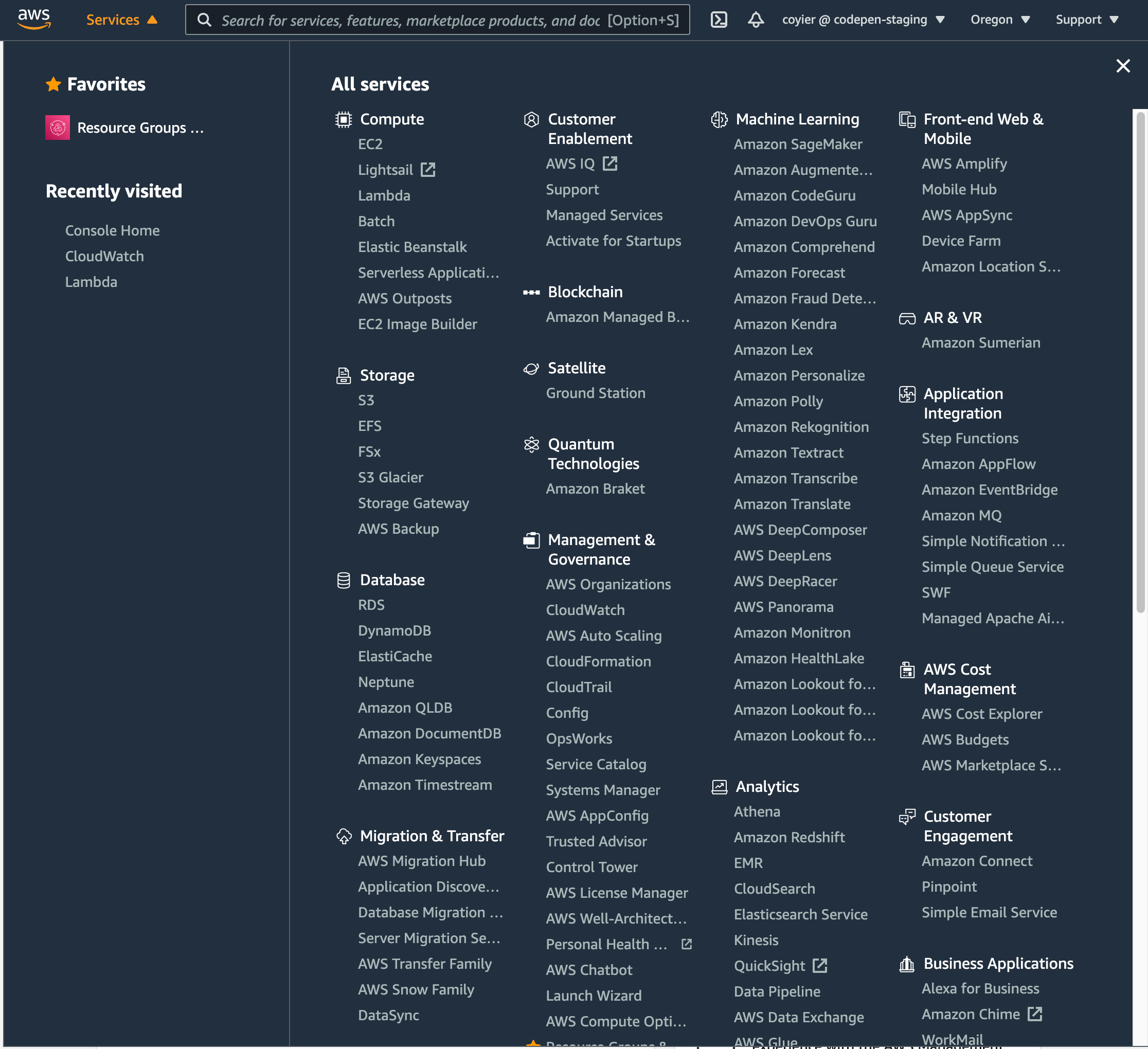
The other was the navigation for AWS services from the AWS Console:

A four column layout with a long list of white links in each column against a dark blue background.
It’s weird how much they use the word “Amazon” and “AWS” when you’re literally logged into AWS.

Both of them have that vibe of: holy crap we have a lot of stuff, I guess we’ll just make a massive grid of links to it all.

The difference is the AWS Console one has a search bar at the top of it. Its primary function is finding things in that menu (but it does search the wider site as well):

Showing a full-width search box with a dark blue background and the AWS logo pinned to the top of the screen, followed by search results for the term s3 and a list of filters to the left of it against a darker blue background.
They also have a “favorites” UI for saving the ones you use the most.

The “search a list of things already on the page” idea reminds me of that classic jQuery contains selector. Please allow me:


The post I Saw Two Mega Menus Today… appeared first on CSS-Tricks.

You can support CSS-Tricks by being an MVP Supporter.


from CSS-Tricks https://ift.tt/3au8wBK
via IFTTT

Dynamically Switching From One HTML Element to Another in Vue

A friend once contacted me asking if I had a way to dynamically change one HTML element into another within Vue’s template block. For instance, shifting a <div> element to a <span> element based on some criteria. The trick was to do this without relying on a series of v-if and v-else code.

I didn’t think much of it because I couldn’t see a strong reason to do such a thing; it just doesn’t come up that often. Later that same day, though, he reached out again and told me he learned how to change element types. He excitedly pointed out that Vue has a built-in component that can be used as a dynamic element in the very way that he needed.

This small feature can keep code in the template nice and tidy. It can reduce v-if and v-else glut down to a smaller amount of code that’s easier to understand and maintain. This allows us to use methods or computed methods to create nicely-coded, and yet more elaborate, conditions in the script block. That’s where such things belong: in the script, not the template block.

I had the idea for this article mainly because we use this feature in several places in the design system where I work. Granted it’s not a huge feature and it is barely mentioned in the documentation, at least as far as I can tell. Yet it has potential to help render specific HTML elements in components.

Vue’s built-in <component> element

There are several features available in Vue that allow for easy dynamic changes to the view. One such feature, the built-in <component> element, allows components to be dynamic and switched on demand. In both the Vue 2 and the Vue 3 documentation, there is a small note about using this element with HTML elements; that is the part we shall now explore.

The idea is to leverage this aspect of the <component> element to swap out common HTML elements that are somewhat similar in nature; yet with different functionality, semantics, or visuals. The following basic examples will show the potential of this element to help with keeping Vue components neat and tidy.

Buttons and links are often used interchangeably, but there are big differences in their functionality, semantics, and even visuals. Generally speaking, a button (<button>) is intended for an internal action in the current view tied to JavaScript code. A link (<a>), on the other hand, is intended to point to another resource, either on the host server or an external resource; most often web pages. Single page applications tend to rely more on the button than the link, but there is a need for both.

Links are often styled as buttons visually, much like Bootstrap’s .btn class that creates a button-like appearance. With that in mind, we can easily create a component that switches between the two elements based on a single prop. The component will be a button by default, but if an href prop is applied, it will render as a link.

Here is the <component> in the template:

<component
  :is="element"
  :href="href"
  class="my-button"
>
  <slot />
</component>

This bound is attribute points to a computed method named element and the bound href attribute uses the aptly named href prop. This takes advantage of Vue’s normal behavior that the bound attribute does not appear in the rendered HTML element if the prop has no value. The slot provides the inner content regardless whether the final element is a button or a link.

The computed method is simple in nature:

element () {
  return this.href ? 'a' : 'button';
}

If there’s an href prop,. then an <a> element is applied; otherwise we get a <button>.

<my-button>this is a button</my-button>
<my-button href="https://www.css-tricks.com">this is a link</my-button>

The HTML renders as so:

<button class="my-button">this is a button</button>
<a href="https://www.css-tricks.com" class="my-button">this is a link</a>

In this case, there could be an expectation that these two are similar visually, but for semantic and accessibility needs, they are clearly different. That said, there’s no reason the two outputted elements have to be styled the same. You could either use the element with the selector div.my-button in the style block, or create a dynamic class that will change based on the element.

The overall goal is to simplify things by allowing one component to potentially render as two different HTML elements as needed — without v-if or v-else!

Ordered or unordered list?

A similar idea as the button example above, we can have a component that outputs different list elements. Since an unordered list and an ordered list make use of the same list item (<li>) elements as children, then that’s easy enough; we just swap <ul> and <ol>. Even if we wanted to have an option to have a description list, <dl>, this is easily accomplished since the content is just a slot that can accept <li> elements or <dt>/<dd>combinations.

The template code is much the same as the button example:

<component
  :is="element"
  class="my-list"
>
  <slot>No list items!</slot>
</component>

Note the default content inside the slot element, I’ll get to that in a moment.

There is a prop for the type of list to be used that defaults to <ul>:

props: {
  listType: {
    type: String,
    default: 'ul'
  }
}

Again, there is a computed method named element:

element () {
  if (this.$slots.default) {
    return this.listType;
  } else {
    return 'div';
  }
}

In this case, we are testing if the default slot exists, meaning it has content to render. If it does, then the the list type passed through the listType prop is used. Otherwise, the element becomes a <div> which would show the “No list items!” message inside the slot element. This way, if there are no list items, then the HTML won’t render as a list with one item that says there are no items. That last aspect is up to you, though it is nice to consider the semantics of a list with no apparent valid items. Another thing to consider is the potential confusion of accessibility tools suggesting this is a list with one item that just states there are no items.

Just like the button example above, you could also style each list differently. This could be based on selectors that target the element with the class name, ul.my-list. Another option is to dynamically change the class name based on the chosen element.

This example follows a BEM-like class naming structure:

<component
  :is="element"
  class="my-list"
  :class="`my-list__${element}`"
>
  <slot>No list items!</slot>
</component>

Usage is as simple as the previous button example:

<my-list>
  <li>list item 1</li>
</my-list>

<my-list list-type="ol">
  <li>list item 1</li>
</my-list>

<my-list list-type="dl">
  <dt>Item 1</dt>
  <dd>This is item one.</dd>
</my-list>

<my-list></my-list>

Each instance renders the specified list element. The last one, though, results in a <div> stating no list items because, well, there’s no list to show!

One might wonder why create a component that switches between the different list types when it could just be simple HTML. While there could be benefits to keeping lists contained to a component for styling reasons and maintainability, other reasons could be considered. Take, for instance, if some forms of functionality were being tied to the different list types? Maybe consider a sorting of a <ul> list that switches to a <ol> to show sorting order and then switching back when done?

Now we’re controlling the elements

Even though these two examples are essentially changing the root element component, consider deeper into a component. For instance, a title that might need to change from an <h2> to an <h3> based on some criteria.

If you find yourself having to use ternary solutions to control things beyond a few attributes, I would suggest sticking with the v-if. Having to write more code to handle attributes, classes, and properties just complicates the code more than the v-if. In those cases, the v-if makes for simpler code in the long run and simpler code is easier to read and maintain.

When creating a component and there’s a simple v-if to switch between elements, consider this small aspect of a major Vue feature.

Expanding the idea, a flexible card system

Consider all that we’ve covered so far and put it to use in a flexible card component. This example of a card component allows for three different types of cards to be placed in specific parts of the layout of an article:

  • Hero card: This is expected to be used at the top of the page and draw more attention than other cards.
  • Call to action card: This is used as a line of user actions before or within the article.
  • Info card: This is intended for pull quotes.

Consider each of these as following a design system and the component controls the HTML for semantics and styling.

In the example above, you can see the hero card at the top, a line of call-to-action cards next, and then — scrolling down a bit — you’ll see the info card off to the right side.

Here is the template code for the card component:

<component :is="elements('root')" :class="'custom-card custom-card__' + type" @click="rootClickHandler">
  <header class="custom-card__header" :style="bg">
    <component :is="elements('header')" class="custom-card__header-content">
      <slot name="header"></slot>
    </component>
  </header>
  <div class="custom-card__content">
    <slot name="content"></slot>
  </div>
  <footer class="custom-card__footer">
    <component :is="elements('footer')" class="custom-card__footer-content" @click="footerClickHandler">
      <slot name="footer"></slot>
    </component>
  </footer>
</component>

There are three of the “component” elements in the card. Each represents a specific element inside the card, but will be changed based on what kind of card it is. Each component calls the elements() method with a parameter identifying which section of the card is making the call.

The elements() method is:

elements(which) {
  const tags = {
    hero: { root: 'section', header: 'h1', footer: 'date' },
    cta: { root: 'section', header: 'h2', footer: 'div' },
    info: { root: 'aside', header: 'h3', footer: 'small' }
  }
  return tags[this.type][which];
}

There are probably several ways of handing this, but you’ll have to go in the direction that works with your component’s requirements. In this case, there is an object that keeps track of HTML element tags for each section in each card type. Then the method returns the needed HTML element based on the current card type and the parameter passed in.

For the styles, I inserted a class on the root element of the card based on the type of card it is. That makes it easy enough to create the CSS for each type of card based on the requirements. You could also create the CSS based on the HTML elements themselves, but I tend to prefer classes. Future changes to the card component could change the HTML structure and less likely to make changes to the logic creating the class.

The card also supports a background image on the header for the hero card. This is done with a simple computed placed on the header element: bg. This is the computed:

bg() {
  return this.background ? `background-image: url(${this.background})` : null;
}

If an image URL is provided in the background prop, then the computed returns a string for an inline style that applies the image as a background image. A rather simple solution that could easily be made more robust. For instance, it could have support for custom colors, gradients, or default colors in case of no image provided. There’s a large number of possibilities that his example doesn’t approach because each card type could potentially have their own optional props for developers to leverage.

Here’s the hero card from this demo:

<custom-card type="hero" background="https://picsum.photos/id/237/800/200">
  <template v-slot:header>Article Title</template>
  <template v-slot:content>Lorem ipsum...</template>
  <template v-slot:footer>January 1, 2011</template>
</custom-card>

You’ll see that each section of the card has its own slot for content. And, to keep things simple, text is the only thing expected in the slots. The card component handles the needed HTML element based solely on the card type. Having the component just expect text makes using the component rather simplistic in nature. It replaces the need for decisions over HTML structure to be made and in turn the card is simply implemented.

For comparison, here are the other two types being used in the demo:

<custom-card type="cta">
  <template v-slot:header>CTA Title One</template>
  <template v-slot:content>Lorem ipsum dolor sit amet, consectetur adipiscing elit.</template>
  <template v-slot:footer>footer</template>
</custom-card>

<custom-card type="info">
  <template v-slot:header>Here's a Quote</template>
  <template v-slot:content>“Maecenas ... quis.”</template>
  <template v-slot:footer>who said it</template>
</custom-card>

Again, notice that each slot only expects text as each card type generates its own HTML elements as defined by the elements() method. If it’s deemed in the future that a different HTML element should be used, it’s a simple matter of updating the component. Building in features for accessibility is another potential future update. Even interaction features can be expanded, based on card types.

The power is in the component that’s in the component

The oddly named <component> element in Vue components was intended for one thing but, as often happens, it has a small side effect that makes it rather useful in other ways. The <component> element was intended to dynamically switch Vue components inside another component on demand. A basic idea of this could be a tab system to switch between components acting as pages; which is actually demonstrated in the Vue documentation. Yet it supports doing the same thing with HTML elements.

This is an example of a new technique shared by a friend that has become s surprisingly useful tool in the belt of Vue features that I’ve used. I hope that this article carries forward the ideas and information about this small feature for you to explore how you might leverage this in your own Vue projects.


The post Dynamically Switching From One HTML Element to Another in Vue appeared first on CSS-Tricks.

You can support CSS-Tricks by being an MVP Supporter.


from CSS-Tricks https://ift.tt/3th4eGm
via IFTTT

Passkeys: What the Heck and Why?

These things called  passkeys  sure are making the rounds these days. They were a main attraction at  W3C TPAC 2022 , gained support in  Saf...