I noted Trey Huffine’s 2018 version of this article in The Great Divide.
To put a point on this divide a bit more, consider this article by Trey Huffine, "A Recap of Frontend Development in 2018." It's very well done! It points to big moments this year, shows interesting data, and makes predictions about what we might see next year. But it's entirely based around the JavaScript ecosystem.
My point was (and still is) that front-end development is more than the JavaScript ecosystem. However, I certainly admit the movings-and-shakings of the JavaScript world is a big deal and probably generally more interesting to watch for most devs.
HTML is evolving at an even slower pace. Occasionally, something will feel new. I got excited about <dialog> this year, even though it first appeared in 2014, but the experts are saying we probably shouldn't use it. Elements like <details> are getting more exciting as Edge-goes-Chromium because they'll be getting more cross-browser support, but it's no picnic. There's just not much exciting to talk about in HTML, at least to me, aside from sort of philosophical approaches to it, like JAMstack.
There are so, so, so (so) many things to read out there on the internet. So many, in fact, that it's difficult to keep up with everything.
But, hey, we've got your back! It's our job to surface the best of the best and share it with you right here. That's why it's a good idea to subscribe to this site and newsletter. Why subscribe to hundreds of sites when you can follow one, right?
Where do we find the links that we share? It truly runs the gamut, but we've decided to list our favorite sources.
Chris Coyier
Labnotes - Assaf Arkin's newsletter is great mishmash of timely, interesting, and funny tidbits with a developer twist.
Code with Veni is new just this year and consistently has great links from underrepresented coders
DEV is blowing up and I end up reading many articles there each week. Meanwhile, it feels like Medium is slowing down significantly when it comes to developer-focused writing.
I obviously look at CodePen every day, which helps me keep an eye on what front-end developers are playing with.
I'd say the main value I get from Twitter is getting great links and thoughts that are a smidge beyond my regular reading. I'm in some community Slacks too, but find it far more conversational and less link-heavy.
Sarah Drasner
Scotch.io consistently has great stuff for pretty much every tech stack you can think of. They also do a great job of finding new authors.
Cassidy William's newsletter is short and sweet, and has coding puzzles in every issue.
I really love PonyFoo's quality and style. They mix it up and keep it interesting. The design is nice and unique as well!
I'm a Vue core team member and love to keep on top of what's going on in the community with the Vue Newsletter. It's curated by a team of really passionate educators and it shows — every newsletter is well curated.
I love Data Sketches so very much. It's a brilliant collaboration between Shirley Wu and Nadieh Bremer, and shows exceptional mastery of technical and illustrative skillsets to convey data. Worth a read for sure.
Like Chris, I love Codrops Collective. You can learn so much about UX animation there.
Speaking of animation, Val Head has a wonderful UI Animation Newsletter. She's kept it up for years, and it's rich with resources from the fanciful to the practical.
Rachel Andrew has been the editor-in-chief of Smashing Magazine for the past year or so, and the content has been wonderful. Smashing is constantly a source of great articles and information about front-end development and design.
I just saw Jared Palmer's Blog a week ago and I really enjoy the writing there. It's informative, interesting and humorous.
Our own Robin Rendle has a great newsletter all about typography. I don't know that much about type, so the poetic deep dives are lovely and informative. It's great for die-hard fans and newbies alike!
CSS {In Real Life} - Michelle Barker is has a pragmatic approach to CSS and does an excellent job explaining complex concepts in a way that's pretty easy to grok.
The History of the Web - This is probably the opposite of "late-breaking" news, but Jay Hoffman's newsletter tells yesteryear's stories of the web, which is great context for things we see evolving today.
CodePen Post Picks - CodePen is full of great minds sharing ideas and the team over there does an excellent job curating noteworthy posts.
RWD Weekly Newsletter - Justin Avery covers responsive design news (obviously) but also provides oodles of other front-end-related goodies.
The Work Behind the Work - This isn't front-end stuff but I like how this site documents the creative process behind famous works that we know and love.
Adactio - Jeremy Keith posts regularly and thoughtfully.
Bruce Lawson - He usually has a weekly link dump that I find useful for uncovering things that would otherwise slip under my radar.
Mozilla Hacks - I could just as easily link up to other browser news, but Mozilla seems to be innovating fast and I like seeing where they're headed.
Ire Aredinokun’s blog Bits of Code is an endless treasure trove of information about front-end development best practices and each post makes me ooo and Alice with delight.
For type and design news I always keep an eye out for Typographica’s year in review, and this year’s edition is just as interesting as the others. They collect a ton of typeface reviews from the releases of the past 12 months and explore what makes each design tick.
Likewise, David Jonathan Ross’s Font of the Month Club is essential reading for designers. David gives provides a typeface that's a work in progress in each issue and then writes diligently about the process behind it. It’s always a wonder.
Tim Kadlec’s blog is a great source of info about accessibility, web performance and general front-end development news.
I’ve been reading a bunch of great newsletters lately and Chip Scanlan’s writing advice is one that certainly stands out from the crowd.
Adrian Roselli’s blog never fails to impress with a ton of deep-dives into some obscure front-end problem or issue I’ve never heard about before.
Where do you look to stay updated? Share your list of favorites with us!
Having a "parent selector" in CSS is mentioned regularly as something CSS could really use. I feel like I've had that thought plenty of times myself, but then when I ask my brain for a use case, I find it hard to think of one. Well, I just had one so I thought I'd document it here.
Now let's say there's one special circumstance where the child needs to be positioned outside the parent and still be visible. Hidden overflow is still a good default for the vast majority of situations, so it's best to leave that rule in place, but in this very specific situation, we need to override that overflow.
.special-child {
   position: absolute;
   bottom: -20px; /* needs to be slightly outside parent */
}

/* Not real, but just to make a point */
.special-child:parent(.parent) {
   overflow: visible;
}
That selector above is fake but it's saying, "Select the parent of .special-child," which would allow that override as needed. Maybe it's like this:
.parent < .special-child {

}
...which is selecting the element on the left rather than the right. Who knows? Probably both of those are problematic somehow and the final syntax would be something else. Or maybe we'll never get it. I have no idea. Just documenting a real use case I had.
You might be thinking, "Why not just use another special class on the parent?" I would have, but the parent was being injected by a third-party library through an API that did not offer to add a class of my choosing on it. Ultimately, I did have to add the class to the parent by writing some custom JavaScript that queried the DOM to find the .special-child, find the parent, then add the class there.
Do y'all have some other use-cases for a parent selector?
Wufoo has always been great with integrations. They have integrations with specific apps, like Campaign Monitor, Mailchimp, and Typekit, but they also integrate with Zapier, which is sort of like an integration inside an integration.
That's kinda meta, but the idea is actually pretty straightforward: Wufoo integrates with Zapier, which integrates with a gazillion (yes, I did the math) other apps. That opens up a whole world of possibilities for what you can do with a Wufoo form.
Some interesting ones:
Trigger an email to send to someone from Campaign Monitor or Mailchimp when they've submitted the form.
Collect submissions in a Google Sheet to build you own database of entries.
Automatically create a card in Trello once the form has been submitted.
Add the person who is submitting the form to a contact list in Salesforce.
Push notifications to Slack once someone completes the form.
Wufoo shared their own list of ideas. Let's sum them up here:
Wufoo + your customer relationship management (CRM) tool
Wufoo + your email tool
Wufoo + your file storage tool
Wufoo + your website-building tool
Wufoo + your project management tool
Wufoo + your calendar tool
Wufoo + your spreadsheet tool
That one about website-building tools is pretty sweet. This lets Wufoo hook up to something, say WordPress, so that you can do something like publish a new page for every submission. Think about that. You have one integration to send an email to the user when they submit the form and perhaps it contains a link to a personalized page. Voltron powers, unite!
Markdown supports HTML, so if you need to, say, embed a YouTube video, you can just copy and paste the embed code from them, drop it into a Markdown document, and you should be good to go. With YouTube specifically, there are other options. But in general, you don't need to do anything special to embed third-party media in Markdown.
You do need to do whatever is necessary for that particular service though. For example, on CodePen, you visit any particular Pen to get the embed code, click "Embed" in the footer, choose options, and ultimately get the embed code. On Twitter, you click a down arrow thingy and choose Embed Tweet, then get forwarded to some other website where you choose options and ultimately get the embed code. It's different on every service.
That's the spirit behind gatsby-remark-embedder from Michaël De Boey, which I recently saw. It spells this out:
Trying to embed well known services (like CodePen, CodeSandbox, Slides, SoundCloud, Spotify, Twitter or YouTube) into your Gatsby website can be hard, since you have to know how this needs to be done for all of these different services.
So what this plugin does is allows you to drop a URL to the thing you're trying to embed on its own line, and it's magically transformed into embed code. For example, you put a URL to a Pen like this:
...by the time the content makes its way to the DOM.
As an owner of CodePen, I can't help but to remind you that doing it this way means you can't take advantage of having a theme or making it editable. But hey, I get it.
What I think is a smidge funny is that... this is exactly what oEmbed is. The whole spirit of oEmbed is, "Put a URL to a thing on its own line and we'll try to make it into an embed for you." It's a clearly defined spec and there is a clear source of data of sites that support the feature.
But I suppose it's a failing of oEmbed that people either don't know about it or don't use it. Even Embedly seems kinda dead-ish?
Gatsby and WordPress is an interesting combo to watch. On one hand, it makes perfect sense. Gatsby can suck up data from anywhere, and with WordPress having a native REST API, it makes for a good pairing. Of course Gatsby has a first-class plugin for sourcing data from WordPress that even supports data from popular plugins like Advanced Custom Fields.
On the other hand, Gatsby is such a part of the JAMstack world that combining it with something as non-JAMstack-y as WordPress feels funny.
Here's some random thoughts and observations I have about this pairing.
Markus says this combination allowed him to "find joy again" in WordPress development.
A world in which you get to build a WordPress site but get to host it on Netlify, with all their fancy developer features (e.g. build previews), is certainly appealing.
Scott Bolinger has a five-minute tour of his own site, with the twist of some of the pages can be statically-built, and other parts dynamically loaded.
There is a GraphQL plugin for WordPress, which I suppose would be an alternate way to yank data in a Gatsby-friendly way. Jason Bahl, the wp-graphql guy, literally works for Gatsby now and has "Development sponsored by Gatsby" as the plugin's Twitter bio. It's unclear if this will be the default future way to integrate Gatsby and WordPress. I sort of suspect not, just because the REST API requires no additional plugin and the GraphQL plugin takes a little work to install. Anecdotally, just installing it and activating it triggers a fatal error on my site, so I'll need to work with my host on that at some point because I'd love to have it installed.
Getting a WordPress site on static hosting seems like a big opportunity that is barely being tapped. Gatsby is just an early player here and is focused on re-building your site the React way. But there are other tools like WP2Static that claim to export a static version of your WordPress site-as is then upload the output to a static host. Ashley Williams and Kristian Freeman get into that in this video (starting about 20 minutes in) and host the result on a Cloudflare Workers site.
This demo from Jérémie Patonnier is incredible. Make sure to look at it in Firefox because some Chrome bug apparently prevents the entire thing from working.
The big idea is that the entire demo is one<rect> element. That's it. It is duplicated with <use> elements when needed, and each individual duplication is styled via CSS, which can control stuff like stroke, fill, x, y, etc.
Page reloads are a thing. Sometimes we refresh a page when we think it’s unresponsive, or believe that new content is available. Sometimes we’re just mad at the dang site and rage-refresh to let it know we’re displeased.
Wouldn’t be nice to know when a user refreshes the page? Not just that, but how many times? That data can help us trigger some sort of behavior after a certain number of reloads.
A sports site is a good example. If I want to check the score of a game that’s in progress but the scores aren't live-updated, then I might find myself refreshing a bunch.
Our goal is to break users out of that habit. We’ll use our page-refresh-counting powers to let folks know that refreshes are unnecessary, thanks to real-time score updates. And if they reload more than three times? We’ll kick ‘em out of their session. That’ll show them.
Here’s a simple demo of that concept.
Let’s re-create it together. But before we get going, there are few questions we need to answer before we start coding:
How can we persist the number of times user reloaded the site? We need a place to keep the number of times user reloaded the site (reloadCount), this place needs to persist that value between the reloads — localStorage sounds like a good solution.
How do we detect if user reloaded the site or just came back after few hours? If we store the reloadCount in localStorage it will persist the value between the reloads, but it will keep that value until we remove programmatically or clear the browser storage. It means that if we come back after few hours the site will still remember last reloadCount and may perform logout after first refresh without warning. We want to avoid that and allow user to reload the site two times each time the user comes back after some period of time. That last sentence holds the answer to the question. We need to store the time when the user left the site and then when the site loads again check when that happened. If that time period wasn’t long enough, we activate the reload counting logic.
How do we know when the user leaves the site? To store that time, we use beforeunload window event and store that value in localStorage.
OK, now that we have the answers, let’s dive into the code.
Step 1: We’ve gotta store the last reload time
We will store the time of last reload using a beforeunload window event. We need two things: (1) an event listener that will listen to the event and fire the appropriate method, and (2) our beforeUnloadHandler method.
First, let’s create a function called initializeReloadCount that will set our event listener using the addEventListener method on the window object.
function initializeReloadCount() {
  window.addEventListener("beforeunload", beforeUnloadHandler)
}
Then we create a second method that will be fired before we leave the site. This method will save the time the refresh happens in localStorage.
function beforeUnloadHandler() {
  localStorage.setItem("lastUnloadAt", Math.floor(Date.now() / 1000))
  window.removeEventListener("beforeunload", beforeUnloadHandler);
}
Step 2: We need a way to handle and store the reload count
Now that we have the time when the site was last closed, we can proceed and implement logic that’s responsible for detecting and counting how many times the site was reloaded. We need a variable to hold our reloadCount and tell us how many times user reloaded the site.
let reloadCount = null
Then, in our initializeReloadCount function, we need to do two things:
Check if we already have a reloadCount value stored in our localStorage, and if so, get that value and save it in our reloadCount. If the value doesn’t exist, it means that the user loaded the site for the first time (or at least did not reload it). In that case, we set the reloadCount to zero and save that value to localStorage.
Detect if the site was reloaded or the user came back to the site after longer period of time. This is the place where we need our lastUnloadAt value. To detect if the site was actually reloaded, we need to compare the time when the site gets loaded (the current time) with the lastUnloadAt value. If those two happened within, say, five seconds (which is totally arbitrary), that means the user reloaded the site and we should run reload count logic. If the time period between those two events is longer, we reset the reloadCount value.
With that, let’s create a new function called checkReload and keep that logic there.
The last function we need in this step is a method responsible for what happens when we confirm that the user reloaded the site. We call that function onReloadDetected, and inside it, we increment the value of reloadCount. If the user refreshed the site third time, we drop the bomb and call our logout logic.
function onReloadDetected() {
  reloadCount = reloadCount + 1
  localStorage.setItem("reloadCount", reloadCount)
  if (reloadCount === 3) {
    logout()
  }
}
Step 3: “Dear user, why you didn’t listen?!”
In this step, we implement the logic responsible for the situation when the user reloads the site to the point of breaching our three-limit threshold, despite our clear warnings to stop doing it.
When that happens, we call our API to log the user out, then we clean up all properties related to the reload count logic. That will allow the user to come back and have a clean account of reloads. We can also redirect the user somewhere useful, like the login screen. (But wouldn’t it be funny to send them here instead?)
function logout(params) {
  // logout API call
  resetReloadCount()
}

function resetReloadCount() {
  window.removeEventListener("beforeunload", beforeUnloadHandler)
  localStorage.removeItem("lastUnloadAt")
  localStorage.removeItem("reloadCount");
}
Bonus: Let’s re-Vue it!
Now that we have the logic implemented, let’s see how can move that logic to a Vue site based on this example:
First, we need to move all of our variables into our component’s data, which is where all reactive props live.
Since we are using Vue and its reactivity system, we can drop all direct DOM manipulations (e.g. document.getElementById("app").innerHTML) and depend on our warningMessages data property. To display the proper warning message we need to add a computed property that will re-calculate each time our reloadCount is changed so that we can return a string from our warningMessages.
Last thing we need to do is find a proper place to activate the reload prevention logic. Vue comes with component lifecycle hooks that are exactly what we need, specifically the created hook. Let’s drop that in.
And there it is, the logic that checks and counts how many times a page has been refreshed. I hope you enjoyed the ride and you find this solution useful or at least inspiring to do something better. 🙂
Say you have a design system and you're having a moment where it doesn't have what you need. You need to diverge and create something new. Yesenia Perez-Cruz categorizes these moments from essentially ooops to niiice:
There are three kinds of deviations that come up in a design
system:
Unintentional divergence typically happens when designers can’t find the information they’re looking for. They may not know that a certain solution exists within a system, so they create their own style. Clear, easy-to-find documentation and usage guidelines can help your team avoid unintentional variation.
Intentional but unnecessary divergence usually results from designers not wanting to feel constrained by the system, or believing they have a better solution. Making sure your team knows how to push back on and contribute to the system can help mitigate this kind of variation.
Intentional, meaningful divergence is the goal of an expressive design system. In this case, the divergence is meaningful because it solves a very specific user problem that no existing pattern solves.
We want to enable intentional, meaningful variation.
And while we're linking up books about design systems, check out Andrew Couldwell's Laying the Foundations.
System design is not a scary thing — this book aims to dispel that myth. It covers what design systems are, why they are important, and how to get stakeholder buy-in to create one. It introduces you to a simple model, and two very different approaches to creating a design system. What's unique about this book is its focus on the importance of brand in design systems and creating documentation.
Most of us have done site speed audits, or seen audits done by others. These can be really helpful for businesses, but I often find they're quite narrow in focus. Typically we use well-known tools that throw up a bunch of things to look at, and then we dive into things from there.
However, if we dig deeper, there are often other ideas on how site speed can be improved. I often see plenty of opportunities that are never covered in site speed audits. Most site speed improvements are the result of a bunch of small changes, and so in this post I’m going to cover a few ideas that I’ve never seen in any site speed audit, all of which can make a difference.
A different angle on image optimization
Consider optimized SVGs over PNGs
I was recently looking to book some tickets to see Frozen 2 (because of, erm, my kids...) and so landed on this page. It makes use of three SVG images for transport icons:
SVG images are vector images, so they're well-suited for things like icons; if you have images displayed as PNGs you may want to ask your designers for the original SVGs, as there can be considerable savings. Though not always better, using an SVG can save 60% of the filesize.
In this case, these icons come in at about 1.2k each, so they are quite small. They would probably fly under the radar of site speed audits (and neither Page Speed Insights or GTMetrix mention these images at all for this page).
So you may be thinking, “They're less than 5k combined — you should look for bigger issues!”, but let's take a look. Firstly, we can run them all through Jake Archibald’s SVG compression tool; this is a great free tool and on larger SVGs it can make a big difference.
In this case the files are small, so you may still be thinking "Why bother?" The tool compresses them without any loss in quality from ~1240 bytes to ~630 bytes — a good ratio but not much of an overall saving.
However… now that we've compressed them, we can think differently about delivering them…
Inline images
GTMetrix makes recommendations around inlining small bits of CSS or JS, but doesn’t mention inlining images. Images can also be inlined, and sometimes this can be the right approach.
If you consider that even a very small image file requires a complete round trip (which can have a very real impact on speed), even for small files this can take a long time. In the case of the Cineworld transport images above, I simulated a "Fast 3G" connection and saw:
The site is not using HTTP2 so there is a long wait period, and then the image (which is 1.2kb) takes almost 600ms to load (no HTTP2 also means this is blocking other requests). There are three of these images, so between them they can be having a real impact on page speed.
However, we've now compressed them to only a few hundred bytes each, and SVG images are actually made up of markup in a similar fashion to HTML:
You can actually put SVG markup directly into an HTML document!
If we do this with all three of the transport images, the compressed HTML for this page that is sent from the server to our browser increases from 31,182 bytes to 31,532 bytes — an increase of only 350 bytes for all 3 images!
So to recap:
Our HTML request has increased 350 bytes, which is barely anything
We can discard three round trips to the server, which we can see were taking considerable time
Some of you may have realized that if the images were not inline they could be cached separately, so future page requests wouldn’t need to refetch them. But if we consider:
Each image was originally about 1.5kb over the network (they aren’t gzipping the SVGs), with about 350 bytes of HTTP headers on top for a total of about 5.5kb transferred. So, overall we've reduced the amount of content over the network.
This also means that it would take over 20 pageviews to benefit from having them cached.
Takeaway: Consider where there are opportunities to use SVGs instead of PNGs.
Takeaway: Make sure you optimize the SVG images, use the free tool I linked to.
Takeaway: Inlining small images can make sense and bring outsized performance gains.
So often nowadays, thanks to the prevalence of JavaScript libraries that offer an off-the-shelf solution, I find JavaScript being used for functionality that could be achieved without it. More JS libraries means more to download, maybe more round trips for additional files from the server, and then the JavaScript execution time and costs themselves.
I have a lot of sympathy for how you get to this point. Developers are often given poor briefs/specs that fail to specify anything about performance, only function. They are often time-poor and so it's easy to end up just dropping something in.
However, a lot of progress has been made in terms of the functionality that can be achieved with HTML and or CSS. Let's look at some examples.
Combo box with search
Dropdown boxes that have a text search option are a fairly common interface element nowadays. One recent article I came across described how to use the Select2 Javascript library to make such a list:
It is a useful UI element, and can help your users. However, in the Select2 library is a JavaScript library, which in turn relies on some CSS and the JQuery library. This means three round trips to collect a bunch of files of varying sizes:
JQuery - 101kb
Select2 JavaScript - 24kb
Select2 CSS - 3kb
This is not ideal for site speed, but we could certainly make the case it is worth it in order to have a streamlined interface for users.
However, it is actually possible to have this functionality out of the box with the HTML datalist element:
This allows the user to search through the list or to free type their own response, so provides the same functionality. Furthermore, it has a native interface on smartphones!
LonelyPlanet has a beautiful website, and I was looking at this page about Spain, which has a ‘Read More’ link that most web users will be familiar with:
Like almost every implementation of this that I see, they have used a JavaScript library to implement this, and once again this comes with a bunch of overheads.
However, HTML has a pair of built-in tags called details and summary, which are designed to implement this functionality exactly. For free and natively in HTML. No overheads, and more accessible for users needing a screen reader, while also conveying semantic meaning to Google.
These tags can be styled in various flexible ways with CSS and recreate most of the JS versions I have seen out there.
For more examples of functionality that you can achieve with HTML instead of JS, check out these links:
https://ift.tt/2dty0QU
https://ift.tt/2ZK0LAw
Takeaway: Examine the functionality of your sites and see where there may be opportunities to reduce your reliance on large Javascript libraries where there are native HTML/CSS options.
Takeaway: Remember that it isn’t only the size of the JS files that is problematic, but the number of round trips that are required.
Note: There are cases where you should use the JS solution, but it is important to weigh up the pros and cons.
Networking tune-ups
Every time the browser has to collect resources from a server, it has to send a message across the internet and back; the speed of this is limited by the speed of light. This may sound like a ridiculous thing to concern ourselves with, but it means that even small requests add time to the page load. If you didn’t catch the link above, my post explaining HTTP2 discusses this issue in more detail.
There are some things we can do to help either reduce the distance of these requests or to reduce the number of round trips needed. These are a little bit more technical, but can achieve some real wins.
TLS 1.3
TLS (or SSL) is the encryption technology used to secure HTTPS connections. Historically it has taken two round trips between the browser and the server to setup that encryption — if the user is 50ms away from the server, then this means 200ms per connection. Keep in mind that Google historically recommends aiming for 200ms to deliver the HTML (this seems slightly relaxed in more recent updates); you're losing a lot of that time here.
The recently defined TLS 1.3 standard reduces this from two round trips to just one, which can shave some precious time off the users initial connection to your website.
Speak to your tech team about migrating to TLS 1.3; browsers that don’t support it will fallback to TLS 1.2 without issue. All of this is behind the scenes and is not a migration of any sort. There is no reason not to do this.
If you are using a CDN, then it can be as simple as just turning it on.
You can use this tool to check which versions of TLS you have enabled.
QUIC / HTTP 3
Over the last 2-3 years we have seen a number of sites move from HTTP 1.1 to HTTP 2, which is a behind-the-scenes upgrade which can make a real improvement to speed (see my link above if you want to read more).
Right off the back of that, there is an emerging pair of standards known as QUIC + HTTP/3, which further optimize the connection between the browser and the server, further reducing the round trips required.
Support for these is only just beginning to become viable, but if you are a CloudFlare customer you can enable that today and over the coming 6 months as Chrome and Firefox roll support out, your users will get a speed boost.
When users connect to your website, they have to open network connections from wherever they are to your servers (or your CDN). If you imagine the internet as a series of roads, then you could imagine they need to ‘drive’ to your server across these roads. However, that means congestion and traffic jams.
As it turns out, some of the large cloud companies have their own private roads which have fewer potholes, less traffic, and improved speed limits. If only your website visitors could get access to these roads, they could ‘drive’ to you faster!
Well, guess what? They can!
For CloudFlare, they provide this access via their Argo product, whereas if you are on AWS at all then you can use their Global Accelerator. This allows requests to your website to make use of their private networks and get a potential speed boost. Both are very cheap if you are already customers.
Takeaway: A lot of these sorts of benefits are considerably easier to get if you're using a CDN. If you're not already using a CDN, then you probably should be. CloudFlare is a great choice, as is CloudFront if you are using AWS. Fastly is the most configurable of them if you're more of a pro.
Takeaway: TLS 1.3 is now very widely supported and offers a significant speed improvement for new connections.
Takeaway: QUIC / HTTP3 are only just starting to get support, but over the coming months this will roll out more widely. QUIC includes the benefits of TLS 1.3 as well as more. A typical HTTP2 connection nowadays needs 3 round trips to open; QUIC needs just one!
Takeaway: If you're on CloudFlare or AWS, then there is potential to get speed ups just from flipping a switch to turn on smart routing features.
Let CSS do more
Above I talked about how HTML has built-in functionality that you can leverage to save relying on solutions that are ‘home-rolled’ and thus require more code (and processing on the browsers side) to implement. Here I'll talk about some examples where CSS can do the same for you.
Reuse images
Often you find pages that are using similar images throughout the page in several places. For example, variations on a logo in different colors, or arrows that point in both directions. As unique assets (however similar they may be), each of these needs to be downloaded separately.
Returning to my hunt for cinema tickets above, where I was looking at this page, we can see a carousel that has left and right arrows:
Similarly to the logic used above, while these image files are small, they still require a round trip to fetch from the server.
However, the arrows are identical — just pointing in opposite directions! It's easy for us to use CSS’s transform functionality to use one image for both directions:
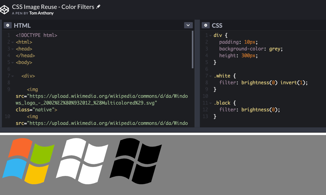
Another example is when the same logo appears in different styles on different parts of the page; often they will load multiple variations, which is not necessary. CSS can re-color logos for you in a variety of ways:
There is a codepen here showing this technique in action. If you want to calculate the CSS filter value required to reach an arbitrary color, then check out this amazing color calculator.
Interactions (e.g. menus & tabs)
Often navigation elements such as menus and tabs are implemented in JavaScript, but these too can be done in pure CSS. Check out this codepen for an example:
Animations
CSS3 introduced a lot of powerful animation capability into CSS. Often these are not only faster than JavaScript versions, but can also be smoother too as they can run in the native code of the operating system rather than having to execute relatively slower Javascript.
You can find plenty more in this article. CSS animations can add a lot of character to pages at a relatively small performance cost.
...and more
For more examples of functionality that you can achieve using pure CSS solutions, take a look at:
https://ift.tt/2dty0QU
https://ift.tt/2Q6PmZy
Takeaway: Use CSS to optimize how many files you have to load using rotations or filters.
Takeaway: CSS animations can add character to pages, and often require less resources than JavaScript.
Takeaway: CSS is perfectly capable of implementing many interactive UI elements.
Wrap up
Hopefully you've found these examples useful in themselves, but the broader point I want to make is that we should all try to think a bit more out of the box with regards to site speed. Of particular importance is reducing the number of round trips needed to the server; even small assets take some time to fetch and can have an appreciable impact on performance (especially mobile).
There are plenty more ideas than we've covered here, so please do jump into the comments if you have other things you have come across.
Sign up for The Moz Top 10, a semimonthly mailer updating you on the top ten hottest pieces of SEO news, tips, and rad links uncovered by the Moz team. Think of it as your exclusive digest of stuff you don't have time to hunt down but want to read!
from The Moz Blog https://ift.tt/2u3vGgK
via IFTTT
Stick around in this field for a while, and you'll see these libraries, languages, build processes, and heck, even entire philosophies on how best to build websites come and go like a slow tide.
You might witness some old-timer waving their fist from time to time, yelling that we should learn from the mistakes of the past. You could also witness some particularly boisterous youth waving their fists just as high, pronouncing the past an irrelevant context and no longer a useful talking point.
They’re both right, probably. As long as nobody is being nasty, it’s all part of the flow.
I've spent this whole year thinking about how I think the term front-end developer is still pretty meaningful, despite the divide in focus. The widening of the role just brings about more opportunity.
There's been a run of tools, articles, and resources about color lately. Please allow me to close a few tabs by rounding them up here for your enjoyment.
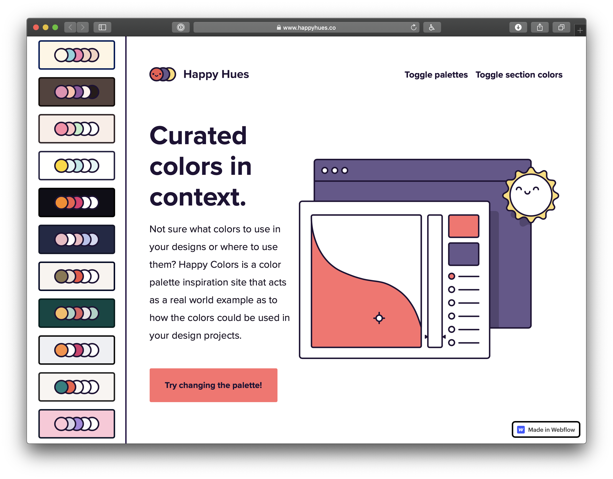
Curated colors in context
Happy Hues demonstrates a bunch of color palettes in the context of the site itself. That's a nice way to do it, because choosing nice colors isn't enough — it's all about context. It can go bad, as the Refactoring UI blog demonstrates.
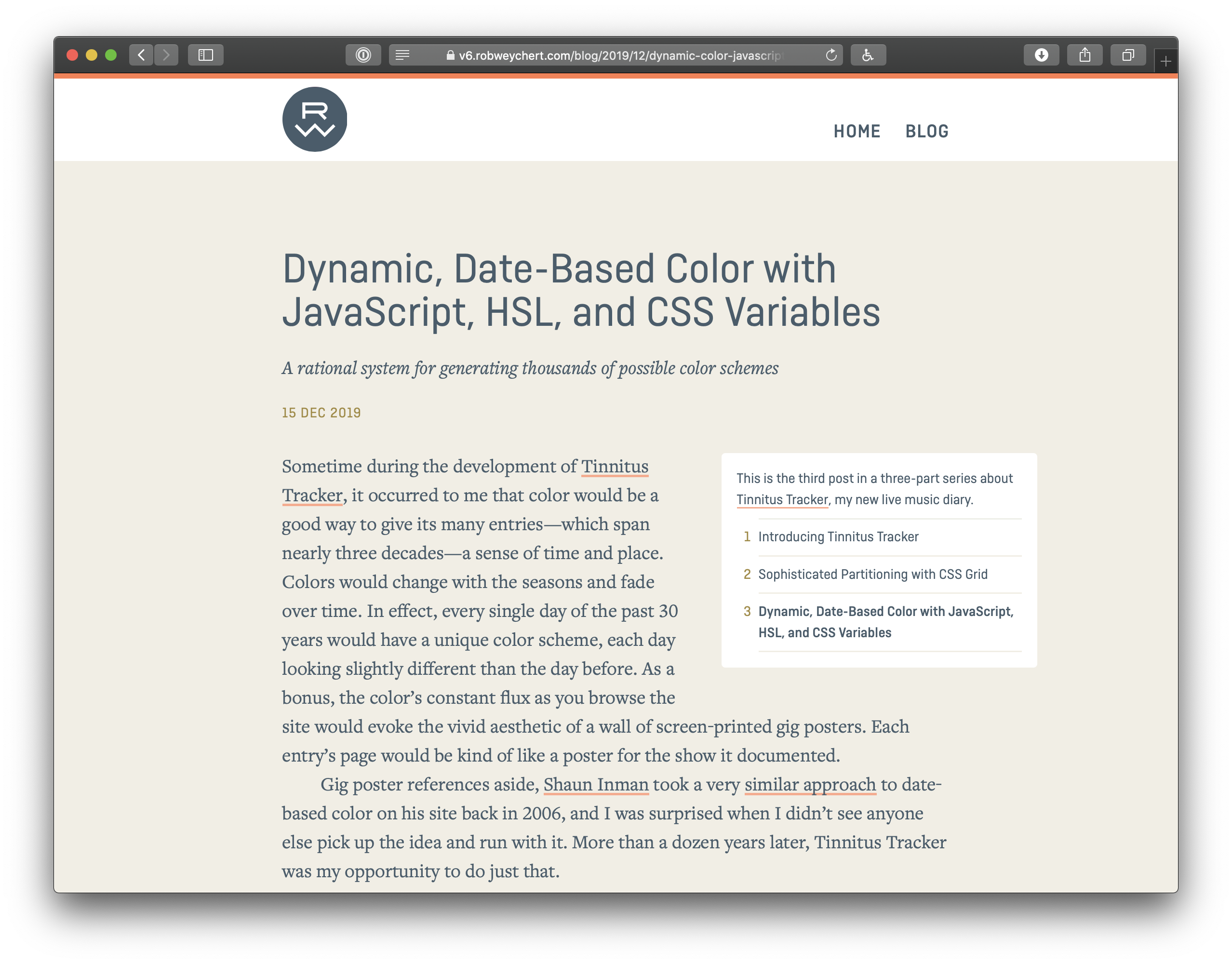
Dynamic, Date-Based Color with JavaScript, HSL, and CSS Variables
Rob Weychert shows off how he created date-based color schemes (so that every single day of the past 30 years would have a unique color scheme, each day looking slightly different than the day before).
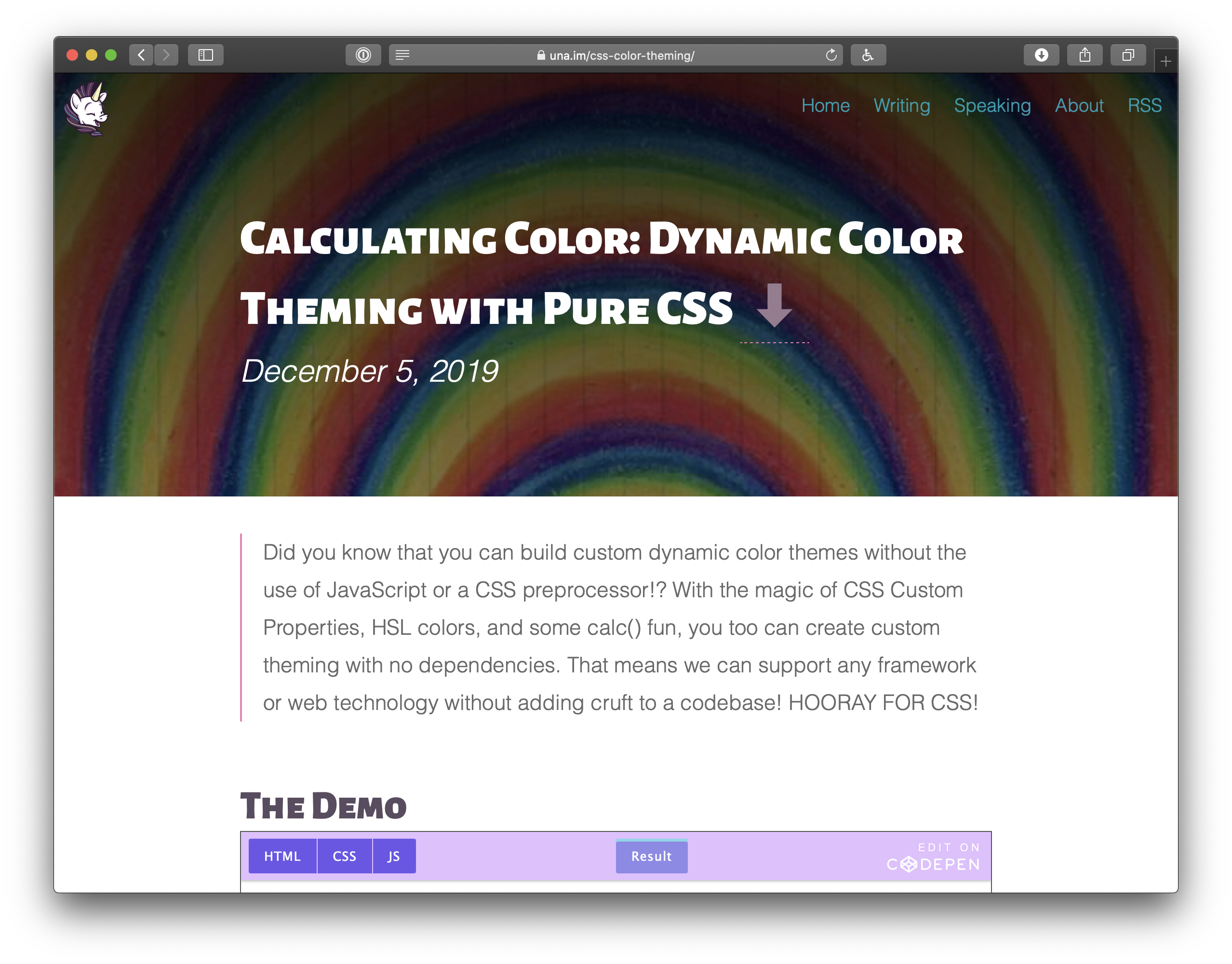
Calculating Color: Dynamic Color Theming with Pure CSS.
Build a site on a single domain, but detect mobile, and render a separate mobile site
Build a separate mobile site on a subdomain
It's funny how quickly huge industry-defining conversations fade from view. This was probably the biggest question in web design and development1 this past decade, and we came up with an answer: It's #1, you should build a responsive website. Any other answer and you're building multiple websites and the pain from that comes from essentially doubling the workload, splitting teams, communication problems across those teams, inconsistencies across the sites, and an iceberg of other pain points this industry has struggled with for ages.
But, the web is a big place.
This emailer specifically mentioned imdb.com as their example. IMDB is an absolutely massive site with a large team (they are owned by Amazon) and lots of money flying around. If the IMDB team decides they would be better off building multiple websites, well that's their business. They've got the resources to do whatever the hell they want.
What are the benefits of transcribing your podcasts and what's the best way to go about getting them on your site? Niki Mosier breaks it down into 8 easy steps in this week's episode of Whiteboard Friday.
Click on the whiteboard image above to open a high resolution version in a new tab!
Video Transcription
Hey, Moz fans. Here's another edition of Whiteboard Friday. I'm Niki Mosier, a senior SEO account manager at Two Octobers, and I'm here today to talk to you about the not-so-secret value of podcast transcripts.
I got the idea to play around with podcast transcripts after hearing Moz's Britney Muller talk about machine learning and podcast transcripts at TechSEO Boost last fall.
+15% increase in organic traffic, +50% keyword lift
I ended up getting the opportunity to play around with this a little bit with a pro bono client we had at a previous job, the Davis Phinney Foundation. They do Parkinson's research and Parkinson's education. They were already podcasting, and then they also had a pretty robust blog, but they weren't adding their podcast transcripts. After about three months of adding a couple of podcast transcripts, we saw some pretty good value for them. We saw a 15% increase in organic traffic to the website and a 50% increase to some keyword lift around the keywords that we were tracking.
Google is now indexing podcasts
Why we think this is relevant right now, as you may know, Google announced, at I/O 2019, that they are indexing podcasts. If you do a search for your favorite podcast, you'll see that come up in the Google search results now. So adding that podcast transcript or any audio transcript to your website, whether that's video, a webinar, or anything, just has some really good value.
How to transcribe & optimize your podcasts
I'm going to walk you through the process that I used for them. It's super easy and you can turn around and apply it to your own website.
1. Download your audio file
So obviously, download the audio file, whether that's MP3 or MP4 or whatever you have, from your video, podcast, or your webinars if you're doing those.
2. Transcribe it
You need to be able to get that text transcript, so running it through either Temi or Otter.ai, both two resources that I've used, both really good. Otter.ai seems to be a little cleaner out of the gate, but I would definitely obviously go through and edit and make sure that all of your text and speaker transitions and everything is accurate.
3. Figure out which keywords the content should rank for
Next up is figuring out what keywords that you want that content to rank for, so doing some search volume research, figuring out what those keywords are, and then benchmarking that keyword data, so whether your website is already ranking for some of those keywords or you have new keywords that you want those pages or those posts to be ranking for.
4. Get a competitive snapshot
Next up is getting a competitive snapshot, so looking at who's ranking for those keywords that you're going to be trying to go after, who has those answer boxes, who has those featured snippets, and then also what are the people also ask features for those keywords.
5. Get your content on-site
Obviously getting that content on your site, whether that's creating brand-new content, either a blog or a page to go with that podcast, video, webinar, or whatever it is, or adding to it to existing content.
Maybe you have some evergreen content that's not performing well for you anymore. Adding a transcript to that content could really kind of give it a lift and make it work better for you.
6. Optimize the content
Next up is optimizing the content on your site, so adding in those keywords to your metadata, to your image alt tags, your H1 tags, and then also adding any relevant schema, so whether that's blog post schema most likely or any other schema type that would be helpful, getting that up there on the page as well.
7. Make sure the page is indexed in Search Console
Once you've done all the hard work, you've got the transcript up there, you have your content and you have it optimized, you obviously want to tell Google, so going into Search Console, having them index that page, whether it's a new page or an existing page, either way, dropping that URL in there, making sure Google is crawling it, and then if it is a new page, making sure it's in your sitemap.
8. Annotate the changes in Google Analytics
Then the last thing is you want to be able to track and figure out if it's working for you. So annotating that in Google Analytics so you know what page, when you added it, so you can have that benchmark date, looking at where you're ranking, and then also looking at those SERP features. Have you gotten any featured snippets?
Are you showing up in those answer boxes? Anything like that. So that's kind of the process. Super easy, pretty straightforward. Just play with it, test it out.
If Google is indexing podcasts, why does this matter?
Then kind of lastly, why is this still important if Google is already indexing podcasts? They may come out and do their own transcription of your podcast or your video or whatever content you have on the site.
Obviously, you want to be in control of what that content is that's going on your site, and then also just having it on there is super important. From an accessibility standpoint, you want Google to be able to know what that content is, and you want anyone else who may have a hearing impairment, they can't listen to the content that you're producing, you want them to be able to access that content. Then, as always, just the more content, the better. So get out there, test it, and have fun. Thanks, Moz fans.
Sign up for The Moz Top 10, a semimonthly mailer updating you on the top ten hottest pieces of SEO news, tips, and rad links uncovered by the Moz team. Think of it as your exclusive digest of stuff you don't have time to hunt down but want to read!
from The Moz Blog https://ift.tt/37bBgf7
via IFTTT
The most likely answer from the thread: DOS was a massive operating system for PCs for a long time and it had a three-character limit on file extensions.
Interesting that the first book on HTML covers this specifically:
Where my mind went was server software. I know that web servers automatically do different things with different file types. In a test on my own server (set up to serve a WordPress site), I put some files at the root that all contain the exact same content: <h1>Cool</h1>
file.text = file is rendered as plain text in browser (Content-Type: text/plain)
file.html = file renders as HTML in browser (Content-Type: text/html)
file.htm = file renders as HTML in browser (Content-Type: text/html)
file.fart = file is downloaded by browser (Content-Type: application/octet-stream)
You can write code to serve files with whatever content types you want, but in lieu of that, file extensions do matter because they affect how default web servers choose to serve file type headers.
With stuff like template literals in JavaScript and templating languages, like JSX, I've gotten used to wanting to write my HTML templates in one nice chunk and sprinkling in variables wherever I need them.
I had a situation where I needed to do that in "raw" PHP the other day, so I'm just documenting it here.
Say I have some data like...
$title = "The Title";
$desc  = "Some information about this thing blah blah.";
$img   = "/images/header.jpg";
But that data changes, or there might be multiple sets of it, and I want to be able to pass that data into a function and have it spit out some HTML. That way, it's easy to change the template and have it affect everywhere that uses it.
One of the more powerful concepts I've stumbled across recently is the idea of abstract syntax trees, or ASTs. If you've ever studied alchemy, you may recall that the whole motivation for alchemists was to discover some way to transform not-gold into gold through scientific or arcane methods.
ASTs are kind of like that. Using ASTs, we can transform Markdown into HTML, JSX into JavaScript, and so much more.
Why are ASTs useful?
Early in my career, I tried to change files using a find-and-replace method. This ended up being fairly complicated, so I tried using regular expressions. I ended up abandoning the idea because it was so brittle; the app broke all the time because someone would enter text in a way I hadn’t anticipated and it would break my regular expressions causing the whole app to fall down.
The reason this was so hard is that HTML is flexible. That makes it extremely hard to parse using regular expressions. String-based replacement like this is prone to breaking because it might miss a match, match too much, or do something weird that results in invalid markup that leaves the page looking janky.
ASTs, on the other hand, turn HTML into something far more structured, which makes it much simpler to dive into a text node and do replacements on only that text, or to mess with elements without needing to deal with the text at all.
This makes AST transformation safer and less error-prone than a purely string-based solution.
What are ASTs used for?
To start, let's take a look at a minimal document using a couple lines of Markdown. This will be saved as a file called home.md, which we'll save in the content folder of our website.
# Hello World!
 An adorable corgi!
Some more text goes here.
Assuming we know Markdown, we can infer that when this Markdown is parsed, it'll end up being an <h1> that says, "Hello World!" and a <p> that says, "This is some Markdown."
But how does it get transformed from Markdown to HTML?
First, we need to install the dependencies required to parse the Markdown into an AST and convert it to HTML. To do that, we need to make sure we've initialized the folder as a package. Run the following command in your terminal:
# make sure you’re in your root folder (where `content` is)
# initialize this folder as an npm package
npm init

# install the dependencies
npm install unified remark-parse remark-html
If we assume our Markdown is stored in home.md, we can get the AST with the following code:
This code takes advantage of Node’s built-in fs module, which allows us to access and manipulate the filesystem. For more information on how this works, check out the official docs.
If we save this as src/index.js and use Node to execute this script from the command line, we’ll see the following in our terminal:
$ node src/index.js
<h1>Hello World!</h1>
<p><img src="<https://images.dog.ceo/breeds/corgi-cardigan/n02113186_1030.jpg>" alt="cardigan corgi"> An adorable corgi!</p>
<p>Some more text goes here.</p>
We tell unified to use remark-parse to turn the Markdown file into an AST, then to use remark-html to turn the Markdown AST into a HTML — or, more specifically, it turns it into something called a VFile. Using the toString() method turns that AST into an actual string of HTML we can display in the browser!
Thanks to the hard work of the open-source community, remark does all the hard work of turning Markdown into HTML for us. (See the diff)
Next, let's look at how this actually works.
What does an AST look like?
To see the actual AST, let’s write a tiny plugin to log it:
Note that the position values have been truncated to save space. They contain information about where the node is in the document. For the purposes of this tutorial, we won’t be using this information. (See the diff)
This is a little overwhelming to look at, but if we zoom in we can see that each part of the Markdown becomes a type of node with a text node inside it.
The type tells us what kind of node we're dealing with.
Each node type has additional properties that describe the node. The depth property on the heading tells us what level heading it is — a depth of 1 means it’s an <h1> tag, 2 means <h2>, and so on.
The children array tells us what's inside this node. In both the heading and the paragraph, there’s only text, but we could also see inline elements here, like <strong>.
This is the power of ASTs: We've now described the Markdown document as an object that a computer can understand. If we want to print this back to Markdown, a Markdown compiler would know that a "heading" node with a depth of 1 starts with #, and a child text node with the value "Hello" means the final line should be # Hello.
How AST transformations work
Transforming an AST is usually done using the visitor pattern. It‘s not important to know the ins and outs of how this works to be productive, but if you’re curious, JavaScript Design Patterns for Humans by Soham Kamani has a great example to help explain how it works. The important thing to know is that the majority of resources on AST work will talk about "visiting nodes," which roughly translates to "find part of the AST so we can do stuff with it." The way this works practice is that we write a function that will be applied to AST nodes matching our criteria.
A few important notes about how it works:
ASTs can be huge, so for performance reasons we will mutate nodes directly. This runs counter to how I would usually approach things — as a general rule I don't like to mutate global state — but it makes sense in this context.
Visitors work recursively. That means that if we process a node and create a new node of the same type, the visitor will run on the newly created node as well unless we explicitly tell the visitor not to.
We're not going to go too deep in this tutorial, but these two ideas will help us understand what's going on as we start to mess with the code.
How do I modify the HTML output of the AST?
What if we want to change the output of our Markdown, though? Let's say our goal is to wrap image tags with a figure element and supply a caption, like this:
To accomplish this, we'll need transform the HTML AST — not the Markdown AST — because Markdown doesn't have a way of creating figure or figcaption elements. Fortunately, because unified is interoperable with multiple parsers, we can do that without writing a bunch of custom code.
Convert a Markdown AST to an HTML AST
To convert the Markdown AST to an HTML AST, add remark-rehype and switch to rehype-stringify for turning the AST back to HTML.
npm install remark-rehype rehype-stringify
Make the following changes in src/index.js to switch over to rehype:
This is the AST for the HTML representation of the image, so we can start changing it over to use the figure element. (See the diff)
Write a plugin for unified
To wrap our img element with a figure element, we need to write a plugin. In unified, plugins are added with the use() method, which accepts the plugin as a first argument and any options as a second argument:
.use(plugin, options)
The plugin code is a function (called an “attacher” in unified jargon) that receives option. These options are used to create a new function (called a “transformer”) that receives the AST and does work to, er, transform it. For more details on plugins, check out the plugin overview in the unified docs.
The function it returns will receive the entire AST as its argument, and it doesn't return anything. (Remember, ASTs are mutated globally.) Create a new file called img-to-figure.js in the same folder as index.js, then put the following inside:
module.exports = options => tree => {
  console.log(tree);
};
Next, we need to add a visitor. This will let us actually get at the code. Unified takes advantage of a number of utility packages, all prefixed with unist-util-*, that allow us to do common things with our AST without writing custom code.
We can use unist-util-visit to modify nodes. This gives us a visit helper that takes three arguments:
The entire AST we're working with
A predicate function to identify which nodes we want to visit
A function to make any changes to the AST we want to make
To install, run the following in your command line:
npm install unist-util-visit
Let's implement a visitor in our plugin by adding the following code:
const visit = require('unist-util-visit');

  module.exports = options => tree => {
    visit(
      tree,
      // only visit p tags that contain an img element
      node =>
        node.tagName === 'p' && node.children.some(n => n.tagName === 'img'),
      node => {
        console.log(node);
      }
    );
};
When we run this, we can see there's only one paragraph node logged:
Now that we have the image attributes, we can start to change the AST. Remember, because ASTs can be really large, we mutate them in place to avoid creating lots of copies and potentially slowing our script down.
We start by changing the node’s tagName to be a figure instead of a paragraph. The rest of the details can stay the same for now.
Make the following changes in src/img-to-figure.js:
const visit = require('unist-util-visit');

module.exports = options => tree => {
  visit(
    tree,
    // only visit p tags that contain an img element
    node =>
    node.tagName === 'p' && node.children.some(n => n.tagName === 'img'),
    node => {
      node.tagName = 'figure';
    }
  );
};
If we run our script again and look at the output, we can see that we’re getting closer!
<h1>Hello World!</h1>
<figure><img src="<https://images.dog.ceo/breeds/corgi-cardigan/n02113186_1030.jpg>" alt="cardigan corgi">An adorable corgi!</figure>
<p>Some more text goes here.</p>
To avoid needing to write custom syntax, we're going to use any text passed inline with an image as the image caption.
We can make an assumption that usually images don't have inline text in Markdown, but it’s worth noting that this could 100% cause unintended captions to appear for people writing Markdown. We're going to take that risk in this tutorial. If you're planning to put this into production, make sure to weigh the trade-offs and choose what's best for your situation.
To use the text, we're going to look for a text node inside our parent node. If we find one, we want to grab its value as our caption. If no caption is found, we don’t want to transform this node at all, so we can return early.
Make the following changes to src/img-to-figure.js to grab the caption:
const visit = require('unist-util-visit');

module.exports = options => tree => {
  visit(
    tree,
    // only visit p tags that contain an img element
    node =>
    node.tagName === 'p' && node.children.some(n => n.tagName === 'img'),
    node => {
      // find the text node
      const textNode = node.children.find(n => n.type === 'text');

      // if there’s no caption, we don’t need to transform the node
      if (!textNode) return;

      const caption = textNode.value.trim();

      console.log({ caption });
      node.tagName = 'figure';
    }
  );
};
Now that we have our caption text, we can add a figcaption to display it. We could do this by creating a new node and deleting the old text node, but since we’re mutating in place it’s a little less complicated to just change the text node into an element.
Elements don’t have text, though, so we need to add a new text node as a child of the figcaption element to display the caption text.
Make the following changes to src/img-to-figure.js to add the caption to the markup:
const visit = require('unist-util-visit');

module.exports = options => tree => {
  visit(
    tree,
    // only visit p tags that contain an img element
    node =>
      node.tagName === 'p' && node.children.some(n => n.tagName === 'img'),
    node => {
      // find the text node
      const textNode = node.children.find(n => n.type === 'text');

      // if there’s no caption, we don’t need to transform the node
      if (!textNode) return;

      const caption = textNode.value.trim();
      // change the text node to a figcaption element containing a text node
      textNode.type = 'element';
      textNode.tagName = 'figcaption';
      textNode.children = [
        {
          type: 'text',
          value: caption
        }
      ];

      node.tagName = 'figure';
    }
  );
};
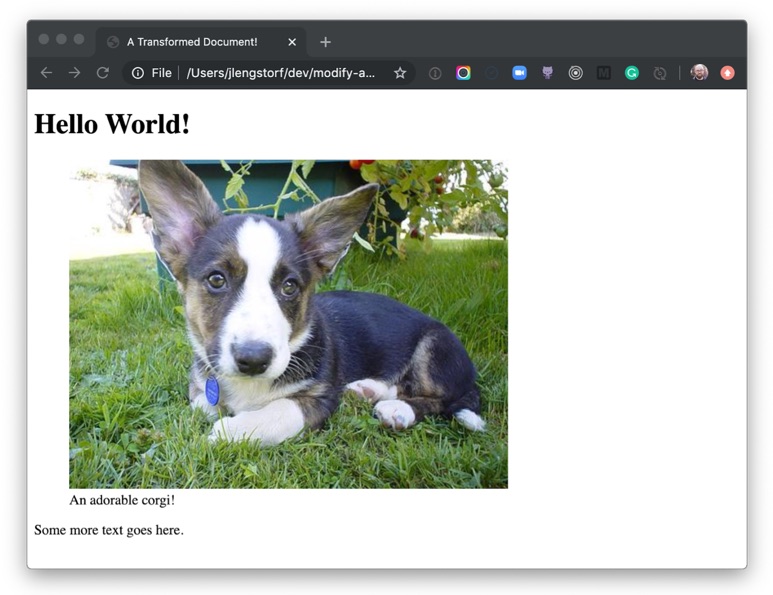
If we run the script again with node src/index.js, we see the transformed image wrapped in a figure element and described with a figcaption!
<h1>Hello World!</h1>
<figure><img src="<https://images.dog.ceo/breeds/corgi-cardigan/n02113186_1030.jpg>" alt="cardigan corgi"><figcaption>An adorable corgi!</figcaption></figure>

<p>Some more text goes here.</p>
Now that we've made a bunch of transformations, we want to save those adjustments to an actual file so we can share them.
Since the Markdown doesn't include a full HTML document, we’re going to add one more rehype plugin called rehype-document to add the full document structure and a title tag.
Run the script again and we'll be able to see a new folder in root called public, and inside that we’ll see home.html. Inside, our transformed document is saved!
If we open public/home.html in a browser, we can see our transformed Markdown rendered as a figure with a caption.
Holy buckets! Look at that adorable corgi! And we know it’s adorable because the caption tells us so.
What to do next
Transforming files using ASTs is extremely powerful — with it, we’re able to create pretty much anything we can imagine in a safe way. No regexes or string parsing required!
From here, you can dig deeper into the ecosystem of plugins for remark and rehype to see more of what’s possible and get more ideas for what you can do with AST transformation, from building your own Markdown-powered static site generator; to automating performance improvements by modifying code in-place; to whatever you can imagine!


