Jason Grigsby finds Chipotle's online ordering form makes use of an input-masking technique that chops up a credit card expiration year making it invalid and thus denying the order. If pattern="\d\d" maxlength="2" was used instead (native browser feature), the browser is smart enough to do the right thing and not deny the order. Scratchpad math, based on published data, makes that worth $4.4 million dollars.
Adrian Roselli recalls an all-too-common form accessibility fail of missing a for/id attribute on labels and inputs results in an unusable experience and a scratchpad math loss of $18 million dollars to campaigns.
The label/input attribution thing really gets me. I feel like that's an extremely basic bit of HTML knowledge that benefits both accessibility and general UX. It's part of every HTML curriculum I've ever seen, and regularly pointed at as something you need to get right. And never a week goes by I don't find some production website not doing it.
The merits of Git as a version control system are difficult to contest, but while Git will do a superb job in keeping track of the commits you and your teammates have made to a repository, it will not, in itself, guarantee the quality of those commits. Git will not stop you from committing code with linting errors in it, nor will it stop you from writing commit messages that convey no information whatsoever about the nature of the commits themselves, and it will, most certainly, not stop you from committing poorly formatted code.
Fortunately, with the help of Git hooks, we can rectify this state of affairs with only a few lines of code. In this tutorial, I will walk you through how to implement Git hooks that will only let you make a commit provided that it meets all the conditions that have been set for what constitutes an acceptable commit. If it does not meet one or more of those conditions, an error message will be shown that contains information about what needs to be done for the commit to pass the checks. In this way, we can keep the commit histories of our code bases neat and tidy, and in doing so make the lives of our teammates, and not to mention our future selves, a great deal easier and more pleasant.
As an added bonus, we will also see to it that code that passes all the tests is formatted before it gets committed. What is not to like about this proposition? Alright, let us get cracking.
Prerequisites
In order to be able to follow this tutorial, you should have a basic grasp of Node.js, npm and Git. If you have never heard of something called package.json and git commit -m [message] sounds like code for something super-duper secret, then I recommend that you pay this and this website a visit before you continue reading.
Our plan of action
First off, we are going to install the dependencies that make implementing pre-commit hooks a walk in the park. Once we have our toolbox, we are going to set up three checks that our commit will have to pass before it is made:
The code should be free from linting errors.
Any related unit tests should pass.
The commit message should adhere to a pre-determined format.
Then, if the commit passes all of the above checks, the code should be formatted before it is committed. An important thing to note is that these checks will only be run on files that have been staged for commit. This is a good thing, because if this were not the case, linting the whole code base and running all the unit tests would add quite an overhead time-wise.
In this tutorial, we will implement the checks discussed above for some front-end boilerplate that uses TypeScript and then Jest for the unit tests and Prettier for the code formatting. The procedure for implementing pre-commit hooks is the same regardless of the stack you are using, so by all means, do not feel compelled to jump on the TypeScript train just because I am riding it; and if you prefer Mocha to Jest, then do your unit tests with Mocha.
Installing the dependencies
First off, we are going to install Husky, which is the package that lets us do whatever checks we see fit before the commit is made. At the root of your project, run:
npm i husky --save-dev
However, as previously discussed, we only want to run the checks on files that have been staged for commit, and for this to be possible, we need to install another package, namely lint-staged:
npm i lint-staged --save-dev
Last, but not least, we are going to install commitlint, which will let us enforce a particular format for our commit messages. I have opted for one of their pre-packaged formats, namely the conventional one, since I think it encourages commit messages that are simple yet to the point. You can read more about it here.
npm install @commitlint/{config-conventional,cli} --save-dev

## If you are on a device that is running windows
npm install @commitlint/config-conventional @commitlint/cli --save-dev
After the commitlint packages have been installed, you need to create a config that tells commitlint to use the conventional format. You can do this from your terminal using the command below:
Great! Now we can move on to the fun part, which is to say implementing our checks!
Implementing our pre-commit hooks
Below is an overview of the scripts that I have in the package.json of my boilerplate project. We are going to run two of these scripts out of the box before a commit is made, namely the lint and prettier scripts. You are probably asking yourself why we will not run the test script as well, since we are going to implement a check that makes sure any related unit tests pass. The answer is that you have to be a little bit more specific with Jest if you do not want all unit tests to run when a commit is made.
As you can tell from the code we added to the package.json file below, creating the pre-commit hooks for the lint and prettier scripts does not get more complicated than telling Husky that before a commit is made, lint-staged needs to be run. Then you tell lint-staged to run the lint and prettier scripts on all staged JavaScript and TypeScript files, and that is it!
At this point, if you set out to anger the TypeScript compiler by passing a string to a function that expects a number and then try to commit this code, our lint check will stop your commit in its tracks and tell you about the error and where to find it. This way, you can correct the error of your ways, and while I think that, in itself, is pretty powerful, we are not done yet!
By adding "jest --bail --coverage --findRelatedTests" to our configuration for lint-staged, we also make sure that the commit will not be made if any related unit tests do not pass. Coupled with the lint check, this is the code equivalent of wearing two safety harnesses while fixing broken tiles on your roof.
What about making sure that all commit messages adhere to the commitlint conventional format? Commit messages are not files, so we can not handle them with lint-staged, since lint-staged only works its magic on files staged for commit. Instead, we have to return to our configuration for Husky and add another hook, in which case our package.json will look like so:
If your commit message does not follow the commitlint conventional format, you will not be able to make your commit: so long, poorly formatted and obscure commit messages!
If you get your house in order and write some code that passes both the linting and unit test checks, and your commit message is properly formatted, lint-staged will run the Prettier script on the files staged for commit before the commit is made, which feels like the icing on the cake. At this point, I think we can feel pretty good about ourselves; a bit smug even.
Implementing pre-commit hooks is not more difficult than that, but the gains of doing so are tremendous. While I am always skeptical of adding yet another step to my workflow, using pre-commit hooks has saved me a world of bother, and I would never go back to making my commits in the dark, if I am allowed to end this tutorial on a somewhat pseudo-poetical note.
A few years ago, I wrote a post here that caught some attention in the community.
I argued Google appears to be ranking websites heavily based on searcher intent — this is more true now than ever.
In fact, it might be algorithmically impossible to get your website on top of the SERPs.
If you find your website in this position, don't give up on SEO!
The point of "Search Engine Optimization" is to get organic exposure through search engines — it doesn't necessarily have to be your website.
We can leverage the ranking authority of other websites pass organic referral traffic to our sites.
I'm going to give 6 times when you should NOT rank your website.
Prefer to watch / listen? I outlined all these points as a part of a recent keynote: https://youtu.be/mMvIty5W93Y
1. When the keywords are just TOO competitive
We've all been there: trying to rank a website with no authority for highly competitive keywords.
These keywords are competitive because they're valuable so we can't give up on them.
Here's a few workarounds I've used in the past.
Tactic 1: Offer to sponsor the content
Ardent sells a product that "decarboxylates" cannabis for medicinal users.
There's a ton of challenges selling this product, mostly because patients don't know what "decarboxylation" means.
So, naturally, ranking for the keyword "what is decarboxylation" is a critical step in their customer’s path to conversion. Problem is, that keyword is dominated by authoritative, niche relevant sites.
While Ardent should still build and optimize content around the subject, it might take years to rank.
When you’re trying to build a business, that’s not good enough.
We decided to reach out to those authoritative sites offering to "sponsor" one of their posts.
In this case, it worked exceptionally well — we negotiated a monthly rate ($250) to tag content with a CTA and link back to Ardent's site.
Granted, this doesn't work in every niche. If you operate in one of those spaces, there’s another option.
Tactic 2: Guest post on their site
Guest writing for Moz in 2015 put my agency on the map.
Publishing on powerful sites quickly expands your reach and lends credibility to your brand (good links, too).
More importantly, it gives you instant ranking power for competitive keywords.
As co-owner of an SEO agency, it would be amazing to rank in Google for "SEO services," right?
Even with an authoritative site, it's difficult to rank your site for the search "SEO service" nationally. You can leverage the authority of industry sites to rank for these competitive searches.
The post I wrote for Moz back in 2015 ranks for some very competitive keywords (admittedly, this was unintentional).
This post continues to drive free leads, in perpetuity.
When we know a client has to get visibility for a given keyword but the SERPs won’t budge, our agency builds guest posting into our client's content strategies.
It's an effective tactic that can deliver big results when executed properly.
2. When you can hijack "brand alternative" keywords
When you're competing for SERP visibility with a large brand, SEO is an uphill battle.
Let's look at a couple tactics if you find yourself in this situation.
Tactic #1: How to compete against HubSpot
HubSpot is a giant on the internet — they dominate the SERPs.
Being that large can have drawbacks, including people searching Googlef "HubSpot alternatives." If you're a competitor, you can't afford to miss out on these keywords.
"Listicle" style articles dominate for these keywords, as they provide the best "type" of result for a searcher with that intent.
It's ranking on top for a lot of valuable keywords to competitors.
As a competitor, you'll want to see if you can get included in this post (and others). By contacting the author with a pitch, we can create an organic opportunity for ourselves.
This pitch generally has a low success. The author needs to feel motivated to add you to the article. Your pitch needs to contain a value proposition that can move them to action.
A few tips:
Find the author's social profiles and add them. Then retweet, share, and like their content to give them a boost
Offer to share the article with your social profiles or email list if they include you in it
Offer to write the section for inclusion to save them time
While success rate isn't great, the payoff is worth the effort.
Tactic #2: Taking advantage of store closures
Teavana is an international tea retailer with millions of advocates (over 200k searches per month in Google).
Just a few months ago, Starbucks decided to close all Teavana stores. With news of Teavana shutting down, fans of the brand would inevitably search for "Teavana replacements" to find a new company to buy similar tea from.
Teami is a small tea brand that sells a number of SKUs very similar to what Teavana. Getting in front of those searches would provide tremendous value to their business.
At that moment, we could do two things:
Try to rank a page on Teami’s for “Teavana replacement”
Get it listed on an authority website in a roundup with other alternatives
If you ask many SEO experts what to do, they'd probably go for the first option. But we went with the second option - getting it listed in a roundup post.
If we ranked Teami as a Teavana replacement — which we could do — people will check the site and know that we sell tea, but they won't take it seriously because they don't trust us yet that we are a good Teavana replacement.
How to pull it off for your business
Find a writer who writes about these topics on authoritative sites. You may need to search for broader keywords and see articles from authority magazine-like websites.
We were able to get our client (Teami Blends) listed as the number-two spot in the article, providing a ton of referral traffic to the website.
3. When you want to rank for "best" keywords
When someone is using “best” keywords (i.e. best gyms in NYC), the SERPs are telling us the searcher doesn’t want to visit a gym’s website.
The SERPs are dominated by “roundup” articles from media sources — these are a far better result to satisfy the searcher’s intent.
That doesn't mean we can't benefit from “best keywords.” Let’s look at a few tactics.
Tactic #1: Capture searchers looking for “best” keywords
Let’s say you come to Miami for a long weekend.
You’ll likely search for "best coffee shops in Miami" to get a feel for where to dine while here.
If you own a coffee shop in Miami, that’s a difficult keyword to rank for - the SERPs are stacked against you.
A few years back we worked with a Miami-based coffee shop chain, Dr Smood, who faced this exact challenge.
Trying to jam their website in the SERPs would be a waste of resources. Instead, we focused on getting featured in press outlets for “best of Miami” articles.
How can you do it?
Find existing articles (ranking for your target “best of” keywords) and pitch for inclusion. You can offer incentives like free meals, discounts, etc. in exchange for inclusion.
You’ll also want to pitch journalists for future inclusion in articles. Scan your target publication for relevant journalists and send an opening pitch:
Hey [NAME],
My name is [YOUR NAME]. Our agency manages the marketing for [CLIENT].
We’ve got a new menu that we think would be a great fit for your column. We’d love to host you in our Wynwood location to sample the tasting menu.
If interested, please let me know a date / time that works for you!
We pitched dozens of journalists on local publications for Dr Smood.
I’ll get to the point - I just read your article on “Best SEO Trainings” on the [BLOG NAME] blog. I recently launched a deep SEO training and I’d love consideration to be included.
I recently launched a platform called The Blueprint Training - I think its a perfect fit for your article.
Now, I realize how much work it is to go back in and edit an article, so I’m willing to do all of the following:
- Write the section for you, in the same format as on the site
- Promote the article via my Twitter account (I get GREAT engagement)
- Give you complimentary access to the platform to see the quality for yourself
Let me know what you think and if there’s anything else I can do for you.
Enjoy your weekend!
If you can understand value propositioning, you’ll have a lot of success with this tactic.
4. When you need to spread your local footprint
Piggybacking off the previous example, when performing keyword research we found Google displayed completely different SERPs for keywords that all classified what Dr Smood offered.
Miami organic cafe
Miami coffee shop
Miami juice bar
The algorithm is telling us each of these keywords is different — it would be extremely difficult to rank the client’s website for all three.
However, we can use other owned properties to go after the additional keywords in conjunction with our website.
Properties like Yelp allow you to edit titles and optimize your listing just like you would your website.
We can essentially perform “on page” SEO for these properties and get them to rank for valuable keyword searches.
The structure we took with Dr Smood was as follows:
When doing this for your business, be sure to identify all the keyword opportunities available and pay attention to how the SERPs react for each.
Understand which citation pages (Yelp, MenuPages, etc) you have available to rank instead your website for local searches and optimize them as you would your website.
5. When you need to boost e-commerce sales
The SERPs for e-commerce stores are brutally competitive. Not only do you have to compete with massive brands / retailers, but also sites like Amazon and Etsy.
Look, I get it — selling on Amazon isn’t that simple. There’s a ton of regulations and fees that come with the platform.
But these regulations are what’s keeping a lot of larger brands from selling there, aka, there's an opportunity there.
Amazon accounts for 40% of online retail in the US (and growing rapidly). Not only can you get your Amazon to rank in Google searches, but 90% of sales on the platform come from internal Amazon searches.
In other words, Amazon is its own marketing engine.
While you might take a haircut on your initial sales, you can use Amazon as a customer acquisition channel and optimize the lifetime value to recoup your lost upfront sales.
Here’s how we did it for a small e-commerce client.
Tactic: Radha Beauty Oil
Radha Beauty sells a range of natural oils for skin, hair and general health. Our keyword research found that Amazon listings dominated most of their target keywords.
With clients like this we make sure to track SERP result type, to properly understand what Google wants to rank for target keywords.
Specifically, Amazon listings had the following SERP share:
First result = 27.3%
Second result = 40.9%
Third result = 35.9%
Fortunately, this client was already selling on Amazon. Unfortunately, they had a limited budget. We didn’t have the hours in our retainer to optimize both their e-commerce store and their Amazon store.
This data gave us the firepower to have a conversation with the client that our time would drive more revenue optimizing their Amazon store over their e-commerce platform.
We focused our efforts optimizing their Amazon listings just like we would an e-commerce store:
Amazon product titles
Amazon descriptions
Generating reviews from past customers
Building links to Amazon store pages
The results were overwhelmingly positive.
If you’re a newer e-commerce brand, an Amazon store gives you the opportunity to outrank giants like Ulta in Google.
6. When the SERPs call for video
Predator Nutrition is an e-commerce site that sells health and fitness supplements. They have their own private label products, but they’re mainly a retailer (meaning they sell other brands as well).
While performing keyword research for them, we found a ton of search volume around people looking for reviews of products they sold.
The SERPs clearly show that searchers prefer to watch videos for “review” searches.
There are a couple ways you can capture these searches:
Create videos for your YouTube channel reviewing products
Find and pay an influencer to review products for you
I prefer method #2, as reviews on third-party channels rank better — especially if you’re targeting YouTubers with a large following.
Not only are you adding more branded content in the SERPs, but you’re getting your products reviewed for targeted audiences.
Final thoughts...
This industry tends to romanticize SEO as a traffic source.
Don’t get me wrong, I love how passionate our community is, but... we have to stop.
We’re trying to build businesses. We can’t fall in love with a single source of traffic (and turn our backs to others).
The internet is constantly changing. We need to adapt along with it.
What do you think?
Sign up for The Moz Top 10, a semimonthly mailer updating you on the top ten hottest pieces of SEO news, tips, and rad links uncovered by the Moz team. Think of it as your exclusive digest of stuff you don't have time to hunt down but want to read!
from The Moz Blog https://ift.tt/2nP9UKk
via IFTTT
The typical journey for a person browsing a website: view a page, click a link, browser loads new page. That's assuming no funny business like a Single Page App, which still follows that journey, but the browser doesn't load a new page — the client fakes it for the sake of a snappier transition.
What if you could load that new page before the person clicks the link so that, when they do, the loading of that next page is much faster? There are two notable projects that try to help with that:
quicklink: detects visible links, waits for the browser to be idle and if it isn't on slow connection, it prefetches those links.
instant.page: if you hover over a link for 65ms, it preloads that link. The new Version 2 allows you to configure of the time delay or whether to wait for a click or press before preloading.
Combine those things with technological improvements like paint holding, and building a SPA architecture just for the speed benefits may become unnecessary (though it may still be desirable for other reasons, like code-splitting, putting the onus of routing onto front-end developers, etc.).
I woke up one morning and realized that I had it all wrong. I discovered that code and design are unable to solve every problem on a design systems team, even if many problems can be solved by coding and designing in a dark room all day. Wait, huh? How on earth does that make any sense? Well, that’s because good design systems work is about hiring, too.
Let me explain.
First, let’s take a look at some common design systems issues. One might be that your components are a thick div soup which is causing issues for users and is all-round bad for accessibility. Another issue might be that you have a large number of custom components that are fragile and extremely difficult to use. Or maybe you have eight different illustration styles and four different modal components. Maybe you have a thousand different color values that are used inconsistently.
Everyone in an organization can typically feel these problems but they’re really hard to describe. Folks can see that it takes way longer to build things than it should and miscommunication is rampant. Our web app might have bad web performance, major accessibility issues and wildly inconsistent design. But why is this? What’s the root cause of all these dang problems?
The strange thing about design systems is it’s difficult to see what the root cause of all these inconsistencies and issues might be. And even the answer isn’t always entirely obvious once you see the problem.
A design systems team can write component documentation to fix these issues, or perhaps refactor things, audit patterns, refactor even more things, redesign components, and provide training and guidance. But when apps get to a certain size then one person (or even a whole team of people) tackling these problems isn’t enough to solve them.
Sure a design systems team can spend a whole bunch of time helping fix an issue but is that really the best use of their time? What if they convinced another team in the company to instead hire a dedicated front-end engineer to build a sustainable working environment? What if they hired an illustrator to make things consistent and ensure high quality across the entire app?
This is why design systems work is also about hiring.
A design systems team is in the perfect place to provide guidance around hiring because they’ll be the first to spot issues across an organization. They’ll see how components are being hacked together or where there’s too many unnecessary custom components that are not part of a library or style guide. The design systems team will see weaknesses in the codebase that no one else can see and they can show which teams are missing which particular skill sets — and fix that issue by hiring folks with skills in those specific areas.
If you're in management and don’t see all those inconsistencies every day, then it’s likely nothing will get done about it. We're unlikely to fix the issues we cannot see.
So as design systems folks, we ultimately need to care about hiring because of this: a codebase is a neighborhood and a community.
And the only way we can fix the codebase is by fixing the community.
Interesting research from Jonathan Sampson, where he watches the network requests a browser makes the very first time you launch it on a fresh install, and otherwise do nothing. This gives you a little insight into what kind of information that browser wants to collect and disseminate.
This was all shared as tweets, but I'm linking to an unrolled thread if there's one available:
In this week's roundup: fighting shifty layouts, some videos might be a bit stalled, and a new way to take screenshots in Firefox.
Let's get into the news!
Identifying the causes of layout shifts during page load
You can now use WebPageTest to capture any layout shifts that occur on your website during page load, and identify what caused them.
Step 1: Paste a snippet
Paste the following snippet into the “Custom Metrics” on webpagetest.org in field in the Custom tab (under Advanced Settings) and make sure that a Chrome browser is selected.
[LayoutShifts]
return new Promise(resolve => {
  new PerformanceObserver(list => {
    resolve(JSON.stringify(list.getEntries().filter(entry => !entry.hadRecentInput)));
  }).observe({type: "layout-shift", buffered: true});
});
Step 2: Inspect entries
After completing the test, inspect the captured LayoutShifts entries on the Custom Metrics page, which is linked from the Details section.
Step 3: Check the filmstrip
Based on the "startTime" and "value" numbers in the data, use WebPageTest’s filmstrip view to pinpoint the individual layout shifts and identify their causes.
If you serve videos for your website from your own web server, keep an eye on the video bitrate (the author suggests FFmpeg and streamclarity.com). If your video has a bitrate of over 1.5 Mbps, playback may stall one or more times for people on 3G connections, depending on the video’s length.
50% of videos in this study have a bitrate that is greater than the downlink speed of a 3G connection — meaning that video playback will be delayed and contain stalls.
Firefox’s DevTools console includes a powerful command for capturing screenshots of the current web page. Like in Chrome DevTools, you can capture a screenshot of an individual element, the current viewport, or the full page, but Firefox’s :screenshot command also provides advanced options for adjusting the device pixel ratio and setting a delay.
// capture a full-page screenshot at a device pixel ratio of 2
:screenshot --fullpage --dpr 2

// capture a screenshot of the viewport with a 5-second delay
:screenshot --delay 5
GraphQL and REST are two specifications used when building APIs for websites to use. REST defines a series of unique identifiers (URLs) that applications use to request and send data. GraphQL defines a query language that allows client applications to specify precisely the data they need from a single endpoint. They are related technologies and used for largely the same things (in fact, they can and often do co-exist), but they are also very different.
That’s a little dry, eh? Let’s explain it a much more entertaining way that might help you understand better, and maybe just get you a little excited about GraphQL!
🍹 You’re at a cocktail mixer
You’re attending this mixer to help build your professional network, so naturally, you want to collect some data about the people around you. Close by, there are five other attendees.
Their name tags read:
Richy REST
Friend of Richy REST
Employer of Richy REST
Georgia GraphQL
Being the dynamic, social, outgoing animal that you are, you walk right up to Richy REST and say, "Hi, I’m Adam Application, who are you?" Richy REST responds:
{
  name: "Richy REST",
  age: 33,
  married: false,
  hometown: "Circuits-ville",
  employed: true
  // ... 20 other things about Richy REST
}
"Whoa, that was a lot to take in," you think to yourself. In an attempt to avoid any awkward silence, you remember Richy REST specifying that he was employed and ask, "Where do you work?"
Strangely, Richy REST has no idea where he works. Maybe the Employer of Richy Rest does?
You ask the same question to the Employer of Richy REST, who is delighted to answer your inquiry! He responds like so:
{
  company: "Mega Corp",
  employee_count: 11230,
  head_quarters: "1 Main Avenue, Big City, 10001, PL"
  year_founded: 2005,
  revenue: 100000000,
  // ... 20 other things about Richy REST Employer
}
At this point, you’re exhausted. You don’t even want to meet the Friend of Richy Rest! That might take forever, use up all your energy and, you don’t have the time.
However, Georgia GraphQL has been standing there politely, so you decide to engage her.
"Hi, what’s your name?"
{
  name: "Georgia GraphQL"
}
"Where are you from, and how old are you?"*
{
  hometown: "Pleasant-Ville",
  age: 28
}
"How many hobbies and friends do you have and what are your friends' names?"
Georgia GraphQL is incredible, articulate, concise, and to the point. You 100% want to swap business cards and work together on future projects with Georgia.
This anecdote encapsulates the developer's experience of working with GraphQL over REST. GraphQL allows developers to articulate what they want with a tidy query and, in response, only receive what they specified. Those queries are fully dynamic, so only a single endpoint is required. REST, on the other hand, has predefined responses and often requires applications to utilize multiple endpoints to satisfy a full data requirement.
Metaphor over! Let’s talk brass tacks.
To expand further upon essential concepts presented in the cocktail mixer metaphor let’s specifically address two limitations that often surface when using REST.
1. Several trips when fetching related resources
Data-driven mobile and web applications often require related resources and data sets. Thus, retrieving data using a REST API can entail multiple requests to numerous endpoints. For instance, requesting a Post entity and related Author might be completed by two requests to different endpoints:
Multiple trips to an API impacts the performance and readiness of an application. It is also a more significant issue for low bandwidth devices (e.g. smart-watches, IoT, older mobile devices, and others).
2. Over-fetching and under-fetching
Over/under-fetching is inevitable with RESTful APIs. Using the example above, the endpoint domainName.com/posts/:id fetches data for a specific Post. Every Post is made up of attributes, such as id, body, title, publishingDate, authorId, and others. In REST, the same data object always gets returned; the response is predefined.
In situations where only a Post title and body are needed, over-fetching happens — as more data gets sent over the network than data that is actually utilized. When an entire Post is required, along with related data about its Author, under-fetching gets experienced — as less data gets sent over the network than is actually utilized. Under-fetching leads to bandwidth overuse from multiple requests to the API.
Client-side querying with GraphQL
GraphQL introduces a genuinely unique approach that provides a tremendous amount of flexibility to client-apps. With GraphQL, a query gets sent to your API and precisely what you need is returned — nothing more and nothing less — in a single request. Query results are returned in the same shape as your query, ensuring that response structures are always predictable. These factors allow apps to run faster and be more stable because they are in control of the data they get, and not the server.
"Results are returned in the same shape as queries."
/* Query */
{
  myFriends(first: 2) {
    items {
      name
      age
    }
  }
}
Now, at this point, you probably think GraphQL is as easy as slicing warm butter with a samurai sword. That might be the reality for front-end developers — specifically developers consuming GraphQL APIs. However, when it comes to server-side setup, someone has to make the sausage. Our friend Georgia GraphQL put in some hard work to become the fantastic professional she is!
Building a GraphQL API, server-side, is something that takes time, energy, and expertise. That said, it's nothing that someone ready for a challenge is unable to handle! There are many different ways to hop in at all levels of abstraction. For example:
Un-assisted: If you really want to get your hands dirty, try building a GraphQL API with the help of packages. For instance, like Rails? Checkout graphql-ruby. Love Node.js? Try express-graphql.
Assisted: If fully maintaining your server/self-hosting is a priority, something like Graph.cool can help you get going on a GraphQL project.
Instant: Tired of writing CRUD boilerplate and want to get going fast? 8base provides an instant GraphQL API and serverless backend that's fully extensible.
Wrapping up
REST was a significant leap forward for web services in enabling highly available resource-specific APIs. That said, its design didn't account for today's proliferation of connected devices, all with differing data constraints and requirements. This oversight has quickly lead to the spread of GraphQL — open-sourced by Facebook in 2015 — for the tremendous flexibility that it gives front-end developers. Working with GraphQL is a fantastic developer experience, both for individual developers as well as teams.
Buy or build is a classic debate in technology. Building things yourself might feel less expensive because there is no line item on your credit card bill, but has cost in the form of time. Buying things, believe it or not, is usually less expensive when it comes to technology that isn't your core focus. Build your core technology, buy everything else.
That's what I think of with a tool like Paperform. A powerful form builder like Paperform costs me a few bucks, but saves me countless hours in building something that might become extremely complex and a massive distraction from my more important goals.
Paperform is a form builder, but disguised within a page builder
Imagine you're building a registration form for a conference. (That's a perfect fit for Paperform, by the way, as Paperform has payment features that can even handle the money part.) The page that explains the conference and the registration form for the conference can be, and maybe should be, the same thing.
The Paperform designer makes it quite intuitive to build out a page of content.
It is equally intuitive to sprinkle questions into the page as you are writing and design it, making it an interactive form.
Block editing
As a little aside, I dig how the editor is block-based. That's a trend I can get behind lately, with some of my favorite apps like Notion really embracing it and huge projects like Gutenberg in WordPress.
This feels lighter than both of those, a little bit more like the Dropbox Paper editor. Building a form is just like editing a document is a principle they have and I think they are right on. It really is just like working in a document with perhaps a bit more configuration possibilities when you get into the details.
You've got a lot of power at the question level
With a form builder, you really want that power. You don't want to get knee-deep into building a form only to find out you can't do the thing you need to with the functionality and flow of the form. Here's a bunch of yes's:
Can you make a field be required? Yes.
Can you apply conditional logic to hide/show fields? Yes.
Can you apply put default and placeholder text? Yes.
Can you set minimum and maximums? Yes.
Can you control the layout? Yes.
Can you control the design? Yes.
Can you programmatically prefill fields? Yes.
Can you have hidden fields? Yes.
Can you have complex fields like address and signatures? Yes.
Features like logic on questions, I happen to know, are particularly tricky to nail the UX on, and Paperform does a great job with it. You control the logic from option built naturally into the form builder where you would expect to find it.
Based on a "yes" answer to a yes/no question, I reveal an extra address field. Even the address field has powerful features, like limiting the countries you use.
Theming is very natural
Controlling color and typography are right up front and very obvious. Color pickers for all the major typographic elements, and the entire kitchen sink of Google Fonts for you to pick from.
I really like that at no point does it feel like you are leaving "the place where you're building the form". You can easily flip around between building the content and design and theme and logic and all that while it's saving your work as you go.
All the most common stuff has UI controls for you, and other big features are easy to find, like uploading background images and controlling buttons. Then if you really need to exert 100% control, their highest plan allows you to inject your own CSS into the form.
"After Submission"
What an obvious thing to call it! I love that. This is where you configure everything that happens with the form data after you've captured it. But instead of calling it something dry and obtuse like "Form Data Configuration Options" or something, it's named after what you are thinking: "What happens after the form is submitted? That's what I'm trying to control."
There are three things that I tend to think about after form submission:
Where is the confirmation email going to go?
What does the success message say to the user?
What integrations can I use?
A nice touch? By default, the form is set up to email you all submissions. Do nothing, and you get that. That's probably what you want 90% of the time anyway. But if you want to get in there and manipulate that email with custom destinations, subject lines, and even entirely reformatted content, you've got it.
In the same fashion, you can create custom PDFs from the submitted data, which is a pretty unique feature and I imagine quite important for some folks.
Customizing that success message, which I find to be appropriate pretty much 100% of the time, is just a matter of changing two fields.
Integrations-wise, for me, the big ones I find myself using are:
Make a Trello card from this.
Put the person on a MailChimp list.
Send a Slack notification.
They've got all those, plus webhooks (hit this arbitrary URL with the data after submission) and Zapier, which covers just about every use case under the sun.
Of course, when you're done building your form, you get a URL you can send people to. For me, the vast majority of the time, what I want to do is embed the form right onto another site, and they have all the options you could want for that as well.
Paperform is too big for one blog post. I barely mentioned payments, which is a massive feature they handle very well. I'd just end by saying it's a very impressive product and if you're picking a form builder, picking one as feature-rich as Paperform isn't likely to be one you'll regret.
Amelia Wattenberger has written this wonderful and interactive piece about React Hooks and details how they can clean up code and remove all those troubling lifecycle events:
React introduced hooks one year ago, and they've been a game-changer for a lot of developers. There are tons of how-to introduction resources out there, but I want to talk about the fundamental mindset change when switching from React class components to function components + hooks.
Make sure you check out that lovely animation when you select the code, too. It’s a pretty smart effect to show the old way of doing things versus the new and fancy way. Also make sure to check out our very own Intro to React Hooks once you’re finished to find more examples of this pattern in use.
<ul>
  <li>Randy Hilpert</li>
  <li>Peggie Jacobi</li>
  <li>Ethelyn Nolan Sr.</li>
  <!-- and then some -->
</ul>
...or file names, or phone numbers, or whatever. And you want to filter them client-side, meaning you aren't making a server-side request to search through data and return results. You just want to type "rand" and have it filter the list to include "Randy Hilpert" and "Danika Randall" because they both have that string of characters in them. Everything else isn't included in the results.
Let's look at how we might do that with different technologies.
CSS can sorta do it, with a little help.
CSS can't select things based on the content they contain, but it can select on attributes and the values of those attributes. So let's move the names into attributes as well.
Note the i on Line 4. That means "case insensitive" which is very useful here.
To make this work dynamically with a filter <input>, we'll need to get JavaScript involved to not only react to the filter being typed in, but generate CSS that matches what is being searched.
Say we have a <style> block sitting on the page:
<style id="cssFilter">
  /* dynamically generated CSS will be put in here */
</style>
We can watch for changes on our filter input and generate that CSS:
filterElement.addEventListener("input", e => {
  let filter = e.target.value;
  let css = filter ? `
    li {
      display: none;
    }
    li[data-name*="${filter}" i] {
      display: list-item;
    }
  ` : ``;
  window.cssFilter.innerHTML = css;
});
Note that we're emptying out the style block when the filter is empty, so all results show.
I'll admit it's a smidge weird to leverage CSS for this, but Tim Carry once took it way further if you're interested in the concept.
jQuery makes it even easier.
Since we need JavaScript anyway, perhaps jQuery is an acceptable tool. There are two notable changes here:
jQuery can select items based on the content they contain. It has a selector API just for this. We don't need the extra attribute anymore.
This keeps all the filtering to a single technology.
We still watch the input for typing, then if we have a filter term, we hide all the list items and reveal the ones that contain our filter term. Otherwise, we reveal them all again:
React can do it with state and rendering only what it needs.
There is no one-true-way to do this in React, but I would think it's React-y to keep the list of names as data (like an Array), map over them, and only render what you need. Changes in the input filter the data itself and React re-renders as necessary.
If we have an names = [array, of, names], we can filter it pretty easily:
This isn't the kind of thing you choose a technology for. You do it in whatever technology you already have. I also don't think any one approach is particularly heavier than the rest in terms of technical debt.
On Monday, September 16, Google announced that they would be restricting review stars in SERPs to specific schemas and would stop displaying reviews that they deemed to be "self-serving." It wasn't clear at the time when this change would be happening, or if it had already happened.
Across our daily MozCast tracking set, we measured a drop the morning of September 16 (in sync with the announcement) followed by a continued drop the next day ...
The purple bar shows the new "normal" in our data set (so far). This represents a two-day relative drop of nearly 14% (13.8%). It definitely appears that Google dropped review snippets from page-1 SERPs across the roughly 48-hour period around their announcement (note that measurements are only taken once per day, so we can't pinpoint changes beyond 24-hour periods).
Review drops by category
When we broke this two-day drop out into 20 industry categories (roughly corresponding to Google Ads), the results were dramatic. Note that every industry experienced some loss of review snippets. This is not a situation with "winners" and "losers" like an algorithm update. Google's changes only reduced review snippets. Here's the breakdown ...
Percent drops in blue are <10%, purple are 10%-25%, and red represents 25%+ drops. Finance and Real Estate were hit the hardest, both losing almost half of their SERPs with review snippets (-46%). Note that our 10K daily data set broken down 20 ways only has 500 SERPs per category, so the sample size is low, but even at the scale of 500 SERPs, some of these changes are clearly substantial.
Average reviews per SERP
If we look only at the page-1 SERPs that have review snippets, were there any changes in the average number of snippets per SERP? The short answer is "no" ...
On September 18, when the dust settled on the drop, SERPs with review snippets had an average of 2.26 snippets, roughly the same as prior to the drop. Many queries seem to have been unaffected.
Review counts per SERP
How did this break down by count? Let's look at just the three days covering the review snippet drop. Page-1 SERPs in MozCast with review snippets had between one and nine results with snippets. Here's the breakdown ...
Consistent with the stable average, there was very little shift across groups. Nearly half of all SERPs with review snippets had just one result with review snippets, with a steady drop as count increases.
Next steps and Q&A
What does this mean for you if your site has been affected? I asked my colleague and local SEO expert, Miriam Ellis, for a bit of additional advice ...
(Q) Will I be penalized if I leave my review schema active on my website?
(A) No. Continuing to use review schema should have no negative impact. There will be no penalty.
(Q) Are first-party reviews “dead”?
(A) Of course not. Displaying reviews on your website can still be quite beneficial in terms of:
Instilling trust in visitors at multiple phases of the consumer journey
Creating unique content for store location landing pages
Helping you monitor your reputation, learn from and resolve customers’ cited complaints
(Q) Could first-party review stars return to the SERPs in future?
(A) Anything is possible with Google. Review stars were often here-today-gone-tomorrow even while Google supported them. But, Google seems to have made a fairly firm decision this time that they feel first-party reviews are “self serving”.
(Q) Is Google right to consider first-party reviews “self-serving”?
(A) Review spam and review gating are serious problems. Google is absolutely correct that efforts must be made to curb abusive consumer sentiment tactics. At the same time, Google’s increasing control of business reputation is a cause for concern, particularly when their own review corpus is inundated with spam, even for YMYL local business categories. In judging which practices are self-serving, Google may want to look closer to home to see whether their growing middle-man role between consumers and businesses is entirely altruistic. Any CTR loss attendant on Google’s new policy could rightly be seen as less traffic for brand-controlled websites and more for Google.
Thanks, Miriam! A couple of additional comments. As someone who tracks the SERPs, I can tell you that the presence of review stars has definitely fluctuated over time, but in the past this has been more of a "volume" knob, for lack of a better word. In other words, Google is always trying to find an overall balance of usefulness for the feature. You can expect this number to vary in the future, as well, but, as Miriam said, you have to look at the philosophy underlying this change. It's unlikely Google will reverse course on that philosophy itself.
Sign up for The Moz Top 10, a semimonthly mailer updating you on the top ten hottest pieces of SEO news, tips, and rad links uncovered by the Moz team. Think of it as your exclusive digest of stuff you don't have time to hunt down but want to read!
from The Moz Blog https://ift.tt/2ltD9S6
via IFTTT
There have been several excellent articles exploring how to use this API, including choices from authors such as Phil Hawksworth, Preethi, and Mateusz Rybczonek, just to name a few. But I’m aiming to do something a bit different here. I had an opportunity earlier in the year to present the VueJS transition component to the Dallas VueJS Meetup of which my first article on CSS-Tricks was based on. During the question-and-answer session of that presentation I was asked about triggering the transitions based on scroll events — which of course you can, but it was suggested by a member of the audience to look into the Intersection Observer.
This got me thinking. I knew the basics of Intersection Observer and how to make a simple example of using it. Did I know how to explain not only how to use it but how it works? What exactly does it provide to us as developers? As a "senior" dev, how would I explain it to someone right out of a bootcamp who possibly doesn’t even know it exists?
I decided I needed to know. After spending some time researching, testing, and experimenting, I’ve decided to share a good bit of what I’ve learned. Hence, here we are.
A brief explanation of the Intersection Observer
The abstract of the W3C public working draft (first draft dated September 14, 2017) describes the Intersection Observer API as:
This specification describes an API that can be used to understand the visibility and position of DOM elements ("targets") relative to a containing element or to the top-level viewport ("root"). The position is delivered asynchronously and is useful for understanding the visibility of elements and implementing pre-loading and deferred loading of DOM content.
The general idea being a way to watch a child element and be informed when it enters the bounding box of one of its parents. This is most commonly going to be used in relation to the target element scrolling into view in the root element. Up until the introduction of the Intersection Observer, this type of functionality was accomplished by listening for scroll events.
Although the Intersection Observer is a more performant solution for this type of functionality, I do not suggest we necessarily look at it as a replacement to scroll events. Instead, I suggest we look at this API as an additional tool that has a functional overlap with scroll events. In some cases, the two can work together to solve specific problems.
A basic example
I know I risk repeating what's already been explained in other articles, but let’s see a basic example of an Intersection Observer and what it gives us.
The Observer is made up of four parts:
the "root," which is the parent element the observer is tied to, which can be the viewport
the "target," which is a child element being observed and there can be more than one
the options object, which defines certain aspects of the observer’s behavior
the callback function, which is invoked each time an intersection change is observed
The code of a basic example could look something like this:
const options = [
  root: document.body,
  rootMargin: '0px',
  threshold: 0
}

function callback (entries, observer) {
  console.log(observer);

  entries.forEach(entry => {
    console.log(entry);
  });
}

let observer = new IntersectionObserver(callback, options);
observer.observe(targetElement);
The first section in the code is the options object which has root, rootMargin, and threshold properties.
The root is the parent element, often a scrolling element, that contains the observed elements. This can be just about any single element on the page as needed. If the property isn’t provided at all or the value is set to null, the viewport is set to be the root element.
The rootMargin is a string of values describing what can be called the margin of the root element, which affects the resulting bounding box that the target element scrolls into. It behaves much like the CSS margin property. You can have values like 10px 15px 20px which gives us a top margin of 10px, left and right margins of 15px, and a bottom margin of 20px. Only the bounding box is affected and not the element itself. Keep in mind that the only lengths allowed are pixels and percentage values, which can be negative or positive. Also note that the rootMargin does not work if the root element is not an actual element on the page, such as the viewport.
The threshold is the value used to determine when an intersection change should be observed. More than one value can be included in an array so that the same target can trigger the intersection multiple times. The different values are a percentage using zero to one, much like opacity in CSS, so a value of 0.5 would be considered 50% and so on. These values relate to the target’s intersection ratio, which will be explained in just a moment. A threshold of zero triggers the intersection when the first pixel of the target element intersects the root element. A threshold of one triggers when the entire target element is inside the root element.
The second section in the code is the callback function that is called whenever a intersection change is observed. Two parameters are passed; the entries are stored in an array and represent each target element that triggers the intersection change. This provides a good bit of information that can be used for the bulk of any functionality that a developer might create. The second parameter is information about the observer itself, which is essentially the data from the provided options object. This provides a way to identify which observer is in play in case a target is tied to multiple observers.
The third section in the code is the creation of the observer itself and where it is observing the target. When creating the observer, the callback function and options object can be external to the observer, as shown. A developer could write the code inline, but the observer is very flexible. For example, the callback and options can be used across multiple observers, if needed. The observe() method is then passed the target element that needs to be observed. It can only accept one target but the method can be repeated on the same observer for multiple targets. Again, very flexible.
Notice the console logs in the code. Here is what those output.
The observer object
Logging the observer data passed into the callback gets us something like this:
...which is essentially the options object passed into the observer when it was created. This can be used to determine the root element that the intersection is tied to. Notice that even though the original options object had 0px as the rootMargin, this object reports it as 0px 0px 0px 0px, which is what would be expected when considering the rules of CSS margins. Then there’s the array of thresholds the observer is operating under.
The entry object
Logging the entry data passed into the callback gets us something like this:
For most devs, the two properties that are most likely to be useful are intersectionRatio and isIntersecting. The isIntersecting property is a boolean that is exactly what one might think it is — the target element is intersecting the root element at the time of the intersection change. The intersectionRatio is the percentage of the target element that is currently intersecting the root element. This is represented by a percentage of zero to one, much like the threshold provided in the observer’s option object.
Three properties — boundingClientRect, intersectionRect, and rootBounds — represent specific data about three aspects of the intersection. The boundingClientRect property provides the bounding box of the target element with bottom, left, right, and top values from the top-left of the viewport, just like with Element.getBoundingClientRect(). Then the height and width of the target element is provided as the X and Y coordinates. The rootBounds property provides the same form of data for the root element. The intersectionRect provides similar data but its describing the box formed by the intersection area of the target element inside the root element, which corresponds to the intersectionRatio value. Traditional scroll events would require this math to be done manually.
One thing to keep in mind is that all these shapes that represent the different elements are always rectangles. No matter the actual shape of the elements involved, they are always reduced down to the smallest rectangle containing the element.
The target property refers to the target element that is being observed. In cases where an observer contains multiple targets, this is the easy way to determine which target element triggered this intersection change.
The time property provides the time (in milliseconds) from when the observer is first created to the time this intersection change is triggered. This is how you can track the time it takes for a viewer to come across a particular target. Even if the target is scrolled into view again at a later time, this property will have the new time provided. This can be used to track the time of a target entering and leaving the root element.
While all this information is provided to us whenever an intersection change is observed, it's also provided to us when the observer is first started. For example, on page load the observers on the page will immediately invoke the callback function and provide the current state of every target element it is observing.
This is a wealth of data about the relationships of elements on the page provided in a very performant way.
Intersection Observer methods
Intersection Observer has three methods of note: observe(), unobserve(), and disconnect().
observe(): The observe method takes in a DOM reference to a target element to be added to the list of elements to be watched by the observer. An observer can have more than one target element, but this method can only accept one target at a time.
unobserve(): The unobserve method takes in a DOM reference to a target element to be removed from the list of elements watched by the observer.
disconnect(): The disconnect method causes the observer to stop watching all of its target elements. The observer itself is still active, but has no targets. After disconnect(), target elements can still be passed to the observer with observe().
These methods provide the ability to watch and unwatch target elements, but there’s no way to change the options passed to the observer when once it is created. You’ll have to manually recreate the observer if different options are required.
Performance: Intersection Observer versus scroll events
In my exploration of the Intersection Observer and how it compares to using scroll events, I knew that I needed to do some performance testing. A totally unscientific effort was thus created using Puppeteer. For the sake of time, I only wanted a general idea of what the performance difference is between the two. Therefore, three simple tests were created.
First, I created a baseline HTML file that included one hundred divs with a bit of height to create a long scrolling page. With a basic http-server active, I loaded the HTML file with Puppeteer, started a trace, forced the page to scroll downward in preset increments to the bottom, stopped the trace once the bottom is reached, and finally saved the results of the trace. I also made it so the test can be repeated multiple times and output data each time. Then I duplicated the baseline HTML and wrote my JavaScript in a script tag for each type of test I wanted to run. Each test has two files: one for the Intersection Observer and the other for scroll events.
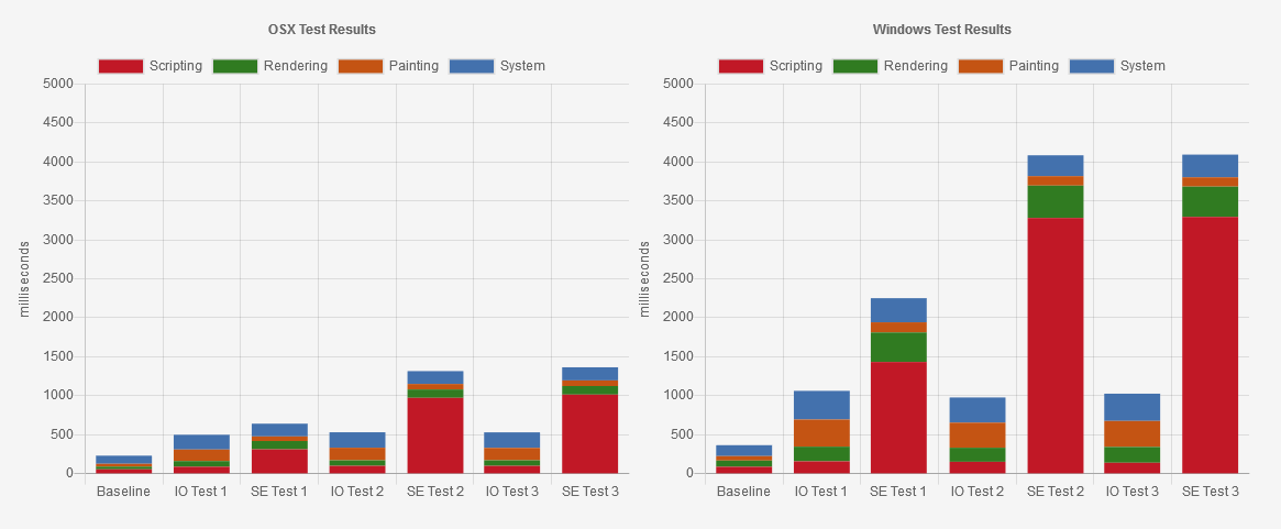
The purpose of all the tests is to detect when a target element scrolls upward through the viewport at 25% increments. At each increment, a CSS class is applied that changes the background color of the element. In other words, each element has DOM changes applied to it that would cause repaints. Each test was run five times on two different machines: my development Mac that’s rather up-to-date hardware-wise and my personal Windows 7 machine that’s probably average these days. The results of the trace summary of scripting, rendering, painting, and system were recorded and then averaged. Again, nothing too scientific about all this — just a general idea.
The first test has one observer or one scroll event with one callback each. This is a fairly standard setup for both the observer and scroll event. Although, in this case, the scroll event has a bit more work to do because it attempts to mimic the data that the observer provides by default. Once all those calculations are done, the data is stored in an entry array just like the observer does. Then the functionality for removing and applying classes between the two is exactly the same. I do throttle the scroll event a bit with requestAnimationFrame.
The second test has 100 observers or 100 scroll events with one callback for each type. Each element is assigned its own observer and event but the callback function is the same. This is actually inefficient because each observer and event behaves exactly the same, but I wanted a simple stress test without having to create 100 unique observers and events — though I have seen many examples of using the observer this way.
The third test has 100 observers or 100 scroll events with 100 callbacks for each type. This means each element has its own observer, event, and callback function. This, of course, is horribly inefficient since this is all duplicated functionality stored in huge arrays. But this inefficiency is the point of this test.
Intersection Observer versus Scroll Events stress tests
In the charts above, you’ll see the first column represents our baseline where no JavaScript was run at all. The next two columns represent the first type of test. The Mac ran both quite well as I would expect for a top-end machine for development. The Windows machine gave us a different story. For me, the main point of interest is the scripting results in red. On the Mac, the difference was around 88ms for the observer while around 300ms for the scroll event. The overall result on the Mac is fairly close for each but that scripting took a beating with the scroll event. For the Windows machine its far, far worse. The observer was around 150ms versus around 1400ms for the first and easiest test of the three.
For the second test, we start to see the inefficiency of the scroll test made clearer. Both the Mac and Windows machines ran the observer test with much the same results as before. For the scroll event test, the scripting gets more bogged down to complete the tasks given. The Mac jumped to almost a full second of scripting while the Windows machine jumped approximately to a staggering 3200ms.
For the third test, things thankfully did not get worse. The results are roughly the same as the second test. One thing to note is that across all three tests the results for the observer were consistent for both computers. Despite no efforts in efficiency for the observer tests, the Intersection Observer outperformed the scroll events by a strong margin.
So, after my non-scientific testing on my own two machines, I felt I had a decent idea of the differences in performance between scroll events and the Intersection Observer. I’m sure with some effort I could make the scroll events more efficient but is it worth doing? There are cases where the precision of the scroll events is necessary, but in most cases, the Intersection Observer will suffice nicely — especially since it appears to be far more efficient with no effort at all.
Understanding the intersectionRatio property
The intersectionRatio property, given to us by IntersectionObserverEntry, represents the percentage of the target element that is within the boundaries of the root element on an intersection change. I found I didn’t quite understand what this value actually represented at first. For some reason I was thinking it was a straightforward zero to 100 percent representation of the appearance of the target element, which it sort of is. It is tied to the thresholds passed to the observer when it is created. It could be used to determine which threshold was the cause of the intersection change just triggered, as an example. However, the values it provides are not always straightforward.
In this demo, the observer has been assigned the parent container as the root element. The child element with the target background has been assigned as the target element. The threshold array has been created with 100 entries with the sequence 0, 0.01, 0.02, 0.03, and so on, until 1. The observer triggers every one percent of the target element appearing or disappearing inside the root element so that, whenever the ratio changes by at least one percent, the output text below the box is updated. In case you’re curious, this threshold was accomplished with this code:
[...Array(100).keys()].map(x => x / 100) }
I don’t recommend you set your thresholds in this way for typical use in projects.
At first, the target element is completely contained within the root element and the output above the buttons will show a ratio of one. It should be one on first load but we’ll soon see that the ratio is not always precise; it’s possible the number will be somewhere between 0.99 and 1. That does seem odd, but it can happen, so keep that in mind if you create any checks against the ratio equaling a particular value.
Clicking the "left" button will cause the target element to be transformed to the left so that half of it is in the root element and the other half is out. The intersectionRatio should then change to 0.5, or something close to that. We now know that half of the target element is intersecting the root element, but we have no idea where it is. More on that later.
Clicking the "top" button does much the same. It transforms the target element to the top of the root element with half of it in and half of it out again. And again, the intersectionRatio should be somewhere around 0.5. Even though the target element is in a completely different location than before, the resulting ratio is the same.
Clicking the "corner" button again transforms the target element to the upper-right corner of the root element. At this point only a quarter of the target element is within the root element. The intersectionRatio should reflect this with a value of around 0.25. Clicking "center" will transform the target element back to the center and fully contained within the root element.
If we click the "large" button, that changes the height of the target element to be taller than the root element. The intersectionRatio should be somewhere around 0.8, give or take a few ten-thousandths of a percent. This is the tricky part of relying on intersectionRatio. Creating code based on the thresholds given to the observer makes it possible to have thresholds that will never trigger. In this "large" example, any code based on a threshold of 1 will fail to execute. Also consider situations where the root element can be resized, such as the viewport being rotated from portrait to landscape.
Finding the position
So then, how do we know where the target element is in relation to the root element? Thankfully, the data for this calculation is provided by IntersectionObserverEntry, so we only have to do simple comparisons.
The setup for this demo is much the same as the one before. The parent container is the root element and the child inside with the target background is the target element. The threshold is an array of 0, 0.5, and 1. As you scroll inside the root element, the target will appear and its position will be reported in the output above the buttons.
Here's the code that performs these checks:
const output = document.querySelector('#output pre');

function io_callback (entries) {
  const ratio = entries[0].intersectionRatio;
  const boundingRect = entries[0].boundingClientRect;
  const intersectionRect = entries[0].intersectionRect;

  if (ratio === 0) {
    output.innerText = 'outside';
  } else if (ratio < 1) {
    if (boundingRect.top < intersectionRect.top) {
      output.innerText = 'on the top';
    } else {
      output.innerText = 'on the bottom';
    }
  } else {
    output.innerText = 'inside';
  }
}
I should point out that I’m not looping over the entries array as I know there will always only be one entry because there’s only one target. I’m taking a shortcut by making use of entries[0] instead.
You’ll see that a ratio of zero puts the target on the "outside." A ratio of less than one puts it either at the top or bottom. That lets us see if the target’s "top" is less than the intersectionRect’s top, which actually means it’s higher on the page and is seen as "on the top." In fact, checking against the root element’s "top" would work for this as well. Logically, if the target isn’t at the top, then it must be at the bottom. If the ratio happens to equal one, then it is "inside" the root element. Checking the horizontal position is the same except it's done with the left or right property.
This is part of the efficiency of using the Intersection Observer. Developers don’t need to request this information from various places on a throttled scroll event (which fires quite a lot regardless) and then calculate the related math to figure all this out. It’s provided by the observer and all that’s needed is a simple if check.
At first, the target element is taller than the root element, so it is never reported as being "inside." Click the "toggle target size" button to make it smaller than the root. Now, the target element can be inside the root element when scrolling up and down.
Restore the target element to its original size by clicking on "toggle target size" again, then click on the "toggle root size" button. This resizes the root element so that it is taller than the target element. Once again, while scrolling up and down, it is possible for the target element to be "inside" the root element.
This demo demonstrates two things about the Intersection Observer: how to determine the position of the target element in relation to the root element and what happens when resizing the two elements. This reaction to resizing is another advantage over scroll events — no need for code to adjust to a resize event.
Creating a position sticky event
The "sticky" value for the CSS position property can be a useful feature, yet it’s a bit limiting in terms of CSS and JavaScript. The styling of the sticky element can only be of one design, whether in its normal state or within its sticky state. There’s no easy way to know the state for JavaScript to react to these changes. So far, there’s no pseudo-class or JavaScript event that makes us aware of the changing state of the element.
I’ve seen examples of having an event of sorts for sticky positioning using both scroll events and the Intersection Observer. The solutions using scroll events always have issues similar to using scroll events for other purposes. The usual solution with an observer is with a "dummy" element that serves little purpose other than being a target for the observer. I like to avoid using single purpose elements like that, so I decided to tinker with this particular idea.
In this demo, scroll up and down to see the section titles reacting to being "sticky" to their respective sections.
This is an example of detecting when a sticky element is at the top of the scrolling container so a class name can be applied to the element. This is accomplished by making use of an interesting quirk of the DOM when giving a specific rootMargin to the observer. The values given are:
rootMargin: '0px 0px -100% 0px'
This pushes the bottom margin of the root’s boundary to the top of the root element, which leaves a small sliver of area available for intersection detection that's zero pixels. A target element touching this zero pixel area triggers the intersection change, even though it doesn’t exist by the numbers, so to speak. Consider that we can have elements in the DOM that exist with a collapsed height of zero.
This solution takes advantage of this by recognizing the sticky element is always in its "sticky" position at the top of the root element. As scrolling continues, the sticky element eventually moves out of view and the intersection stops. Therefore, we add and remove the class based on the isIntersecting property of the entry object.
The outer div with the class sticky-container is the target for our observer. This div will be set as the sticky element and acts as the container. The element used to style and change the element based on the sticky state is the sticky-content div and its children. This insures that the actual sticky element is always in contact with the shrunken rootMargin at the top of the root element.
You’ll see that .sticky-container creates our sticky element at the top of zero. The rest is a mixture of styles for the regular state in .sticky-content and the sticky state with .active .sticky-content. Again, you can pretty much do anything you want inside the sticky content div. In this demo, there’s a hidden section symbol that appears from a delayed transition when the sticky state is active. This effect would be difficult without something to assist, like the Intersection Observer.
This is actually a very straightforward example of using the Intersection Observer for this task. The only oddity is the -100% value in the rootMargin. Take note that this can be repeated for the other three sides as well; it just requires a new observer with its own unique rootMargin with -100% for the appropriate side. There will have to be more unique sticky containers with their own classes such as sticky-container-top and sticky-container-bottom.
The limitation of this is that the top, right, bottom, or left property for the sticky element must always be zero. Technically, you could use a different value but then you’d have to do the math to figure out the proper value for the rootMargin. This is can be done easily, but if things get resized, not only does the math need to be done again, the observer has to be stopped and restarted with the new value. It’s easier to set the position property to zero and use the interior elements to style things how you want them.
Combining with Scrolling Events
As we've seen in some of the demos so far, the intersectionRatio can be imprecise and somewhat limiting. Using scroll events can be more precise but at the cost of inefficiency in performance. What if we combined the two?
In this demo, we've created an Intersection Observer and the callback function serves the sole purpose of adding and removing an event listener that listens for the scroll event on the root element. When the target first enters the root element, the scroll event listener is created and then is removed when the target leaves the root. As the scrolling happens, the output simply shows each event’s timestamp to show it changing in real time — far more precise than the observer alone.
The setup for the HTML and CSS is fairly standard at this point, so here’s the JavaScript.
This is a fairly standard example. Take note that we’ll want the threshold to be zero because we’ll get multiple event listeners at the same time if there’s more than one threshold. The callback function is what we’re interested in and even that is a simple setup: add and remove the event listener in an if-else block. The event’s callback function simply updates the div in the output. Whenever the target triggers an intersection change and is not intersecting with the root, we set the output back to zero.
This gives the benefits of both Intersection Observer and scroll events. Consider having a scrolling animation library in place that works only when the section of the page that requires it is actually visible. The library and scroll events are not inefficiently active throughout the entire page.
Interesting differences with browsers
You're probably wondering how much browser support there is for Intersection Observer. Quite a bit, actually!
This browser support data is from Caniuse, which has more detail. A number indicates that browser supports the feature at that version and up.
Desktop
Chrome
Opera
Firefox
IE
Edge
Safari
58
45
55
No
16
12.1
Mobile / Tablet
iOS Safari
Opera Mobile
Opera Mini
Android
Android Chrome
Android Firefox
12.2-12.3
46
No
76
76
68
All the major browsers have supported it for some time now. As you might expect, Internet Explorer doesn’t support it at any level, but there’s a polyfill available from the W3C that takes care of that.
As I was experimenting with different ideas using the Intersection Observer, I did come across a couple of examples that behave differently between Firefox and Chrome. I wouldn't use these example on a production site, but the behaviors are interesting.
The target element is moving within the root element by way of the CSS transform property. The demo has a CSS animation that transforms the target element in and out of the root element on the horizontal axis. When the target element enters or leaves the root element, the intersectionRatio is updated.
If you view this demo in Firefox, you should see the intersectionRatio update properly as the target elements slides back and forth. Chrome behaves differently. The default behavior there does not update the intersectionRatio display at all. It seems that Chrome doesn’t keep tabs of a target element that is transformed with CSS. However, if we were to move the mouse around in the browser as the target element moves in and out of the root element, the intersectionRatio display does indeed update. My guess is that Chrome only "activates" the observer when there is some form of user interaction.
This time we're animating a clip-path that morphs a square into a circle in a repeating loop. The square is the same size as the root element so the intersectionRatio we get will always be less than one. As the clip-path animates, Firefox does not update the intersectionRatio display at all. And this time moving the mouse around does not work. Firefox simply ignores the changing size of the element. Chrome, on the other hand, actually updates the intersectionRatio display in real time. This happens even without user interaction.
If container has overflow clipping or a css clip-path property, update intersectionRect by applying container’s clip.
So, when a target is clipped, the boundaries of the intersection area are recalculated. Firefox apparently hasn’t implemented this yet.
Intersection Observer, version 2
So what does the future hold for this API?
There are proposals from Google that will add an interesting feature to the observer. Even though the Intersection Observer tells us when a target element crosses into the boundaries of a root element, it doesn’t necessarily mean that element is actually visible to the user. It could have a zero opacity or it could be covered by another element on the page. What if the observer could be used to determine these things?
Please keep in mind that we're still in the early days for such a feature and that it shouldn't be used in production code. Here’s the updated proposal with the differences from the spec's first version highlighted.
If you you've been viewing the the demos in this article with Chrome, you might have noticed a couple of things in the console — such as entries object properties that don’t appear in Firefox. Here's an example of what Firefox logs in the console:
There are some differences in how a few of the properties are displayed, such as target and prototype, but they operate the same in both browsers. What’s different is that Chrome has a few extra properties that don’t appear in Firefox. The observer object has a boolean called trackVisibility, a number called delay, and the entry object has a boolean called isVisible. These are the newly proposed properties that attempt to determine whether the target element is actually visible to the user.
I’ll give a brief explanation of these properties but please read this article if you want more details.
The trackVisibility property is the boolean given to the observer in the options object. This informs the browser to take on the more expensive task of determining the true visibility of the target element.
The delay property what you might guess: it delays the intersection change callback by the specified amount of time in milliseconds. This is sort of the same as if your callback function's code were wrapped in setTimeout. For the trackVisibility to work, this value is required and must be at least 100. If a proper amount is not given, the console will display this error and the observer will not be created.
Uncaught DOMException: Failed to construct 'IntersectionObserver': To enable the
'trackVisibility' option, you must also use a 'delay' option with a value of at
least 100. Visibility is more expensive to compute than the basic intersection;
enabling this option may negatively affect your page's performance.
Please make sure you really need visibility tracking before enabling the
'trackVisibility' option.
The isVisible property in the target’s entry object is the boolean that reports the output of the visibility tracking. This can be used as part of any code much the same way isIntersecting can be used.
In all my experiments with these features, seeing it actually working seems to be hit or miss. For example, delay works consistently but isVisible doesn’t always report true — for me at least — when the element is clearly visible. Sometimes this is by design as the spec does allow for false negatives. That would help explain the inconsistent results.
I, for one, can’t wait for this feature to be more feature complete and working in all browsers that support Intersection Observer.
Now thy watch is over
So comes an end to my research on Intersection Observer, an API that I definitely look forward to using in future projects. I spent a good number of nights researching, experimenting, and building examples to understand how it works. But the result was this article, plus some new ideas for how to leverage different features of the observer. Plus, at this point, I feel I can effectively explain how the observer works when asked. Hopefully, this article helps you do the same.


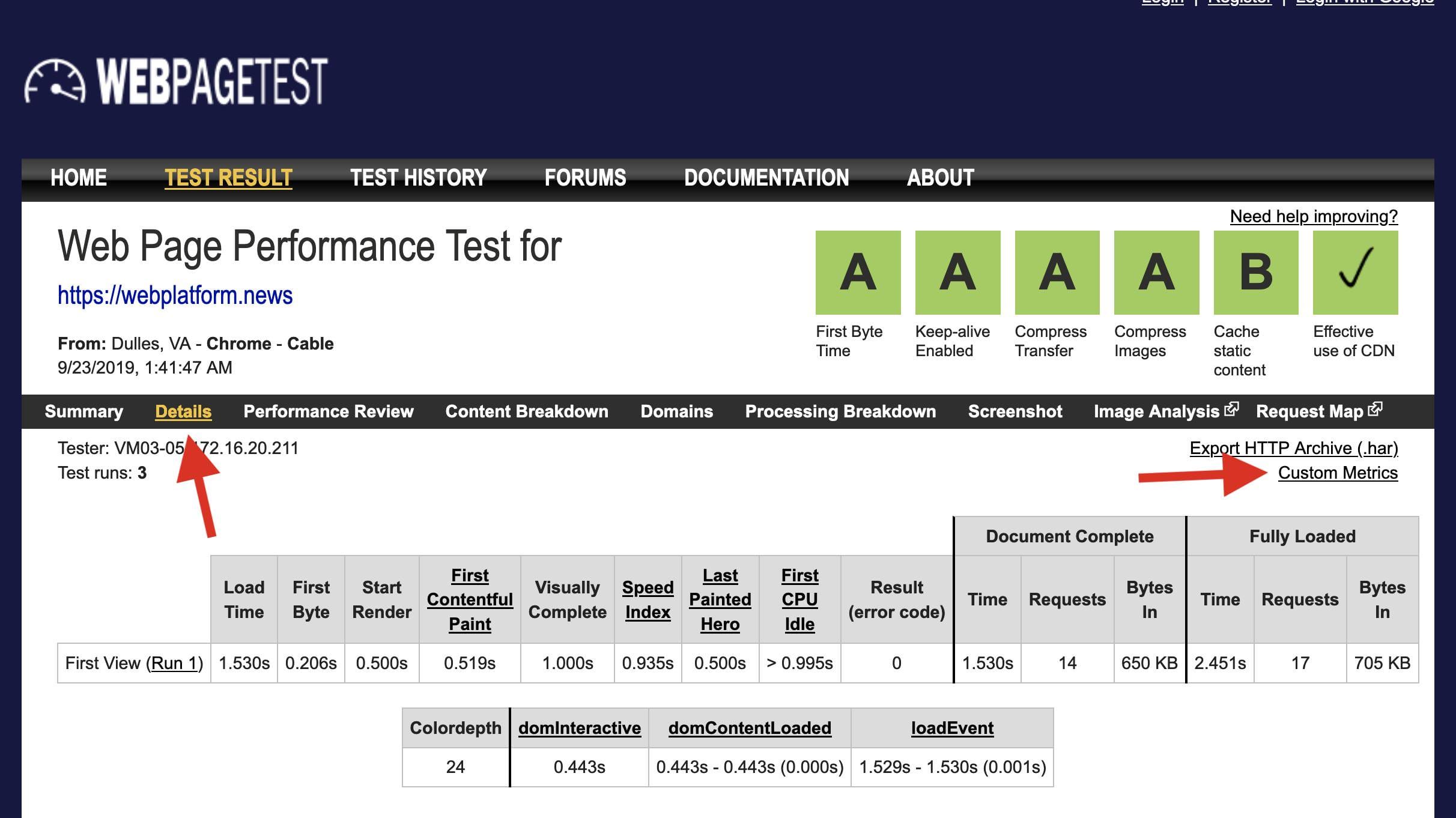
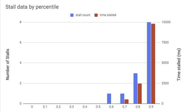


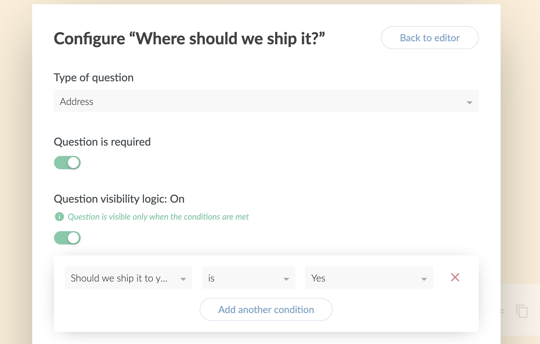
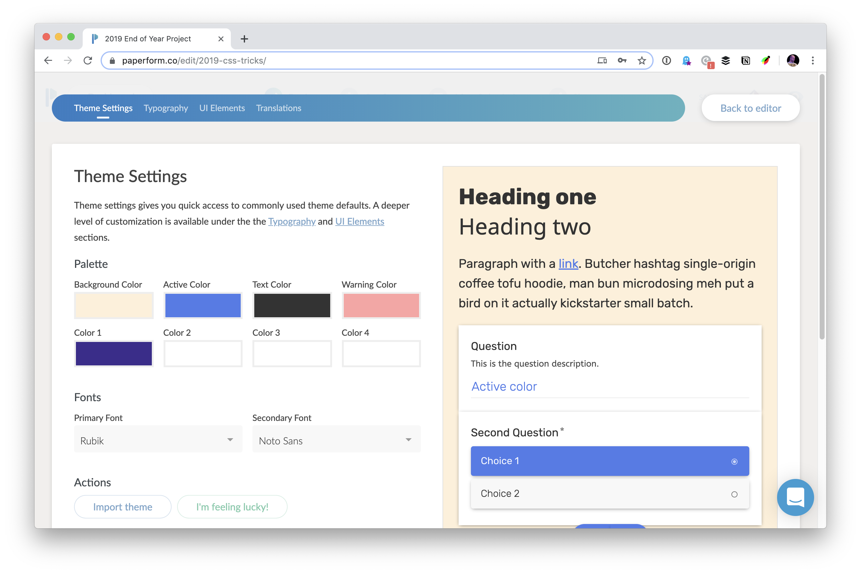
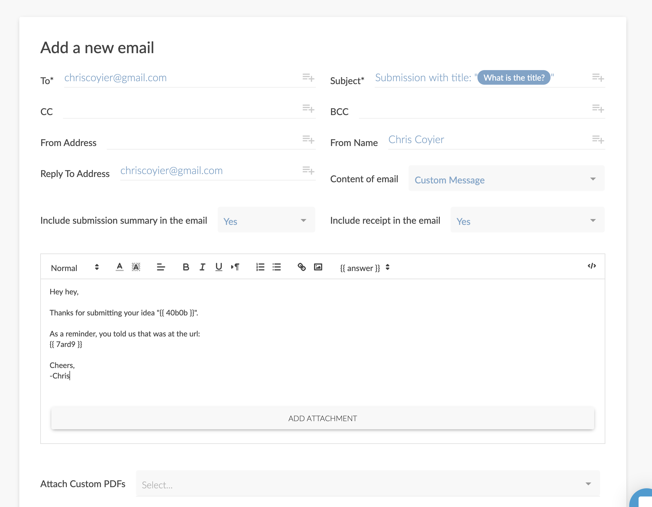
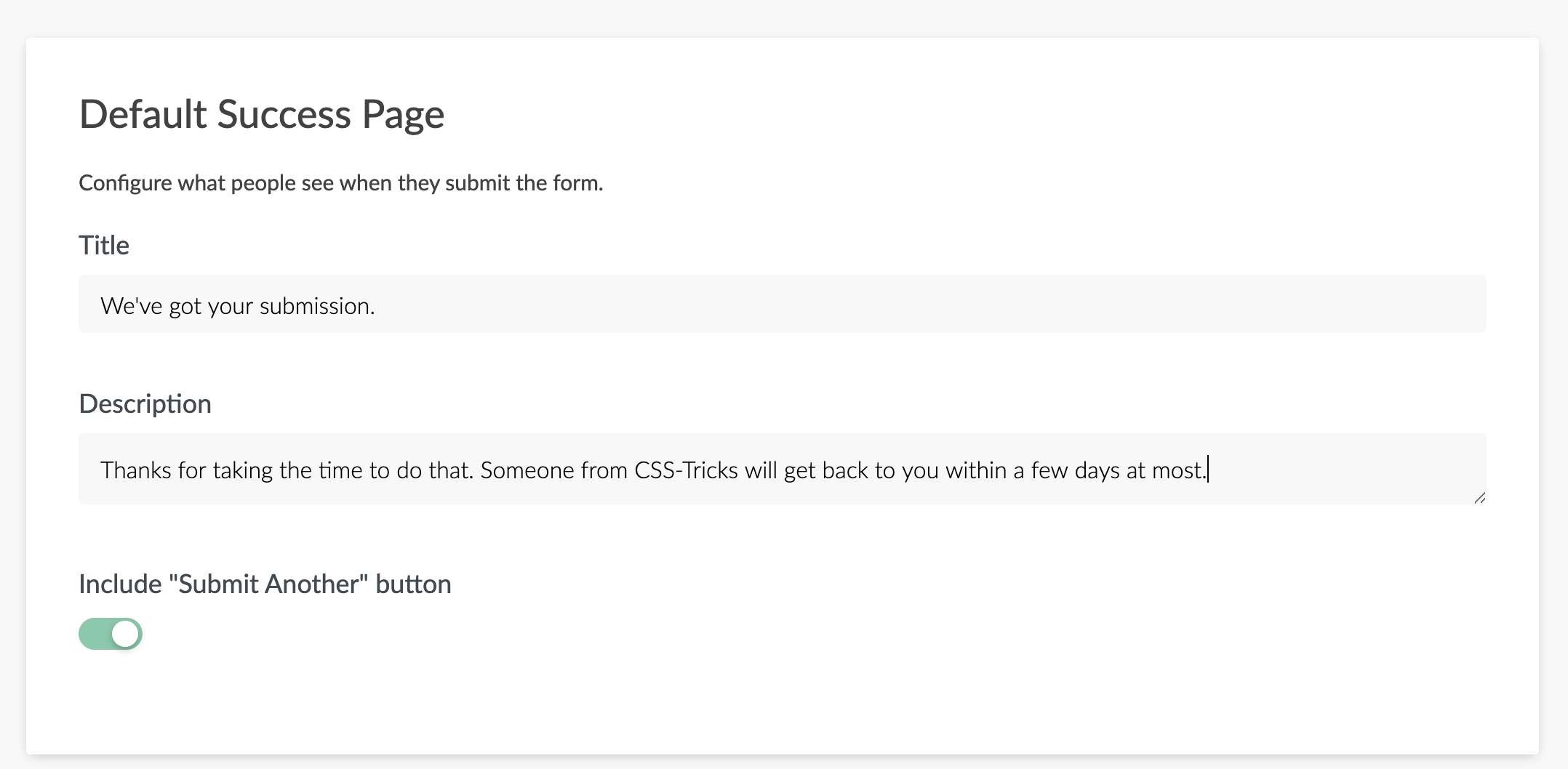


