Looks like it was almost 9 years ago when Airbnb first published their JavaScript Style Guide. 112k stars on GitHub later, it seems like the de facto preset for Babel / ES Lint. But it’s not the only company out there with public ES Lint setups. Katy recently shared Mapbox’s setup.
ESLint plugins will help keep your code consistent and improve the quality, but they are also excellent teaching tools. When I come across a plugin, I take joy in reading each rule to learn the benefits of enabling or disabling it.
The CSS Paint API (part of the magical Houdini family) opens the door to an exciting new world of design in CSS. Using the Paint API, we can create custom shapes, intricate patterns, and beautiful animations — all with a touch of randomness — in a way that is portable, fast, and responsive.
We are going to dip our toes into the bubbling cauldron of generative CSS magic by creating my favorite shape, the blob. Random blobs are a great starting point for anyone new to generative art/design, and we will be learning the CSS Paint API as we go, so this is an ideal starting point for folks who are new to this world. You’ll be a generative CSS magician in no time!
Let’s hop on our broomsticks and conjure up some shapes.
Generative?
For some folks reading this, generative art may be an unfamiliar topic. If you are already comfortable with generative art/design, feel free to hop down to the next section. If not, here’s a little example:
Imagine, for a moment, that you are sitting at a desk. You have three stamps, some dice, and a piece of paper. Each of the stamps has a different shape on it. There is a square, a line, and a circle. You roll the dice. If the dice land on one, you use the square stamp on the page. If the dice lands on two, you use the line stamp. If it lands on three, you use the circle stamp. If the dice reads four, five, or six, you do nothing. You repeat the roll-and-stamp process until the page fills with shapes — this is generative art!
It can seem a little scary at first, but really, that’s all “generative” means — something created with an element of chance/unpredictability. We define some rules and let a source of randomness guide us to an outcome. In the “analog” example above, the randomness source is some dice. When we are working in the browser, it could be Math.random() or another similar function.
To bring things back to the land of ones and zeros for a moment, this is what the above example would look like if written in code:
Pretty cool, eh? By defining some simple rules and actioning them at random, we have created a unique pattern. In this tutorial series, we will use generative techniques just like this to create exciting user interfaces.
What is the CSS Paint API, and what’s a worklet?
The CSS Paint API allows us low-level access to CSS itself(!) through an HTML5 <canvas>-like drawing API. We can harness this power with something called a worklet.
Worklets, in short, are JavaScript classes. Each worklet class must have a paint() function. A worklet’s paint() function can programmatically create an image for any CSS property that expects one.
For example:
.my-element {
  background-image: paint(texture);
}
Here, we have a fictional texture worklet that generates a beautiful (I’ll leave this up to your imagination), programmatic texture. Where we might usually assign a url(...) value to the background-image property, we instead call paint(worklet_name) — this runs the worklet’s paint() function and renders the output to the target element.
We will be getting into how to write worklets in detail shortly, but I wanted to give you a quick primer on what they are before I start talking about them.
What we are building
So, in this tutorial, we will be building a generative blob worklet. Our worklet will take a few input parameters (as CSS Custom Properties, more on this a little later) and return a beautiful, random blob shape.
Let’s get started by checking out some examples of the finished worklet in action — if a picture paints a thousand words, a CodePen must paint a million, right?
The blob worklet, as a background image
First, here’s a demo of the blob worklet just hanging out on its own, generating a value for the background-image property of an element:
I encourage you to look at the CSS for the above CodePen, change the custom properties, resize the element, and see what happens. See how the shape resizes fluidly and updates when the custom properties change? Don’t worry about understanding how this works right now. At this stage, we are only concerned with what we are building.
Generative image masks, a practical use case
Awesome, now that we have seen the “standalone” worklet, let’s check out how we can use it. In this example, the worklet functions as a generative image mask:
The result (I think) is rather striking. The worklet adds a natural, eye-catching curve to the design. In addition, the mask shape is different each time the page loads, which is a fantastic way to keep the UI fresh and exciting — click “rerun” on the CodePen above to see this effect in action. This ever-changing behavior is subtle, for sure, but I hope it will bring folks who notice it a little bit of joy. The web can be quite a cold, sterile place, and generative touches like this can make it feel a lot more organic!
Note: I’m certainly not suggesting we all start making our entire interfaces change at random. That would be terrible for usability! This kind of behavior works best when applied sparingly and only to presentational elements of your website or app. Think blog post headers, hero images, subtle background patterns, etc.
Now, this is just one example (and simple one, at that), but I hope it gives you some ideas on how you could use the blob worklet in your own design and development. For anyone looking for some extra inspiration, a quick Dribbble search for “blobs” should give you a whole heap of ideas!
Wait, do I need the CSS Paint API to make blobs?
In short, no!
There are, in fact, a plethora of ways to make blobs to use in your UI design. You could reach for a tool like Blobmaker, do some magic with border-radius, use a regular <canvas> element, whatever! There are tons of roads leading to blob city.
None of these, however, are quite the same as using the CSS Paint API. Why?
Well, to name a few reasons…
It allows us to be expressive in our CSS
Instead of dragging around sliders, tweaking radii, or endlessly clicking “regenerate” in the hope that a perfect blob comes our way, we can use just a few human-readable values to get what we need.
For example, the blob worklet we will be building in this tutorial takes the following input properties:
Need your blobs to be super subtle and minimal? Reduce the --blob-variance custom property. Need them to be detailed and overstated? Bring it up!
Fancy redesigning your site in a more brutalist direction? No problem! Instead of re-exporting hundreds of assets or custom coding a bunch of border-radius properties, simply reduce the --blob-smoothness custom property to zero:
Handy, eh? The CSS Paint API, through worklets, allows us to create ever-unique UI elements that fit right in with a design system.
Note: I am using GSAP in the examples above to animate the input properties of the paint worklet we are building in this tutorial.
It is super performant
It just so happens that generative work can get a little heavy, computation-wise. We often find ourselves looping through lots of elements, performing calculations, and other fun stuff. When we factor in that we may need to create multiple programmatic, generative visuals on a page, performance issues could become a risk.
Luckily for us, CSS Paint API worklets do all their magic outside of the main browser thread. The main browser thread is where all of the JavaScript we usually write exists and executes. Writing code this way is perfectly OK (and generally preferable), **but it can have limitations. When we try and do too much on the main browser thread, the can UI become sluggish or even blocked.
As worklets run on a different thread to the main website or app, they will not “block” or slow down the interface. Additionally, this means that the browser can spin up lots of separate worklet instances that it can call on when needed — this is similar to containerization and results in blazing fast performance!
It won’t clutter the DOM
Because the CSS Paint API essentially adds an image to a CSS property, it doesn’t add any extra elements to the DOM. To me, this feels like a super clean approach to creating generative visual elements. Your HTML structure remains clear, semantic, and unpolluted, while your CSS handles how things look.
Browser support
It is worth noting that the CSS Paint API is a relatively new technology, and although support is growing, it is still unavailable in some major browsers. Here is a browser support table:
This browser support data is from Caniuse, which has more detail. A number indicates that browser supports the feature at that version and up.
Desktop
Chrome
Firefox
IE
Edge
Safari
65
No
No
79
No
Mobile / Tablet
Android Chrome
Android Firefox
Android
iOS Safari
92
No
92
No
Although browser support is still a little thin on the ground — in this tutorial, we will be looking at how to use the css-paint-polyfill maintained by GoogleChromeLabs to make sure users in all browsers can enjoy our creations.
We will, additionally, be looking at how to “fail gracefully” when the CSS Paint API is unsupported. A polyfill means extra JavaScript weight, so for some folks, it is not a viable solution. If this is you, don’t worry. We will be exploring browser support options for everyone.
Let’s code!
OK, OK! We know what we are building and why the CSS Paint API rocks — now let’s get coding! First things first, let’s get a development environment spun up.
To get us started, I have created a worklet-starter-kit repository. As a first step, pop on over to GitHub and clone it. Once you have cloned and navigated inside the repo, run:
npm install
Followed by:
npm run start
Once you have run the above commands, a simple development server fires up in the current directory, and your default browser opens. As worklets must be loaded either over HTTPS or from localhost — this setup ensures that we can use our worklet without any CORS issues. The starter kit also handles automatically refreshing the browser when we make any changes.
As well as serving our content and providing a basic live reload, this repository features a simple build step. Powered by esbuild, this process bundles up any JavaScript imports inside our worklet and outputs the result to a worklet.bundle.js file. Any changes made in worklet.js are automatically reflected in worklet.bundle.js.
If you have a poke around the repository, you might notice that there is already some HTML and CSS kicking around. We have a simple index.html file with a single worklet-canvas div, alongside some CSS to center it on the page and scale it to the viewport. Think of this as a blank canvas for all of your worklet experimentation!
Initializing our worklet
OK, now that we have our development environment up and running, it’s time to create our worklet. Let’s start by navigating to the worklet.js file.
Note: Remember, worklet.bundle.js is automatically generated by our build step. We don’t ever want to edit this file directly.
In our worklet.js file, we can define our Blob class and register it with the registerPaint function. We pass two values to registerPaint — the name we would like our worklet to have (in our case, blob) and the class that defines it:
class Blob {}

registerPaint("blob", Blob);
Excellent! We just took the first step towards creating our blobs!
Adding a paint() function
Now, not much is happening yet, so let’s add a simple paint() function to our Blob class to check things are working OK:
We can think of this paint() function like a callback. It runs, initially, when the worklet’s target element first renders. After this, any time the element’s dimensions change or the worklet’s input properties update, it runs again.
When the paint() function is called, it automatically has a few values passed through it. In this tutorial, we are making use of the first three:
context — a 2D drawing context similar to that of a <canvas> element, we use this to draw things.
geometry — an object containing the width and height of the target element
Now that we have a simple paint() function defined, let’s pop over to the index.html file and load our worklet. To do so, we are going to add a new <script> just before our closing </body> tag:
<script>
  if (CSS["paintWorklet"] !== undefined) {
    CSS.paintWorklet.addModule("./worklet.bundle.js");
  }
</script>
Note: we are registering the bundled version of our worklet!
Excellent. Our blob worklet is now loaded and ready for use in our CSS. Let’s use it to generate a background-image for our worklet-canvas class:
Once you have added the above snippet, you should see a red square. Our worklet is alive! Nice work. If you resize the browser window, you should see the worklet-canvas element’s dimensions printed in the browser console. Remember, the paint() function runs whenever the worklet target’s dimensions change.
Defining the worklet’s input properties
To allow our worklet to generate beautiful blobs, we need to help it out and pass it some properties. The properties we need are:
--blob-seed — a “seed” value for a pseudorandom number generator; more on this in a moment
--blob-num-points — how detailed the blob is based on the number of points used along the shape
--blob-variance — how varied the blob’s control points are
--blob-smoothness — the smoothness/sharpness of the blob’s edges
--blob-fill — the blob’s fill color
Let’s tell our worklet that it will receive these properties and that it needs to watch them for changes. To do so, we can head back over to our Blob class and add an inputProperties getter:
Now, at this point, we could use the CSS Properties and Values API (another member of the Houdini family) **to assign some defaults and make these custom properties a little easier to parse in our worklet. Unfortunately, however, at this moment, the Properties and Values API does not have the best browser support.
For now, to keep things simple, we are going to leave our custom properties as they are — relying on some basic parsing functions in our worklet instead.
Heading back to our worklet class for a moment, let’s add these utility functions:
In the absence of the Properties and Values API, these simple utility functions will help us convert the properties passed to paint() to usable values.
Using our new helper functions, we can parse properties and define some variables to use in our paint() function. Let’s remove the old “debug” code, too:
If you log any of these variables, you should see that the properties made available by the paint() function map exactly to the Custom Properties we defined in our CSS a moment ago.
If you open up dev-tools, inspect the worklet-canvas element, and change any of these custom properties — you should see that the logs re-run and reflect the updated value. Why? Our worklet reacts to any changes to its input properties and re-runs its paint() function when it detects them.
OK, folks, it’s time to start forming our blob shape. To do this, we need a way of generating random numbers. After all, this is what will make our blobs generative!
Now, you may be thinking, “Hey, we can use Math.random() for this!” and in many ways, you would be right on. There is, however, a problem with using a “regular” random number generator in CSS Paint API worklets. Let’s check it out.
The problem with Math.random()
We noticed earlier how a worklet’s paint() function runs rather often. If we use a method such as Math.random() to generate random values within paint() — they will be different each time the function executes. Different random numbers mean a different visual result every time the worklet re-renders. We do not want this at all. Sure, we want our blobs to be random, but only at the point of conception. They shouldn’t change once they exist on the page unless we explicitly tell them to do so.
I found this concept a little tricky to get my head around at first, so I have made a couple of CodePens (best viewed in a browser that natively supports the CSS Paint API) to help demonstrate. In the first example, we have a worklet that sets a random background color, using Math.random():
Warning: resizing the element below will result in a flash of color.
Try resizing the element above and notice how the background color changes as it updates. For some niche applications and fun demos, this might be what you want. In most practical use-cases, though, it isn’t. Aside from being visually jarring, behavior like this could be an accessibility issue for users who are sensitive to motion. Imagine that your worklet contained hundreds of dots that all started flying around and flashing whenever something on the page changed size!
Luckily for us, this issue is quite simple to fix. The solution? A pseudorandom number generator! Pseudorandom number generators (or PRNGs) generate random numbers based on a seed. Given the same seed value, a PRNG always returns the same sequence of random numbers — this is perfect for us, as we can re-initialize the PRNG every time the paint() function runs, ensuring the same sequence of random values!
Here’s a CodePen demonstrating how a PRNG works:
Click “generate” to choose some random numbers — then, click “generate” a few more times. Notice how the sequence of numbers is the same each time you click? Now, try changing the seed value, and repeat this process. The numbers will be different from the previous seed value, but consistent across generations. This is the beauty of a PRNG. Predictable randomness!
Here’s the random-background-color CodePen again, using a PRNG rather than Math.random():
Ah! Much better! The element has a random color set when the page loads, but the background color does not change when it resizes. Perfect! You can test this out by clicking “Rerun” on the CodePen above, and resizing the element.
Adding pseudorandom numbers to our worklet
Let’s go ahead and add a PRNG function above our Blob class definition:
// source: https://github.com/bryc/code/blob/master/jshash/PRNGs.md
function mulberry32(a) {
  return function () {
    a |= 0;
    a = (a + 0x6d2b79f5) | 0;
    var t = Math.imul(a ^ (a >>> 15), 1 | a);
    t = (t + Math.imul(t ^ (t >>> 7), 61 | t)) ^ t;
    return ((t ^ (t >>> 14)) >>> 0) / 4294967296;
  };
}
Now, I’d be lying if I said I understand quite literally anything this function is doing. I discovered this beautiful little snippet of code through Jake Archibald’s excellent article on being predictably random with the CSS Paint API, and have used it in a ton of work since. You can find the original repository for this function over at GitHub — it includes a whole heap of excellent PRNGs and is certainly worth a look.
Note: while I don’t fully understand how this function works, I know how to use it. Often, when working in the generative world (if you are anything like me, anyway!), you will find yourself in this situation. When you do, don’t worry! It is absolutely OK to use a snippet of code to create some art/design without knowing exactly how it works. We can learn by doing, and that’s awesome.
OK, great, we have a PRNG function. Let’s add it to paint():
const random = mulberry32(seed);
In this snippet, we call mulberry32() with our --blob-seed custom property as its seed value, and it returns a brand new function. This new function — random — returns a random number between zero and one.
Lovely, let’s put our shiny new PRNG to use.
A quick aside: Drawing with the CSS Paint API
When working with CSS Paint API worklets, just like HTML <canvas>, we draw everything inside a 2D context. This context has a width and a height. For worklets, the width and height of this context always matches that of the element the worklet is painting to.
Say, for example, we wanted to add a point to the center of a 1920x1080px context, we could visualize it like so:
As we begin to write our “render” code, this is good to keep in mind.
How our blob is formed, an overview
Before we write any code, I’d like to show you a little SVG animation of how we will create our blob shape. If you are a visual learner like me, you may find an animated reference helpful for understanding this kind of thing:
To break this process down into three steps:
Plot several equally spaced points around the radius of a circle.
Pull each point a random amount towards the center of the circle.
Draw a smooth curve through each of the points.
Now, things are about to get a tiny bit maths-y but don’t worry. We’ve got this!
Defining the blob’s control points
To start, let’s define the radius of our blob. The blob’s radius determines how large or small it is.
We want our blob shape to always “fit” inside the element it is painted on. To ensure this is the case, we check the width and height of the worklet’s target element and set the blob’s radius accordingly. Our blob is essentially a weird circle, and a circle’s total width/height will always be equal to its radius multiplied by two, so we divide this value to match. Let’s add some code to achieve this in our paint() function:
Here’s an image to help explain what is happening here:
Cool! Now that we know what the radius of our blob should be, we can initialize its points:
const points = [];

const center = {
  x: geometry.width / 2,
  y: geometry.height / 2,
};

const angleStep = (Math.PI * 2) / numPoints;

for (let i = 1; i <= numPoints; i++) {
  const angle = i * angleStep;
  const point = {
    x: center.x + Math.cos(angle) * radius,
    y: center.y + Math.sin(angle) * radius,
  };
}
Phew! In this snippet, we “walk” around the circumference of a circle, plopping down some equally spaced points as we go. How does this work?
To start, we define an angleStep variable. The maximum angle between two points on the circumference of a circle is Pi × 2. By dividing Pi × 2 by the number of “points” we would like to create, we have the desired (equally spaced) angle between each point.
Next, we loop over each point. For each of these points, we define an angle variable. This variable is our angleStep multiplied by the point’s index. Given a radius, an angle, and a center point for a circle, we can use Math.cos() and Math.sin() to plot each point.
Note: If you would like to learn a little more about trigonometric functions, I wholeheartedly recommend Michelle Barker’s excellent series!
Now that we have some perfect, beautiful, equally spaced points positioned around the circumference of a circle — we should mess them up. To do so, we can “pull” each one, a random amount, towards the circle’s center.
How can we do this?
First, let’s add a new lerp function (short for linear interpolation) just below where we defined mulberry32:
This function takes a start-point, an end-point, and an “amount” value between zero and one. The return value of this function is a new point, placed somewhere between the start and end points.
In our worklet, just below where we define the point variable in our for-loop, we can use this lerp function to “pull” the point towards the center position. We store the modified point in our points array:
points.push(lerp(point, center, variance * random()));
For the linear interpolation amount, we use our --blob-variance property multiplied by a random number generated by random() — as random() always returns a value between zero and one, this amount will always be somewhere between zero, and our --blob-variance number.
Note: A higher --blob-variance will result in crazier blobs, as each point can end up closer to the center.
Drawing the curve
So, we have our blob’s points stored in an array. Right now, though, they aren’t used for anything! For the final step in our blob creation process, we will draw a smooth curve through each of them.
To draw this curve, we are going to use something called a Catmull-Rom spline. A Catmull-Rom spline is, in short, a great way of drawing a smooth Bézier curve through any number of { x, y } points. With a spline, we don’t have to worry about any tricky control point calculation. We pass in an array of points, and get a beautiful, organic curve back. No sweat.
Let’s head over to the start of our worklet.js file and add the following import:
import { spline } from "@georgedoescode/generative-utils";
Then install the package like so:
npm i @georgedoescode/generative-utils
This spline function is quite sizeable and a little complex. For this reason, I have packaged it up and added it to my generative-utils repository, a small collection of handy generative art utilities.
Once we have imported spline — we can use it in our worklet’s paint() function like this:
Note: Place this snippet just after your for-loop!
We pass in our points, --blob-smoothness property, and a flag to let spline know it should return a closed shape. In addition, we use our --blob-fill custom property to set the fill color of the blob. Now, if we take a look at our browser window, we should see something like this!
Hooray! We did it! The spline function has successfully drawn a smooth curve through each of our points, thus making a gorgeous (and random) blob shape. If you would like your blob to be a little less rounded, try reducing the --blob-smoothness property.
Now, all we need to do is add a touch more randomness.
A random, random seed value
Right now, our blob’s PRNG seed is a fixed value. We defined this --blob-seed custom property in our CSS earlier, with a value of 123456 — this is great, but it means that the random numbers generated by random() and, therefore, the blob’s core shape, is always the same.
For some instances, this is ideal. You may not want your blobs to be random! You may want to choose some perfect seed values and use them across your site as part of a semi-generative design system. For other cases, though, you may want your blobs to be random — just like the image mask example I showed you earlier.
How can we do this? Randomize the seed!
Now, this isn’t quite as simple as it might seem. Initially, when I was working on this tutorial, I thought, “Hey, I can initialize the seed value in the Blob class’s constructor!” Unfortunately, though, I was wrong.
Since the browser may spin up multiple instances of a worklet to handle calls to paint() — one of several Blob classes may end up rendering the blob! If we initialize our seed value inside the worklet class, this value will be different across instances, and could lead to the visual “glitching” we discussed earlier.
To test this out, add a constructor function to your Blob class with the following code inside:
constructor() {
  console.log(`My seed value is ${Math.random()}`);
}
Now, check out your browser console, and resize the window. In most cases, you get multiple logs with different random values. This behavior is no good for us; we need our seed value to be constant.
To solve this issue, let’s add a little JavaScript on the main thread. I am popping this in the <script> tag we created earlier:
Excellent! Now when refreshing the browser window, we should see a new blob shape each time.
For our simple demo, this is perfect. In a “real” application, you may want to create a .blob class, target all instances of it on load, and update the seed value of each element. You could also experiment with setting the blob’s variance, number of points, and roundness properties to random values.
For this tutorial, though, that’s it! All we have left to do is make sure our code works OK for users in all browsers, or provide a suitable fallback for when it doesn’t.
Loading a polyfill
By adding a polyfill, our CSS Paint API code will work in all major browsers, with the cost of extra JavaScript weight. Here’s how we can update our CSS.paintWorklet.addModule code to add one to our example:
(async function () {
  if (CSS["paintWorklet"] === undefined) {
    await import("https://unpkg.com/css-paint-polyfill");
  }
  CSS.paintWorklet.addModule("./worklet.bundle.js");
})();
Using this snippet, we only load the polyfill if the current browser does not support the CSS Paint API. Nice!
A CSS-based fallback
If extra JavaScript weight isn’t your vibe, that’s cool. I totally get it. Luckily, using @supports, we can define a lightweight, CSS-only fallback for browsers that do not support the CSS Paint API. Here’s how:
In this snippet, we apply a background-color and a blob-like border-radius (generated by fancy border radius) to the target element. If the CSS Paint API is supported, we remove these values and use our worklet to paint a generative blob shape. Awesome!
The end of the road
Well, folks, we’re all done. To quote the Grateful Dead — what a long, strange trip it’s been!
I know, there’s a lot to take in here. We have covered core generative art concepts, learned all about the CSS Paint API, and made some awesome generative blobs while we were at it. Not bad going at all, I say.
Now that we have learned the basics, though, we are ready to start creating all kinds of generative magic. Keep an eye out for more generative UI design tutorials from me soon, but in the meantime, try and take what we have learned in this tutorial and experiment! I’m sure you have a ton of fantastic ideas.
An explanation of those new GitHub social media images:
[…] our custom Open Graph image service is a little Node.js app that uses the GitHub GraphQL API to collect data, generates some HTML from a template, and pipes it to Puppeteer to “take a screenshot” of that HTML.
It’s so satisfying to produce templated images from HTML and CSS. It’s the perfect way to do social media images. If you’re doing it at scale like GitHub, there are a couple of nice tricks in here for speeding it up.
John Resig and I recently self-published our book on GraphQL. There are tons of how-tos for self-publishing a book, or even online classes, but very little in the way of why you would want to, or whether it’s even worth your while. I’m going to share my experience and revenue numbers with you in this post, as well as those from others who have self-published material. I’ll go specifically into the pros and cons of self-publishing books and courses in tech.
Revenue
This is probably what you’re most curious about, right? When I originally started working on our book, I sent a book proposal to publishers. But by the time John and I joined forces, we were both set on self-publishing. He had written two popular JavaScript books and a blog post about traditional publishing for programming books, which includes:
Programmers aren’t that into reading books! Programming books, by and large, are poor sellers. They rarely sell more than 4,000 copies.
He made $7,500 on his first 4,000 copies, where his royalty rate started at 10% for print sales and 20% for digital copies.
On the topic of traditional publishing revenue, Randall Kanna says: “Nothing comes from a tech book. Just the credibility.” A book can make significantly more, but it’s rare. Martin Kleppmann’s book on machine learning was O’Reilly’s second most popular seller in 2019, and he made $478,000 in the first three years (with 108,000 copies sold, a 10% royalty on print sales, and a 25% royalty on digital sales).
The Pragmatic Bookshelf is the outlying publisher when it comes to royalties: it gives authors 50% of gross profit. In their first 10 years operating, 42% of their authors made more than $50,000, and 12% made more than $100,000.
That said, self-publishing has much higher royalty rates:
Amazon: 70% (for e-books; 60% minus printing cost for printed books)
This gives authors the potential to make more money. Discover Meteor was probably the most successful self-published programming book of its time, with around $500,000 in sales (9,000 copies) between 2013 (when they launched) and 2018 (when they made it available for free). The authors Sacha Grief and Tom Coleman put a lot of effort into marketing it (described in their Gumroad case study), and it became the recommended learning resource in the Meteor community. The current best-selling book is Adam Wathan and Steve Schoger’s Refactoring UI, which I believe passed $2 million in 2020! 🤑 Their success was also largely due to their ability to market the book, in addition to addressing a significant need for a broad audience (practical user interface design for front-end developers).
That’s books. Looking at publishing video courses, there are a few options:
Some book publishers, like O’Reilly, have video platforms.
YouTube is popular, of course. For example, Florin Pop, in his first year on YouTube, gained 74,000 subscribers and made $4,500 in ads from 1.6 million views.
Self publishing (hosting the content on your own site behind a paywall).
Like self-published books, self-published courses have a lot of potential. Level Up Tutorials, Kent C. Dodds, and Wes Bos don’t share revenue numbers for their courses, but I’m assuming they have made considerable sums. Wes, for example, has sold his courses to over 140,000 people at the time of writing!
Those are the outliers, of course. The majority of resources out there make significantly less. Take, for example, the self-published books in the GraphQL space that we were entering:
So, yes, the potential is big. But it’s not a guarantee.
Self-publishing pros and cons
Pros
Cons
Potential for more revenue. You get to set the price, sell different packages, and receive a larger cut.
It’s much harder. A publisher does a ton of things for you: editing, gathering feedback from technical reviewers, the build toolchain, translating, an online store, getting it on Amazon and other bookstores, customer service, tracking errata, etc. Doing all of these things yourself takes a lot of time, especially if you also decide to build a Gatsby site to display the text online. 😜
Flexibility. You get to decide what goes into the book as well as how it’s formatted and sold.
No built-in marketingordistribution. The success of your own book completely depends on your ability to market it. This is hard, as you can read in swyx’s notes on the topic. Books published traditionally usually sell more copies.
Updates. You have the email addresses of your readers, and can send them updated versions of the book.
No print edition. While you can print on demand with some services, like Kindle Direct Publishing, most people don’t put in that effort.
These pros and cons are for books. If you’re wondering about a breakdown of pros and cons specifically for self-published courses, they’re very similar because they face the same opportunities and challenges.
Should I create a book or course?
This is the big question. And while I wish I could give you a definitive answer one way or the other, it’s always going to be the same answer we love to give in tech: it depends.
Why would you want to self-publish a book or course? Here are some reasons:
Income: It’s nice to put something out there and have it generate an income as long as it’s available.
Positive impact: Creating a digital asset has high potential leverage. For example, if something takes you X amount of resources to create, and you distribute it to a thousand people who each gain Y amount of utility from learning with it, you’ve produced 1000 * Y utility in the world, which can be much larger than X. For more on this, I recommend Kleppmann’s post on the topic.
Reputation: Having written a book can help you get a job, gain clients, or simply elevate your reputation. Eve Porcello says publishing boosted her credibility—and as an added benefit, many readers hire her to teach workshops.
Knowledge: If you’re like me, you’ll find that you learn much more about the topic you’re writing about than you knew when you started. I know I certainly did—I finally read the GraphQL spec, learned Vue and Android, ran into and solved a ton of bugs, and went through countless blog posts and conference talks. 😄
Enjoyment: Some people enjoy the creative process. I liked learning, building example applications, and writing. In other words, there’s a level of self-fulfillment you can get from the work.
Those are the reasons why you might want to self-publish material. But whether you should actually do it depends on:
Your writing ability: You absolutely need to be good at explaining complex concepts in simple terms that are easy for anyone to grasp. That’s a seriously high bar, especially if there’s existing good content on the topic.
Your willingness to market: You need to be willing to get the word out, because no one will do it for you (at least at first). That takes some guts. I know there are many of people out there who have a tough time promoting themselves and their work.
What it’s worth to you: You’ve seen a lot of the benefits that self-publishing content can offer, but are they worth it to you? Do impact, knowledge, and reputation motivate you? Maybe none of that matters and you’re simply looking for a labor of love. Whatever your motivation is, it’s important. Without it, you could lose steam and wind up with an unfinished project.
The opportunity cost: What else would you do with your time and energy if you didn’t self-publish? Is that thing more valuable to you? Is there anything you’d regret missing out on because of this?
For me, while writing a book had an opportunity cost of lower income (compared to doing more consulting work), I’ve made a positive impact, increased my knowledge on a subject I care about, gained reputation, and enjoyed the process. And it also feels great when someone goes out of their way to tell me they’re “blown away” and appreciate reading my book. 😃🤗✨
Thanks to Chris Coyier, Geoff Graham, Sacha Greif, Robin Wieruch, Mandi Wise, Sebastian Grebe, Julian Mayorga, and Rachel Lake for providing input for this article.
I’d wager to say that most websites that are business-minded have accounts. A way to log into them. Social media sites, eCommerce sites, CMS systems, you name it, having accounts people log into is at the heart of them. So… make it good. That’s what Magic does (great name!).
Have you heard that language used in a sign-in system like “email me a magic link to sign in”? Well, now you know what can power it. But Magic isn’t just that, it’s all types of auth, including social logins and WebAuthn. Magic is a developer SDK that enables passwordless login in all these methods.
Magic is for teams of any size. Upon signing up, you’ll get $85 in credit which covers 10,000 logins, and each login is $0.0085 after that. That kind of pricing makes it extremely affordable for apps of any size. Small apps will have tiny (or no) bill, and by the time you have tens or hundreds of thousands of users, the cost will feel negligible. Especially considering all the time you saved by not rolling auth from scratch.
Why Magic? What does it offer?
Magic appeals to developers because:
Superior developer experience. It’s easy to use and it’s fast to implement.
Metered pricing — only pay for what you need. Also save money by avoiding the technical debt of your own auth.
The ability to adapt to future authentication methods. Auth is always evolving.
Don’t have to to deal with passwords — less security concerns.
Next-gen security infastructure.
I really like all those, but especially #3. I think of it like image CDNs that offer optimization. The world of images is always evolving as well, and a good image CDN will evolve to support the latest formats and optimization techniques without any work on your end. So too with Magic and Auth.
The “J” and the “a” in Jamstack originally referred to “JavaScript” and “APIs”, which is exactly what Magic offers. Magic fits the Jamstack model very nicely. No server? No problem. Even though Magic absolutely has server-side offerings, and Jamstack could use things like cloud functions, you can get auth done entirely client-side if you’d like. Here’s a great (quick!) tutorial on that.
Here’s the most important thing though: Great UX. Users really like it when the auth of an app feels easy and is never a blocker for them using your app. That’s gonna help your conversion rates.
How do you implement Magic?
First, you need an account. I found it satisfying, of course, that they dog food their own auth signup process, giving you a taste for what you can have right away.
From here, you can scaffold an app out super quickly. The great DX continues here as they offer a way to scaffold out a working app right off the bat:
That’s just a client-side web version. The core of it is really this simple:
import { Magic } from 'magic-sdk'

const m = new Magic(API_KEY)
m.auth.loginWithMagicLink('user@email.address')
They’ve got server-side support for Node, Python, Ruby, PHP and Go. Magic is for apps of any scale, including incredibly security-sensitive apps. For example, you can even use client-side auth but then use AWS services, with their Hardware Security Modules (HSMs) and all.
Magic has SDK’s for React Native, iOS, Android, and of course native web. Then in addition to the email magic link style signup, they have social login support for Google, Facebook, Apple, GitHub, GitLab, Bitbucket, Linkedin, Twitter, and Discord. Phew! That’s a lot of support for a lot of things. Magic has you covered.
While I was plucking away with this and logging in myself, I could see all the action on my dashboard.
No Passwords
It’s notable that with Magic, there are literally no passwords. Magic email link flow means users need no passwords, and with social logins, users only need to be logged into that other service, not remember/save a password unique to your app. That’s the Magic thesis, which they spell out clearly in Passwords Suck:
Using passwords is a nightmare. No one wants to memorize yet another passphrase when our heads are already filled with them. Passwords are a huge vector for security breaches precisely because they place the burden of choosing unique and secure secrets on the user, who just can’t be bothered. We end up having one password for all the important stuff like banking, work, and school, one for the social-medias, and one for all the miscellaneous one-off services we don’t care too much about. The result is that a whopping 59% of people reuse their passwords across services, which means a leak anywhere quickly becomes a liability for the whole web.
Going password-less is good for users and good for the web.
Get Started
I’d encourage you to check it out. You can sign up for free, no credit card required, and if you do that today you’ll get 10,000 free logins on your account to try out. If you love it, and you have fellow industry folks you refer to Magic, you get 3,000 bonus logins — up to 90,000 in total.
It was interesting that when Safari 15 was dropping at this last WWDC, in my circles at least, I mostly heard enthusiasm. Like the colors-in-the-browser-controls stuff was a neat trick and fun to play with. And there were other more serious features, like iCloud Private Relay, which were near-universally applauded for the security innovation.
But the UX changes in Safari 15 are much more controversial in wider and more generally Apple-related circles.
But I’d say most of the criticism is leveled at the browser controls themselves, regardless of the color trickery. Nick Herr went as far as calling it Chickenshit Minimalism:
Condensing the address bar into each tab is also irksome. It is a clever idea, but it means that everything moves around because tabs move. They scroll left to right; they change size as you open and close other tabs.
The small size of a browser tab also means that many controls are hidden by default, including the reload and share buttons. They are all buried into one of those vague “⋯” controls that Apple is obsessed with these days. If you share web links a lot, there is not even a way to add the button back to the toolbar in a more permanent state. This, I think, continues a worrying pattern of bad UI habits.
In other words, chucking useful buttons under a random kebab menu isn’t something that people who used those buttons are going to be fond of. There’s “Hiding buttons from popular built-in apps is a bad idea.” by Federico Viticci, which goes into similar changes in iOS Safari. Gruber also:
I think the new Safari interface is a noble experiment — intriguing ideas that were worth trying out. But I don’t know anyone who thinks, in practice, that they’re not a huge regression in usability. I’d love it if Apple just went back to the previous Safari interface for tabs and browser chrome. It’s crazy to me that even the Share button is now an extra click or tap away. If Apple ships this design for the Mac it’s going to push a lot of current Safari users to Chrome or other Chromium-based browsers.
Not popular changes. I wonder if people would really jump-ship just for this? My hunch is that Safari users are either Safari users because that’s just what ships on their Mac and they don’t care to think about it much, or are Safari users very much on purpose because of the Apple-ness of it and these changes wouldn’t be enough to force them away.
Others applaud the effort. Jason Snell calls it a self-inflicted wound, but sees the good:
Apple has tried to minimize Safari’s interface as much as possible. Its designers have looked at every single interface element, from the tabs to the URL bar to every single toolbar item, and pondered if they could afford to hide, remove, or minimize those elements to give more space on the screen for the web page itself.
I think that Apple should be applauded for making the effort, not only because the vast majority of its customers are using screens that are at most 13 inches measured diagonally, but because Apple should always be striving to find better ways of doing things. I don’t believe there’s any class of app—from web browsers to email clients to text editors—that’s a solved problem.
What I see in Safari 15 is the first steps into a new design language for iOS, one prioritizing adaptive, contextual interfaces. Ever since the move to the new “all screen” iPhone X design, content has been king on iOS, and Apple has been removing more and more user chrome. This is the next step on that journey.
High five to Luke Channings for looking into this… “Does Safari 15 finally fix viewport height?” The answer is… mostly yes: “if you subtract env(safe-area-inset-bottom) from 100vh you’ll get what you want.”
For quite a while now, the CSS spec has included a lot of really useful mathematical functions, such as trigonometric functions (sin(), cos(), tan(), asin(), acos(), atan(), atan2()), exponential functions (pow(), exp(), sqrt(), log(), hypot()), sign-related functions (abs(), sign()) and stepped value functions (round(), mod(), rem()).
However, these are not yet implemented in any browser, so this article is going to show how, using CSS features we already have, we can compute the values that abs(), sign(), round() and mod() should return. And then we’ll see what cool things this allows us to build today.
A few of the things these functions allow us to make.
Note that none of these techniques were ever meant to work in browsers from back in the days when dinosaurs roamed the internet. Some techniques depend on the browser supporting the ability to register custom properties (using @property), which means they’re limited to Chromium for now.
The computed equivalents
--abs
We can get this by using the new CSS max() function, which is already implemented in the current versions of all major browsers.
Let’s say we have a custom property, --a. We don’t know whether this is positive or negative and we want to get its absolute value. We do this by picking the maximum between this value and its additive inverse:
--abs: max(var(--a), -1*var(--a));
If --a is positive, this means it’s greater than zero, and multiplying it with -1 gives us a negative number, which is always smaller than zero. That, in turn, is always smaller than the positive --a, so the result returned by max() is equal to var(--a).
If --a is negative, this means it’s smaller than zero, and that multiplying it by -1 gives us a positive number, which is always bigger than zero, which, in turn, is always bigger than the negative --a. So, the result returned by max() is equal to -1*var(--a).
--sign
This is something we can get using the previous section as the sign of a number is that number divided by its absolute value:
A very important thing to note here is that this only works if --a is unitless, as we cannot divide by a number with a unit inside calc().
Also, if --a is 0, this solution works only if we register --sign (this is only supported in Chromium browsers at this point) with an initial-value of 0:
@property --sign {
  syntax: '<integer>';
  initial-value: 0;
  inherits: false /* or true depending on context */
}
This is because --a, being 0, also makes --abs compute to 0 — and dividing by 0 is invalid in CSS calc() — so we need to make sure --sign gets reset to 0 in this situation. Keep in mind that this does not happen if we simply set it to 0 in the CSS prior to setting it to the calc() value and we don’t register it:
In practice, I’ve also often used the following version for integers:
--sign: clamp(-1, var(--a), 1);
Here, we’re using a clamp() function. This takes three arguments: a minimum allowed value -1, a preferred value var(--a) and a maximum allowed value, 1. The value returned is the preferred value as long as it’s between the lower and upper bounds and the limit that gets exceeded otherwise.
If --a is a negative integer, this means it’s smaller or equal to -1, the lower bound (or the minimum allowed value) of our clamp() function, so the value returned is -1. If it’s a positive integer, this means it’s greater or equal to 1, the upper bound (or the maximum allowed value) of the clamp() function, so the value returned is 1. And finally, if --a is 0, it’s between the lower and upper limits, so the function returns its value (0 in this case).
This method has the advantage of being simpler without requiring Houdini support. That said, note that it only works for unitless values (comparing a length or an angle value with integers like ±1 is like comparing apples and oranges — it doesn’t work!) that are either exactly 0 or at least as big as 1 in absolute value. For a subunitary value, like -.05, our method above fails, as the value returned is -.05, not -1!
My first thought was that we can extend this technique to subunitary values by introducing a limit value that’s smaller than the smallest non-zero value we know --a can possibly take. For example, let’s say our limit is .000001 — this would allow us to correctly get -1 as the sign for -.05, and 1 as the sign for .0001!
Temani Afif suggested a simpler version that would multiply --a by a very large number in order to produce a superunitary value.
--sign: clamp(-1, var(--a)*10000, 1);
I eventually settled on dividing --a by the limit value because it just feels a bit more intuitive to see what minimum non-zero value it won’t go below.
This is one I was stuck on for a while until I got a clever suggestion for a similar problem from Christian Schaefer. Just like the case of the sign, this only works on unitless values and requires registering the --round variable as an <integer> so that we force rounding on whatever value we set it to:
This builds on the --floor technique in order to get an integer quotient, which then allows us to get the modulo value. This means that both our values must be unitless.
What sort of things can we do with the technique? Let’s take a good look at three use cases.
Effortless symmetry in staggered animations (and not only!)
While the absolute value can help us get symmetrical results for a lot of properties, animation-delay and transition-delay are the ones where I’ve been using it the most, so let’s see some examples of that!
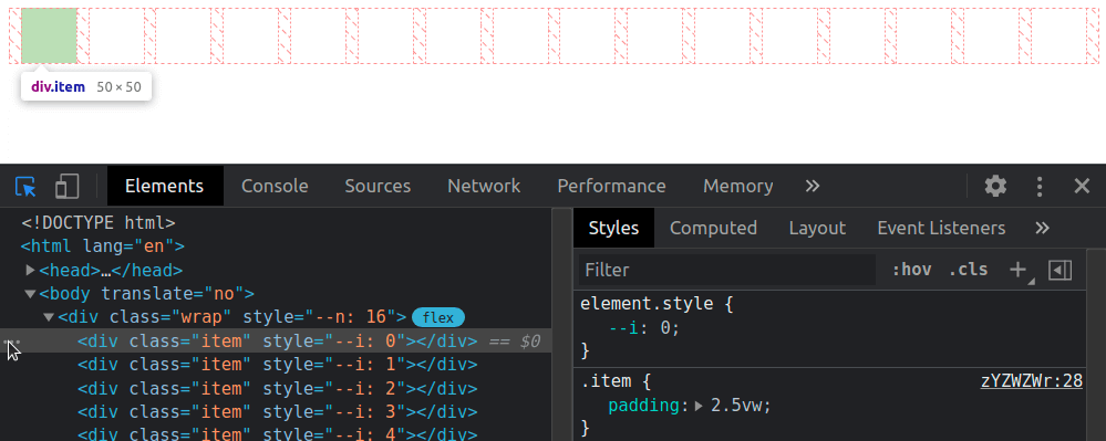
We put --n items within a container, each of these items having an index --i. Both --n and --i are variables we pass to the CSS via style attributes.
- let n = 16;

.wrap(style=`--n: ${n}`)
  - for(let i = 0; i < n; i++)
    .item(style=`--i: ${i}`)
This gives us the following compiled HTML:
<div class='wrap' style='--n: 16'>
  <div class='item' style='--i: 0'></div>
  <div class='item' style='--i: 1'></div>
  <!-- more such items -->
</div>
We set a few styles such that the items are laid out in a row and are square with a non-zero edge length:
Now we add two sets of keyframes to animate a scaling transform and a box-shadow. The first set of keyframes, grow, makes our items scale up from nothing at 0% to full size at 50%, after which they stay at their full size until the end. The second set of keyframes, melt, shows us the items having inset box shadows that cover them fully up to the midway point in the animation (at 50%). That’s also when the items reach full size after growing from nothing. Then the spread radius of these inset shadows shrinks until it gets down to nothing at 100%.
Now comes the interesting part! We compute the middle between the index of the first item and that of the last one. This is the arithmetic mean of the two (since our indices are zero-based, the first and last are 0 and n - 1 respectively):
--m: calc(.5*(var(--n) - 1));
We get the absolute value, --abs, of the difference between this middle, --m, and the item index, --i, then use it to compute the animation-delay:
The absolute value ,--abs, of the difference between the middle, --m, and the item index, --i, can be as small as 0 (for the middle item, if --n is odd) and as big as --m (for the end items). This means dividing it by --m always gives us a value in the [0, 1] interval, which we then multiply with the animation duration $t to ensure every item has a delay between 0s and the animation-duration.
Note that we’ve also set animation-fill-mode to backwards. Since most items will start the animations later, this tells the browser to keep them with the styles in the 0% keyframes until then.
In this particular case, we wouldn’t see any difference without it either because, while the items would be at full size (not scaled to nothing like in the 0% keyframe of the grow animation), they would also have no box-shadow until they start animating. However, in a lot of other cases, it does make a difference and we shouldn’t forget about it.
Another possibility (one that doesn’t involve setting the animation-fill-mode) would be to ensure the animation-delay is always smaller or at most equal to 0 by subtracting a full animation-duration out of it.
Both options are valid, and which one you use depends on what you prefer to happen at the very beginning. I generally tend to go for negative delays because they make more sense when recording the looping animation to make a gif like the one below, which illustrates how the animation-delay values are symmetrical with respect to the middle.
The staggered looping animation.
For a visual comparison between the two options, you can rerun the following demo to see what happens at the very beginning.
A fancier example would be the following:
Navigation links sliding up and then back down with a delay proportional to how far they are from the selected one.
Here, each and every one of the --n navigation links and corresponding recipe articles have an index --idx. Whenever a navigation link is hovered or focused, its --idx value is read and set to the current index, --k, on the body. If none of these items is hovered or focused, --k gets set to a value outside the [0, n) interval (e.g. -1).
The absolute value, --abs, of the difference between --k and a link’s index, --idx, can tell us whether that’s the currently selected (hovered or focused) item. If this absolute value is 0, then our item is the currently selected one (i.e. --not-sel is 0 and --sel is 1). If this absolute value is bigger than 0, then our item is not the currently selected one (i.e. --not-sel is 1 and --sel is 0).
Given both --idx and --k are integers, it results that their difference is also an integer. This means the absolute value, --abs, of this difference is either 0 (when the item is selected), or bigger or equal to 1 (when the item is not selected).
When we put all of this into code, this is what we get:
The --sel and --not-sel properties (which are always integers that always add up to 1) determine the size of the navigation links (the width in the wide screen scenario and the height in the narrow screen scenario), whether they’re greyscaled or not and whether or not their text content is hidden. This is something we won’t get into here, as it is outside the scope of this article and I’ve already explained in a lot of detail in a previous one.
What is relevant here is that, when a navigation link is clicked, it slides out of sight (up in the wide screen case, and left in the narrow screen case), followed by all the others around it, each with a transition-delay that depends on how far they are from the one that was clicked (that is, on the absolute value, --abs, of the difference between their index, --idx, and the index of the currently selected item, --k), revealing the corresponding recipe article. These transition-delay values are symmetrical with respect to the currently selected item.
transition: transform 1s calc(var(--abs)*.05s);
The actual transition and delay are actually a bit more complex because more properties than just the transform get animated and, for transform in particular, there’s an additional delay when going back from the recipe article to the navigation links because we wait for the <article> element to disappear before we let the links slide down. But what were’re interested in is that component of the delay that makes the links is closer to the selected one start sliding out of sight before those further away. And that’s computed as above, using the --abs variable.
You can play with the interactive demo below.
Things get even more interesting in 2D, so let’s now make our row a grid!
We start by changing the structure a bit so that we have 8 columns and 8 rows (which means we have 8·8 = 64 items in total on the grid).
- let n = 8;
- let m = n*n;

style
  - for(let i = 0; i < n; i++)
    | .item:nth-child(#{n}n + #{i + 1}) { --i: #{i} }
    | .item:nth-child(n + #{n*i + 1}) { --j: #{i} }
.wrap(style=`--n: ${n}`)
  - for(let i = 0; i < m; i++)
    .item
The above Pug code compiles to the following HTML:
<style>
  .item:nth-child(8n + 1) { --i: 0 } /* items on 1st column */
  .item:nth-child(n + 1) { --j: 0 } /* items starting from 1st row */
  .item:nth-child(8n + 2) { --i: 1 } /* items on 2nd column */
  .item:nth-child(n + 9) { --j: 1 } /* items starting from 2nd row */
  /* 6 more such pairs */
</style>
<div class='wrap' style='--n: 8'>
  <div class='item'></div>
  <div class='item'></div>
  <!-- 62 more such items -->
</div>
Just like the previous case, we compute a middle index, --m, but since we’ve moved from 1D to 2D, we now have two differences in absolute value to compute, one for each of the two dimensions (one for the columns, --abs-i, and one for the rows, --abs-j).
We use the exact same two sets of @keyframes, but the animation-delay changes a bit, so it depends on both --abs-i and --abs-j. These absolute values can be as small as 0 (for tiles in the dead middle of the columns and rows) and as big as --m (for tiles at the ends of the columns and rows), meaning that the ratio between either of them and --m is always in the [0, 1] interval. This means the sum of these two ratios is always in the [0, 2] interval. If we want to reduce it to the [0, 1] interval, we need to divide it by 2 (or multiply by .5, same thing).
This gives us delays that are in the [0s, $t] interval. We can take the denominator, var(--m), out of the parenthesis to simplify the above formula a bit:
Just like the previous case, this makes grid items start animating later the further they are from the middle of the grid. We should use animation-fill-mode: backwards to ensure they stay in the state specified by the 0% keyframes until the delay time has elapsed and they start animating.
Alternatively, we can subtract one animation duration $t from all delays to make sure all grid items have already started their animation when the page loads.
Let’s now see a few more interesting examples. We won’t be going into details about the “how” behind them as the symmetrical value technique works exactly the same as for the previous ones and the rest is outside the scope of this article. However, there is a link to a CodePen demo in the caption for each of the examples below, and most of these Pens also come with a recording that shows me coding them from scratch.
In the first example, each grid item is made up of two triangles that shrink down to nothing at opposite ends of the diagonal they meet along and then grow back to full size. Since this is an alternating animation, we let the delays to stretch across two iterations (a normal one and a reversed one), which means we don’t divide the sum of ratios in half anymore and we subtract 2 to ensure every item has a negative delay.
In the second example, each grid item has a gradient at an angle that animates from 0deg to 1turn. This is possible via Houdini as explained in this article about the state of animating gradients with CSS.
The third example is very similar, except the animated angle is used by a conic-gradient instead of a linear one and also by the hue of the first stop.
In the fourth example, each grid cell contains seven rainbow dots that oscillate up and down. The oscillation delay has a component that depends on the cell indices in the exact same manner as the previous grids (the only thing that’s different here is the number of columns differs from the number of rows, so we need to compute two middle indices, one along each of the two dimensions) and a component that depends on the dot index, --idx, relative to the number of dots per cell, --n-dots.
In the fifth example, the tiles making up the cube faces shrink and move inwards. The animation-delay for the top face is computed exactly as in our first 2D demo.
The animation-delay isn’t the only property we can set to have symmetrical values. We can also do this with the items’ dimensions. In the seventh example below, the tiles are distributed around half a dozen rings starting from the vertical (y) axis and are scaled using a factor that depends on how far they are from the top point of the rings. This is basically the 1D case with the axis curved on a circle.
The eighth example shows ten arms of baubles that wrap around a big sphere. The size of these baubles depends on how far they are from the poles, the closest ones being the smallest. This is done by computing the middle index, --m, for the dots on an arm and the absolute value, --abs, of the difference between it and the current bauble index, --j, then using the ratio between this absolute value and the middle index to get the sizing factor, --f, which we then use when setting the padding.
Different styles for items before and after a certain (selected or middle) one
Let’s say we have a bunch of radio buttons and labels, with the labels having an index set as a custom property, --i. We want the labels before the selected item to have a green background, the label of the selected item to have a blue background and the rest of the labels to be grey. On the body, we set the index of the currently selected option as another custom property, --k.
- let n = 8;
- let k = Math.round((n - 1)*Math.random());

body(style=`--k: ${k}`)
  - for(let i = 0; i < n; i++)
    - let id = `r${i}`;
    input(type='radio' name='r' id=id checked=i===k)
    label(for=id style=`--i: ${i}`) Option ##{i}
We set a few layout and prettifying styles, including a gradient background on the labels that creates three vertical stripes, each occupying a third of the background-size (which, for now, is just the default 100%, the full element width):
From the JavaScript, we update the value of --k whenever we select a different option:
addEventListener('change', e => {
  let _t = e.target;

  document.body.style.setProperty('--k', +_t.id.replace('r', ''))
})
Now comes the interesting part! For our label elements, we compute the sign, --sgn, of the difference between the label index, --i, and the index of the currently selected option, --k. We then use this --sgn value to compute the background-position when the background-size is set to 300% — that is, three times the label’s width because we may have of three possible backgrounds: one for the case when the label is for an option before the selected one, a second for the case when the label is for the selected option, and a third for the case when the label is for an option after the selected one.
If --i is smaller than --k (the case of a label for an option before the selected one), then --sgn is -1 and the background-position computes to 50%*(1 + -1) = 50%*0 = 0%, meaning we only see the first vertical stripe (the green one).
If --i is equal --k (the case of the label for the selected option), then --sgn is 0 and the background-position computes to 50%*(1 + 0) = 50%*1 = 50%, so we only see the vertical stripe in the middle (the blue one).
If --i is greater than --k (the case of a label for an option after the selected one), then --sgn is 1 and the background-position computes to 50%*(1 + 1) = 50%*2 = 100%, meaning we only see the last vertical stripe (the grey one).
A more aesthetically appealing example would be the following navigation where the vertical bar is on the side closest to the selected option and, for the selected one, it spreads across the entire element.
This uses a structure that’s similar to that of the previous demo, with radio inputs and labels for the navigation items. The moving “background” is actually an ::after pseudo-element whose translation value depends on the sign, --sgn. The text is a ::before pseudo-element whose position is supposed to be in the middle of the white area, so its translation value also depends on --sgn.
Let’s now quickly look at a few more demos where computing the sign (and maybe the absolute value as well) comes in handy.
First up, we have a square grid of cells with a radial-gradient whose radius shrinks from covering the entire cell to nothing. This animation has a delay computed as explained in the previous section. What’s new here is that the coordinates of the radial-gradient circle depend on where the cell is positioned with respect to the middle of the grid — that is, on the signs of the differences between the column --i and row --j indices and the middle index, --m.
Then we have a double spiral of tiny spheres where both the sphere diameter --d and the radial distance --x that contributes to determining the sphere position depend on the absolute value --abs of the difference between each one’s index, --i, and the middle index, --m. The sign, --sgn, of this difference is used to determine the spiral rotation direction. This depends on where each sphere is with respect to the middle – that is, whether its index ,--i, is smaller or bigger than the middle index, --m.
/* relevant styles */
--m: calc(.5*(var(--p) - 1));
--abs: max(calc(var(--m) - var(--i)), calc(var(--i) - var(--m)));
--sgn: clamp(-1, var(--i) - var(--m), 1);
--d: calc(3px + var(--abs)/var(--p)*#{$d}); /* sphere diameter */
--a: calc(var(--k)*1turn/var(--n-dot)); /* angle used to determine sphere position */
--x: calc(var(--abs)*2*#{$d}/var(--n-dot)); /* how far from spiral axis */
--z: calc((var(--i) - var(--m))*2*#{$d}/var(--n-dot)); /* position with respect to screen plane */
width: var(--d); height: var(--d);
transform:
  /* change rotation direction by changing x axis direction */
  scalex(var(--sgn))
  rotate(var(--a))
  translate3d(var(--x), 0, var(--z))
  /* reverse rotation so the sphere is always seen from the front */
  rotate(calc(-1*var(--a)));
  /* reverse scaling so lighting on sphere looks consistent */
  scalex(var(--sgn))
Finally, we have a grid of non-square boxes with a border. These boxes have a mask created using a conic-gradient with an animated start angle, --ang. Whether these boxes are flipped horizontally or vertically depends on where they are with respect to the middle – that is, on the signs of the differences between the column --i and row --j indices and the middle index, --m. The animation-delay depends on the absolute values of these differences and is computed as explained in the previous section. We also have a gooey filter for a nicer “wormy” look, but we won’t be going into that here.
Let’s say we have an element for which we store a number of seconds in a custom property, --val, and we want to display this in a mm:ss format, for example.
We use the floor of the ratio between --val and 60 (the number of seconds in a minute) to get the number of minutes and modulo for the number of seconds past that number of minutes. Then we use a clever little counter trick to display the formatted time in a pseudo-element.
@property --min {
  syntax: '<integer>';
  initial-value: 0;
  inherits: false;
}

code {
  --min: calc(var(--val)/60 - .5);
  --sec: calc(var(--val) - var(--min)*60);
  counter-reset: min var(--min) sec var(--sec);

  &::after {
    /* so we get the time formatted as 02:09 */
    content:
      counter(min, decimal-leading-zero) ':'
      counter(sec, decimal-leading-zero);
  }
}
This works in most situations, but we encounter a problem when --val is exactly 0. In this case, 0/60 is 0 and then subtracting .5, we get -.5, which gets rounded to what’s the bigger adjacent integer in absolute value. That is, -1, not 0! This means our result will end up being -01:60, not 00:00!
Fortunately, we have a simple fix and that’s to slightly alter the formula for getting the number of minutes, --min:
--min: max(0, var(--val)/60 - .5);
There are other formatting options too, as illustrated below:
/* shows time formatted as 2:09 */
content: counter(min) ':' counter(sec, decimal-leading-zero);

/* shows time formatted as 2m9s */
content: counter(min) 'm' counter(sec) 's';
We can also apply the same technique to format the time as hh:mm:ss (live test).
Time isn’t the only thing we can use this for. Counter values have to be integer values, which means the modulo trick also comes in handy for displaying decimals, as in the second slider seen below.
Styled range inputs, one of which has a decimal output (live demo)
A couple more such examples:
Styled range inputs, one of which has a decimal output (live demo)Styled range inputs, one of which has a decimal output (live demo)
Even more use cases
Let’s say we have a volume slider with an icon at each end. Depending on the direction we move the slider’s thumb in, one of the two icons gets highlighted. This is possible by getting the absolute value, --abs, of the difference between each icon’s sign, --sgn-ico (-1 for the one before the slider, and 1 for the one after the slider), and the sign of the difference, --sgn-dir, between the slider’s current value, --val, and its previous value, --prv. If this is 0, then we’re moving in the direction of the current icon so we set its opacity to 1. Otherwise, we’re moving away from the current icon, so we keep its opacity at .15.
This means that, whenever the range input’s value changes, not only do we need to update its current value, --val, on its parent, but we need to update its previous value, which is another custom property, --prv, on the same parent wrapper:
addEventListener('input', e => {
  let _t = e.target, _p = _t.parentNode;

  _p.style.setProperty('--prv', +_p.style.getPropertyValue('--val'))
  _p.style.setProperty('--val', +_t.value)
})
The sign of their difference is the sign of the direction, --sgn-dir, we’re going in and the current icon is highlighted if its sign, --sgn-ico, and the sign of the direction we’re going in, --sgn-dir, coincide. That is, if the absolute value, --abs, of their difference is 0 and, at the same time, the parent wrapper is selected (it’s either being hovered or the range input in it has focus).
Another use case is making property values of items on a grid depend on the parity of the sum of horizontal --abs-i and vertical --abs-j distances from the middle, --m. For example, let’s say we do this for the background-color:
A more interesting variation of the previous demo (live demo)
We could also make both the direction of a rotation and that of a conic-gradient() depend on the same parity of the sum, --sum, of horizontal --abs-i and vertical --abs-j distances from the middle, --m. This is achieved by horizontally flipping the element if the sum, --sum, is even. In the example below, the rotation and size are also animated via Houdini (they both depend on a custom property, --f, which we register and then animate from 0 to 1), and so are the worm hue, --hue, and the conic-gradient() mask, both animations having a delay computed exactly as in previous examples.
Finally, another big use case for the techniques explained so far is shading not just convex, but also concave animated 3D shapes using absolutely no JavaScript! This is one topic that’s absolutely massive on its own and explaining everything would take an article as long as this one, so I won’t be going into it at all here. But I have made a few videos where I code a couple of such basic pure CSS 3D shapes (including a wooden star and a differently shaped metallic one) from scratch and you can, of course, also check out the CSS for the following example on CodePen.