Fluid typography is the idea that font-size (and perhaps other attributes of type, like line-height) change depending on the screen size (or perhaps container queries if we had them).
The core trickery comes from viewport units. You can literally set type in viewport units (e.g. font-size: 4vw), but the fluctuations in size are so extreme that it's usually undesirable. That's tampered by doing something like font-size: calc(16px + 1vw). But while we're getting fancy with calculations anyway, the most common implementation ended up being an equation to calculate plain English:
I want the type to go between being 16px on a 320px screen to 22px on a 1000px screen.
html {
  font-size: 16px;
}
@media screen and (min-width: 320px) {
  html {
    font-size: calc(16px + 6 * ((100vw - 320px) / 680));
  }
}
@media screen and (min-width: 1000px) {
  html {
    font-size: 22px;
  }
}
That's essentially setting a minimum and maximum font size so the type won't shrink or grow to anything too extreme. "CSS locks" was a term coined by Tim Brown.
Minimum and maximum you say?! Well it so happens that functions for these have made their way into the CSS spec in the form of min() and max().
So we can simplify our fancy setup above with a one-liner and maintain the locks:
html {
  font-size: min(max(16px, 4vw), 22px);
}
We actually might want to stop there because even though both Safari (11.1+) and Chrome (79+) support this at the current moment, that's as wide as support will get today. Speaking of which, you'd probably want to slip a font-size declaration before this to set an acceptable fallback value with no fancy functions.
But as long as we're pushing the limits, there is another function to simplify things even more: clamp()! Clamp takes three values, a min, max, and a flexible unit (or calculation or whatever) in the middle that it will use in case the value is between the min and max. So, our one-liner gets even smaller:
body {
  font-size: clamp(16px, 4vw, 22px);
}
That'll be Chrome 79+ (which doesn't hasn't even dropped to stable but will very soon).
Uncle Dave is very happy that FitText is now a few bytes instead of all-of-jQuery plus 40 more lines. Here is us chucking CSS custom properties at it:
As you begin to make use of React hooks in your applications, you’ll want to be certain the code you write is nothing short of solid. There’s nothing like shipping buggy code. One way to be certain your code is bug-free is to write tests. And testing React hooks is not much different from how React applications are tested in general.
In this tutorial, we will look at how to do that by making use of a to-do application built with hooks. We’ll cover writing of tests using Ezyme and React Testing Library, both of which are able to do just that. If you’re new to Enzyme, we actually posted about it a little while back showing how it can be used with Jest in React applications. It’s not a bad idea to check that as we dig into testing React hooks.
Here’s what we want to test
A pretty standard to-do component looks something like this:
We need to install the packages before we can start testing. Time to fire up the terminal!
npm install --save-dev enzyme enzyme-adapter-16
Inside the src directory, create a file called setupTests.js. This is what we’ll use to configure Enzyme’s adapter.
import Enzyme from "enzyme";
import Adapter from "enzyme-adapter-react-16";
Enzyme.configure({ adapter: new Adapter() });
Now we can start writing our tests! We want to test four things:
That the component renders
That the initial to-dos get displayed when it renders
That we can create a new to-do and get back three others
That we can delete one of the initial to-dos and have only one to-do left
In your src directory, create a folder called __tests__ and create the file where you’ll write your Todo component’s tests in it. Let’s call that file Todo.test.js.
With that done, we can import the packages we need and create a describe block where we’ll fill in our tests.
import React from "react";
import { shallow, mount } from "enzyme";
import Todo from "../Todo";

describe("Todo", () => {
  // Tests will go here using `it` blocks
});
Test 1: The component renders
For this, we’ll make use of shallow render. Shallow rendering allows us to check if the render method of the component gets called — that’s what we want to confirm here because that’s the proof we need that the component renders.
it("renders", () => {
  shallow(<Todo />);
});
Test 2: Initial to-dos get displayed
Here is where we’ll make use of the mount method, which allows us to go deeper than what shallow gives us. That way, we can check the length of the to-do items.
We mount the component then we make use of find() and instance() methods to set the value of the input field. We assert that the value of the input field is set to “Fix failing test” before going further to simulate a click event, which should add the new item to the to-do list.
We finally assert that we have three items on the list and that the third item is equal to the one we created.
Test 4: We can delete one of the initial to-dos and have only one to-do left
it("removes an item", () => {
  const wrapper = mount(<Todo />);
  wrapper
    .find("li button")
    .first()
    .simulate("click");
  expect(wrapper.find("li")).toHaveLength(1);
  expect(wrapper.find("li span").map(item => item.text())).toEqual([
    "Take out the trash"
  ]);
});
In this scenario, we return the to-do with a simulated click event on the first item. It’s expected that this will call the removeTodo() method, which should delete the item that was clicked. Then we’re checking the numbers of items we have, and the value of the one that gets returned.
The source code for these four tests are here on GitHub for you to check out.
import React from "react";
import { render, fireEvent } from "@testing-library/react";
import Todo from "../Todo";
import "@testing-library/jest-dom/extend-expect";

test("Todo", () => {
  // Tests go here
}
Test 1: The initial to-do renders
We’ll write our tests in a test block. The first test will look like this:
What’s happening here? We’re making use of getTestId to return the node of the element where data-testid matches the one that was passed to the method. That’s the <ul> element in this case. Then, we’re checking that it has a total of two children (each child being a <li> element inside the unordered list). This will pass as the initial to-do is equal to two.
Test 2: We can add a new to-do
We’re also making use of getTestById here to return the node that matches the argument we’re passing in.
We use getByTestId to return the input field and the ul element like we did before. To simulate a click event that adds a new to-do item, we’re using fireEvent.click() and passing in the getByText() method, which returns the node whose text matches the argument we passed. From there, we can then check to see the length of the to-dos by checking the length of the children array.
Test 3: We can delete a to-do
This will look a little like what we did a little earlier:
it("deletes a to-do", () => {
  const { getAllByTestId, getByTestId } = render(<Todo />);
  const todos = getByTestId("todos");
  const deleteButton = getAllByTestId("delete-button");
  const first = deleteButton[0];
  fireEvent.click(first);
  expect(todos.children.length).toBe(1);
});
We’re making use of getAllByTestId to return the nodes of the delete button. Since we only want to delete one item, we fire a click event on the first item in the collection, which should delete the first to-do. This should then make the length of todos children equal to one.
There are two lint rules to abide by when working with hooks:
Rule 1: Call hooks at the top level
...as opposed to inside conditionals, loops or nested functions.
// Don't do this!
if (Math.random() > 0.5) {
  const [invalid, updateInvalid] = useState(false);
}
This goes against the first rule. According to the official documentation, React depends on the order in which hooks are called to associate state and the corresponding useState call. This code breaks the order as the hook will only be called if the conditions are true.
Rule 2: Call hooks from React functional components
Hooks are meant to be used in React functional components — not in React’s class component or a JavaScript function.
We’ve basically covered what not to do when it comes to linting. We can avoid these missteps with an npm package that specifically enforces these rules.
npm install eslint-plugin-react-hooks --save-dev
Here’s what we add to the package’s configuration file to make it do its thing:
If you are making use of Create React App, then you should know that the package supports the lint plugin out of the box as of v3.0.0.
Go forth and write solid React code!
React hooks are equally prone to error as anything else in your application and you’re gonna want to ensure that you use them well. As we just saw, there’s a couple of ways we can go about it. Whether you use Enzyme or You can either make use of enzyme or React Testing Library to write tests is totally up to you. Either way, try making use of linting as you go, and no doubt, you’ll be glad you did.
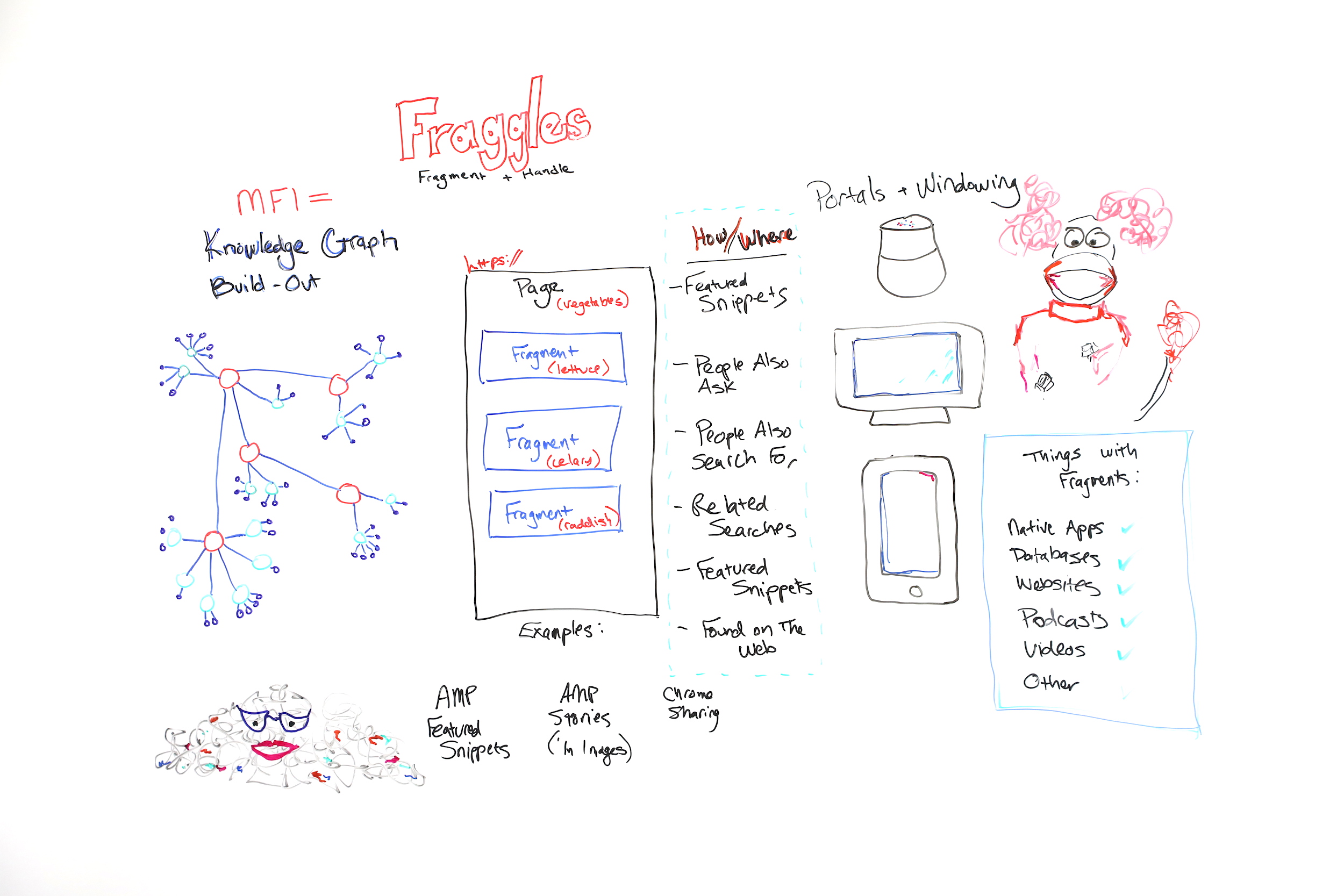
What are "fraggles" in SEO and how do they relate to mobile-first indexing, entities, the Knowledge Graph, and your day-to-day work? In this glimpse into her 2019 MozCon talk, Cindy Krum explains everything you need to understand about fraggles in this edition of Whiteboard Friday.
Click on the whiteboard image above to open a high resolution version in a new tab!
Video Transcription
Hi, Moz fans. My name is Cindy Krum, and I'm the CEO of MobileMoxie, based in Denver, Colorado. We do mobile SEO and ASO consulting. I'm here in Seattle, speaking at MozCon, but also recording this Whiteboard Friday for you today, and we are talking about fraggles.
So fraggles are obviously a name that I'm borrowing from Jim Henson, who created "Fraggle Rock." But it's a combination of words. It's a combination of fragment andhandle. I talk about fraggles as a new way or a new element or thing that Google is indexing.
Fraggles and mobile-first indexing
Let's start with the idea of mobile-first indexing, because you have to kind of understand that before you can go on to understand fraggles. So I believe mobile-first indexing is about a little bit more than what Google says. Google says that mobile-first indexing was just a change of the crawler.
They had a desktop crawler that was primarily crawling and indexing, and now they have a mobile crawler that's doing the heavy lifting for crawling and indexing. While I think that's true, I think there's more going on behind the scenes that they're not talking about, and we've seen a lot of evidence of this. So what I believe is that mobile-first indexing was also about indexing, hence the name.
Knowledge Graph and entities
So I think that Google has reorganized their index around entities or around specifically entities in the Knowledge Graph. So this is kind of my rough diagram of a very simplified Knowledge Graph. But Knowledge Graph is all about person, place, thing, or idea.
Nouns are entities. Knowledge Graph has nodes for all of the major person, place, thing, or idea entities out there. But it also indexes or it also organizes the relationships of this idea to this idea or this thing to this thing. What's useful for that to Google is that these things, these concepts, these relationships stay true in all languages, and that's how entities work, because entities happen before keywords.
This can be a hard concept for SEOs to wrap their brain around because we're so used to dealing with keywords. But if you think about an entity as something that's described by a keyword and can be language agnostic, that's how Google thinks about entities, because entities in the Knowledge Graph are not written up per se or their the unique identifier isn't a word, it's a number and numbers are language agnostic.
But if we think about an entity like mother, mother is a concept that exists in all languages, but we have different words to describe it. But regardless of what language you're speaking, mother is related to father, is related to daughter, is related to grandfather, all in the same ways, even if we're speaking different languages. So if Google can use what they call the "topic layer"and entities as a way to filter in information and understand the world, then they can do it in languages where they're strong and say, "We know that this is true absolutely 100% all of the time."
Then they can apply that understanding to languages that they have a harder time indexing or understanding, they're just not as strong or the algorithm isn't built to understand things like complexities of language, like German where they make really long words or other languages where they have lots of short words to mean different things or to modify different words.
Languages all work differently. But if they can use their translation API and their natural language APIs to build out the Knowledge Graph in places where they're strong, then they can use it with machine learning to also build it and do a better job of answering questions in places or languages where they're weak. So when you understand that, then it's easy to think about mobile-first indexing as a massive Knowledge Graph build-out.
We've seen this happening statistically. There are more Knowledge Graph results and more other things that seem to be related to Knowledge Graph results, like people also ask, people also search for, related searches. Those are all describing different elements or different nodes on the Knowledge Graph. So when you see those things in the search, I want you to think, hey, this is the Knowledge Graph showing me how this topic is related to other topics.
So when Google launched mobile-first indexing, I think this is the reason it took two and a half years is because they were reindexing the entire web and organizing it around the Knowledge Graph. If you think back to the AMA that John Mueller did right about the time that Knowledge Graph was launching, he answered a lot of questions that were about JavaScript and href lang.
When you put this in that context, it makes more sense. He wants the entity understanding, or he knows that the entity understanding is really important, so the href lang is also really important. So that's enough of that. Now let's talk about fraggles.
Fraggles = fragment + handle
So fraggles, as I said, are a fragment plus a handle. It's important to know that fraggles — let me go over here —fraggles and fragments, there are lots of things out there that have fragments. So you can think of native apps, databases, websites, podcasts, and videos. Those can all be fragmented.
Even though they don't have a URL, they might be useful content, because Google says its goal is to organize the world's information, not to organize the world's websites. I think that, historically, Google has kind of been locked into this crawling and indexing of websites and that that's bothered it, that it wants to be able to show other stuff, but it couldn't do that because they all needed URLs.
But with fragments, potentially they don't have to have a URL. So keep these things in mind — apps, databases and stuff like that — and then look at this.
So this is a traditional page. If you think about a page, Google has kind of been forced, historically by their infrastructure, to surface pages and to rank pages. But pages sometimes struggle to rank if they have too many topics on them.
So for instance, what I've shown you here is a page about vegetables. This page may be the best page about vegetables, and it may have the best information about lettuce, celery, and radishes. But because it's got those topics and maybe more topics on it, they all kind of dilute each other, and this great page may struggle to rank because it's not focused on the one topic, on one thing at a time.
Google wants to rank the best things. But historically they've kind of pushed us to put the best things on one page at a time and to break them out. So what that's created is this "content is king, I need more content, build more pages" mentality in SEO. The problem is everyone can be building more and more pages for every keyword that they want to rank for or every keyword group that they want to rank for, but only one is going to rank number one.
Google still has to crawl all of those pages that it told us to build, and that creates this character over here, I think, Marjory the Trash Heap, which if you remember the Fraggles, Marjory the Trash Heap was the all-knowing oracle. But when we're all creating kind of low- to mid-quality content just to have a separate page for every topic, then that makes Google's life harder, and that of course makes our life harder.
So why are we doing all of this work? The answer is because Google can only index pages, and if the page is too long or too many topics, Google gets confused. So we've been enabling Google to do this. But let's pretend, go with me on this, because this is a theory, I can't prove it. But if Google didn't have to index a full page or wasn't locked into that and could just index a piece of a page, then that makes it easier for Google to understand the relationships of different topics to one page, but also to organize the bits of the page to different pieces of the Knowledge Graph.
So this page about vegetables could be indexed and organized under the vegetable node of the Knowledge Graph. But that doesn't mean that the lettuce part of the page couldn't be indexed separately under the lettuce portion of the Knowledge Graph and so on, celery to celery and radish to radish. Now I know this is novel, and it's hard to think about if you've been doing SEO for a long time.
But let's think about why Google would want to do this. Google has been moving towards all of these new kinds of search experiences where we have voice search, we have the Google Home Hub kind of situation with a screen, or we have mobile searches. If you think about what Google has been doing, we've seen the increase in people also ask, and we've seen the increase in featured snippets.
They've actually been kind of, sort of making fragments for a long time or indexing fragments and showing them in featured snippets. The difference between that and fraggles is that when you click through on a fraggle, when it ranks in a search result, Google scrolls to that portion of the page automatically. That's the handle portion.
So handles you may have heard of before. They're kind of old-school web building. We call them bookmarks, anchor links, anchor jump links, stuff like that. It's when it automatically scrolls to the right portion of the page. But what we've seen with fraggles is Google is lifting bits of text, and when you click on it, they're scrolling directly to that piece of text on a page.
So we see this already happening in some results. What's interesting is Google is overlaying the link. You don't have to program the jump link in there. Google actually finds it and puts it there for you. So Google is already doing this, especially with AMP featured snippets. If you have a AMP featured snippet, so a featured snippet that's lifted from an AMP page, when you click through, Google is actually scrolling and highlighting the featured snippet so that you could read it in context on the page.
But it's also happening in other kind of more nuanced situations, especially with forums and conversations where they can pick a best answer. The difference between a fraggle and something like a jump link is that Google is overlaying the scrolling portion. The difference between a fraggle and a site link is site links link to other pages, and fraggles, they're linking to multiple pieces of the same long page.
So we want to avoid continuing to build up low-quality or mid-quality pages that might go to Marjory the Trash Heap. We want to start thinking in terms of can Google find and identify the right portion of the page about a specific topic, and are these topics related enough that they'll be understood when indexing them towards the Knowledge Graph.
Knowledge Graph build-out into different areas
So I personally think that we're seeing the build-out of the Knowledge Graph in a lot of different things. I think featured snippets are kind of facts or ideas that are looking for a home or validation in the Knowledge Graph. People also ask seem to be the related nodes. People also search for, same thing. Related searches, same thing. Featured snippets, oh, they're on there twice, two featured snippets. Found on the web, which is another way where Google is putting expanders by topic and then giving you a carousel of featured snippets to click through on.
So we're seeing all of those things, and some SEOs are getting kind of upset that Google is lifting so much content and putting it in the search results and that you're not getting the click. We know that 61% of mobile searches don't get a click anymore, and it's because people are finding the information that they want directly in a SERP.
That's tough for SEOs, but great for Google because it means Google is providing exactly what the user wants. So they're probably going to continue to do this. I think that SEOs are going to change their minds and they're going to want to be in those windowed content, in the lifted content, because when Google starts doing this kind of thing for the native apps, databases, and other content, websites, podcasts, stuff like that, then those are new competitors that you didn't have to deal with when it was only websites ranking, but those are going to be more engaging kinds of content that Google will be showing or lifting and showing in a SERP even if they don't have to have URLs, because Google can just window them and show them.
So you'd rather be lifted than not shown at all. So that's it for me and featured snippets. I'd love to answer your questions in the comments, and thanks very much. I hope you like the theory about fraggles.
Sign up for The Moz Top 10, a semimonthly mailer updating you on the top ten hottest pieces of SEO news, tips, and rad links uncovered by the Moz team. Think of it as your exclusive digest of stuff you don't have time to hunt down but want to read!
from The Moz Blog https://ift.tt/37QC9Ld
via IFTTT
Web scraping has always been taken care of by actual developers, since a lot of coding, proxy management and CAPTCHA-solving is involved. However, the scraped data is very often needed by people that are non-coders: Marketers, Analysts, Business Developers etc.
Zenscrape is an easy-to-use web scraping tool that allows people to scrape websites without having to code.
Let’s run through a quick example together:
Select the data you need
The setup wizard guides you through the process of setting up your data extractor. It allows you to select the information you want to scrape visually. Click on the desired piece of content and specify what type of element you have. Depending on the package you have bought (they also offer a free plan), you can select up to 30 data elements per page.
The scraper is also capable of handling element lists.
Schedule your extractor
Perhaps, you want to scrape the selected data at a specific time interval. Depending on your plan, you can choose any time span between one minute to one hour. Also, decide what is supposed to happen with the scraped data after it has been gathered.
Use your data
In this example, we have chosen the .csv-export method and have selected a 10 minute scraping interval. Our first set of data should be ready by now. Let’s take a look:
Success! Our data is ready for us to be downloaded. We can now access all individual data sets or download all previously gathered data at once, in one file.
Need more flexibility?
Zenscrape also offers a web scraping API that returns the HTML markup of any website. This is especially useful for complicated scraping projects, that require the scraped content to be integrated into a software application for further processing.
Just like the web scraping suite, the API does not forward failed requests and takes care of proxy management, Capotcha-solving and all other maintenance tasks that are usually involved with DIY web scrapers.
Since the API returns the full HTML markup of the related website, you have full flexibility in terms of data selection and further processing.
You’re probably already at least a little familiar with CSS variables. If not, here’s a two-second overview: they are really called custom properties, you set them in declaration blocks like --size: 1em and use them as values like font-size: var(--size);, they differ from preprocessor variables (e.g. they cascade), and here’s a guide with way more information.
But are we using them to their full potential? Do we fall into old habits and overlook opportunities where variables could significantly reduce the amount of code we write?
This article was prompted by a recent tweet I made about using CSS variables to create dynamic animation behavior.
That’s an awful lot of code for something not particularly complex. We haven’t added many styles and we’ve added a lot of rules to cater to the button’s different states and colors. We could significantly reduce the code with a scoped variable.
In our example, the only differing value between the two button variants is the hue. Let’s refactor that code a little then. We won’t change the markup but cleaning up the styles a little, we get this:
This not only reduces the code but makes maintenance so much easier. Change the core button styles in one place and it will update all the variants! 🙌
I’d likely leave it there to make it easier for devs wanting to use those buttons. But, we could take it further. We could inline the variable on the actual element and remove the class declarations completely. 😲
Inlining those variables might not be best for your next design system or app but it does open up opportunities. Like, for example, if we had a button instance where we needed to override the color.
You may be writing straightforward HTML, but in many cases, you may be using a framework, like React or a preprocessor like Pug, to write your markup. These solutions allow you to leverage JavaScript to create random inline variables. For the following examples, I’ll be using Pug. Pug is an indentation-based HTML templating engine. If you aren’t familiar with Pug, do not fear! I’ll try to keep the markup simple.
Let’s start by randomizing the hue for our buttons:
button.button(style=`--hue: ${Math.random() * 360}`) First
With Pug, we can use ES6 template literals to inline randomized CSS variables. 💪
So, now that we have the opportunity to define random characteristics for an element, what else could we do? Well, one overlooked opportunity is animation. True, we can’t animate the variable itself, like this:
@keyframes grow {
  from { --scale: 1; }
  to   { --scale: 2; }
}
But we can create dynamic animations based on scoped variables. We can change the behavior of animation on the fly! 🤩
Example 1: The excited button
Let’s create a button that floats along minding its own business and then gets excited when we hover over it.
Start with the markup:
button.button(style=`--hue: ${Math.random() * 360}`) Show me attention
But, we need to introduce another keyframes definition. What if we could merge the two animations into one? They aren’t too far off from each other in terms of structure.
Although this works, we end up with an animation that isn’t quite as smooth because of the translation steps. So what else could we do? Let’s find a compromise by removing the steps at 25% and 75%.
Nice! Now our button has two different types of animations but defined via one set of keyframes. 🤯
Let’s have a little more fun with it. If we take it a little further, we can make the button a little more playful and maybe stop animating altogether when it’s active. 😅
Now that we’ve gone through some different techniques for things we can do with the power of scope, let’s put it all together. We are going to create a randomly generated bubble scene that heavily leverages scoped CSS variables.
Let’s start by creating a bubble. A static bubble.
We are using background with multiple values and a border to make the bubble effect — but it’s not very dynamic. We know the border-radius will always be the same. And we know the structure of the border and background will not change. But the values used within those properties and the other property values could all be random.
Let’s add some more bubbles and leverage the inline scope to position them as well as size them. Since we are going to start randomizing more than one value, it’s handy to have a function to generate a random number in range for our markup.
- const randomInRange = (max, min) => Math.floor(Math.random() * (max - min + 1)) + min
With Pug, we can utilize iteration to create a large set of bubbles:
- const baseHue = randomInRange(0, 360)
- const bubbleCount = 50
- let b = 0
while b < bubbleCount
  - const size = randomInRange(10, 50)
  - const x = randomInRange(0, 100)
  .bubble(style=`--x: ${x}; --size: ${size}; --hue: ${baseHue}`)
  - b++
Updating our .bubble styling allows us to make use of the new inline variables.
That’s pretty boring. They all do the same thing at the same time. So let’s randomize the speed, delay, end scale and distance each bubble is going to travel.
I know. You hate parallax. You know what we should hate more? When things that used to work on the web stop working without any clear warning or idea why.
Way back in 2014, Keith Clark blogged an exceptionally clever CSS trick where you essentially use a CSS transform to scale an element down affecting how it appears to scroll, then "depth correcting" it back to "normal" size. Looks like we got five years of fun out of that, but it's stopped working in iOS 13.
Here's a video of official simulators and the problem:
In link building, few things are more frustrating than finding the perfect link opportunity but being completely unable to find a contact email address.
It’s probably happened to you — if you’re trying to build links or do any sort of outreach, it almost always entails sending out a fairly significant amount of emails. There are plenty of good articles out there about building relationships within the context of link building, but it’s hard to build relationships when you can’t even find a contact email address.
So, for today, I want to focus on how you can become better at finding those important email addresses.
Link builders spend a lot of time just trying to find contact info, and it’s often a frustrating process, just because sussing out email addresses can indeed be quite difficult. The site you’re targeting might not even have a contact page in the first place. Or, if the site does have a contact page, it might only display a generic email address. And, sometimes, the site may list too many email addresses. There are eight different people with similar-sounding job titles — should you reach out to the PR person, the marketing director, or the webmaster? It’s not clear.
Whatever the case may be, finding the right email address is absolutely imperative to any successful outreach campaign. In our industry, the numbers around outreach and replies aren’t great. Frankly, it’s shocking to hear the industry standard — only 8.5% of outreach emails receive a response.
I can’t help but wonder how many mistakes are made along the way to such a low response rate.
While there are certainly instances where there is simply no clear and obvious contact method, that should be the exception — not the rule! An experienced link builder understands that finding relevant contact information is essential to their success.
That’s why I’ve put together a quick list of tips and tools that will help you to find the email addresses and contact information you need when you’re building links.
And, if you follow my advice, here is a glimpse of the results you could expect:
We don’t track clicks, in case you were wondering ;)
ALWAYS start by looking around!
First, let’s start with my golden rule: Before you fire up any tool, you should always manually look for the correct contact email yourself.
Based on my experience, tools and automation are a last resort. If you rely solely upon tools and automated solutions, you’ll end up with many more misfired emails than if you were to go the manual route. There’s a simple reason for this: the email address listed on your target website may, surprisingly, belong to the right person you should contact!
Now, if you are using a tool, they may generate dozens of email addresses, and you’ll never end up actually emailing the correct individual. Another reason I advocate manually looking for emails is because many email finding tools are limited and can only find email addresses that are associated with a domain name. So, if there is a webmaster that happens to have a @gmail.com email address, the email finding tool will not find it.
It’s also important to only reach out to people you strongly believe will have an interest in your email in order to stay GDPR compliant.
So, always start your manual search by looking around the site. Usually, there will be a link to the contact page in the header, footer, or sidebar. If there’s not a page explicitly named “contact,” or if the contact page only has generic email addresses, that’s when I would recommend jumping to an “About Us” page, should there be one.
You always want to find a personal email, not a generic one or a contact form. Outreach is more effective when you can address a specific individual, not whoever who is checking info@domain.com that day.
If you encounter too many emails and aren’t sure who the best person to contact is, I suggest sending an email to your best hunch that goes something like this:
And who knows, you may even get a reply like this:
If you weren’t able to locate an email address at this point, I’d move on to the next section.
Ask search engines for help
Perhaps the contact page you were looking for was well-hidden; maybe they don’t want to be contacted that much or they're in desperate need of a new UX person.
You can turn to search engines for help.
My go-to search engine lately is Startpage. Dubbed as the world's most private search engine, they display Google SERPs in a way that doesn’t make you feel like you just stepped into Times Square. They also have a cool option to browse the search results anonymously with "Anonymous View."
For our purposes, I would use the site: search operator just like this:
If there is in fact a contact page or email somewhere on their website that you were not able to find, any competent search engine will find it for you. If the above site query doesn't return any results, then I’d start expanding my search to other corners of the web.
Use the search bar and type:
If you’re looking for the email of a specific person, type their name before or after the quotation marks.
With this query you can find non-domain email addresses:
If that person’s email address is publicly available somewhere, you will likely be able to find it within the search results.
Email-finding tools
There are many, many excellent email finding tools to choose from. The first one I want to talk about is Hunter.
Hunter has a Chrome extension that’s really easy to use. After you’ve downloaded the extension, there’s not much more that needs to be done.
Go to the site which you are thinking about sending an email to, click on the extension in the top right corner of your screen, and Hunter, well, hunts.
It returns every email address it can find associated with that domain. And also allows you to filter the results based on categories.
Did I say “email address?” I meant to say email address, name, job title, etc. Essentially, it’s a one-click fix to get everything you need to send outreach.
Because I use Hunter regularly (and for good reason, as you can see), it’s the one I’m most familiar with. You can also use Hunter’s online app to look up emails in bulk.
The major downside of working in bulk is coming up with an effective formula to sift through all the emails. Hunter may generate dozens of emails for one site, leaving you to essentially guess which email address is best for outreach. And if you’re relying on guess-work, chances are pretty high you’re leaving perfectly good prospects on the table.
There are several other email finding tools to pick from and I would be remiss to not mention them. Here are 5 alternative email-finding tools:
Even though I personally try not to be too dependent on tools, the fact of the matter is that they provide the easiest, most convenient route in many cases.
The guessing game
I know there's no word in the digital marketing world that produces more shudders than “guessing.” However, there are times when guessing is easier.
Let’s be real: there aren’t too many different ways that companies both large and small format their email addresses. It’s usually going to be something like:
If you’ve ever worked for a living, you know most of the variations. But, in case you need some help, there’s a tool for that.
Now, I’m not suggesting that you just pick any one of these random addresses, send your email, cross your fingers, and hope for the best. Far from it. There are actually tools that you can use that will indicate when you’ve selected the right one.
Sales Navigator is such a tool. Sales Navigator is a Gmail extension that is easy to use. Simply enter the name of the person you’re looking for, and it will return all of the possible standard variations that they may use for their email address. Then, you can actually test the address from your Gmail account. When you type in the address into the proper line, a sidebar will appear on your screen. If there no is no information in that sidebar, you have the wrong address. If, however, you get a return that looks like this:
Congratulations! You’ve found the right email address.
Obviously, this method only works if you know the name of the person you want to email, but just don’t have their email address. Still, in those scenarios, Sales Navigator works like a charm.
Trust, but verify
There’s nothing more annoying than when you think you’ve finally struck gold, but the gold turned out to be pyrite. Getting an email that bounces back because it wasn’t the correct address is frustrating. And even worse, if it happens too often, your email can end up on email blacklists and destroy your email deliverability.
There are ways to verify, however. At my company, we use Neverbounce. It’s effective and incredibly easy to use. With Neverbounce, you can enter in either individual email addresses or bulk lists, and voila!
It will let you know if that email address is currently Valid, Invalid, or Unknown. It’s that easy. Here are some other email verifiers:
Here’s one final out-of-the-box approach. This approach works more often with sites where one person clearly does most, if not all, of the work. A site where someone’s name is the domain name, for example.
If you come across a site like davidfarkas.com and you see a newsletter that can be subscribed to, hit that subscribe button. Once that’s done, you can simply reply to one iteration of the newsletter.
This method has an added benefit. An effective way of building links is building relationships, just like I said in the opening. When you can demonstrate that you're already subscribing to a webmaster’s newsletter, you'll be currying favor with that webmaster.
Conclusion
When you send a link building outreach email, you want to make sure it’s going to a real person and, even more importantly, ending up in the right hands. Sending an email to an incorrect contact periodically may seem like a negligible waste of time, but when you send emails at the volume a link builder should, the waste adds up very quickly. In fact, enough waste can kill everything else that you’re trying to accomplish.
It’s well worth your time to make sure you’re getting it right by putting in the effort to finding the right email address. Be a picky link builder. Don’t just choose the first email that comes your way and never rely solely on tools. If you email the wrong person, it will look to them like that you didn’t care enough to spend time on their site, and in return, they will ignore you and your pitch.
With the tips outlined above, you'll avoid these issues and be on your way to more successful outreach.
Sign up for The Moz Top 10, a semimonthly mailer updating you on the top ten hottest pieces of SEO news, tips, and rad links uncovered by the Moz team. Think of it as your exclusive digest of stuff you don't have time to hunt down but want to read!
from The Moz Blog https://ift.tt/2DnE0sQ
via IFTTT
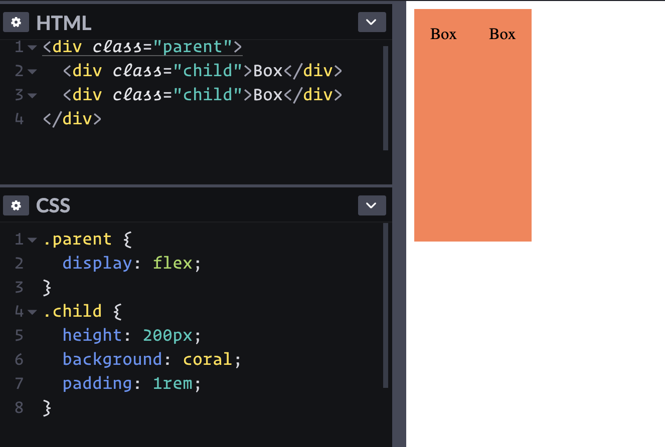
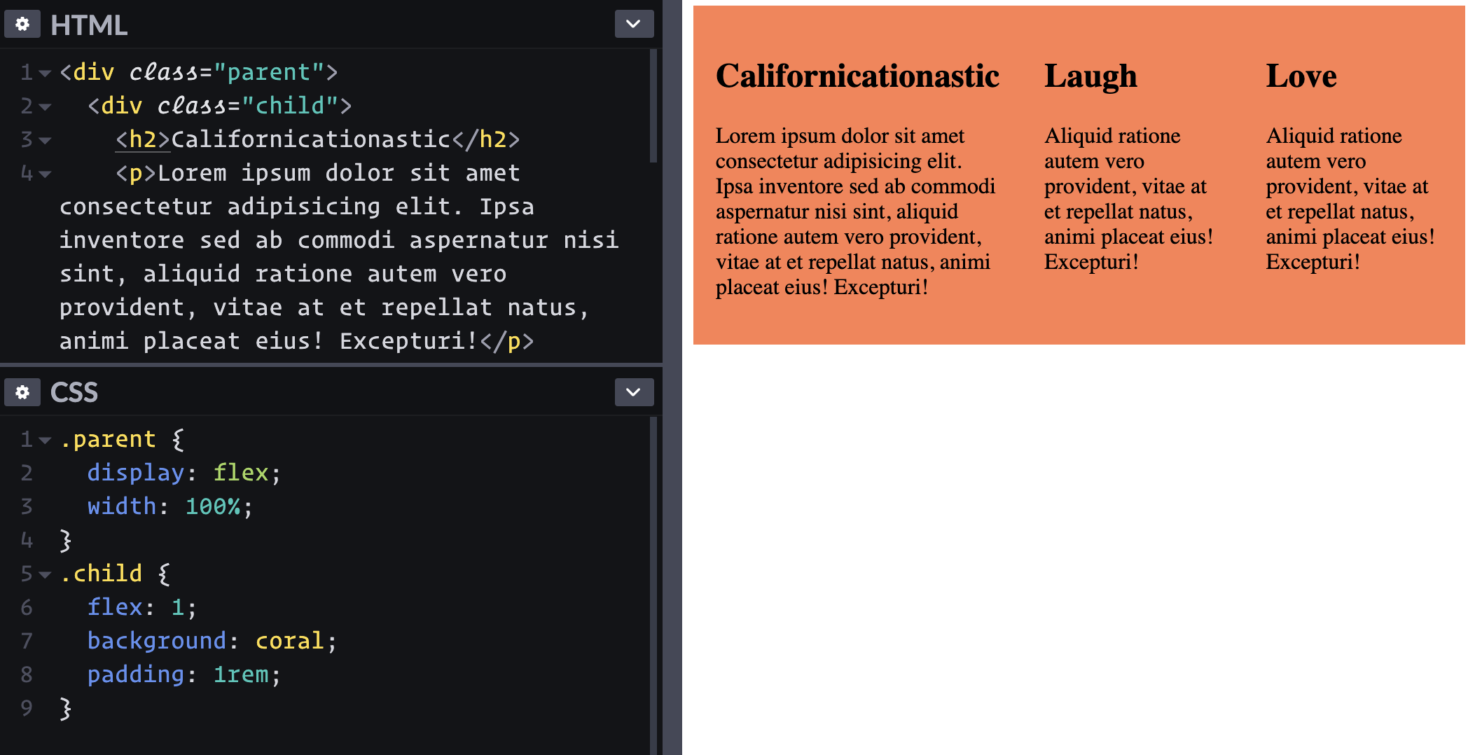
I just need to put two boxes side-by-side and I hear flexbox is good at stuff like that.
Just adding display: flex; to the parent element lays out the children in a row.
Well, that's cool. I guess I could have floated them, but this is easier.
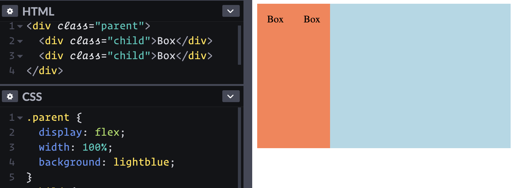
They should probably take up the full space they have though. Can I just stretch the parent to 100% wide? Well, I can, but that's apparently not going to affect the child elements.
If the parent element has more space than the children need, it doesn't do anything to help the children fill the space alone.
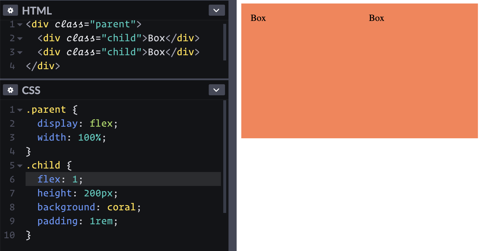
Maybe I can use width: 50%; on the children? That works, but I thought the point of flexbox is that you don't have to be all specific about width. Ah yes, flexbox has all of these ways of expressing the growy-shrinky-initial behavior of children. Looks like flex: 1; is about as easy as it gets here.
Applying flex: 1; to the children allow them to grow and fill the space.
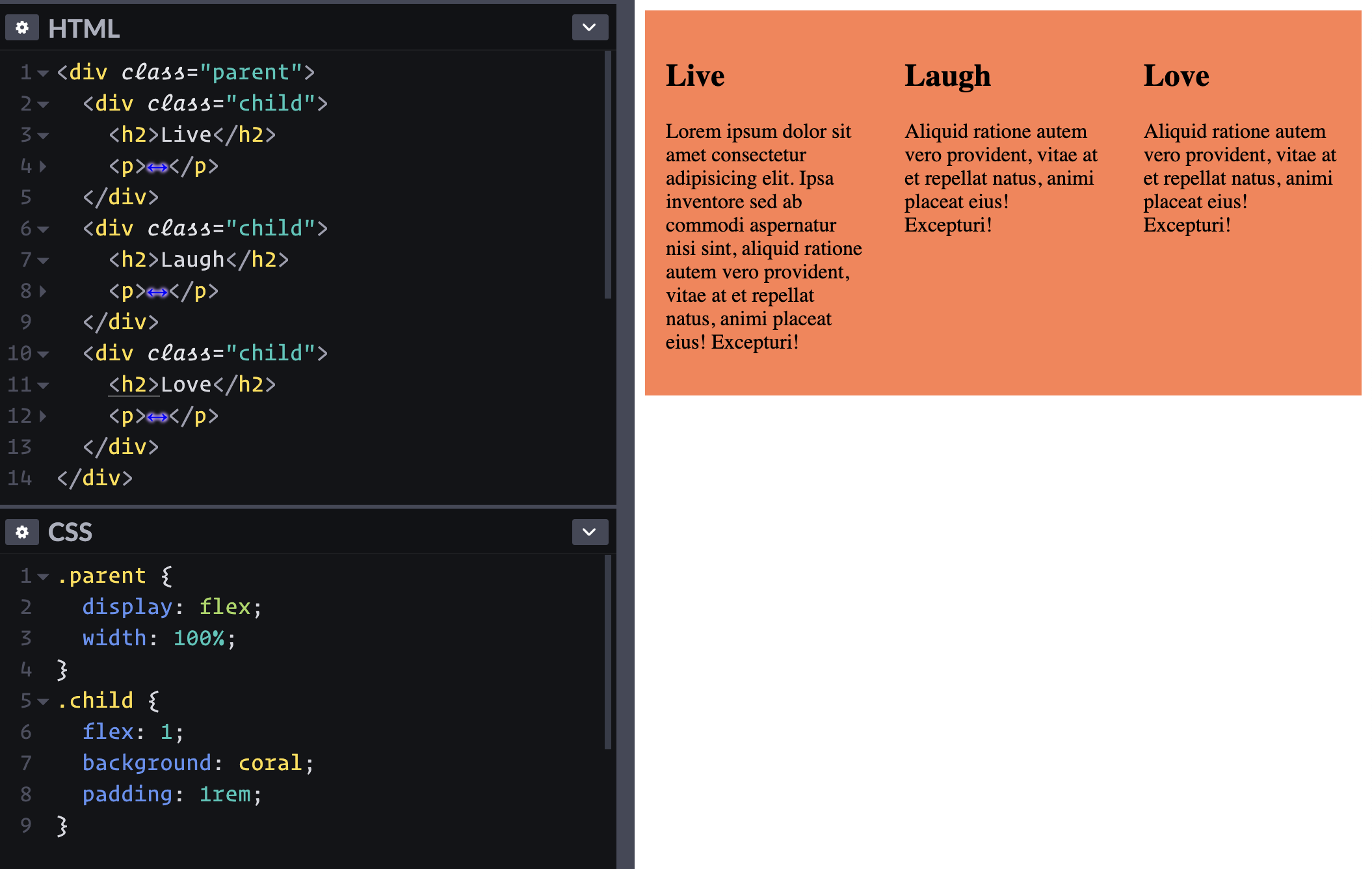
I like how I haven't had to do any math or hard code values so far. Can I make it a three-up pattern without touching CSS?
Nice.
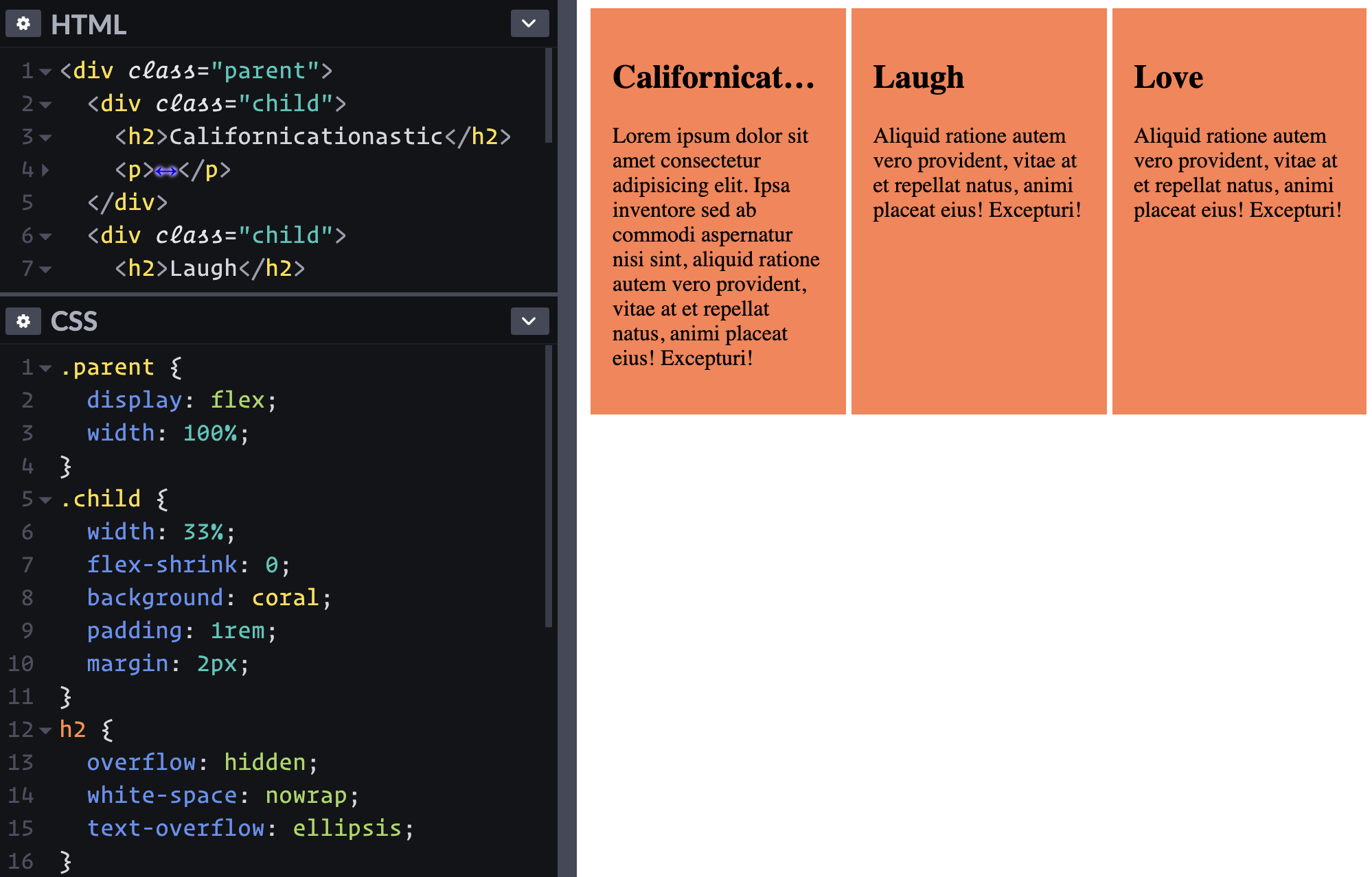
Hmmm, wait. The sizing is a bit, uhhhh, flexy? Nothing is forcing these boxes to be one-third of the container all the time.
Looks like flex-basis: 33% doesn't fix this. flex: 0 0 33%; also doesn't do the trick. Looks like width: 33%; flex-shrink: 0; does though, if we're really wanting to strongarm it.
Sometimes a design calls for exactly equal size boxes. This is maybe CSS Grid territory, but whatever.
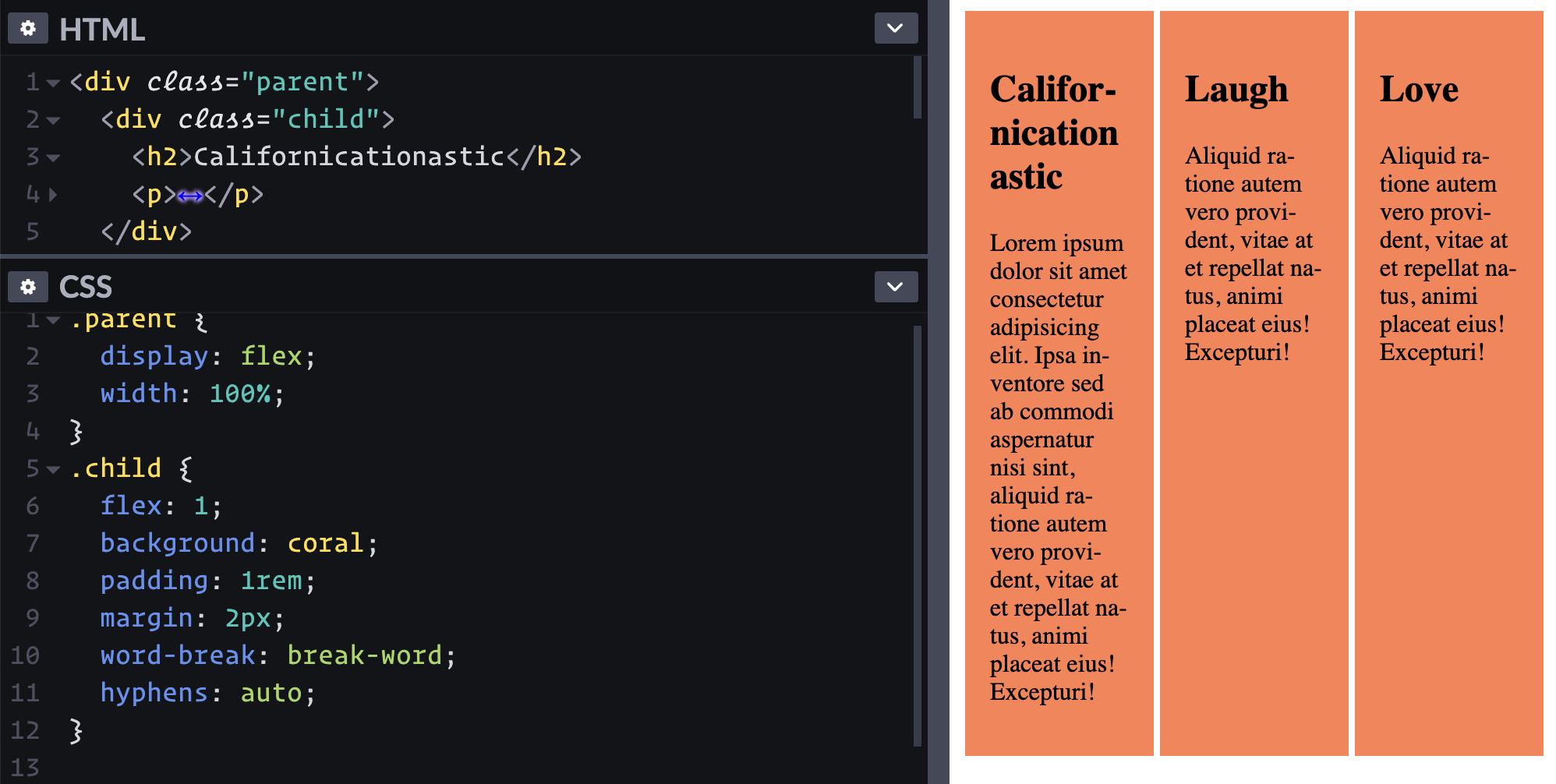
The long word forcing that sizing behavior at narrow widths is perhaps an uncommon scenario. We could have also solved it with word-break: break-word; hyphens: auto; on the child.
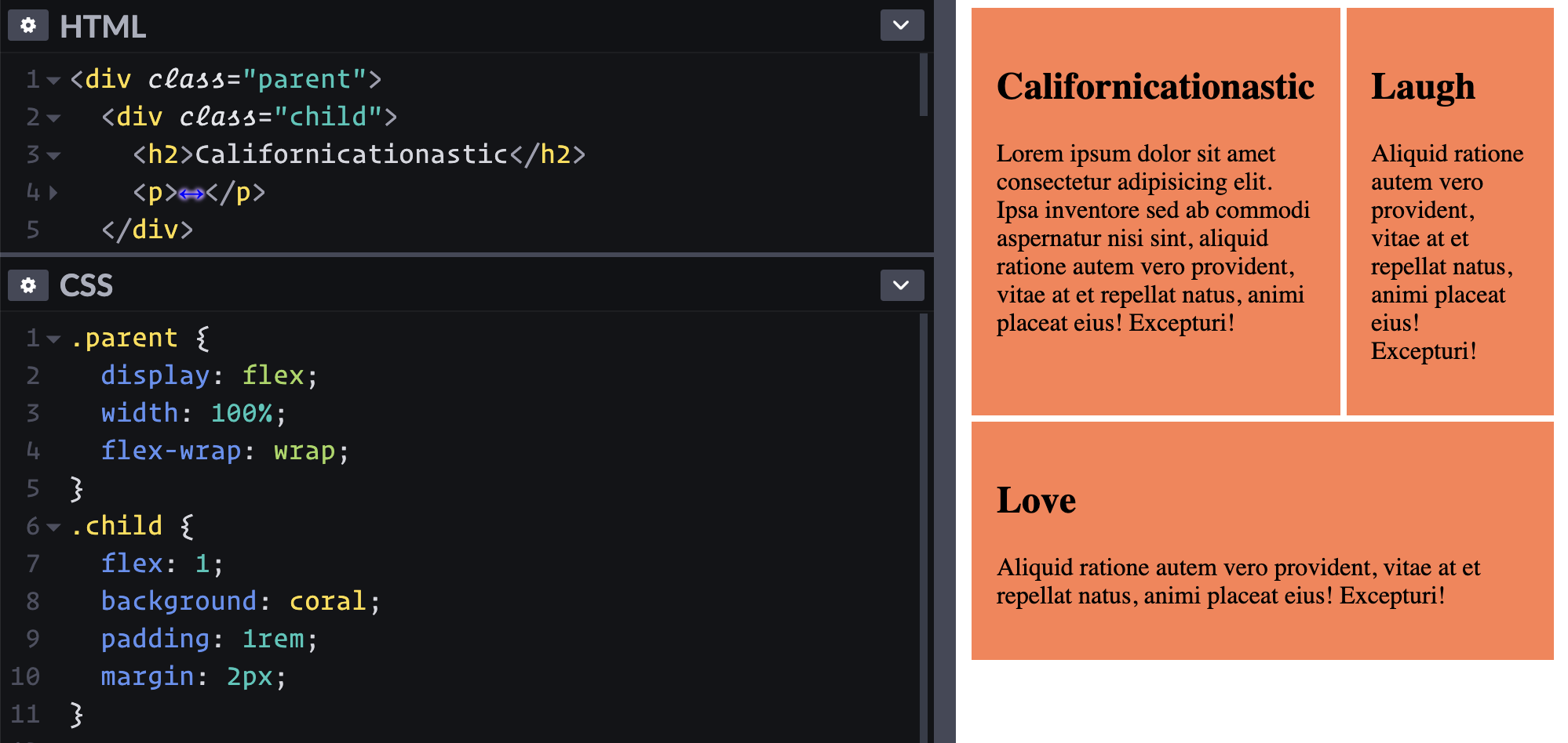
Another thing we could do it just let the dang items wrap instead of being so strict about it. Flexbox can do that, right?
Oh hey, that reminds me how cool it is that those first two items are the same height. That's the default stretch behavior, but it can be controlled as well. And it's by row, which is why the second row has its own different height.
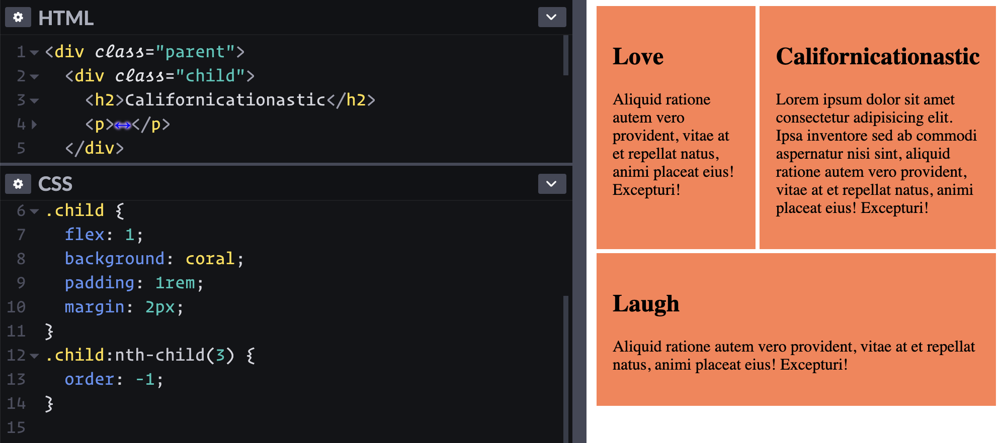
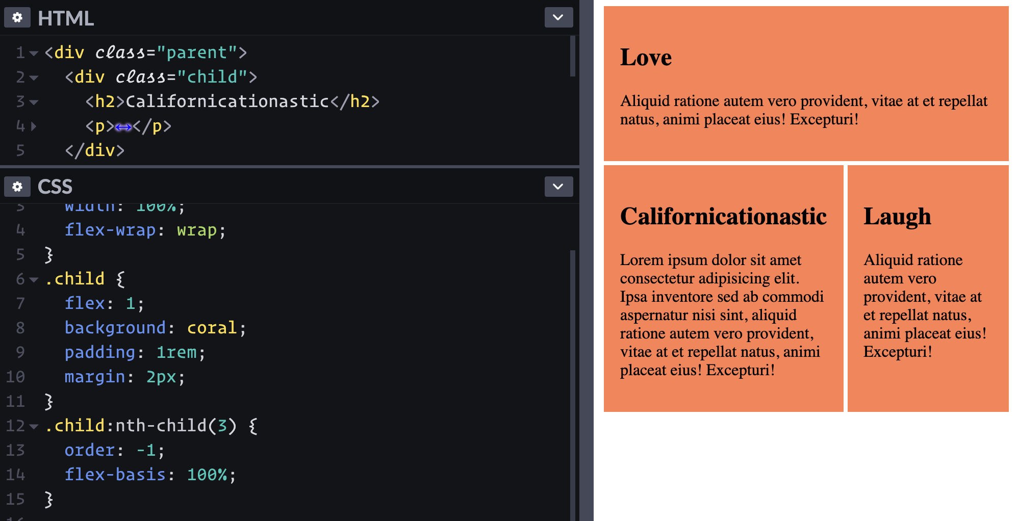
What if I want that first "Love" block to be on top instead? Looks like I can re-order it, eh? Let's see, the default order is 0, so to be first, I do order: -1;.
Ha! That kinda worked. But I meant that I want it to take up the full width on the top row. I guess I can just kick it up to flex-basis: 100%; and the others will wrap accordingly.
It's pretty weird to have the source order and visual order different like this. Maybe that should go in the "don't ever do this" category.
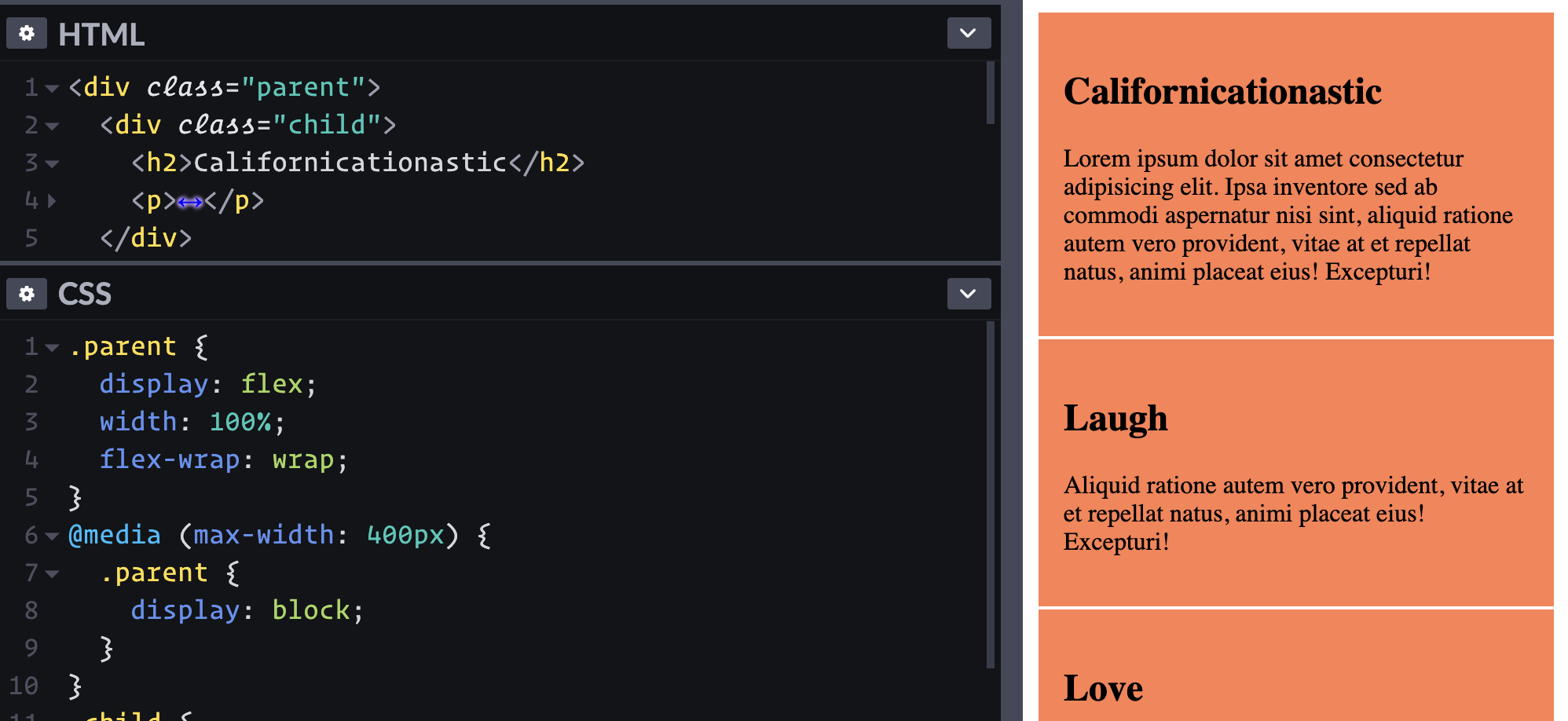
What if I wanna bail on the whole flexbox thing at a certain point? Part of me wants to change the direction to go vertical with flex-direction: column; and force the children to be full-width. Ah, a simple display: block; on the parent does that in one swoop.
Rather than changing all the flexbox stuff to handle a column layout, we just turn flexbox off.
Flexbox can do way more stuff! One of my favorites is how auto margins work to "push" other elements away when there is space. This is just one little journey playing with some UI and seeing the useful things flexible does along with things that can make it confusing.
Picture-in-Picture made its first appearance on the web in the Safari browser with the release of macOS Sierra in 2016. It made it possible for a user to pop a video out into a small floating window that stays above all others, so that they can keep watching while doing other things. It’s an idea that came from TV, where, for example, you might want to keep watching your Popular Sporting Event even as you browse the guide or even other channels.
Not long after that, Android 8.0 was released which included picture-in-picture support via native APIs. Chrome for Android was able to play videos in picture-in-picture mode through this API even though its desktop counterpart was unable to do so.
At the time of writing, only Chrome (version 70+) and Edge (version 76+) support this feature. Firefox, Safari, and Opera all use proprietary APIs for their implementations.
This browser support data is from Caniuse, which has more detail. A number indicates that browser supports the feature at that version and up.
Desktop
Chrome
Opera
Firefox
IE
Edge
Safari
70
64
72
No
76
TP
Mobile / Tablet
iOS Safari
Opera Mobile
Opera Mini
Android
Android Chrome
Android Firefox
13.3
No
No
No
78
68
How to use the Picture-In-Picture API
Let's start by adding a video to a webpage.
<video controls src="video.mp4"></video>
In Chrome, there will already be a toggle for entering and exiting Picture-in-Picture mode.
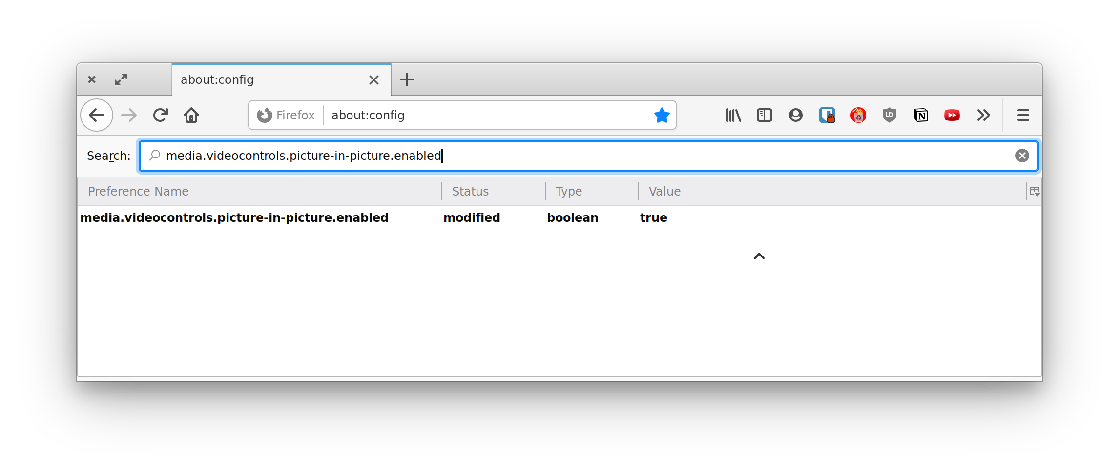
To test Firefox’s implementation, you’ll need to enable the media.videocontrols.picture-in-picture.enabled flag in about:config first, then right-click on the video to find the picture-in-picture option.
While this works, in many cases, you want your video controls to be consistent across browsers and you might want control over which videos can be entered into picture-in-picture mode and which ones cannot.
We can replace the default method of entering picture-in-picture mode in the browser with our own method using the Picture-in-Picture Web API. For example, let's add a button that, when clicked, enables it:
Then select both the video and the button in JavaScript:
const video = document.getElementById('video');
const pipButton = document.getElementById('pipButton');
The button is hidden and disabled by default because we need to know if the Picture-in-Picture API is supported and enabled in the user's browser before displaying the it. This is a form of progressive enhancement which helps avoid a broken experience in browsers that do not support the feature.
We can check that the API is supported and enable the button as shown below:
if ('pictureInPictureEnabled' in document) {
  pipButton.classList.remove('hidden')
  pipButton.disabled = false;
}
Entering picture-in-picture mode
Let’s say our JavaScript has determined that the browser has picture-in-picture support enabled. Let's call requestPictureInPicture() on the video element when the button with #pipButton is clicked. This method returns a promise that places the video in a mini window on the bottom-right side of the screen by default when resolved, although it can be moved around by the user.
if ('pictureInPictureEnabled' in document) {
  pipButton.classList.remove('hidden')
  pipButton.disabled = false;

  pipButton.addEventListener('click', () => {
    video.requestPictureInPicture();
  });
}
We cannot leave the code above as is because requestPictureInPicture() returns a promise and it's possible for the promise to reject if, for example, the video metadata is not yet loaded or if the disablePictureInPicture attribute is present on the video.
Let's add a catch block to capture this potential error and let the user know what is going on:
The browser helpfully provides a close button on the picture-in-picture window, which enables the window to be close when clicked. However, we can also provide another way to exit picture-in-picture mode as well. For example, we can make clicking our #pipButton close any active picture-in-picture window.
One other situation where you might want to close the picture-in-picture window is when the video enters full-screen mode. Chrome already does this automatically without having to write any code.
Picture-in-Picture events
The browser allows us to detect when a video enters or leaves picture-in-picture mode. Since there are many ways picture-in-picture mode can be entered or exited, it is better to rely on event detection to update media controls.
The events are enterpictureinpicture and leavepictureinpicture which, as their names imply, fire when a video enters or exits picture-in-picture mode, respectively.
In our example, we need to update the #pipButton label depending on whether the video is or is not currently in picture-in-picture mode.
The browser shows a play/pause button in the picture-in-picture window by default except when the video is playing a MediaStream object (produced by a virtual video source such as a camera, video recording device, screen sharing service, or other hardware sources).
It's also possible to add controls that go to the previous or next track straight from the picture-in-picture window:
navigator.mediaSession.setActionHandler('previoustrack', () => {
  // Go to previous track
});

navigator.mediaSession.setActionHandler('nexttrack', () => {
  // Go to next track
});
Displaying a webcam feed in a picture-in-picture window
Video meeting web applications could benefit from placing a webcam feed in picture-in-picture mode when a user switches back and forth between the app and other browser tabs or windows.
That's pretty much all you need to about the Picture-in-Picture Web API at this time! Currently, the API only supports the <video> element but it is meant to be extensible to other elements as well.
Although browser support is spotty right now, you can still use it as a way to progressively enhance the video experience on your website.


