One was the footer of an (older) U.S. Government website:

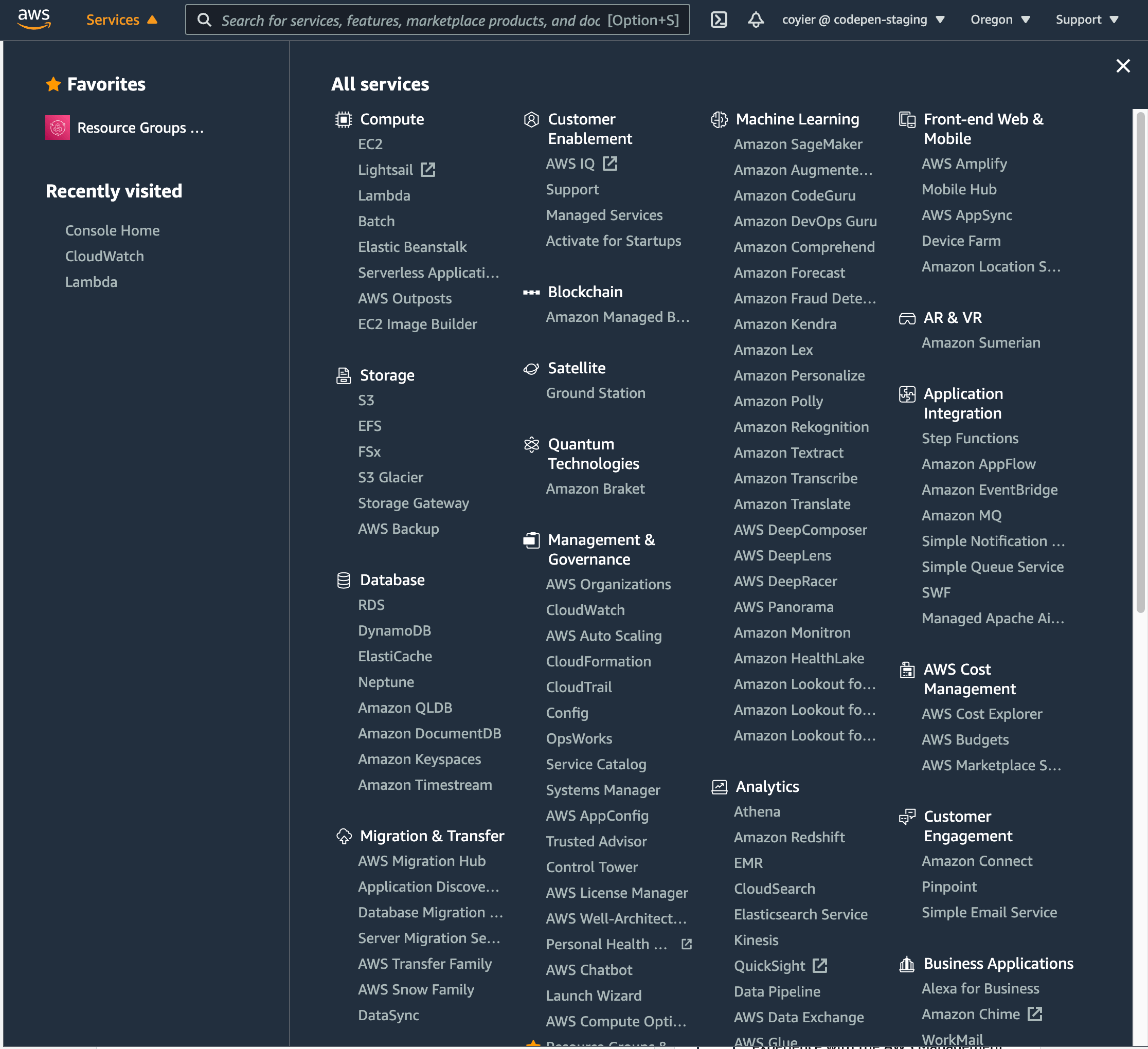
The other was the navigation for AWS services from the AWS Console:

Both of them have that vibe of: holy crap we have a lot of stuff, I guess we’ll just make a massive grid of links to it all.
The difference is the AWS Console one has a search bar at the top of it. Its primary function is finding things in that menu (but it does search the wider site as well):

The “search a list of things already on the page” idea reminds me of that classic jQuery contains selector. Please allow me:
The post I Saw Two Mega Menus Today… appeared first on CSS-Tricks.
You can support CSS-Tricks by being an MVP Supporter.
from CSS-Tricks https://ift.tt/3au8wBK
via IFTTT

No comments:
Post a Comment