Increment is a beautiful quarterly magazine (print and web) published by Stripe “about how teams build and operate software systems at scale”. While there is always stuff about making websites in general, this issue is the first focused on front-end¹ development.
I’ve got an article in there: When frontend means full stack. I’ll probably someday port it over here and perhaps add some more context (there were some constraints for print) but I love how it turned out on their site! A taste:
We handle this growing responsibility in different ways. Even though we all technically fall within the same big-tent title, many frontend developers wind up specializing. Often, we don’t have a choice. The term “unicorn” once described the extremely rare person who was good at both frontend and backend development, but these days it’s just as rare to find people skilled at the full spectrum of frontend development. In fact, the term “full stack” has largely come to mean “a frontend developer who does a good amount of the stuff a backend developer used to do.”
The whole issue is chock full of wonderful authors:
Lea Verou’s A user’s guide to CSS variables (TIL that variables can cause infinite loops and that is detected and invalidates all the variables)
Evan You’s The process: Making Vue 3 (Sometimes what drives change in frameworks is the browser’s evolving and making more things possible and more efficient)
Ipsita Agarwal’s Case study: Web components for screen readers (The story of a select component at Slack and the complexity of accessibility)
Safia Abdalla’s On composable modular frontends (“We also need to bring the principles of composable design to the frontend.”)
And the article that is the most right up my alley, Why is CSS . . . the way it is? by Chris Lilley. It’s somehow astonishing, gutwrenching, understandable, and comfortable to know that CSS evolves like any other software project. Sometimes thoughtfully and carefully, and sometimes with a meh, we’ll fix it later.
Once a feature is in place, it’s easier to slightly improve it than to add a new, better, but completely different feature that does the same thing.
This explains, for example, why list markers were initially specified in CSS by expanding the role of float. (The list marker was floated left so the list item text wrapped around it to the right.) That effort was abandoned and replaced by the list-style-position property, whose definition currently has the following, not very confidence-inspiring inline issue: “This is handwavey nonsense from CSS2, and needs a real definition.”
That’s a damn fine collection of writings on front end if you ask me.
A big thank you to Sid Orlando and Molly McArdle who helped me through the process and seem to do a great job running the ship over there.
The issue uses “frontend” throughout, and I appreciate them having a styleguide and being consistent about it. But I can’t bring myself to use it. 🔗The term “front-end” is correct when used as a compound adjective, and the term “front end” is correct when used as a noun.
Many developers are at least marginally familiar with AWS Lambda functions. They’re reasonably straightforward to set up, but the vast AWS landscape can make it hard to see the big picture. With so many different pieces it can be daunting, and frustratingly hard to see how they fit seamlessly into a normal web application.
The Serverless framework is a huge help here. It streamlines the creation, deployment, and most significantly, the integration of Lambda functions into a web app. To be clear, it does much, much more than that, but these are the pieces I’ll be focusing on. Hopefully, this post strikes your interest and encourages you to check out the many other things Serverless supports. If you’re completely new to Lambda you might first want to check out this AWS intro.
There’s no way I can cover the initial installation and setup better than the quick start guide, so start there to get up and running. Assuming you already have an AWS account, you might be up and running in 5–10 minutes; and if you don’t, the guide covers that as well.
Your first Serverless service
Before we get to cool things like file uploads and S3 buckets, let’s create a basic Lambda function, connect it to an HTTP endpoint, and call it from an existing web app. The Lambda won’t do anything useful or interesting, but this will give us a nice opportunity to see how pleasant it is to work with Serverless.
First, let’s create our service. Open any new, or existing web app you might have (create-react-app is a great way to quickly spin up a new one) and find a place to create our services. For me, it’s my lambda folder. Whatever directory you choose, cd into it from terminal and run the following command:
sls create -t aws-nodejs --path hello-world
That creates a new directory called hello-world. Let’s crack it open and see what’s in there.
If you look in handler.js, you should see an async function that returns a message. We could hit sls deploy in our terminal right now, and deploy that Lambda function, which could then be invoked. But before we do that, let’s make it callable over the web.
Working with AWS manually, we’d normally need to go into the AWS API Gateway, create an endpoint, then create a stage, and tell it to proxy to our Lambda. With serverless, all we need is a little bit of config.
Still in the hello-world directory? Open the serverless.yaml file that was created in there.
The config file actually comes with boilerplate for the most common setups. Let’s uncomment the http entries, and add a more sensible path. Something like this:
functions:
  hello:
    handler: handler.hello
#   The following are a few example events you can configure
#   NOTE: Please make sure to change your handler code to work with those events
#   Check the event documentation for details
    events:
      - http:
        path: msg
        method: get
That’s it. Serverless does all the grunt work described above.
CORS configuration
Ideally, we want to call this from front-end JavaScript code with the Fetch API, but that unfortunately means we need CORS to be configured. This section will walk you through that.
Below the configuration above, add cors: true, like this
That’s the section! CORS is now configured on our API endpoint, allowing cross-origin communication.
CORS Lambda tweak
While our HTTP endpoint is configured for CORS, it’s up to our Lambda to return the right headers. That’s just how CORS works. Let’s automate that by heading back into handler.js, and adding this function:
Before returning from the Lambda, we’ll send the return value through that function. Here’s the entirety of handler.js with everything we’ve done up to this point:
Let’s run it. Type sls deploy into your terminal from the hello-world folder.
When that runs, we’ll have deployed our Lambda function to an HTTP endpoint that we can call via Fetch. But… where is it? We could crack open our AWS console, find the gateway API that serverless created for us, then find the Invoke URL. It would look something like this.
Fortunately, there is an easier way, which is to type sls info into our terminal:
Just like that, we can see that our Lambda function is available at the following path:
Now that we’ve gotten our feet wet, let’s repeat this process. This time, though, let’s make a more interesting, useful service. Specifically, let’s make the canonical “resize an image” Lambda, but instead of being triggered by a new S3 bucket upload, let’s let the user upload an image directly to our Lambda. That’ll remove the need to bundle any kind of aws-sdk resources in our client-side bundle.
Building a useful Lambda
OK, from the start! This particular Lambda will take an image, resize it, then upload it to an S3 bucket. First, let’s create a new service. I’m calling it cover-art but it could certainly be anything else.
sls create -t aws-nodejs --path cover-art
As before, we’ll add a path to our HTTP endpoint (which in this case will be a POST, instead of GET, since we’re sending the file instead of receiving it) and enable CORS:
// Same as before
  events:
    - http:
      path: upload
      method: post
      cors: true
Next, let’s grant our Lambda access to whatever S3 buckets we’re going to use for the upload. Look in your YAML file — there should be a iamRoleStatements section that contains boilerplate code that’s been commented out. We can leverage some of that by uncommenting it. Here’s the config we’ll use to enable the S3 buckets we want:
Note the /* on the end. We don’t list specific bucket names in isolation, but rather paths to resources; in this case, that’s any resources that happen to exist inside your-bucket-name.
Since we want to upload files directly to our Lambda, we need to make one more tweak. Specifically, we need to configure the API endpoint to accept multipart/form-data as a binary media type. Locate the provider section in the YAML file:
For good measure, let’s give our function an intelligent name. Replace handler: handler.hello with handler: handler.upload, then change module.exports.hello to module.exports.upload in handler.js.
Now we get to write some code
First, let’s grab some helpers.
npm i jimp uuid lambda-multipart-parser
Wait, what’s Jimp? It’s the library I’m using to resize uploaded images. uuid will be for creating new, unique file names of the sized resources, before uploading to S3. Oh, and lambda-multipart-parser? That’s for parsing the file info inside our Lambda.
Next, let’s make a convenience helper for S3 uploading:
Lastly, we’ll plug in some code that reads the upload files, resizes them with Jimp (if needed) and uploads the result to S3. The final result is below.
I’m sorry to dump so much code on you but — this being a post about Amazon Lambda and serverless — I’d rather not belabor the grunt work within the serverless function. Of course, yours might look completely different if you’re using an image library other than Jimp.
Let’s run it by uploading a file from our client. I’m using the react-dropzone library, so my JSX looks like this:
<Dropzone
  onDrop={files => onDrop(files)}
  multiple={false}
>
  <div>Click or drag to upload a new cover</div>
</Dropzone>
The onDrop function looks like this:
const onDrop = files => {
  let request = new FormData();
  request.append("fileUploaded", files[0]);


  fetch("https://yb1ihnzpy8.execute-api.us-east-1.amazonaws.com/dev/upload", {
    method: "POST",
    mode: "cors",
    body: request
    })
  .then(resp => resp.json())
  .then(res => {
    if (res.error) {
      // handle errors
    } else {
      // success - woo hoo - update state as needed
    }
  });
};
And just like that, we can upload a file and see it appear in our S3 bucket!
An optional detour: bundling
There’s one optional enhancement we could make to our setup. Right now, when we deploy our service, Serverless is zipping up the entire services folder and sending all of it to our Lambda. The content currently weighs in at 10MB, since all of our node_modules are getting dragged along for the ride. We can use a bundler to drastically reduce that size. Not only that, but a bundler will cut deploy time, data usage, cold start performance, etc. In other words, it’s a nice thing to have.
Fortunately for us, there’s a plugin that easily integrates webpack into the serverless build process. Let’s install it with:
npm i serverless-webpack --save-dev
…and add it via our YAML config file. We can drop this in at the very end:
// Same as before
plugins:
  - serverless-webpack
Naturally, we need a webpack.config.js file, so let’s add that to the mix:
Notice that we’re setting target: node so Node-specific assets are treated properly. Also note that you may need to set the output filename to handler.js. I’m also adding aws-sdk to the externals array so webpack doesn’t bundle it at all; instead, it’ll leave the call to const AWS = require("aws-sdk"); alone, allowing it to be handled by our Lamdba, at runtime. This is OK since Lambdas already have the aws-sdk available implicitly, meaning there’s no need for us to send it over the wire. Finally, the mainFields: ["main"] is to tell webpack to ignore any ESM module fields. This is necessary to fix some issues with the Jimp library.
Now let’s re-deploy, and hopefully we’ll see webpack running.
Now our code is bundled nicely into a single file that’s 935K, which zips down further to a mere 337K. That’s a lot of savings!
Odds and ends
If you’re wondering how you’d send other data to the Lambda, you’d add what you want to the request object, of type FormData, from before. For example:
request.append("xyz", "Hi there");
…and then read formPayload.xyz in the Lambda. This can be useful if you need to send a security token, or other file info.
If you’re wondering how you might configure env variables for your Lambda, you might have guessed by now that it’s as simple as adding some fields to your serverless.yaml file. It even supports reading the values from an external file (presumably not committed to git). This blog post by Philipp Müns covers it well.
Wrapping up
Serverless is an incredible framework. I promise, we’ve barely scratched the surface. Hopefully this post has shown you its potential, and motivated you to check it out even further.
If you’re interested in learning more, I’d recommend the learning materials from David Wells, an engineer at Netlify, and former member of the serverless team, as well as the Serverless Handbook by Swizec Teller
I totally forgot that the Jamstack Conf was this week but thankfully they’ve already published the talks on the Jamstack YouTube channel. I’m really looking forward to sitting down with these over a coffee while I also check out Netlify’s other big release today: Build Plugins.
These are plugins that run whenever your site is building. One example is the A11y plugin that will fail a build if accessibility failures are detected. Another minifies HTML and there’s even one that inlines critical CSS. What’s exciting is that these build plugins are kinda making complex Gulp/Grunt environments the stuff of legend. Instead of going through the hassle of config stuff, build plugins let Netlify figure it all out for you. And that’s pretty neat.
Also, our very own Sarah Drasner wrote just about how to create your first Netlify Build Plugin. So, if you have an idea for something that you could share with the community, then that may be the best place to start.
Businesses all over the globe are struggling with new challenges as a direct result of the COVID-19 pandemic. With consumers turning to the internet for the majority of their needs, it's never been more vital to ensure your online presence is easily found and your business updates clearly communicated.
In this special edition of Whiteboard Friday, Britney Muller outlines a checklist that businesses can use to meet the changing needs of consumers and improve visibility for local searches.
Bonus — We've adapted these tips into a free checklist you can download and share:
Click on the whiteboard image above to open a high resolution version in a new tab!
Video Transcription
Hey, Moz fans. Welcome to another edition of Whiteboard Friday. Today we're going over crisis adaptation, and I first have to give a huge shout-out to Miriam Ellis, who really helped me package all of this up to deliver to you today.
If you're not already following Miriam on Twitter, I highly suggest you do. She is a local SEO genius. So let's dive right in.
Meet your customers where they are
You often hear this phrase in marketing and in SEO about meeting your customers where they are. This might be important now more than ever because the current landscape, it's changed so much.
Listen to your customers & understand how their needs have shifted
In order to better meet your customers where they are, you really first have to listen and understand how their needs have shifted, how have their concerns shifted. What are they searching for now? Just really paying attention and listening online to your current target market.
One of the things I also like to suggest is listen to competitive reviews. Keep an eye on competitive reviews being posted on Google and other spaces to get a gauge of how things have perhaps moved.
Know where your audience is
This could have also shifted a bit. Whiteboard Friday's OG, Rand Fishkin, launched SparkToro that does exactly that. So you can really deep dive into current data around what your audience is listening to, who they follow, all sorts of great stuff for you to leverage in today's climate.
Connect with potential customers in meaningful ways
Now is a great time to reach out and engage with not only potential customers but current customer base and remind people that you are still here, you're still serving them in various ways. So it's really, really key.
Partner with relevant businesses
I've seen this do really well in some great examples of pivoting, where a fruit delivery company partnered with a bakery to include these free cakes within orders. What a great way to get some visibility for that bakery, and vice versa — they could do different things. I think it's a great time to leverage those relationships and help one another out. I absolutely love that tip.
Communicate all changes and updates
Now the other big, big priority right now is all around communicating changes and updates to your website visitors. So what do you need to cover?
Changes to hours is so important right now. It's essential that you have that information readily visible to anyone visiting your website, if this applies to you. All forms of availability, video, curbside, no touch delivery, have that information available.
Any expected delays and product availability challenges. This is a really great tip too.
Sanitation and any adopted safety precautions.
Payment methods accepted. This can be really helpful in the transaction.
Any philanthropic efforts that you're doing to help support people in need.
I'm seeing a lot of these show up in banners and readily available information for people visiting websites. I think it's great to consider making sure that this information is easy for people to access.
Immediately communicate this information:
Set up online orders and catalog inventory/services
In addition to these things, set up online orders. At the very least, catalog your online inventory or services for people to still have that awareness of what you're currently offering.
I would suggest if you're a struggling business and you don't want to go into a huge website build, you can absolutely check out and explore things like Squarespace or Shopify. I would have never thought I would be suggesting these platforms a year ago just because they're not usually great for SEO reasons. But they can do a beautiful job of solving this problem so quickly, and then you can roll out V2 and V3 down the road when you're ready to make those improvements. But I think just getting businesses off the ground is so important right now.
Add products for free on Google Shopping
This was such a neat thing that Google offered I believe several weeks ago, and it's doing great. What it basically does is it allows you to list products for free on Google Shopping, giving you that extra visibility right now. So if you're an e-commerce brand, definitely check that out.
Create maps showing delivery radiuses
Miriam had this great idea to create maps showing delivery radiuses, if that applies to you, so really giving someone visiting your site an easy to consume idea of the areas that you serve. Sometimes when you see the ZIP codes, it's a little overwhelming. You have to do a little work. But that's kind of a great idea.
Routific
Then this was mentioned in a recent GatherUp webinar by Darren Shaw — Routific. So if you are doing local deliveries and they're getting a little out of hand, Routific is a company that creates delivery routes to make them most efficient for you, which I thought was so cool.
I didn't even know that existed. So it's a good little tool tip.
Double down on SEO and content marketing
I absolutely loved Mike King's post on this — I think it was a couple weeks ago — where he explains why economic downturns favor the bold. It's brilliant. There are incredible use cases around this, and we'll link to that down below.
Someone who has impressed the heck out of me the last couple of weeks is Kristin Tynski — I hope I'm saying that right — over at Fractl. She is going above and beyond to create content pieces that are not only genius but are link building opportunities, apply to various clients, and use traditional journalism tactics to gather offline, unique data to present online. I highly suggest you pay attention to what Kristin is up to. She is a genius. Kristin, we have to meet sometime. I'm a huge fan of you. Keep up the great work.
Local & Google My Business
Now let's dive into some GMB stuff. While this might not apply to you if you're not a local business, I think there are still things to take away for larger companies that also either have a local listing or just to be aware of.
So here's an example of Uptown China Restaurant, a local Chinese restaurant. It's awesome in Queen Anne, and it's going to be our example. So what's the first thing?
Correct any GMB errors
Just correct any GMB errors. Make sure that the current data shown and information is correct and up to date.
Update hours to remove warning
Then this is probably my favorite hack of all, from Joy Hawkins, about this warning that we see on all businesses currently, because of the pandemic, that says hours or services may differ. You can get this removed simply by updating your hours. How incredible is that?
So I highly suggest you just update your hours. Joy also mentioned in this webinar I keep referring to, that was so good, she suggests using the hours that you are available to take phone calls. Google has never had an issue with that, and it tends to make the most sense. So something to think about.
Respond to reviews
Now is also a great time to invest and be engaged with these reviews. I think it's one of the most overlooked PR and marketing tactics available, where customers exploring your brand, exploring your location want to know that (a) you care and that (b) you're going to engage with a customer and that you have a timely response. So I think it's important to respond to reviews, especially on behalf of the business side.
Confirm or reject any new Google My Business prompts
So we're going to continue to see different things roll out. There were senior hours available to, I believe, grocery stores that popped up as an option. No-contact delivery. These things will always be changing. So I think it's important to maybe put a reminder in your calendar just to keep an eye on are there any new options within Google My Business that I could activate or clarify. Google loves that, and it also helps fill out your listing better.
Update menu and product listings
What a great time to take some good, new photos.Update your menu items. I wish Uptown China Restaurant did this, and I might suggest it to them that they can add those offerings. They can add those things to really pop up on the listing and kind of make it shine.
Use Posts
Posts have always been really, really great for Google My Business listings because it gives you a big photo. It lasts for a while up here, I believe up to 14 days. It's very prevalent when you see it. Now Google has also been offering COVID-19 posts.
There isn't an option to add an image with the COVID-19 posts. It's text only, but it lasts longer and it's more prominent than a regular post. So it will show up higher in your Google My Business listing, and we've also seen it pop up in actual SERPs in the organic area. So pretty cool. Good to know. I suggest you doing that. You have control over the messaging. You can say whatever you would like. You can provide updated info, all that good stuff.
People are getting really savvy with product posts, which again it would show up in your Google My Business listing with a big photo and a description. What he's seen people do is basically have a photo of a car with text on it that says "No-Touch Delivery" or different service options as the product.
Google is currently letting that slide. I don't know if that will last forever. But it's an interesting thing to explore if you really want that visibility if someone is struggling with their business right now, and you can kind of get that to pop up on the SERPs.
Enable text messaging
So I've heard from so many SEOs that this has continued to go up into the right during the pandemic, and it makes sense.
People want to just quickly get information from businesses. You can create a welcome message. So I highly suggest exploring that if that's available to you.
Update images
Again, I think I've said this like three times, but update images. It's a great time to do that, and it can really help make your stuff pop.
Share these tips with businesses in need!
Lastly, don't forget to share these tips with businesses.
Understand that there are a lot of people in need right now, and if there's anything that we can do to help, by all means let's make all of that stuff happen. The fact is that you're not alone. So whether you're doing this work on behalf of a client, or you yourself or family or friends are really struggling with a business right now, there are different support groups and options as far as financial support.
We've created a free PDF checklist of all this information that you can download and share with any marketers, clients, or businesses in need:
I know we at Moz are going to be putting everything we have into helping you and others during this time, and so I created a form at the bottom of this post where you can fill in some information and let us know if there are specific problems that we could help with. We're in this together.
We want to help you all as much as we can. I will be taking that very seriously and spending lots of time on replying or creating material to help individuals struggling. So please fill that out. Also, feel free to leave comments and suggestions in the comments. I think some of the best, most valuable takeaways sometimes happen in the comments where you're either clarifying something that I said or adding something really great. I would really appreciate that. Just want to get all the good information out there so that we can help everyone out. I really appreciate you taking the time to watch this edition of Whiteboard Friday, and I will see you all again soon. Thanks.
Sign up for The Moz Top 10, a semimonthly mailer updating you on the top ten hottest pieces of SEO news, tips, and rad links uncovered by the Moz team. Think of it as your exclusive digest of stuff you don't have time to hunt down but want to read!
from The Moz Blog https://ift.tt/36DmFKw
via IFTTT
Core Web Vitals is what Google is calling a a new collection of three web performance metrics:
LCP: Largest Contentful Paint
FID: First Input Delay
CLS: Cumulative Layout Shift
These are all measurable. They aren’t in Lighthouse (e.g. the Audits tab in Chrome DevTools) just yet, but sounds like that’s coming up soon. For now, an open source library will get you the numbers. There is also a browser extension (that feels pretty alpha as you have to install it manually).
That’s all good to me. I like seeing web performance metrics evolve into more meaningful numbers. I’ve spent a lot of time in my days just doing stuff like reducing requests and shrinking assets, which is useful, but kind of a side attack to web performance. These metrics are what really matter because they are what users actually see and experience.
The bigger news came today though in that they are straight up telling us: Core Web Vitals matter for your SEO:
Today, we’re building on this work and providing an early look at an upcoming Search ranking change that incorporates these page experience metrics. We will introduce a new signal that combines Core Web Vitals with our existing signals for page experience to provide a holistic picture of the quality of a user’s experience on a web page.
Straight up, these numbers matter for SEO (or they will soon).
And they didn’t bury the other lede either:
As part of this update, we’ll also incorporate the page experience metrics into our ranking criteria for the Top Stories feature in Search on mobile, and remove the AMP requirement from Top Stories eligibility.
AMP won’t be required for SERP carousel thing, which was the #1 driver of AMP adoption. I can’t wait to see my first non-AMP page up there! I know some features will be unavailable, like the ability to swipe between stories (because that relies on things like the Google AMP cache), but whatever, bring it on. Let AMP just be a thing people use because they want to not because they have to.
Oh hey! A brand new property that affects how a box is sized! That’s a big deal. There are lots of ways already to make an aspect-ratio sized box (and I’d say this custom properties based solution is the best), but none of them are particularly intuitive and certainly not as straightforward as declaring a single property.
So, with the impending arrival of aspect-ratio (MDN, and not to be confused with the media query version), I thought I’d take a look at how it works and try to wrap my mind around it.
Shout out to Una where I first saw this. Boy howdy did it strike interest in folks:
Just dropping aspect-ratio on an element alone will calculate a height based on the auto width.
Without setting a width, an element will still have a natural auto width. So the height can be calculated from the aspect ratio and the rendered width.
.el {
  aspect-ratio: 16 / 9;
}
If the content breaks out of the aspect ratio, the element will still expand.
The aspect ratio becomes ignored in that situation, which is actually nice. Better to avoid potential data loss. If you prefer it doesn’t do this, you can always use the padding hack style.
If the element has either a height or width, the other is calculated from the aspect ratio.
So aspect-ratio is basically a way of seeing the other direction when you only have one (demo).
If the element has both a height and width, aspect-ratio is ignored.
The combination of an explicit height and width is “stronger” than the aspect ratio.
Factoring in min-* and max-*
There is always a little tension between width, min-width, and max-width (or the height versions). One of them always “wins.” It’s generally pretty intuitive.
If you set width: 100px; and min-width: 200px; then min-width will win. So, min-width is either ignored because you’re already over it, or wins. Same deal with max-width: if you set width: 100px; and max-width: 50px; then max-width will win. So, max-width is either ignored because you’re already under it, or wins.
It looks like that general intuitiveness carries on here: the min-* and max-* properties will either win or are irrelevant. And if they win, they break the aspect-ratio.
.el {
  aspect-ratio: 1 / 4;
  height: 500px;

  /* Ignored, because width is calculated to be 125px */
  /* min-width: 100px; */

  /* Wins, making the aspect ratio 1 / 2 */
  /* min-width: 250px; */
}
With value functions
Aspect ratios are always most useful in fluid situations, or anytime you essentially don’t know one of the dimensions ahead of time. But even when you don’t know, you’re often putting constraints on things. Say 50% wide is cool, but you only want it to shrink as far as 200px. You might do width: max(50%, 200px);. Or constrain on both sides with clamp(200px, 50%, 400px);.
But say you run into that minimum 200px, and then apply a min-width of 300px? The min-width wins. It’s still intuitive, but it gets brain-bending because of how many properties, functions, and values can be involved.
Maybe it’s helpful to think of aspect-ratio as the weakest way to size an element?
It will never beat any other sizing information out, but it will always do its sizing if there is no other information available for that dimension.
After careful consideration, we settled on rearchitecting our platform to use $FLASHY_LANGUAGE and $HYPED_TECHNOLOGY. Not only is $FLASHY_LANGUAGE popular according to the Stack Overflow developer survey, it’s also cross platform; we’re using it to reimplement our mobile apps as well. Rewriting our core infrastructure was fairly straightforward: as we have more engineers than we could possibly ever need or even know what to do with, we simply put a freeze on handling bug reports and shifted our effort to $HYPED_TECHNOLOGY instead. We originally had some trouble with adapting to some of $FLASHY_LANGUAGE’s quirks, and ran into a couple of bugs with $HYPED_TECHNOLOGY, but overall their powerful new features let us remove some of the complexity that our previous solution had to handle.
There is absolutely no way Saagar Jha is poking at this or this.
Diana Smith with another mind-bending all HTML & CSS painting.
I love that these occupy a special place on the “Should I draw this in CSS?” curve. Things like simple shapes are definitely on the “yes” side of the curve. Then there’s a large valley where things get a little too impractical to draw that way, and using some other image format (e.g. SVG) makes way more sense.
Diana’s work pulls the curve back up to the “yes” side. Not only because it’s proof that CSS can be an amazing expressionistic art tool, but also from a performance standpoint — it’s only 2 KB of HTML and 10 KB of CSS.
For those who have missed the big news, Firefox now supports conic gradients!
Starting with Firefox 75, released on the April 7, we can go to about:config, look for the layout.css.conic-gradient.enabled flag and set its value to true (it’s false by default and all it takes to switch is double-clicking it).
Enabling conic gradients in Firefox 75+
With that enabled, now we can test our CSS including conic gradients in Firefox as well.
While some of the demos in this article work just fine when using a polyfill, some use CSS variables inside the conic gradient and therefore require native support for this feature.
One thing I particularly like about conic gradients is just how much they can simplify background patterns. So let’s take a few linear-gradient() patterns from the gallery created by Lea Verou about a decade ago and see how we can now simplify them with conic-gradient!
That’s quite a bit of CSS and perhaps even a bit intimidating. It’s not easy to just look at this and understand how it all adds up to give us the pyramid pattern. I certainly couldn’t do it. It took me a while to get it, even though gradients are one of the CSS features I’m most comfortable with. So don’t worry if you don’t understand how those gradients manage to create the pyramid pattern because, one, it is complicated and, two, you don’t even need to understand that!
Using conic-gradient(), we can now get the same result in a much simpler manner, with a single background layer instead of four!
What I like to do when coding repeating patterns is draw equidistant vertical and horizontal lines delimiting the rectangular boxes defined by the background-size. In this case, it’s pretty obvious we have square boxes and where their limits are, but it’s a really useful technique for more complex patterns.
Highlighting the pattern’s cells
By default, conic gradients start from 12 o’clock and go clockwise. However, in our case, we want to offset the start of the gradient by 45° in the clockwise direction and afterwards make every one of the four shades occupy a quarter (25%) of the available space around the midpoint of our square box.
A pattern cell with a conic gradient’s hard stops at every 25% starting from 45° w.r.t. the vertical axis (live).
Not only does the code look simpler, but we’ve also gone from 260 bytes to 103 bytes, reducing the code needed to get this pattern by more than half.
We’re using the double position syntax as that’s also well supported these days.
We can see it in action in the Pen below:
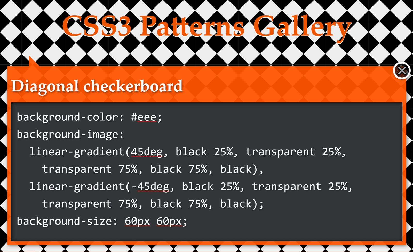
Checkerboard
The checkerboard pattern
This pattern above is created with two linear gradients:
background-color: #eee;
background-image:
  linear-gradient(45deg, black 25%, transparent 25%,
    transparent 75%, black 75%, black),
  linear-gradient(45deg, black 25%, transparent 25%,
    transparent 75%, black 75%, black);
background-size: 60px 60px;
background-position: 0 0, 30px 30px;
Let’s see how we can simplify this CSS when replacing these linear gradients with a conic one!
Just like in the previous case, we draw vertical and horizontal lines in order to better see the rectangles defined by the background-size.
Highlighting the pattern’s cells
Looking at the square highlighted in deeppink in the illustration above, we see that, in this case, our conic gradient starts from the default position at 12 o’clock. A quarter of it is black, the next quarter is dirty white and then we have repetition (the same black and then dirty white quarter slices once more).
A pattern cell with a conic gradient’s hard stops at every 25%, starting from the default at 12 o’clock and repeating after 50% (demo).
This repetition in the second half of the [0%, 100%] interval means we can use a repeating-conic-gradient(), which gives us the following code (bringing the compiled CSS from 263 bytes down to only 73 bytes – that’s reducing it by over 70%):
Again, we have a pattern created with two linear gradients:
background-color: #eee;
background-image:
  linear-gradient(45deg, black 25%, transparent 25%,
    transparent 75%, black 75%, black),
  linear-gradient(-45deg, black 25%, transparent 25%,
    transparent 75%, black 75%, black);
background-size: 60px 60px;
We draw horizontal and vertical lines to split this pattern into identical rectangles:
Highlighting the pattern’s cells
What we now have is pretty much the same checkerbox pattern as before, with the sole difference that we don’t start from the default position at 12 o’clock, but from 45° in the clockwise direction.
If you’re having trouble visualising how simply changing the start angle can make us go from the previous pattern to this one, you can play with it in the interactive demo below:
Note that this demo does not work in browsers that have no native support for conic gradients.
Again, not only is the code simpler to understand, but we’ve also gone from 229 bytes to only 83 bytes in the compiled CSS, reducing it by almost two-thirds!
Half-Rombes
The half-rombes pattern
This pattern was created with four linear gradients:
Just like in the previous cases, we draw equidistant vertical and horizontal lines in order to better see the repeating unit:
Highlighting the pattern’s cells.
What we have here is a pattern that’s made up of congruent isosceles triangles (the angled edges are equal and the dark blue triangles are a reflection of the light blue ones) formed by the intersection of equidistant parallel lines that are either horizontal, angled clockwise, or the other way. Each of these three types of parallel lines is highlighted in the illustration below:
Parallel guides
Every pattern cell contains a full triangle and two adjacent triangle halves in the upper part, then a reflection of this upper part in the lower part. This means we can identify a bunch of congruent right triangles that will help us get the angles we need for our conic-gradient():
A pattern cell with a conic gradient’s hard stops such that they’re either horizontal or go through the cell corners, all starting from β w.r.t. the vertical axis (demo)
This illustration shows us that the gradient starts from an angle, β, away from the default conic gradient start point at 12 o’clock. The first conic slice (the top right half triangle) goes up to α, the second one (the bottom right dark triangle) up to 2·α, and the third one (the bottom light triangle) goes halfway around the circle from the start (that’s 180°, or 50%). The fourth one (the bottom left dark triangle) goes to 180° + α and the fifth one (the top left light triangle) goes to 180° + 2·α, while the sixth one covers the rest.
This means going from 343 bytes to only 157 bytes in the compiled CSS. The result can be seen below:
You can tweak the pattern width ($w) and height ($h) in the Sass code in order to see how the pattern gets squished and stretched for different aspect ratios.
In the particular case where the angle between 2*$a and 50% (or 180deg) is also $a, it results that $a is 60deg, our isosceles triangles are equilateral, and our gradient can be reduced to a repeating one (and under 100 bytes in the compiled CSS):
While these are not repeating patterns, they’re examples of a situation where a single conic gradient achieves an effect that would have previously needed a bunch of linear ones.
What we have here is a conic-gradient() created starting from two straight lines intersecting within the rectangular box where we set the background.
The gradient goes around the point of coordinates, x,y, where the two straight lines intersect. It starts from an angle, β, which is the angle of the line segment that’s closest to the top-right corner, then has hard stops at α, 50% (or 180°) and 180° + α.
If we want to have multiple elements with similar such patterns created with the help of different intersecting lines and different palettes, we have the perfect use case for CSS variables:
All we have to do is set the position (--xy), the start angle (--b), the first angle (--a) and the palette (--c0 through --c3).
.panel {
  /* same as before */

  &:nth-child(1) {
    --xy: 80% 65%;
    --b: 31deg;
    --a: 121deg;
    --c0: #be5128;
    --c1: #ce9248;
    --c2: #e4c060;
    --c3: #db9c4e
  }

  /* similarly for the other panels */
}
Instead of hardcoding, we could also generate these values randomly or extract them from a data object with the help of a CSS or HTML preprocessor. In this second case, we’d set these custom properties inline, which is precisely what I did in the Pen below:
Since we’re using custom properties inside the conic gradients, this demo does not work in browsers that don’t support them natively.
Well, that’s it! I hope you’ve enjoyed this article and that it gives you some ideas about how conic gradients can make your life easier.
CSS was introduced to the web all the way back in 1996. At the time, most computer monitors were pretty terrible. The colors of CSS — whether defined with the RGB, HSL, or hexadecimal format — catered to the monitors of the time, all within the sRGB colorspace.
Most newer devices have a wide-gamut display. A gamut is the range of colors that can be displayed. A wide-gamut display is capable of showing more colors than sRGB. They use the Display P3 colorspace. (There’s also Rec.2020, an even larger colorspace, but that’s pretty rare and not currently worth thinking about.) As Lea Verou of the CSS working group put it, “Our websites are washed out because screens advanced faster than CSS Color did.” If we want to make full use of the range of colors that the majority of screens are capable of displaying, we need to use new CSS colors formats: lab, lch or display-p3.
Examples in the wild can be found on the website of Panic (creators of the once popular Coda text editor and the still very popular Untitled Goose Game) or the marketing site for a product called Playdate. They both make use of strikingly vibrant and intense colors that are uniquely vivid by making use of display-p3.
To get some idea of the range of colors that are missing from sRGB, check out the following Pen. The inner boxes contain a color beyond the sRGB gamut. The outer boxes show that color clamped to the sRGB color gamut (meaning the nearest equivalent color that a browser is capable of showing without using display-p3, lab, or lch). (Note that support is currently limited to Safari users.)
The color picker in Safari Technology Preview helpfully shows which colors lie outside of the sRGB color gamut.
Any color above or to the right of the white line lie outside of the sRGB gamut
A tale of new syntaxes
Before jumping into the syntax for lab(), lch(), and the color() function, let’s take a look at the new rgb() and hsl() syntaxes (which are supported in all web browsers, minus Internet Explorer).
In the older syntax, each number is comma separated: rgb(200, 100, 20);. Commas are no longer necessary, so the space separated value rgb(200 100 20); is valid. To specify transparency, we can now use rgb(200 100 20 / 50%) rather than using rgba() or hsla(). There’s no real benefit to the newer syntaxes but it’s worth looking at because they match the syntax for lch(), lab() and color().
lab(), lch() and color() always use space separated numbers (no commas allowed) and a forward slash followed by a percentage to specify transparency. Let’s take a look at how they work.
The CSS color() function and display-p3 colorspace
The color() function allows a color to be specified in a particular colorspace (rather than using the sRGB colorspace used by rgb(), hsl(), or hex). The colorspace we need to specify in order to use wide-gamut color is display-p3, which uses three numeric values, representing the red, green, and blue channels of the color: 1 0 0 is total red, 0 0 1 is total blue, and 0 1 0 is total green.
background-color: color(display-p3 1 0 0.331); /* vibrant pink color */
At the time of writing, display-p3 is the only way to access high-gamut colors, having been supported in Safari since 2017. However, lab() and lch() will be better options once they are implemented (Chrome and Safari are currently working on it). Here’s a take from Lea Verou:
display-p3 is not perceptually uniform, and is difficult to create variants (lighter or darker, more or less vivid etc) by tweaking its parameters. Furthermore, it’s a short-term solution. It works now, because screens that can display a wider gamut than P3 are rare. Once hardware advances again, color(display-p3 ...) will have the same problem as sRGB colors have today. LCH and Lab are device independent, and can represent the entire gamut of human vision so they will work regardless of how hardware advances.
A better lightness: Lab and LCH
You may have seen articles around the web arguing that HSL is easier to reason about than RGB or Hexadecimal values.
The real appeal of HSLa is that it makes more intuitive sense what changing the values will do to the color. Increasing the second value will increase the saturation of that color. Decreasing the third value will decrease the lightness of that color. That makes creating your own color variations on the fly way easier.
While HSL might be easier to understand than hexadecimal or RGB, it’s far from perfect. The way it calculates lightness simply doesn’t match human perception. According to HSL, hsl(240deg 100% 50%) and hsl(60deg 100% 50%) have the same lightness, 50%. Let’s compare the two.
To the human eye, the blue looks darker. As Brian Kardell puts it:
Doing things like mixing colors, lightening, darkening, can be done well only if they include a sense of how our eyes really work rather than how machines like to think about storing and displaying.
A trick for aesthetically pleasing gradients of the same color at different lightnesses is to convert to Lab, vary the L instead, and then convert back to HSL/RGB.
“The perceived brightness of all of the hues in a spectrum with the same saturation and lightness. […] It’s quite clear they’re different.” —Brian Kardell (Image: Rob Waychert)
Lab and LCH both use the CIELAB colorspace which is designed to align with human vision. If you give two colors the same lightness value, they appear to the human eye to have the same lightness, regardless of their hue.
Lab
background-color: lab(40% 83 -104); /* a shade of purple */
The L in lab() stands for lightness and is written as a percentage (which can go up to 400% for extra bright white, but will generally be between 0% and 100% ). A and B don’t stand for anything — they’re color channels. A is a numerical value between green (negative values) and red (positive values) while B is a numerical value between blue (negative values) and yellow (positive values). Lightness is pretty easy for us to understand. The red/green value and blue/yellow value, however, aren’t exactly intuitive. LCH is probably a better alternative.
LCH
background-color: lch(69% 56 244); /* a shade of blue */
lch() is the most human-readable of the new color values. L again stand for lightness (and works in exactly the same way), C is for chroma, and H is for hue. Chroma is largely analogous to saturation, but it can also be thought of as the color intensity or vibrancy. Unlike the other new color formats, you can actually predict the sort of effect changing these individual values will have — its similar to HSL in this way. The best way to get your head around it is to try out this LCH color picker.
Defining fallbacks
We have two kinds of support to think about: browser support for the new CSS color values and the ability of screens to display these colors.
Falling back to the closest matching sRGB value for browsers that don’t support color functions is easy and exactly like we’re used to defining fallback properties:
.pink-text {
  color: rgb(255, 0, 79); /* Will be used as a fallback */
  color: color(display-p3 1 0 0.331); /* Will be used if supported */
}
The second line of code in the example above will be ignored if the browser doesn’t understand it and the rgb() value will be used instead, thanks to the cascade. It would be laborious to type out two lines of CSS every time you want to specify a color. CSS variables are a great way to deal with this. In this example we’ll use @supports to tell if the browser has support for color functions in CSS:
There is a PostCSS plugin that converts lab() and lch() functions to rgb(). If you’re into Sass there is a tool from Miriam Suzanne called Blend.
A media query for color
@supports tells us whether the browser supports the relevant CSS syntax. What it doesn’t tell us is whether a user’s monitor can actually display certain color values. If a monitor doesn’t support high-gamut color, the screen will display the nearest equivalent sRGB color. This means all monitors are catered for without writing any extra code.
However, if you’d rather choose the fallback color manually yourself rather than let the browser calculate one for you, you can pass a second color value to the color() function. This would, however, require browser support for the color function (but support for the second argument hasn’t landed in any browser yet).
Should you need greater control to do something fancy, the Media Queries Level 4 spec brings a new color-gamut media query that can help us here.
@media (color-gamut: p3) {
  /* Code to run only on hardware that supports P3 color */
}
In this example, we are obviously checking for P3 support, but we could also check for the rec-2020 colorspace we alluded to earlier, which has an even wider gamut than P3. The number of screens supporting rec-2020 is currently minimal and only include high-definition televisions, meaning they won’t be a common target for developers in the near future. You can also check for sRGB support, but that is almost all monitors nowadays. The color-gamut query, on the other hand, has reasonably good browser support at the time of writing.
Sidenote: dynamic-range media query
In the Safari 13.1 release notes, the dynamic-range media query is is used to conditionally apply a P3 color. Apparently, that’s not a good use case. According to Florian Rivoal (editor of the Media Queries specification), this query is designed to be used for video:
[S]ome screen can show ultra-bright lights for brief amounts of times, that are used in videos for things like sparks, direct sunlight, etc. This is much brighter than white, and isn’t meant to be used with static images. It would be uncomfortable, and would also damage the screen.
One more sidenote: Design tool support
Unfortunately popular web design tools like Figma, Sketch and XD do not currently support Lab, LCH or P3 colorspaces. Photoshop, however, does have a Lab color picker.
There we have it! CSS colors are expanding at a time when screens support more colors than ever. It’s an exciting time for color nerds out there!


