There are some new features in CSS that can assist us with building layouts for different directions and languages with ease. This article is about CSS logical properties and values (e.g. margin-inline-start). These are a W3C working draft that still going under heavy editing, but have shipped in many browsers. I want to talk about this because I’ve been using these properties for a little while and have seen a significant boost to my workflow after switching to them.
I’ll talk about the specifications and how can you use it today in your work. I live in Egypt where we use Arabic as a primary language. Arabic is written from right to left, which means Arabic websites look like a mirror image of an English version. Most of the websites we create are bilingual, which means we provide a stylesheet specific for each direction. We do that by flipping values and properties of almost everything! I will not talk in details about this part but you can talk a quick look about a past article I wrote on the topic.
It starts with declaring the dir attribute on the HTML tag.
<html dir="rtl">This attribute accepts one of two values: ltr (which is the default value if none is specified) and rtl. According to its value, the browser starts to paint the elements following a specific algorithm. Text will be written with respect to the direction and punctuations will be placed in their correct location. Some elements, like tables, will have their direction switched (for example, a <td> starting from the right in rtl). Thankfully, some new specifications, like CSS Grid, and flexbox follow a similar approach to the table. That means we don't have to change the order of anything because the browser will take care of it!
HTML5 introduced a new auto value for the dir attribute. It will check for the first character within the element and, if it belongs to a language that is written from left-to-right (like Latin characters), the element will have an ltr direction and vice versa. The W3C urges authors to avoid relying on this value to determine text direction and use a server-side solution instead.
An interesting use case for the auto value is when you're unsure about the direction of the content, such user-generated content, like a comment thread. I see a lot of people contributing to discussions in Arabic websites in English. The support for auto is pretty good except, for Internet Explorer and Edge.
Introducing the :dir() pseudo-class
The :dir() pseudo-class is a new selector modifier that selects an element by evaluating its direction value. It works like this:
/* Select all paragraphs that have their computed direction value set to rtl */
p:dir(rtl) {
  font-size: 16px; /* Sometimes Arabic glyphs need a size boost to feel right. */
}


/* Select all paragraphs that have their computed direction value set to ltr */
p:dir(ltr) {
  font-size: 14px;
}
The beauty of this selector is that it's the first one to select elements based on a computed value. Whether the direction of the element was inherited from the HTML dir attribute or set using CSS like html:lang("ar") { direction: rtl; }, the selector will match the element. Even better, if you have the direction of the element set to auto, it will still correctly the element based on its content!
<style>
  p {
    direction: auto;
  }
  p:dir(ltr) {
    background: green;
  }
  p:dir(rtl) {
    background: red;
  }
</style>


<!-- The following paragraph will have a green background -->
<p>This is a paragraph that starts with a latin character</p>
<!-- The following paragraph will have a red background -->
<p>هذا النص يستخدم حروف عربية</p>
Sadly, the support for :dir() isn't great and limited only to Firefox.
This browser support data is from Caniuse, which has more detail. A number indicates that browser supports the feature at that version and up.
Desktop
| Chrome | Opera | Firefox | IE | Edge | Safari |
|---|---|---|---|---|---|
| No | No | 17* | No | No | No |
Mobile / Tablet
| iOS Safari | Opera Mobile | Opera Mini | Android | Android Chrome | Android Firefox |
|---|---|---|---|---|---|
| No | No | No | No | No | 68 |
Even if the browser support was great, the selector only allows you to target elements and manually apply certain styles to them. That means that we still should flip the values for everything (like margins, paddings, floats, positions, etc.) which doesn't really enhance our workflow or reduce the effort to produce multi-directional layouts.
Introducing CSS logical properties and values
As defined by the W3C, logical properties and values provide us with the ability to control layout through logical, rather than physical, direction and dimension mappings. Let's skip the technical jargon and jump directly to the details. These provide us with new properties and values that will evaluate differently according to certain conditions.
Logical values
Let's say we have a paragraph that we want to align in a direction that’s opposite to the natural direction of the language. Let's say this is in English that follows the ltr direction. We would do something like this:
<article>
  <p class="opposite">
    Lorem ipsum dolor sit amis ..
  </p>
</article>
And the CSS file would be like this:
.opposite {
  text-align: right;
}
To provide the opposite for the rtl version, we would override the selector by targeting the <html> tag with the dir attribute, or simply provide a different file for the rtl version, like this:
html[dir="rtl"] .opposite {
  text-align : left;
}
Logical properties and values were created to solve this problem. Why don't we use values that evaluates to the correct context instead of using left and right? In an ltr element, the value left means the beginning or the start of the element while on the rtl element, the value right means the start! It's simple, right?
So instead of what we wrote before, we can use:
.opposite {
  text-align: end;
}
And that's it! If the element’s computed direction is ltr, the text would be aligned right; and the computed direction would be opposite for the rtl elements. So, instead of using left and right values for text-align, we can simply replace it with start and end. This is a lot easier and more convenient than our previous options.
Logical properties
What we just looked at were logical values, so let's turn now to logical properties. Logical properties are new properties that have the same idea; they evaluate differently according to the direction of the element. Take a look at margin as an example. Previously, we wanted to add some space toward the start of the paragraph. We can do so in the ltr document by using:
article img {
  margin-left: 15px;
}
Now, in the case of the rtl version, we will need to add the margin to the opposite direction in addition to resetting the left value:
html[dir="rtl"] article img {
  margin-left: 0;
  margin-right: 15px;
}
We can do better with logical properties. Consider the following:
article img {
  margin-inline-start: 15px;
}
The -inline-start part evaluates to the beginning of the horizontal axis of the image. In the case of ltr, that means left, and in the case of rtl, that means right.
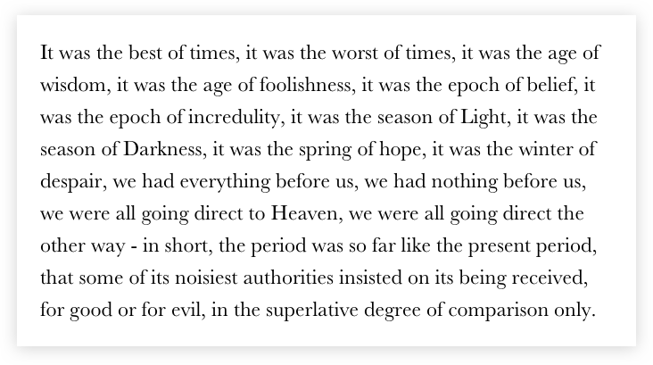
The start and end are probably obvious by now, but what is with the word inline and why do we need it? To understand it, we need to talk about something called CSS writing modes. Jen Simmons wrote an excellent article on that topic. I won’t regurgitate everything explained there, but the bottom line is that we can use writing modes to define the writing direction. Some languages, like the Chinese, Korean, and Japanese, can be written vertically from top to bottom. CSS writing modes allow us to control that flow. Take a look at the following paragraph:

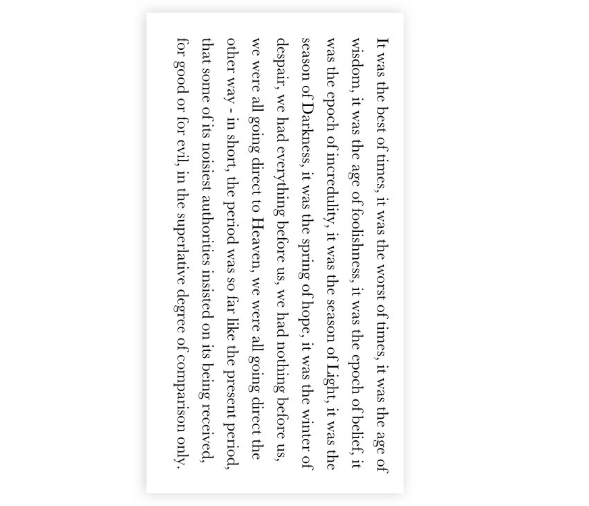
You can clearly identify the top, bottom, left and right edges of the block. What will happen if we change the direction of the paragraph using CSS writing modes to flow vertically?

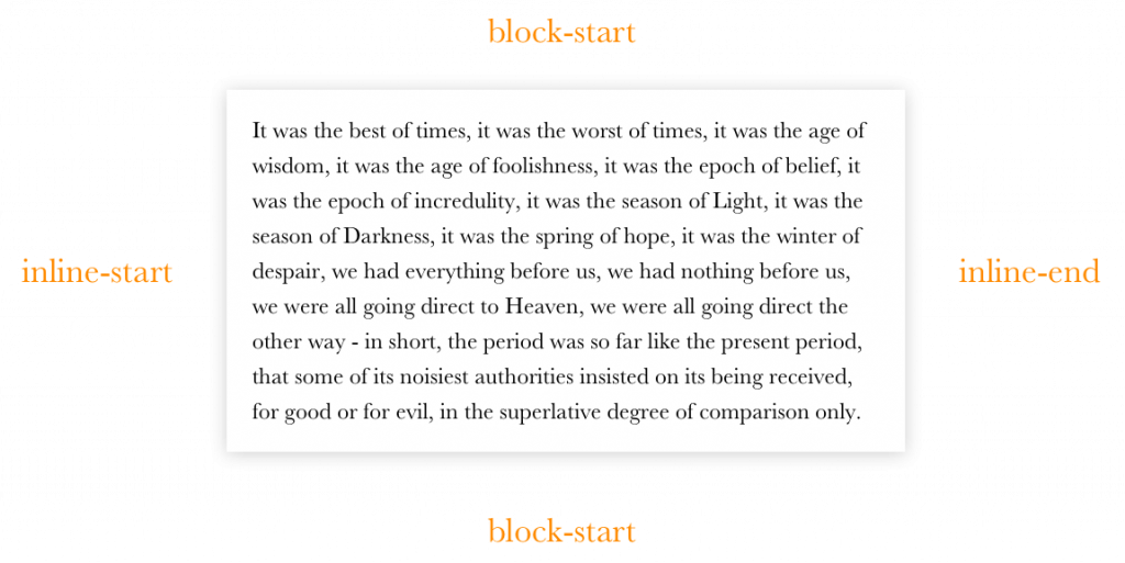
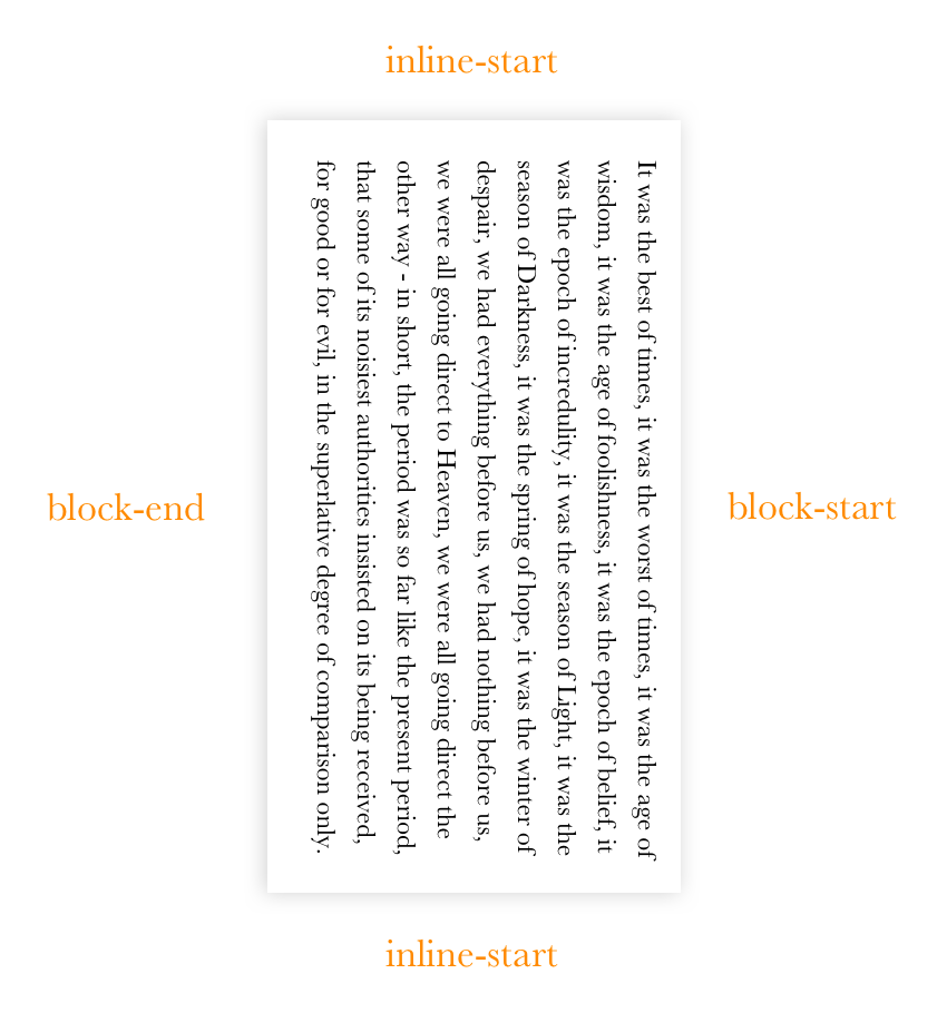
When we talk about the “top” of this rotated paragraph, do we mean the where the content begins or what was the right edge when it wasn’t rotated? Identifying the four directions becomes confusing. Let's look at them from a different perspective. In “normal” writing conditions, the vertical axis will have the suffix -block and the horizontal axis will have the suffix -inline, both followed by start or end:

And if we rotate it, it should be like this:

Since we are talking about normal horizontal layout, we will be using -inline-start and -inline-end, but it is good to know about the other properties as well. We can also write logical shorthand values by using the logical keyword. Consider the following:
article img {
  margin: logical 10px 20px 30px 40px;
}
The computed value of the image's margin will be the following:
article img {
  margin-block-start: 10px;
  margin-inline-start: 20px;
  margin-block-end: 30px;
  margin-inline-end: 40px;
}
The logical keyword is an experimental feature at this point in time, which means it may change or it may be replaced by the time the spec becomes official. There’s an open discussion on the topic that you can follow in the meantime.
Logical properties also allow us to apply values to a certain axis, meaning we have margin-inline and margin-block for the horizontal and vertical axises, respectively.
| Property | Logical Property |
|---|---|
margin-top |
margin-block-start |
margin-left |
margin-inline-start |
margin-right |
margin-inline-end |
margin-bottom |
margin-block-end |
Just like with the logical margin properties, we also have logical padding properties which follow the same rules as the margin.
| Property | Logical Property |
|---|---|
padding-top |
padding-block-start |
padding-left |
padding-inline-start |
padding-right |
padding-inline-end |
padding-bottom |
padding-block-end |
Logical positioning properties
In the previous examples we were able to modify the meaning of the property by appending suffixes, but what about the positions? The properties names changed completely from what we know now as top, right, bottom, and left.
.element {
  position: absolute;
  inset-block-start: 0;  /* evaluates to top */
  inset-block-end: 0;    /* evaluates to bottom */
  inset-inline-start: 0; /* evaluates to left in ltr and right in rtl */
  inset-inline-end: 0;   /* evaluates to right in ltr and left in rtl */
}
Learning new properties and values can be hard but, hey, we get a shorthand property called inset to make it a little easier:
/* Shorthand FTW! */
.element {
  position: absolute;
  inset: logical 10px 20px 30px 40px;
}


/* It evaluates to this */
.element {
  position: absolute;
  inset-block-start: 10px;
  inset-inline-start: 20px;
  inset-block-end: 30px;
  inset-inline-end: 40px;
}
inset supports both inset-block and inset-inline just like margin and padding.
| Property | Logical Property |
|---|---|
top |
inset-block-start |
left |
inset-inline-start |
right |
inset-inline-end |
bottom |
inset-block-end |
Logical border properties
Border properties can also become logical by appending the -inline-start and -block-start.
| Property | Logical Property |
|---|---|
border-top{-size|style|color} |
border-block-start{-size|style|color} |
border-left{-size|style|color} |
border-inline-start{-size|style|color} |
border-right{-size|style|color} |
border-inline-end{-size|style|color} |
border-bottom{-size|style|color} |
border-block-end{-size|style|color} |
In her deep dive on logical properties and values, Rachel Andrew includes an excellent demo that demonstrates logical border properties and how they respond to different writing modes.
How can we start using all this today?
We can start using all the magic of logical properties and value today, thanks to the power of PostCSS! Jonathan Neal wrote this lovely PostCSS plugin that enables us to write logically and compile the code to something today’s browsers will understand. The plugin works in three stages:
- It translates the new syntax to existing standards that unsupported browsers will recognize, using the
:dirpseudo-class to create output to ltr andrtl. - It uses another one of Neal’s plugins to translate
:dirto an attribute selector, like this:
 .element:dir(ltr) {
   ...
 }
 [dir="ltr"] .element {
   ...
}- It uses the postcss-nested plugin to transform nested selectors to one-line selectors, the same way other CSS preprocessors do.
PostCSS works with any workflow. You can try it with Grunt, Gulp, and webpack.
I will close by saying I have seen a lot of benefits since making the shift to logical properties and values. Sure, building multi-directional layouts takes time. There’s the learning curve, the addition of more properties to write, and of course, testing. Our previous methods for creating multi-directional layouts were either taking care of both directions in development or working on one direction at a time — neither of which is all that suitable for big projects. With logical properties and values you write your code once and it works for both directions without any consideration.
References
- CSS Writing Modes by Jen Simmons
- Understanding Logical Properties And Values by Rachel Andrew
- PostCSS Logical Properties and Values by Jonathan Neal
- Multilingual layouts in 2017 in Arabic by Me (Slides)
The post Building Multi-Directional Layouts appeared first on CSS-Tricks.
from CSS-Tricks https://ift.tt/2utFcd2
via IFTTT

No comments:
Post a Comment