Friday 31 January 2020

Innovation Can’t Keep the Web Fast

Every so often, the fruits of innovation bear fruit in the form of improvements to the foundational layers of the web. In 2015, HTTP/2 became a published standard in an effort to update an aging protocol. This was was both necessary and overdue, as HTTP/1 rendered web performance as an arcane sort of discipline in the form of strange workarounds of its limitations. Though HTTP/2 proliferation isn’t absolute — and there are kinks yet to be worked out — I don’t think it’s a stretch to say the web is better off because of it.

Unfortunately, the rollout of HTTP/2 has presided over a 102% median increase of bytes transferred over mobile the last four years. If we look at the 90th percentile of that same dataset — because it’s really the long tail of performance we need to optimize for — we see an increase of 239%. From 2016 (PDF warning) to 2019, the average mobile download speed in the U.S. has increased by 73%. In Brazil and India, average mobile download speeds increased by 75% and 28%, respectively, in that same period of time.

While page weight alone doesn’t necessarily tell the whole story of the user experience, it is, at the very least, a loosely related phenomenon which threatens the collective user experience. The story that HTTPArchive tells through data acquired from the Chrome User Experience Export (CrUX) can be interpreted a number of different ways, but this one fact is steadfast and unrelenting: most metrics gleaned from CrUX over the last couple of years show little, if any improvement despite various improvements in browsers, the HTTP protocol, and the network itself.

Given these trends, all that can be said of the impact of these improvements at this point is that it has helped to stem the tide of our excesses, but precious little to reduce them. Despite every significant improvement to the underpinnings of the web and the networks we access it through, we continue to build for it in ways that suggest we’re content with the never-ending Jevons paradox in which we toil.

If we’re to make progress in making a faster web for everyone, we must recognize some of the impediments to that goal:

  1. The relentless desire to monetize every square inch of the web, as well as the army of third party vendors which fuel the research mandated by such fevered efforts.
  2. Workplace cultures that favor unrestrained feature-driven development. This practice adds to — but rarely takes away from — what we cram down the wire to users.
  3. Developer conveniences that make the job of the developer easier, but can place an increasing cost on the client.

Counter-intuitively, owners of mature codebases which embody some or all of these traits continue to take the same unsustainable path to profitability they always have. They do this at their own peril, rather than acknowledge the repeatedly established fact that performance-first development practices will do as much — or more — for their bottom line and the user experience.

It’s with this understanding that I’ve come to accept that our current approach to remedy poor performance largely consists of engineering techniques that stem from the ill effects of our business, product management, and engineering practices. We’re good at applying tourniquets, but not so good at sewing up deep wounds.

It’s becoming increasingly clear that web performance isn’t solely an engineering problem, but a problem of people. This is an unappealing assessment in part because technical solutions are comparably inarguable. Content compression works. Minification works. Tree shaking works. Code splitting works. They’re undeniably effective solutions to what may seem like entirely technical problems.

The intersection of web performance and people, on the other hand, is messy and inconvenient. Unlike a technical solution as clearly beneficial as HTTP/2, how do we qualify what successful performance cultures look like? How do we qualify successful approaches to get there? I don’t know exactly what that looks like, but I believe a good template is the following marriage of cultural and engineering tenets:

  1. An organization can’t be successful in prioritizing performance if it can’t secure the support of its leaders. Without that crucial element, it becomes extremely difficult for organizations to create a culture in which performance is the primary feature of their product.
  2. Even with leadership support, performance can’t be effectively prioritized if the telemetry isn’t in place to measure it. Without measurement, it becomes impossible to explain how product development affects performance. If you don’t have the numbers, no one will care about performance until it becomes an apparent crisis.
  3. When you have the support of leadership to make performance a priority and the telemetry in place to measure it, you still can’t get there unless your entire organization understands web performance. This is the time at which you develop and roll out training, documentation, best practices, and standards the organization can embrace. In some ways, this is the space which organizations have already spent a lot of time in, but the challenging work is in establishing feedback loops to assess how well they understand and have applied that knowledge.
  4. When all of the other pieces are finally in place, you can start to create accountability in the organization around performance. Accountability doesn’t come in the form of reprisals when your telemetry tells you performance has suffered over time, but rather in the form of guard rails put in place in the deployment process to alert you when thresholds have been crossed.

Now comes the kicker: even if all of these things come together in your workplace, good outcomes aren’t guaranteed. Barring some regulation that forces us to address the poorly performing websites in our charge — akin to how the ADA keeps us on our toes with regard to accessibility — it’s going to take continuing evangelism and pressure to ensure performance remains a priority. Like so much of the work we do on the web, the work of maintaining a good user experience in evolving codebases is never done. I hope 2020 is the year that we meaningfully recognize that performance is about people, and adapt accordingly.

As technological innovations such as HTTP/3 and 5G emerge, we must take care not to rest on our laurels and simply assume they will heal our ills once and for all. If we do, we’ll certainly be having this discussion again when the successors to those technologies loom. Innovation alone can’t keep the web fast because making the web fast — and keeping it that way — is the hard work we can only accomplish by working together.

The post Innovation Can’t Keep the Web Fast appeared first on CSS-Tricks.


from CSS-Tricks https://ift.tt/31bVlAl
via IFTTT

Smaller HTML Payloads with Service Workers

Short story: Philip Walton has a clever idea for using service workers to cache the top and bottom of HTML files, reducing a lot of network weight.

Longer thoughts: When you're building a really simple website, you can get away with literally writing raw HTML. It doesn't take long to need a bit more abstraction than that. Even if you're building a three-page site, that's three HTML files, and your programmer's mind will be looking for ways to not repeat yourself. You'll probably find a way to "include" all the stuff at the top and bottom of the HTML, and just change the content in the middle.

I have tended to reach for PHP for that sort of thing in the past (<?php include('header.php); ?>), although these days I'm feeling much more jamstacky and I'd probably do it with Eleventy and Nunjucks.

Or, you could go down the SPA (Single Page App) route just for this basic abstraction if you want. Next and Nuxt are perhaps a little heavy-handed for a few includes, but hey, at least they are easy to work with and the result is a nice static site. The thing about these JavaScript-powered SPA frameworks (Gatsby is in here, too), is that they "hydrate" from static sites into SPAs as the JavaScript loads. Part of the reason for that is speed. No longer does the browser need to reload and request a whole big HTML page again to render; it just asks for whatever smaller amount of data it needs and replaces it on the fly.

So in a sense, you might build a SPA because you have a common header and footer and just want to replace the guts, for efficiencies sake.

Here's Phil:

In a traditional client-server setup, the server always needs to send a full HTML page to the client for every request (otherwise the response would be invalid). But when you think about it, that’s pretty wasteful. Most sites on the internet have a lot of repetition in their HTML payloads because their pages share a lot of common elements (e.g. the <head>, navigation bars, banners, sidebars, footers etc.). But in an ideal world, you wouldn’t have to send so much of the same HTML, over and over again, with every single page request.

With service workers, there’s a solution to this problem. A service worker can request just the bare minimum of data it needs from the server (e.g. an HTML content partial, a Markdown file, JSON data, etc.), and then it can programmatically transform that data into a full HTML document.

So rather than PHP, Eleventy, a JavaScript framework, or any other solution, Phil's idea is that a service worker (a native browser technology) can save a cache of a site's header and footer. Then server requests only need to be made for the "guts" while the full HTML document can be created on the fly.

It's a super fancy idea, and no joke to implement, but the fact that it could be done with less tooling might be appealing to some. On Phil's site:

 on this site over the past 30 days, page loads from a service worker had a 47.6% smaller network payloads, and a median First Contentful Paint (FCP) that was 52.3% faster than page loads without a service worker (416ms vs. 851ms).

Aside from configuring a service worker, I'd think the most finicky part is having to configure your server/API to deliver a content-only version of your stuff or build two flat file versions of everything.

Direct Link to ArticlePermalink

The post Smaller HTML Payloads with Service Workers appeared first on CSS-Tricks.


from CSS-Tricks https://ift.tt/36wgZ3Z
via IFTTT

Lightning-Fast Web Performance

If you're interested in leveling up your knowledge and skill of web performance, you can't do better than learning directly from Scott Jehl.

Direct Link to ArticlePermalink

The post Lightning-Fast Web Performance appeared first on CSS-Tricks.


from CSS-Tricks https://ift.tt/36hgSIF
via IFTTT

SEO for 2020 - Whiteboard Friday

Posted by BritneyMuller

It's a brand-new decade, rich with all the promise of a fresh start and new beginnings. But does that mean you should be doing anything different with regards to your SEO?

In this Whiteboard Friday, our Senior SEO Scientist Britney Muller offers a seventeen-point checklist of things you ought to keep in mind for executing on modern, effective SEO. You'll encounter both old favorites (optimizing title tags, anyone?) and cutting-edge ideas to power your search strategy from this year on into the future.

Click on the whiteboard image above to open a high resolution version in a new tab!

Video Transcription

Hey, Moz fans. Welcome to another edition of Whiteboard Friday. Today we are talking about SEO in 2020. What does that look like? How have things changed?

Do we need to be optimizing for favicons and BERT? We definitely don't. But here are some of the things that I feel we should be keeping an eye on. 

☑ Cover your bases with foundational SEO

Titles, metas, headers, alt text, site speed, robots.txt, site maps, UX, CRO, Analytics, etc.

To cover your bases with foundational SEO will continue to be incredibly important in 2020, basic things like title tags, meta descriptions, alt, all of the basic SEO 101 things.

There have been some conversations in the industry lately about alt text and things of that nature. When Google is getting so good at figuring out and knowing what's in an image, why would we necessarily need to continue providing alt text?

But you have to remember we need to continue to make the web an accessible place, and so for accessibility purposes we should absolutely continue to do those things. But I do highly suggest you check out Google's Visual API and play around with that to see how good they've actually gotten. It's pretty cool.

☑ Schema markup

FAQ, Breadcrumbs, News, Business Info, etc.

Schema markup will continue to be really important, FAQ schema, breadcrumbs, business info. The News schema that now is occurring in voice results is really interesting. I think we will see this space continue to grow, and you can definitely leverage those different markup types for your website. 

☑ Research what matters for your industry!

Just to keep in mind, there's going to be a lot of articles and research and information coming at you about where things are going, what you should do to prepare, and I want you to take a strategic stance on your industry and what's important in your space.

While I might suggest page speed is going to be really important in 2020, is it for your industry? We should still worry about these things and still continue to improve them. But if you're able to take a clearer look at ranking factors and what appears to be a factor for your specific space, you can better prioritize your fixes and leverage industry information to help you focus.

☑ National SERPs will no longer be reliable

You need to be acquiring localized SERPs and rankings.

This has been the case for a while. We need to localize search results and rankings to get an accurate and clear picture of what's going on in search results. I was going to put E-A-T here and then kind of cross it off.

A lot of people feel E-A-T is a huge factor moving forward. Just for the case of this post, it's always been a factor. It's been that way for the last ten-plus years, and we need to continue doing that stuff despite these various updates. I think it's always been important, and it will continue to be so. 

☑ Write good and useful content for people

While you can't optimize for BERT, you can write better for NLP.

This helps optimize your text for natural language processing. It helps make it more accessible and friendly for BERT. While you can't necessarily optimize for something like BERT, you can just write really great content that people are looking for.

☑ Understand and fulfill searcher intent, and keep in mind that there's oftentimes multi-intent

One thing to think about this space is we've kind of gone from very, very specific keywords to this richer understanding of, okay, what is the intent behind these keywords? How can we organize that and provide even better value and content to our visitors? 

One way to go about that is to consider Google houses the world's data. They know what people are searching for when they look for a particular thing in search. So put your detective glasses on and examine what is it that they are showing for a particular keyword.

Is there a common theme throughout the pages? Tailor your content and your intent to solve for that. You could write the best article in the world on DIY Halloween costumes, but if you're not providing those visual elements that you so clearly see in a Google search result page, you're never going to rank on page 1.

☑ Entity and topical integration baked into your IA

Have a rich understanding of your audience and what they're seeking.

This plays well into entities and topical understanding. Again, we've gone from keywords and now we want to have this richer, better awareness of keyword buckets. 

What are those topical things that people are looking for in your particular space? What are the entities, the people, places, or things that people are investigating in your space, and how can you better organize your website to provide some of those answers and those structures around those different pieces? That's incredibly important, and I look forward to seeing where this goes in 2020. 

☑ Optimize for featured snippets

Featured snippets are not going anywhere. They are here to stay. The best way to do this is to find the keywords that you currently rank on page 1 for that also have a featured snippet box. These are your opportunities. If you're on page 1, you're way more apt to potentially steal or rank for a featured snippet.

One of the best ways to do that is to provide really succinct, beautiful, easy-to-understand summaries, takeaways, etc., kind of mimic what other people are doing, but obviously don't copy or steal any of that. Really fun space to explore and get better at in 2020. 

☑ Invest in visuals

We see Google putting more authority behind visuals, whether it be in search or you name it. It is incredibly valuable for your SEO, whether it be unique images or video content that is organized in a structured way, where Google can provide those sections in that video search result. You can do all sorts of really neat things with visuals. 

☑ Cultivate engagement

This is good anyway, and we should have been doing this before. Gary Illyes was quoted as saying, "Comments are better for on-site engagement than social signals." I will let you interpret that how you will.

But I think it goes to show that engagement and creating this community is still going to be incredibly important moving forward into the future.

☑ Repurpose your content

Blog post → slides → audio → video

This is so important, and it will help you excel even more in 2020 if you find your top-performing web pages and you repurpose them into maybe be a SlideShare, maybe a YouTube video, maybe various pins on Pinterest, or answers on Quora.

You can start to refurbish your content and expand your reach online, which is really exciting. In addition to that, it's also interesting to play around with the idea of providing people options to consume your content. Even with this Whiteboard Friday, we could have an audio version that people could just listen to if they were on their commute. We have the transcription. Provide options for people to consume your content. 

☑ Prune or improve thin or low-quality pages

This has been incredibly powerful for myself and many other SEOs I know in improving the perceived quality of a site. So consider testing and meta no-indexing low-quality, thin pages on a website. Especially larger websites, we see a pretty big impact there. 

☑ Get customer insights!

This will continue to be valuable in understanding your target market. It will be valuable for influencer marketing for all sorts of reasons. One of the incredible tools that are currently available by our Whiteboard Friday extraordinaire, Rand Fishkin, is SparkToro. So you guys have to check that out when it gets released soon. Super exciting. 

☑ Find keyword opportunities in Google Search Console

It's shocking how few people do this and how accessible it is. If you go into your Google Search Console and you export as much data as you can around your queries, your click-through rate, your position, and impressions, you can do some incredible, simple visualizations to find opportunities.

For example, if this is the rank of your keywords and this is the click-through rate, where do you have high click-through rate but low ranking position? What are those opportunity keywords? Incredibly valuable. You can do this in all sorts of tools. One I recommend, and I will create a little tutorial for, is a free tool called Facets, made by Google for machine learning. It makes it really easy to just pick those apart. 

☑ Target link-intent keywords

A couple quick link building tactics for 2020 that will continue to hopefully work very, very well. What I mean by link-intent keywords is your keyword statistics, your keyword facts.

These are searches people naturally want to reference. They want to link to it. They want to cite it in a presentation. If you can build really great content around those link-intent keywords, you can do incredibly well and naturally build links to a website. 

☑ Podcasts

Whether you're a guest or a host on a podcast, it's incredibly easy to get links. It's kind of a fun link building hack. 

☑ Provide unique research with visuals

Andy Crestodina does this so incredibly well. So explore creating your own unique research and not making it too commercial but valuable for users. I know this was a lot.

There's a lot going on in 2020, but I hope some of this is valuable to you. I truly can't wait to hear your thoughts on these recommendations, things you think I missed, things that you would remove or change. Please let us know down below in the comments, and I will see you all soon. Thanks.

Video transcription by Speechpad.com


Sign up for The Moz Top 10, a semimonthly mailer updating you on the top ten hottest pieces of SEO news, tips, and rad links uncovered by the Moz team. Think of it as your exclusive digest of stuff you don't have time to hunt down but want to read!


from The Moz Blog https://ift.tt/2vCMgot
via IFTTT

Thursday 30 January 2020

Sticky Table of Contents with Scrolling Active States

Say you have a two-column layout: a main column with content. Say it has a lot of content, with sections that requires scrolling. And let's toss in a sidebar column that is largely empty, such that you can safely put a position: sticky; table of contents over there for all that content in the main column. A fairly common pattern for documentation.

Bramus Van Damme has a nice tutorial on all this, starting from semantic markup, implementing most of the functionality with HTML and CSS, and then doing the last bit of active nav enhancement with JavaScript.

For example, if you don't click yourself down to a section (where you might be able to get away with :target styling for active navigation), JavaScript is necessary to tell where you are scrolled to an highlight the active navigation. That active bit is handled nicely with IntersectionObserver, which is, like, the perfect API for this.

Here's that result:

It reminds me of a very similar demo from Hakim El Hattab he called Progress Nav. The design pattern is exactly the same, but Hakim's version has this ultra fancy SVG path that draws itself along the way, indenting for sub nav. I'll embed a video here:

That one doesn't use IntersectionObserver, so if you want to hack on this, combine 'em!

The post Sticky Table of Contents with Scrolling Active States appeared first on CSS-Tricks.


from CSS-Tricks https://ift.tt/36KsXpT
via IFTTT

“resize: none;” on textareas is bad UX

Catalin Rosu:

Sometimes you need to type a long reply that consists of many paragraphs and wrapping that text within a tiny textarea box makes it hard to understand and to follow as you type. There were many times when I had to write that text within Notepad++ for example and then just paste the whole reply in that small textarea. I admit I also opened the DevTools to override the resize: none declaration but that’s not really a productive way to do things.

Removing the default reliability of a <textarea> is generally user-hurting vanity. Even if the resized textarea "breaks" the site layout, too bad, the user is trying to do something very important on this site right now and you should not let anything get in the way of that. I know the web is a big place though, so feel free to prove me wrong in the comments.

This must have been cathartic for Catalin, who has been steadily gaining a reputation on Stack Overflow for an answer on how to prevent a textarea from resizing from almost a decade ago.

Direct Link to ArticlePermalink

The post “resize: none;” on textareas is bad UX appeared first on CSS-Tricks.


from CSS-Tricks https://ift.tt/2PNxIZA
via IFTTT

Understanding Immutability in JavaScript

If you haven’t worked with immutability in JavaScript before, you might find it easy to confuse it with assigning a variable to a new value, or reassignment. While it’s possible to reassign variables and values declared using let or var, you'll begin to run into issues when you try that with const.

Say we assign the value Kingsley to a variable called firstName:

let firstName = "Kingsley";

We can reassign a new value to the same variable,

firstName = "John";

This is possible because we used let. If we happen to use const instead like this:

const lastName = "Silas";

…we will get an error when we try to assign it to a new value;

lastName = "Doe"
// TypeError: Assignment to constant variable.

That is not immutability.

An important concept you’ll hear working with a framework, like React, is that mutating states is a bad idea. The same applies to props. Yet, it is important to know that immutability is not a React concept. React happens to make use of the idea of immutability when working with things like state and props.

What the heck does that mean? That’s where we're going to pick things up.

Mutability is about sticking to the facts

Immutable data cannot change its structure or the data in it. It’s setting a value on a variable that cannot change, making that value a fact, or sort of like a source of truth — the same way a princess kisses a frog hoping it will turn into a handsome prince. Immutability says that frog will always be a frog.

[ILLUSTRATION]

Objects and arrays, on the other hand, allow mutation, meaning the data structure can be changed. Kissing either of those frogs may indeed result in the transformation of a prince if we tell it to.

[ILLUSTRATION]

Say we have a user object like this:

let user = { name: "James Doe", location: "Lagos" }

Next, let’s attempt to create a newUser object using those properties:

let newUser = user

Now let’s imagine the first user changes location. It will directly mutate the user object and affect the newUser as well:

user.location = "Abia"
console.log(newUser.location) // "Abia"

This might not be what we want. You can see how this sort of reassignment could cause unintended consequences.

Working with immutable objects

We want to make sure that our object isn’t mutated. If we’re going to make use of a method, it has to return a new object. In essence, we need something called a pure function.

A pure function has two properties that make it unique:

  1. The value it returns is dependent on the input passed. The returned value will not change as long as the inputs do not change.
  2. It does not change things outside of its scope.

By using Object.assign(), we can create a function that does not mutate the object passed to it. This will generate a new object instead by copying the second and third parameters into the empty object passed as the first parameter. Then the new object is returned.

const updateLocation = (data, newLocation) => {
    return {
      Object.assign({}, data, {
        location: newLocation
    })
  }
}

updateLocation() is a pure function. If we pass in the first user object, it returns a new user object with a new value for the location.

Another way to go is using the Spread operator:

const updateLocation = (data, newLocation) => {
  return {
    ...data,
    location: newLocation
  }
}

OK, so how does this all of this fit into React? Let’s get into that next.

Immutability in React

In a typical React application, the state is an object. (Redux makes use of an immutable object as the basis of an application’s store.) React’s reconciliation process determines if a component should re-render or if it needs a way to keep track of the changes.

In other words, if React can’t figure out that the state of a component has changed, then it will not not know to update the Virtual DOM.

Immutability, when enforced, makes it possible to keep track of those changes. This allows React to compare the old state if an object with it’s new state and re-render the component based on that difference.

This is why directly updating state in React is often discouraged:

this.state.username = "jamesdoe";

React will not be sure that the state has changed and is unable to re-render the component.

Immutable.js

Redux adheres to the principles of immutability. Its reducers are meant to be pure functions and, as such, they should not mutate the current state but return a new object based on the current state and action. We’d typically make use of the spread operator like we did earlier, yet it is possible to achieve the same using a library called Immutable.js.

While plain JavaScript can handle immutability, it’s possible to run into a handful of pitfalls along the way. Using Immutable.js guarantees immutability while providing a rich API that is big on performance. We won’t be going into all of the fine details of Immutability.js in this piece, but we will look at a quick example that demonstrates using it in a to-do application powered by React and Redux.

First, lets’ start by importing the modules we need and set up the Todo component while we’re at it.


const { List, Map } = Immutable;
const { Provider, connect } = ReactRedux;
const { createStore } = Redux;

If you are following along on your local machine. you’ll need to have these packages installed:

npm install redux react-redux immutable 

The import statements will look like this.

import { List, Map } from "immutable";
import { Provider, connect } from "react-redux";
import { createStore } from "redux";

We can then go on to set up our Todo component with some markup:

const Todo = ({ todos, handleNewTodo }) => {
  const handleSubmit = event => {
    const text = event.target.value;
    if (event.which === 13 && text.length > 0) {
      handleNewTodo(text);
      event.target.value = "";
    }
  };

  return (
    <section className="section">
      <div className="box field">
        <label className="label">Todo</label>
        <div className="control">
          <input
            type="text"
            className="input"
            placeholder="Add todo"
            onKeyDown={handleSubmit}
          />
        </div>
      </div>
      <ul>
        {todos.map(item => (
          <div key={item.get("id")} className="box">
            {item.get("text")}
          </div>
        ))}
      </ul>
    </section>
  );
};

We’re using the handleSubmit() method to create new to-do items. For the purpose of this example, the user will only be create new to-do items and we only need one action for that:

const actions = {
  handleNewTodo(text) {
    return {
      type: "ADD_TODO",
      payload: {
        id: uuid.v4(),
        text
      }
    };
  }
};

The payload we’re creating contains the ID and the text of the to-do item. We can then go on to set up our reducer function and pass the action we created above to the reducer function:

const reducer = function(state = List(), action) {
  switch (action.type) {
    case "ADD_TODO":
      return state.push(Map(action.payload));
    default:
      return state;
  }
};

We’re going to make use of connect to create a container component so that we can plug into the store. Then we’ll need to pass in mapStateToProps() and mapDispatchToProps() functions to connect.

const mapStateToProps = state => {
  return {
    todos: state
  };
};

const mapDispatchToProps = dispatch => {
  return {
    handleNewTodo: text => dispatch(actions.handleNewTodo(text))
  };
};

const store = createStore(reducer);

const App = connect(
  mapStateToProps,
  mapDispatchToProps
)(Todo);

const rootElement = document.getElementById("root");

ReactDOM.render(
  <Provider store={store}>
    <App />
  </Provider>,
  rootElement
);

We’re making use of mapStateToProps() to supply the component with the store’s data. Then we’re using mapDispatchToProps() to make the action creators available as props to the component by binding the action to it.

In the reducer function, we make use of List from Immutable.js to create the initial state of the app.

const reducer = function(state = List(), action) {
  switch (action.type) {
    case "ADD_TODO":
      return state.push(Map(action.payload));
    default:
      return state;
  }
};

Think of List as a JavaScript array, which is why we can make use of the .push() method on state. The value used to update state is an object that goes on to say that Map can be recognized as an object. This way, there’s no need to use Object.assign() or the spread operator, as this guarantees that the current state cannot change. This looks a lot cleaner, especially if it turns out that the state is deeply nested — we do not need to have spread operators sprinkled all over


Immutable states make it possible for code to quickly determine if a change has occurred. We do not need to do a recursive comparison on the data to determine if a change happened. That said, it’s important to mention that you might run into performance issues when working with large data structures — there’s a price that comes with copying large data objects.

But data needs to change because there’s otherwise no need for dynamic sites or applications. The important thing is how the data is changed. Immutability provides the right way to change the data (or state) of an application. This makes it possible to trace the state’s changes and determine what the parts of the application should re-render as a result of that change.

Learning about immutability the first time will be confusing. But you’ll become better as you bump into errors that pop up when the state is mutated. That’s often the clearest way to understand the need and benefits of immutability.

Further reading

The post Understanding Immutability in JavaScript appeared first on CSS-Tricks.


from CSS-Tricks https://ift.tt/36GdsPY
via IFTTT

Uses This

A little interview with me over on Uses This. I'll skip the intro since you know who I am, but I'll republish the rest here.

What hardware do you use?

I'm a fairly cliché Mac guy. After my first Commodore 64 (and then 128), the only computers I've ever had have been from Apple. I'm a longtime loyalist in that way and I don't regret a second of it. I use the 2018 MacBook Pro tricked out as much as they would sell it to me. It's the main tool for my job, so I've always made sure I had the best equipment I can. A heaping helping of luck and privilege have baked themselves into moderate success for me such that I can afford that.

At the office, I plug it into two of those LG UltraFine 4k monitors, a Microsoft Ergonomic Keyboard, and a Logitech MX Master mouse. I plug in some Audioengine A2s for speakers. Between all those extras, the desk is more cluttered in wires than I would like and I look forward to an actually wireless future.

I'm only at the office say 60% of the time and aside from that just use the MacBook Pro as it is. I'm probably a more efficient coder at the office, but my work is a lot of email and editing and social media and planning and such that is equally efficient away from the fancy office setup.

And what software?

  • Notion for tons of stuff. Project planning. Meeting notes. Documentation. Public documents.
  • Things for personal TODO lists.
  • BusyCal for calendaring.
  • 1Password for password, credit cards, and other secure documents and notes.
  • Slack for team and community chat.
  • WhatsApp for family chat.
  • Zoom for business face-to-face chat and group podcasting.
  • Audio Hijack for locally recording podcasts.
  • FaceTime for family face to face chat.
  • ScreenFlow for big long-form screen recordings.
  • Kap for small short-form screen recordings.
  • CleanMyMac for tidying up.
  • Local for local WordPress development.
  • VS Code for writing code.
  • TablePlus for dealing with databases.
  • Tower for Git.
  • iTerm for command line work.
  • Figma for design.
  • Mailplane to have a tabbed in-dock closable Gmail app.
  • Bear for notes and Markdown writing.

What would be your dream setup?

I'd happily upgrade to a tricked out 16" MacBook Pro. If I'm just throwing money at things I'd also happily take Apple's Pro Display XDR, but the price on those is a little frightening. I already have it pretty good, so I don't do a ton of dreaming about what could be better.

The post Uses This appeared first on CSS-Tricks.


from CSS-Tricks https://ift.tt/2tcGvgr
via IFTTT

Free Website Builder + Free CRM + Free Live Chat = Bitrix24

(This is a sponsored post.)

You may know Bitrix24 as the world’s most popular free CRM and sales management system, used by over 6 million businesses. But the free website builder available inside Bitrix24 is worthy of your attention, too.

Why do I need another free website/landing page builder?

There are many ways to create free websites — Wix, Squarepage, WordPress, etc. And if you need a blog — Medium, Tumblr and others are at your disposal. Bitrix24 is geared toward businesses that need websites to generate leads, sell online, issue invoices or accept payments. And there’s a world of difference between regular website builders and the ones that are designed with specific business needs in mind.

What does a good business website builder do? First, it creates websites that engage visitors so that they start interacting. This is done with the help of tools like website live chat, contact form or a call back request widget. Second, it comes with a landing page designer, because business websites are all about conversion rates, and increasing conversion rates requires endless tweaking and repeated testing. Third, integration between a website and a CRM system is crucial. It’s difficult to attract traffic to websites and advertising expensive. So, it makes sense that every prospect from the website as logged into CRM automatically and that you sell your goods and services to clients not only once but on a regular basis. This is why Bitrix24 comes with email and SMS marketing and advertising ROI calculator.

Another critical requirement for many business websites is ability to accept payments online and function as an ecommerce store, with order processing and inventory management. Bitrix24 does that too. Importantly, unlike other ecommerce platforms, Bitrix24 doesn’t charge any transaction fees or come with sales volume limits.

What else does Bitrix24 offer free of charge?

The only practical limit of the free plan is 12 users inside the account. You can use your own domain free of charge, the bandwidth is free and unlimited and there’s only a technical limit on the number of free pages allowed (around 100) in order to prevent misusing Bitrix24 for SEO-spam pages. In addition to offering free cloud service, Bitrix24 has on-premise editions with open source code access that can be purchased. This means that you can migrate your cloud Bitrix24 account to your own server at any moment, if necessary.

To register your free Bitrix24 account, simply click here. And if you have a public Facebook or Twitter profile and share this post, you’ll be automatically entered into a contest, in which the winner gets a 24-month subscription for the Bitrix24 Professional plan ($3,336 value).

Direct Link to ArticlePermalink

The post Free Website Builder + Free CRM + Free Live Chat = Bitrix24 appeared first on CSS-Tricks.


from CSS-Tricks https://synd.co/2TTFB3p
via IFTTT

Wednesday 29 January 2020

How Do You Do max-font-size in CSS?

CSS doesn't have max-font-size, so if we need something that does something along those lines, we have to get tricky.

Why would you need it at all? Well, font-size itself can be set in dynamic ways. For example, font-size: 10vw;. That's using "viewport units" to size the type, which will get larger and smaller with the size of the browser window. If we had max-font-size, we could limit how big it gets (similarly the other direction with min-font-size).

One solution is to use a media query at a certain screen size breakpoint that sets the font size in a non-relative unit.

body {
  font-size: 3vw;
}
@media screen and (min-width: 1600px) {
  body {
     font-size: 30px;
  }
}

There is a concept dubbed CSS locks that gets fancier here, slowly scaling a value between a minimum and maximum. We've covered that. It can be like...

body {
  font-size: 16px;
}
@media screen and (min-width: 320px) {
  body {
    font-size: calc(16px + 6 * ((100vw - 320px) / 680));
  }
}
@media screen and (min-width: 1000px) {
  body {
    font-size: 22px;
  }
}

We've also covered how it's gotten (or will get) a lot simpler.

There is a max() function in CSS, so our example above becomes a one-liner:

font-size: max(30vw, 30px);

Or double it up with a min and max:

font-size: min(max(16px, 4vw), 22px);

Which is identical to:

font-size: clamp(16px, 4vw, 22px);

Browser compatibility for these functions is pretty sparse as I'm writing this, but Chrome currently has it. It will get there, but look at the first option in this article if you need it right now.

Now that we have these functions, it seems unlikely to me we'll ever get min-font-size and max-font-size in CSS, since the functions are almost more clear as-is.

The post How Do You Do max-font-size in CSS? appeared first on CSS-Tricks.


from CSS-Tricks https://ift.tt/31cFFNi
via IFTTT

Resizing Values in Steps in CSS

There actually is a steps() function in CSS, but it's only used for animation. You can't, for example, tell an element it's allowed to grow in height but only in steps of 10px. Maybe someday? I dunno. There would have to be some pretty clear use cases that something like background-repeat: space || round; doesn't already handle.

Another way to handle steps would be sequential media queries.

@media (max-width: 1500px) { body { font-size: 30px; }}
@media (max-width: 1400px) { body { font-size: 28px; }}
@media (max-width: 1300px) { body { font-size: 26px; }}
@media (max-width: 1200px) { body { font-size: 24px; }}
@media (max-width: 1000px) { body { font-size: 22px; }}
@media (max-width: 900px) { body { font-size: 20px; }}
@media (max-width: 800px) { body { font-size: 18px; }}
@media (max-width: 700px) { body { font-size: 16px; }}
@media (max-width: 600px) { body { font-size: 14px; }}
@media (max-width: 500px) { body { font-size: 12px; }}
@media (max-width: 400px) { body { font-size: 10px; }}
@media (max-width: 300px) { body { font-size: 8px; }}

That's just weird, and you'd probably want to use fluid typography, but the point here is resizing in steps and not just fluidity.

I came across another way to handle steps in a StackOverflow answer from John Henkel a while ago. (I was informed Star Simpson also called it out.) It's a ridiculous hack and you should never use it. But it's a CSS trick so I'm contractually obliged to share it.

The calc function uses double precision float. Therefore it exhibits a step function near 1e18... This will snap to values 0px, 1024px, 2048px, etc.

calc(6e18px + 100vw - 6e18px);

That's pretty wacky. It's a weird "implementation detail" that hasn't been specced, so you'll only see it in Chrome and Safari.

You can fiddle with that calculation and apply the value to whatever you want. Here's me tuning it down quite a bit and applying it to font-size instead.

Try resizing that to see the stepping behavior (in Chrome or Safari).

The post Resizing Values in Steps in CSS appeared first on CSS-Tricks.


from CSS-Tricks https://ift.tt/37DWiDX
via IFTTT

Four Layouts for the Price of One

Pretty notable when a tweet about a flexbox layouts gets 8K+ likes on Twitter!

That's "native" CSS nesting in use there as well, assuming we get that at some point and the syntax holds.

There was some feedback that the code is inscrutable. I don't really think so, to me it says:

  • All these inputs are allowed both to shrink and grow
  • There is even spacing around all of it
  • The email input should be three times bigger than the others
  • If it needs to wrap, fine, wrap.

A great use case for flexbox, which is the right layout mechanism when you aren't trying to be super precise about the size of everything.

There is a blog post (no byline 🤷‍♂️) with a more longwinded explanation.


This reminds me a lot of Tim Van Damme's Adaptive Photo Layout where photos lay themselves out with flexbox. They don't entirely keep their aspect ratios, but they mostly do, thanks to literally the flexibility of flexbox.

Here's a fun fork of the original.

It's like a zillion layouts for the price of one, and just a few lines of code to boot.

The post Four Layouts for the Price of One appeared first on CSS-Tricks.


from CSS-Tricks https://ift.tt/38SMpCG
via IFTTT

Practice GraphQL Queries With the State of JavaScript API

Learning how to build GraphQL APIs can be quite challenging. But you can learn how to use GraphQL APIs in 10 minutes! And it so happens I've got the perfect API for that: the brand new, fresh-of-the-VS-Code State of JavaScript GraphQL API.

The State of JavaScript survey is an annual survey of the JavaScript landscape. We've been doing it for four years now, and the most recent edition reached over 20,000 developers.

We've always relied on Gatsby to build our showcase site, but until this year, we were feeding our data to Gatsby in the form of static YAML files generated through some kind of arcane magic known to mere mortals as "ElasticSearch."

But since Gatsby poops out all the data sources it eats as GraphQL anyway, we though we might as well skip the middleman and feed it GraphQL directly! Yes I know, this metaphor is getting grosser by the second and I already regret it. My point is: we built an internal GraphQL API for our data, and now we're making it available to everybody so that you too can easily exploit out dataset!

"But wait," you say. "I've spent all my life studying the blade which has left me no time to learn GraphQL!" Not to worry: that's where this article comes in.

What is GraphQL?

At its core, GraphQL is a syntax that lets you specify what data you want to receive from an API. Note that I said API, and not database. Unlike SQL, a GraphQL query does not go to your database directly but to your GraphQL API endpoint which, in turn, can connect to a database or any other data source.

The big advantage of GraphQL over older paradigms like REST is that it lets you ask for what you want. For example:

query {
  user(id: "foo123") {
    name
  }
}

Would get you a user object with a single name field. Also need the email? Just do:

query {
  user(id: "foo123") {
    name
    email
  }
}

As you can see, the user field in this example supports an id argument. And now we come to the coolest feature of GraphQL, nesting:

query {
  user(id: "foo123") {
    name
    email
    posts { 
      title
      body
    }
  }
}

Here, we're saying that we want to find the user's posts, and load their title and body. The nice thing about GraphQL is that our API layer can do the work of figuring out how to fetch that extra information in that specific format since we're not talking to the database directly, even if it's not stored in a nested format inside our actual database.

Sebastian Scholl does a wonderful job explaining GraphQL as if you were meeting it for the first time at a cocktail mixer.

Introducing GraphiQL

Building our first query with GraphiQL, the IDE for GraphQL

GraphiQL (note the "i" in there) is the most common GraphQL IDE out there, and it's the tool we'll use to explore the State of JavaScript API. You can launch it right now at graphiql.stateofjs.com and it'll automatically connect to our endpoint (which is api.stateofjs.com/graphql). The UI consists of three main elements: the Explorer panel, the Query Builder and the Results panels. We'll later add the Docs panels to that but let's keep it simple for now.

The Explorer tab is part of a turbo-boosted version of GraphiQL developed and maintained by OneGraph. Much thanks to them for helping us integrate it. Be sure to check out their example repo if you want to deploy your own GraphiQL instance.

Don't worry, I'm not going to make you write any code just yet. Instead, let's start from an existing GraphQL query, such as the one corresponding to developer experience with React over the past four years.

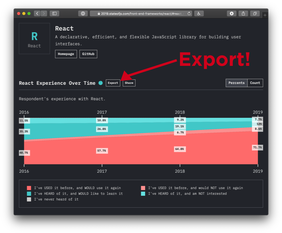
Remember how I said we were using GraphQL internally to build our site? Not only are we exposing the API, we're also exposing the queries themselves. Click the little "Export" button, copy the query in the "GraphQL" tab, paste it inside GraphiQL's query builder window, and click the "Play" button.

Source URL
The GraphQL tab in the modal that triggers when clicking Export.

If everything went according to plan, you should see your data appear in the Results panel. Let's take a moment to analyze the query.

query react_experienceQuery {
  survey(survey: js) {
    tool(id: react) {
      id
      entity {
        homepage
        name
        github {
          url
        }
      }
      experience {
        allYears {
          year
          total
          completion {
            count
            percentage
          }
          awarenessInterestSatisfaction {
            awareness
            interest
            satisfaction
          }
          buckets {
            id
            count
            percentage
          }
        }
      }
    }
  }
}

First comes the query keyword which defines the start of our GraphQL query, along with the query's name, react_experienceQuery. Query names are optional in GraphQL, but can be useful for debugging purposes.

We then have our first field, survey, which takes a survey argument. (We also have a State of CSS survey so we needed to specify the survey in question.) We then have a tool field which takes an id argument. And everything after that is related to the API results for that specific tool. entity gives you information on the specific tool selected (e.g. React) while experience contains the actual statistical data.

Now, rather than keep going through all those fields here, I'm going to teach you a little trick: Command + click (or Control + click) any of those fields inside GraphiQL, and it will bring up the Docs panel. Congrats, you've just witnessed another one of GraphQL's nifty tricks, self-documentation! You can write documentation directly into your API definition and GraphiQL will in turn make it available to end users.

Changing variables

Let's tweak things a bit: in the Query Builder, replace "react" with "vuejs" and you should notice another cool GraphQL thing: auto-completion. This is quite helpful to avoid making mistakes or to save time! Press "Play" again and you'll get the same data, but for Vue this time.

Using the Explorer

We'll now unlock one more GraphQL power tool: the Explorer. The Explorer is basically a tree of your entire API that not only lets you visualize its structure, but also build queries without writing a single line of code! So, let's try recreating our React query using the explorer this time.

First, let's open a new browser tab and load graphiql.stateofjs.com in it to start fresh. Click the survey node in the Explorer, and under it the tool node, click "Play." The tool's id field should be automatically added to the results and — by the way — this is a good time to change the default argument value ("typescript") to "react."

Next, let's keep drilling down. If you add entity without any subfields, you should see a little squiggly red line underneath it letting you know you need to also specify at least one or more subfields. So, let's add id, name and homepage at a minimum. Another useful trick: you can automatically tell GraphiQL to add all of a field's subfields by option+control-clicking it in the Explorer.

Next up is experience. Keep adding fields and subfields until you get something that approaches the query you initially copied from the State of JavaScript site. Any item you select is instantly reflected inside the Query Builder panel. There you go, you just wrote your first GraphQL query!

Filtering data

You might have noticed a purple filters item under experience. This is actually they key reason why you'd want to use our GraphQL API as opposed to simply browsing our site: any aggregation provided by the API can be filtered by a number of factors, such as the respondent's gender, company size, salary, or country.

Expand filters and select companySize and then eq and range_more_than_1000. You've just calculated React's popularity among large companies! Select range_1 instead and you can now compare it with the same datapoint among freelancers and independent developers.

It's important to note that GraphQL only defines very low-level primitives, such as fields and arguments, so these eq, in, nin, etc., filters are not part of GraphQL itself, but simply arguments we've defined ourselves when setting up the API. This can be a lot of work at first, but it does give you total control over how clients can query your API.

Conclusion

Hopefully you've seen that querying a GraphQL API isn't that big a deal, especially with awesome tools like GraphiQL to help you do it. Now sure, actually integrating GraphQL data into a real-world app is another matter, but this is mostly due to the complexity of handling data transfers between client and server. The GraphQL part itself is actually quite easy!

Whether you're hoping to get started with GraphQL or just learn enough to query our data and come up with some amazing new insights, I hope this guide will have proven useful!

And if you're interested in taking part in our next survey (which should be the State of CSS 2020) then be sure to sign up for our mailing list so you can be notified when we launch it.

State of JavaScript API Reference

You can find more info about the API (including links to the actual endpoint and the GitHub repo) at api.stateofjs.com.

Here's a quick glossary of the terms used inside the State of JS API.

Top-Level Fields

  • Demographics: Regroups all demographics info such as gender, company size, salary, etc.
  • Entity: Gives access to more info about a specific "entity" (library, framework, programming language, etc.).
  • Feature: Usage data for a specific JavaScript or CSS feature.
  • Features: Same, but across a range of features.
  • Matrices: Gives access to the data used to populate our cross-referential heatmaps.
  • Opinion: Opinion data for a specific question (e.g. "Do you think JavaScript is moving in the right direction?").
  • OtherTools: Data for the "other tools" section (text editors, browsers, bundlers, etc.).
  • Resources: Data for the "resources" section (sites, blogs, podcasts, etc.).
  • Tool: Experience data for a specific tool (library, framework, etc.).
  • Tools: Same, but across a range of tools.
  • ToolsRankings: Rankings (awareness, interest, satisfaction) across a range of tools.

Common Fields

  • Completion: Which proportion of survey respondents answered any given question.
  • Buckets: The array containing the actual data.
  • Year/allYears: Whether to get the data for a specific survey year; or an array containing all years.

The post Practice GraphQL Queries With the State of JavaScript API appeared first on CSS-Tricks.


from CSS-Tricks https://ift.tt/2S05TOQ
via IFTTT

Apollo GraphQL without JavaScript

It's cool to see progressive enhancement being done even while using the fanciest of the fancy front-end technologies.

This is a button in a JSX React component that has a click handler applied directly to it that fires a data mutation Ajax request through Apollo GraphQL. That is about the least friendly environment for progressive enhancement I can imagine.

Hugo Giraudel writes that they do server-side rendering already, so the next tricky part is the click handler. Without JavaScript, the only mechanism we have for posting data is a <form>, so that's what they do. It submits to the /graphql endpoint with the data it needs to perform the mutation via hidden inputs, plus additional data on where to redirect upon success or failure.

Pretty neat.

Direct Link to ArticlePermalink

The post Apollo GraphQL without JavaScript appeared first on CSS-Tricks.


from CSS-Tricks https://ift.tt/2G7o0wE
via IFTTT

Tuesday 28 January 2020

Use and Reuse Everything in SVG… Even Animations!

If you are familiar with SVG and CSS animations and started to work with them often, here are some ideas you might want to keep in mind before jumping into the job. This article will be about learning how to build and optimize your code with <use> element, CSS Variables and CSS animations.

Live Demo

Part 1: The SVG <use> element

If you are a developer that likes to keep your code DRY or a big fan of Sass/CSS variables, there is a good chance that you will like this tag.

Let’s say you have an element that is repeated many times in your graphic. Instead of having a complex part of your code repeated many times in your SVG, you can define this part once and then clone it somewhere else in your document with the <use> element. This will not only reduce an enormous amount of code, but also will make your markup simpler and easier to manipulate.

To start implementing the <use> element, go to your SVG and follow this steps:

  1. Identify the part of the code that you want to clone
  2. Add an ID to that part
  3. Link it inside your <use> tag like this: <use xlink:href="#id"/>

That’s it! Your new clone is ready, now you can change its attributes (e.g. x and y position) to fit your needs.

Let’s dive into a very convenient example

I want to share this real case where I needed to animate a big cube made of little cube units. (Imagine the classic Rubik’s Cube.)

We’ll start by drawing the cube unit in SVG using basic shapes and transforms:

<svg viewBox="-130 -20 300 100">
  <g id="cube">
    <rect width="21" height="24" transform="skewY(30)"/>
    <rect width="21" height="24" transform="skewY(-30) translate(21 24.3)"/>
    <rect width="21" height="21"  transform="scale(1.41,.81) rotate(45) translate(0 -21)"/>
  </g>
</svg>

Note that the shapes are grouped in a <g> element so we can add the ID to the whole figure.

Next, let’s build a bigger cube cloning this unit. First, we need to wrap the cube from the previous example inside the <defs> tag inside the SVG. In the <defs> element we can put whatever we want to reuse, which could be a single shape, a group, a gradient.. almost any SVG element. They won’t render anywhere unless we use them outside this tag.

Then we can link the unit as many times as we want using its ID and change the x and y position on every clone like this:

<use xlink:href="#cube" x="142" y="124"/>
<use xlink:href="#cube" x="100" y="124"/>
<!-- ... -->

Now we have to position every cube remembering that the last element will appear at the front, after that we’ll have our first big cube ready!

xlink:href is deprecated since SVG2, but is better to use it for compatibility purposes. In modern browsers you can just use href but I tested it on Safari and at the time of writing is not working there. If you use xlink:href make sure you include this namespace in your SVG tag: xmlns:xlink="http://www.w3.org/1999/xlink" (you won’t need it if you decide to use href).

Part 2: Using CSS variables to apply different styles to your reused graphic

I chose a main color for the cube, which is a lighter and a darker shade for the sides and a stroke color. But what if we want to make a second cube a different color?

We can replace the fills and strokes with CSS variables to make these attributes more flexible. That way, we’ll be able to reuse the same cube unit with another palette (instead of defining a second unit with different colors for a second cube).

Why not add a class to the new cube and change the fill color with CSS? We’ll do that, but first, try to inspect a <use> element. You’ll notice it renders in the Shadow DOM. which means it is not vulnerable to scripts and styles, like elements in the normal DOM. Whatever values you define in the figure inside <defs> will be inherited by all its instances and you won’t be able to rewrite those with CSS. But if you replace those values with variables, then you’ll be able to control them in CSS.

In our cube unit, we’ll go through each side and replace the fill and stroke values with semantic variable names.

For example, this:

<rect fill="#00affa" stroke="#0079ad" />

…can be replaced with this:

<rect fill="var(--mainColor)" stroke="var(--strokeColor)" />

From here, we must duplicate the SVG to build a second cube. However, we don’t need to duplicate <defs> if we are keeping both in the same document. We can add a class to each SVG and control the color palette through CSS, redefining the values of the variable.

Let’s create a palette for the blue cube and another one for the pink cube:

.blue-cube {
  --mainColor: #009CDE;
  --strokeColor: #0079ad;
  --lightColor: #00affa;
  --darkColor: #008bc7;
}

.pink-cube {
  --mainColor: #de0063;
  --strokeColor: #ad004e;
  --lightColor: #fa0070;
  --darkColor: #c7005a;
}

This way, we can add as many cubes as we want and change all colors from one place.

Part 3: Reusing animations

The idea for this instance is to break the cubes on hover — something like an exploded view so some pieces will move away from the center when we place the cursor over the cubes.

Let’s start by defining two movements, one for each axis: move Y and move X. By dividing the animations in movements, we’ll be able to reuse them in every cube. The animations will consist of moving the cube from its initial position to 30px or 50px away in one direction. We can use a transform translate (X or Y ) to achieve that. For example:

@keyframes moveX {
  to { transform: translateX(-35px);  }
}

But if we want to be able to reuse this animation, it’s better to replace the numeric value with a variable, like this:

@keyframes moveX {
  to { transform: translateX(var(--translate, 35px)); }
}

If the variable is not defined, the default value will be 35px.

Now we need at least one class to bind to the animation. In this case, though, we need two classes to move cubes in the x-axis: .m-left and .m-right.

.m-left, .m-right { 
  animation: 2s moveX alternate infinite; 
}

For the cube to move left, we need a negative value, but we can also declare a different number. We can define our variable like this inside the .m-left class:

.m-left { --translate: -50px; }

What’s happening here is we’re declaring that, when we add the class .m-left to one element, this will play the animation moveX (the one defined in the @keyframes) which will last two seconds to translate in the x-axis and reach a new position that is -50px left. Then, the animation alternates directions so that it moves from the last position and take two more seconds to go to its original state. And so on, because it’s an infinite loop.

We can declare another variable to the .m-right class but if we don’t, remember that it will take the 35px we declared at the beginning.

The default animation-play-state value is running but maybe we don’t want the cubes to move all the time. It would be very distracting and annoying to use on a site with some nearby content. So, let’s try to play the animation only on hover by adding this:

svg:hover .m-left {
  animation: 2s moveX alternate infinite;
}

You can try it by yourself and will find that the animation is jumping super fast to the initial state every time we place the cursor out of the cube. To avoid it, we can add the value paused at the end of the animation shorthand:

.m-left {
  animation: 2s moveX alternate infinite paused;
}

Now the animation is paused but will be running on hover by adding this line of CSS:

svg:hover * { 
  animation-play-state: running; 
}

We can apply each class to different elements in the SVG. In the first blue cube, we are moving single cubes; in the second one, we’re applying those classes to groups of cubes.

One last thing…

It wasn’t until later that I realized I could reuse a single unit to build them all. I worked on the small cube to make it isometric enough so it could align easily with the other ones next to it. At this point, my unit was a <path>, but I decided to replace it with SVG shapes to reduce the code and get cleaner markup.

I learned that it is better to take some time to analyze what can be done with SVG before drawing every single shape and dealing with a huge amount of code. It might take more time at the beginning, but will save you a lot of time and effort in the long run.

The post Use and Reuse Everything in SVG… Even Animations! appeared first on CSS-Tricks.


from CSS-Tricks https://ift.tt/37uU0H7
via IFTTT

Set Type on a Circle… with offset-path

Here's some legit CSS trickery from yuanchuan. There is this CSS property offset-path. Once upon a time, it was called motion-path and then it was renamed. I sort of rolled my eyes at the time, because the property is so obviously for animating things along a path. But you don't have to use it for animation, hence the rename, and this example proves it!

The thing with setting elements on a path though, is that the whole element is plopped on that path. So if that element is, say, <span>Chris</span>, that entire word is placed at a single point on the path. yuanchuan's trick is to break the string into letters-as-spans, then place each span along the path (with a different offset-distance).

There is a top-of-circle path applied to each span:

offset-path: path('M 0 200 A 200 200 0 0 1 400 200')

Then there's some fancy-dancing math (rather specific to this demo, of course) to calculate appropriate distances for each letter:

offset-distance: calc(8% + var(--n) * 89.5% / var(--total));

The beauty is that each span has its own custom property that affects the calculation. No big-chunk-of-:nth-child repetitive CSS is needed.

<div style="--total:14;">
  <span style="--n:0">C</span>
  <span style="--n:1">S</span>
  <span style="--n:2">S</span>
  <!-- ... -->

And it's not just for letters! It's good for all sorts of stuff!

Related notes:

  • This is way cleaner than an old method we blogged where each span had to use transform: rotate() with a common transform-origin point set down away from the letter itself.
  • SVG handles this without any hackery. (This isn't totally a hack, but since you have to split into spans, you at least need to aria-label the parent, which then makes it feel hackier.)
  • Nitpick (I'm the worst): Don't just make up HTML tags like this demo Pen on non-demo sites that people need to use.

The post Set Type on a Circle… with offset-path appeared first on CSS-Tricks.


from CSS-Tricks https://ift.tt/37A3oJt
via IFTTT

aviationstack

Monday 27 January 2020

What does “revert” do in CSS?

Miriam Suzanne has a Mozilla Developer video on the subject. The revert value is fairly new, supported in Firefox and Safari, but not yet in Chrome-world. We've already got a couple of related keywords that work on any property which are meant to help control inheritance and reset values.

The difference is small, but important: unset allows inheritance, while initial does not.

Miriam makes the case that revert is actually the most useful of them because it "takes user and user-agent styles into consideration."

I don't disagree. But (and I hate to say this) I do think we need a fourth option, one that has the forcing power of initial, but the UA stylesheet respect of revert. Something like...

.button {
  all: default; /* Not real! */

  /* New styles starting from UA base */
}

These keywords work with any property, but I think using all is the most compelling. It's a way to wipe out all styles on an element to start with a blank slate. That said, none of the three options is quite good enough for that use case. The unset and revert values aren't good enough because they still allow inheritance and so doesn't wipe out styles well enough. The initial value is too strong in that it wipes out defaults you might not expect, like making a <div> inline instead of block.

The post What does “revert” do in CSS? appeared first on CSS-Tricks.


from CSS-Tricks https://ift.tt/36sCHoF
via IFTTT

Passkeys: What the Heck and Why?

These things called  passkeys  sure are making the rounds these days. They were a main attraction at  W3C TPAC 2022 , gained support in  Saf...