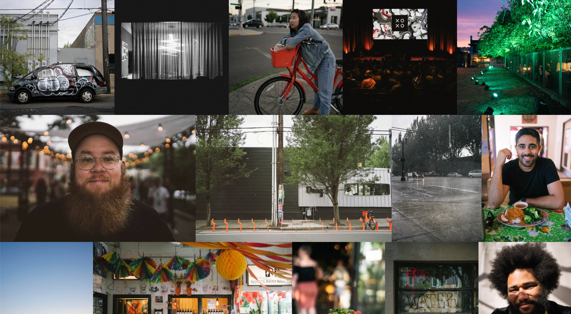
Let’s take a look at a super lightweight way to create a horizontal masonry effect for a set of arbitrarily-sized photos. Throw any set of photos at it, and they will line up edge-to-edge with no gaps anywhere.
The solution is not only lightweight but also quite simple. We’ll be using an unordered list of images and just 17 lines of CSS, with the heavy lifters being flexbox and object-fit.
Why?
I have two hobbies: documenting my life with photos, and figuring out interesting ways to combine CSS properties, both old and new.
A couple of weeks ago, I attended XOXO and shot a ton of photos which I narrowed down to a nice little set of 39. Wanting to own my content, I’ve spent the past couple of years thinking about putting together a simple photo blog, but was never able to nail the layout I had in mind: a simple masonry layout where photos fill out rows while respecting their aspect ratio (think Photos.app on iOS, Google Photos, Flickr…).

I did some research to see if there were any lightweight, non-JavaScript options, but couldn’t find anything suiting my needs. Facing some delayed flights, I started playing around with some code, limiting myself to keep things as simple as possible (because that’s my definition of fun).
Basic Markup
Since I’m basically creating a list of images, I opted for an unordered list:
<ul>
  <li>
    <img>
  </li>
  <!-- ... -->
  <li>
    <img>
  </li>
</ul>
All hail flexbox
Then came a string of lightbulb moments:
- Flexbox is great for filling up rows by determining cell width based on cell content.
- This meant the images (landscape or portrait) all needed to have the same height.
- I could use
object-fit: cover;to make sure the images filled the cells.
In theory, this sounded like a solid plan, and it got me a result I was about 90% happy with.
ul {
  display: flex;
  flex-wrap: wrap;
}

li {
  height: 40vh;
  flex-grow: 1;
}

img {
  max-height: 100%;
  min-width: 100%;
  object-fit: cover;
  vertical-align: bottom;
}
Note: 40vh seemed like the best initial approach for desktop browsers, showing two full rows of photos at a reasonable size, and hinting at more below. This also allowed more photos per line, which dramatically improves the aspect ratios.
Last row stretchiness
The only issue I ran into is that flexbox really wants to fill all the lines, and it did some silly things to the aspect ratios of the photos on the last row. This is probably my least favorite bit of this layout, but I had to add an empty <li> element at the end of the list.
<ul>
  <li>
    <img>
  </li>
  <!-- ... -->
  <li>
    <img>
  </li>
  <li></li>
</ul>
Combined with this bit of CSS:
li:last-child {
  flex-grow: 10;
}
Note: There's no science in using "10" here. In all my testing, this delivered the best results.
Demo
See the Pen
Adaptive Photo Layout by Tim Van Damme (@maxvoltar)
on CodePen.
Viewport optimization
There are some considerations to keep in mind when working in different viewport orientations.
Portrait
If your viewport is taller than it is wide, this approach limits the amount of photos per line thus messing up their aspect ratios. To solve this, you can make the photo rows less tall with this simple media query:
@media (max-aspect-ratio: 1/1) {
  li {
    height: 30vh;
  }
}
Short Screens
To help with small devices in landscape, increasing the height of photos helps to see them as large as possible:
@media (max-height: 480px) {
  li {
    height: 80vh;
  }
}
Smaller Screens + Portrait
Most phones aren’t wide enough to allow flexbox to properly do its job without miniaturizing the photos, so here I opted to not try to fit multiple photos per line. Still, it’s worth setting a maximum height here so you’ll at least have a hint at the next photo in the list.
@media (max-aspect-ratio: 1/1) and (max-width: 480px) {
  ul {
    flex-direction: row;
  }

  li {
    height: auto;
    width: 100%;
  }

  img {
    width: 100%;
    max-height: 75vh;
    min-width: 0;
  }
}
There we have it!
This approach doesn’t fully respect the aspect ratios of photos (but it’s close) and occasionally leads to some weird results, but I absolutely love the simplicity and flexibility of it all. Want to have your gallery scroll horizontally instead of vertically? A couple of tweaks will allow you to do this. Are there 1,000 photos in the gallery or just one? It’ll all look good. Unclear about aspect ratios? Flexbox is your best friend. Take another look at the demo if you haven't yet, and let me know what you think!
Bonus
Depending on the size of these photos, a page like this can grow to multiple megabytes real quick. On the blog I’m working on, I’ve added loading="lazy" to help with this. With that attribute in place on the images, it only loads photos once you approach them while scrolling. It’s supported just in Chrome for now, but you could roll your own more supported technique.
The post Adaptive Photo Layout with Flexbox appeared first on CSS-Tricks.
from CSS-Tricks https://ift.tt/30LZid4
via IFTTT

No comments:
Post a Comment