I’m sure a lot of you are paying attention to Deno anyway, the next-gen JavaScript-on-the-sever project from Node creator Ryan Dahl, especially after dropping all these candid regrets about what happened in Node. But perhaps your paying more attention now that Deno has taken some seed investment and will be turning itself into a company, while staying open-source:
For Deno to grow and be maximally useful, it must remain permissively free. We don’t believe the “open core” business model is right for a programming platform like Deno. We do not want to find ourselves in the unfortunate position where we have to decide if certain features are for paid customers only. If you watch our conference talks, you will find we’ve been hinting at commercial applications of this infrastructure for years. We are bullish about the technology stack we’ve built and intend to pursue those commercial applications ourselves. Our business will build on the open source project, not attempt to monetize it directly.
I’m excited about this because other people are, to some degree. I know the “secure by default” nature of it is exciting to my extremely security-conscious co-founder, Alex.
I find features like “TypeScript out of the box” interesting. While I don’t really use TypeScript myself, I find it striking just what a big deal it is. Talking to Laurie Voss a few years back, I learned that nearly two-thirds of developers were using it, and it doesn’t seem like it has lost any steam. And you’ve got Scott Tolinski over here waxing poetic about how GraphQL is all typed and you get this dreamy fully-typed stack when TypeScript is part of the mix.
There is already a bundler (literally, Bundler) for Deno that supports TypeScript out of the box, along with JSX. Guess what else does? The big next-gen build tools, Snowpack, Vite, and wmr.
Deno is also written in Rust, which is an interesting angle to all this, partially because of the speed (it’s fast). Snowpack and Vite both use esbuild under the hood, which is written in Go (also fast). I don’t have a great sense of whether Go or Rust is faster for this type of work, but they are both a big leap forward from most of the bundlers and task runners we use today. You can even use esbuild directly, or with light abstractions over it, like Estrella. Again, TypeScript supported.
It makes me wonder about Babel. If you don’t run TypeScript through it, and don’t need it for JSX, and don’t need to compile away basic ES6/7 stuff now that support is so wide, how long does it stick around? A long time, is the answer, of course. A project as big as Babel doesn’t just disappear. I suppose all it takes is one exotic and desirable new JavaScript feature that is compilable to an existing syntax, and everybody will be putting it back into their pipelines.
Few weeks ago, I stumbled upon this cool pop-out effect by Mikael Ainalem. It showcases the clip-path: path() in CSS, which just got proper support in most modern browsers. I wanted to dig into it myself to get a better feel for how it works. But in the process, I found some issues with clip-path: path(); and wound up finding an alternative approach that I wanted to walk through with you in this article.
If you haven’t used clip-path or you are unfamiliar with it, it basically allows us to specify a display region for an element based on a clipping path and hide portions of the element that fall outside the clip path.
You can kind of think of it as though the star is a cookie cutter, the element is the cookie dough, and the result is a star-shaped cookie.
Possible values for clip-path include circle , ellipse and polygon which limit the use-case to just those specific shapes. This is where the new path value comes in — it allows us to use a more flexible SVG path to create various clipping paths that go beyond basic shapes.
Let’s take what we know about clip-path and start working on the hover effect. The basic idea of the is to make the foreground image of a person appear to pop-out from the colorful background and scale up in size when the element is hovered. An important detail is how the foreground image animation (scale up and move up) appears to be independent from the background image animation (scale up only).
This effect looks cool, but there are some issues with the path value. For starters, while we mentioned that support is generally good, it’s not great and hovers around 82% coverage at the time of writing. So, keep in mind that mobile support is currently limited to Chrome and Safari.
Besides support, the bigger and more bizarre issue with path is that it currently only works with pixel values, meaning that it is not responsive. For example, let’s say we zoom into the page. Right off the bat, the path shape starts to cut things off.
This severely limits the number of use cases for clip-path: path(), as it can only be used on fixed-sized elements. Responsive web design has been a widely-accepted standard for many years now, so it’s weird to see a new CSS property that doesn’t follow the principle and exclusively uses pixel units.
What we’re going to do is re-create this effect using standard, widely-supported CSS techniques so that it not only works, but is truly responsive as well.
The tricky part
We want anything that overflows the clip-path to be visible only on the top part of the image. We cannot use a standard CSS overflow property since it affects both the top and bottom.
Using overflow-y: hidden, the bottom part looks good, but the image is cut-off at the top where the overflow should be visible.
So, what are our options besides overflow and clip-path? Well, let’s just use <clipPath> in the SVG itself. <clipPath> is an SVG property, which is different than the newly-released and non-responsive clip-path: path.
SVG <clipPath> element
SVG <clipPath> and <path> elements adapt to the coordinate system of the SVG element, so they are responsive out of the box. As the SVG element is being scaled, its coordinate system is also being scaled, and it maintains its proportions based on the various properties that cover a wide range of possible use cases. As an added benefit, using clip-path in CSS on SVG has 95% browser support, which is a 13% increase compared to clip-path: path.
Let’s start by setting up our SVG element. I’ve used Inkscape to create the basic SVG markup and clipping paths, just to make it easy for myself. Once I did that, I updated the markup by adding my own class attributes.
SVG <clipPath> elements created in Inkscape. The green element represents a clipping path that will be applied to the background image. The red is a clipping path that will be applied to both the background and foreground image.
This markup can be easily reused for other background and foreground images. We just need to replace the URL in the href attribute inside image elements.
Now we can work on the hover animation in CSS. We can get by with transforms and transitions, making sure the foreground is nicely centered, then scaling and moving things when the hover takes place.
Here is the result of the above HTML and CSS code. Try resizing the screen and changing the dimensions of the SVG element to see how the effect scales with the screen size.
This looks great! However, we’re not done. We still need to address some issues that we get now that we’ve changed the markup from an HTML image element to an SVG element.
SEO and accessibility
Inline SVG elements won’t get indexed by search crawlers. If the SVG elements are an important part of the content, your page SEO might take a hit because those images probably won’t get picked up.
We’ll need additional markup that uses a regular <img> element that’s hidden with CSS. Images declared this way are automatically picked up by crawlers and we can provide links to those images in an image sitemap to make sure that the crawlers manage to find them. We’re using loading="lazy" which allows the browser to decide if loading the image should be deferred.
We’ll wrap both elements in a <figure> element so that we markup reflects the relationship between those two images and groups them together:
We also need to address some accessibility concerns for this effect. More specifically, we need to make improvements for users who prefer browsing the web without animations and users who browse the web using screen readers.
Making SVG elements accessible takes a lot of additional markup. Additionally, if we want to remove transitions, we would have to override quite a few CSS properties which can cause issues if our selector specificities aren’t consistent. Luckily, our newly added regular image has great accessibility features baked right in and can easily serve as a replacement for users who browse the web without animations.
We need to hide the SVG element from assistive devices, by adding aria-hidden="true", and we need to update our CSS to include the prefers-reduced-motion media query. We are inclusively hiding the fallback image for users without the reduced motion preference meanwhile keeping it available for assistive devices like screen readers.
Please note that these improvements won’t change how the effect looks and behaves for users who don’t have the prefers-reduced-motion preference set or who aren’t using screen readers.
That’s a wrap
Developers were excited about path option for clip-path CSS attribute and new styling possibilities, but many were displeased to find out that these values only support pixel values. Not only does that mean the feature is not responsive, but it severely limits the number of use cases where we’d want to use it.
We converted an interesting image pop-out hover effect that uses clip-path: path into an SVG element that utilizes the responsiveness of the <clipPath> SVG element to achieve the same thing. But in doing so, we introduced some SEO and accessibility issues, that we managed to work around with a bit of extra markup and a fallback image.
Thank you for taking the time to read this article! Let me know if this approach gave you an idea on how to implement your own effects and if you have any suggestions on how to approach this effect in a different way.
It’s a reasonable UX thing that you can click-to-open something, and then not only be able to click that same thing to close it, but click outside the thing that it opened to close it. Kitty Giraudel just blogged about that. The trick is that once the thing is opened, you attach an event handler to the window with that watches for events (like another click). If that subsequent click did not happen within the newly-opened area, close it. Like, literally thing.contains(event.target). It’s a nice trick, I think.
There are lots of little things to think about though. For example:
we have to stop the propagationg of the click event on the toggle itself. Otherwise, it goes up to the window click listener, and since the toggle is not contained within the menu, it would close the latter as soon as we try to open it.
Right right. Can’t have that or it breaks the whole thing.
We have this same pattern in a lot of places on CodePen. Like Kitty, we have it implemented in React. In taking a peak at our implementation, it’s got a number of bells-and-whistles I figured were worth mentioning. For example, ours isn’t a function or hook, but a component wrapper we use like:
<ClickOutsideDetector
  listen
  onClickOutside={() => { closeTheThing(); }}
>
  A Menu or Modal or something.
</ClickOutsideDetector>
That way it is a generic wrapper that we can use for anything on a “click outside”. The bells-and-whistles being:
You can pass in component prop so that it doesn’t have to manifest as a <div> but whatever you want it to be semantically.
The listen prop allows you to toggle if it is currently actively listening to events. Like a quick way to short-circuit it.
An ESC keypress is the functional equivalent to clicking outside.
Handles touch events as well as clicks
Handles a case where the click outside happens into an <iframe> in which case the window has a blur event rather than a click.
Allows you to pass in elements to ignore, so rather than the stopPropagation trick that Kitty documented, we can be specific about elements that don’t trigger a click outside.
So many little things! To me this is the kinda perfect little example of real-world development. You just want one little behavior and ultimately there are a ton of considerations and edge cases you have to deal with and it’s never really done. I just touched our component in the last few months because of a third-party tool we used changed how they did something which affected iframes in use on the page. Ultimately I had to watch for a blur event that then check the classList of document.activeElement to see if that was the thing eating the click outside!
Join guest host Britney Muller in the third and final installment of her link building series, as she walks through the dos and don’ts of link building outreach in 2021.
from The Moz Blog https://ift.tt/3rSlksp
via IFTTT
Here’s Ashley Rich at Delicious Brains writing about all the layers of caching that are relevant to a WordPress site. I think we all know that caching is complicated, but jeez, it’s a journey to understand all the caches at work here. The point of cache being speed and reducing burden on the worst bottlenecks and slowest/busiest parts of a web stack.
Here’s my own understanding:
Files can be cached by the browser. This is the fastest possible cache as no network request happens at all. Assets like images, CSS, and JavaScript are often cached this way because they don’t change terribly frequently, but you have to make sure you’re telling browsers that it’s OK to do this and have a mechanism in place to break that cache if you need to (e.g. by changing file names). You very rarely cache the HTML this way, as it changes the most and file-name-cache-busting of HTML seems more tricky than it’s worth.
Files can be cached at the CDN level. This is great because even though network traffic is happening, CDN servers are very fast and likely geographically closer to users than your origin server. If users get files from here, they never even trouble your origin server. You’ll need a way to break this cache as well, which again is probably through changing file names. You might cache HTML at this level even without changing file names if you have a mechanism to clear that cache globally when content changes.
The origin server might cache built HTML pages. On a WordPress site, the pages are built with PHP which probably triggers MySQL queries. If the server can save the result of the things that have already executed, that means it can serve a “static” file as a response, which it can do much faster than having to run the PHP and MySQL. That’ll work for logged out users, who all get the same response, but not for logged in users who have dynamic content on the page (like the WordPress admin bar).
The database has its own special caching. After a MySQL query is executed, the results can be saved in an Object Cache, meaning the same request can come from that cache instead of having to run the query again. You get that automatically to some degree, but ideally it gets wired up to a more persistent store, which you do not get automatically
Phew. It gets a little easier with Jamstack since your pages are prebuilt and CDN-hosted already, and in the case of Netlify, you don’t even have to worry about cache busting.
But even as complex as this is, I don’t worry about it all that much. This WordPress site uses Flywheel for hosting which deals with the database and server-level caching, I have Cloudflare in front of it with special WordPress optimization for the CDN caching, and roll-my-own file-name cache busting (I wish this part was easier). I’d certainly trust SpinupWP to get it right too, given Ashley’s great writeup I’m linking to here.
Site performance is potentially the most important metric. The better the performance, the better chance that users stay on a page, read content, make purchases, or just about whatever they need to do. A 2017 study by Akamai says as much when it found that even a 100ms delay in page load can decrease conversions by 7% and lose 1% of their sales for every 100ms it takes for their site to load which, at the time of the study, was equivalent to $1.6 billion if the site slowed down by just one second. Google’s industry benchmarks from 2018 also provide a striking breakdown of how each second of loading affects bounce rates.
On the flip side, Firefox made their webpages load 2.2 seconds faster on average and it drove 60 million more Firefox downloads per year. Speed is also something Google considers when ranking your website placement on mobile. Having a slow site might leave you on page 452 of search results, regardless of any other metric.
This is a very basic site made with simple HTML, CSS, and JavaScript. I’ve intentionally tried to keep this as simple as possible, meaning the reason it is slow has nothing to do with the complexity of the site itself, or because of some framework it uses. About the most complex part are some social media buttons for people to share the page.
Here’s the thing: performance is more than a one-off task. It’s inherently tied to everything we build and develop. So, while it’s tempting to solve everything in one fell swoop, the best approach to improving performance might be an iterative one. Determine if there’s any low-hanging fruit, and figure out what might be bigger or long-term efforts. In other words, incremental improvements are a great way to score performance wins. Again, every millisecond counts.
In that spirit, what we’re looking at in this article is focused more on the incremental wins and less on providing an exhaustive list or checklist of performance strategies.
Lighthouse
We’re going to be working with Lighthouse. Many of you may already be super familiar with it. It’s even been covered a bunch right here on CSS-Tricks. It’s is a Google service that audit things performance, accessibility, SEO, and best practices. I’m going to audit the performance of my slow site before and after the things we tackle in this article. The Lighthouse reports can be accessed directly in Chrome’s DevTools.
Go ahead, briefly look at the things that Lighthouse says are wrong with the website. It’s good to know what needs to be solved before diving right in.
On the bright side, we’re one-third of the way to our goal!
We can totally fix this, so let’s get started!
Improvement #1: Redirects
Before we do anything else, let’s see what happens when we first hit the website. It gets redirected. The site used to be at one URL and now it lives at another. That means any link that references the old URL is going to redirect to the new URL.
Redirects are often pretty light in terms of the latency that they add to a website, but they are an easy first thing to check, and they can generally be removed with little effort.
We can try to remove them by updating wherever we use the previous URL of the site, and point it to the updated URL so users are taken there directly instead of redirected. Using a network request inspector, I’m going to see if there’s anything we can remove via the Network panel in DevTools. We could also use a tool, like Postman if we need to, but we’ll limit our work to DevTools as much as possible for the sake of simplicity.
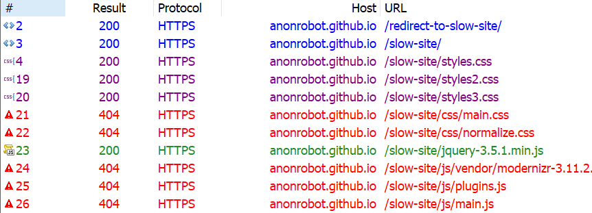
First, let’s see if there are any HTTP or HTML redirects. I like using Fiddler, and when I inspect the network requests I see that there are indeed some old URLs and redirects floating around.
It looks like the first request we hit is https://anonrobot.github.io/redirect-to-slow-site/ before it HTML redirects to https://anonrobot.github.io/slow-site/. We can repoint all our redirect-to-slow-site URLs to the updated URL. In DevTools, the Network inspector helps us see what the first webpage is doing too. From my view in Fiddler it looks like this:
This tell us that the site is using an HTML redirect to the next site. I’m going to update my referenced URL to the new site to help decrease latency that adds drag to the initial page load.
Improvement #2: The Critical Render Path
Next, I’m going to profile the sit with the Performance panel in DevTools. I am most interested in unblocking the site from rendering content as fast as it can. This is the process of turning HTML, CSS and JavaScript into a fully fleshed out, interactive website.
It begins with retrieving the HTML from the server and converting this into the Document Object Model (DOM). We’ll run any inline JavaScript as we see it, or download it if it’s an external asset as we go line-by-line parsing the HTML. We’ll also build the CSS into the CSS Object Model (CSSOM). The CSSOM and the DOM combine to make the render tree. From there, we run the layout which places everything on the screen in the correct place before finally running paint.
This process can be “blocked” if it has to wait for resources to load before it runs. That’s what we call the Critical Render Path, and the things that block the path are critical resources.
The most common critical resources are:
A <script> tag that is in the <head> and doesn’t contain an async, or defer, or module attribute.
A <link rel="stylesheet"> that doesn’t have the disabled attribute to inform the browser to not download the CSS and doesn’t have a media attribute that matches the user’s device.
There’s a few more types of resources that might block the Critical Render Path, like fonts, but the two above are by far the most common. These resources block rendering because the browser thinks the page is “unfinished” and has no idea what resources it needs or has. For all the browser knows, the site could download something that expects the browser to do even more work, like styling or color changes; hence, the site is incomplete to the browser, so it assumes the worst and blocks rendering.
An example CSS file that wouldn’t block rendering would be:
The "media="print" attribute only downloads the stylesheet when the user prints the webpage (because perhaps you want to style things differently in print), meaning the file itself isn’t blocking anything from rendering before it.
As Chris likes to say, a front-end developer is aware. And being aware of what a page needs to download before rendering begins is vitally important for improving performance audit scores.
Improvement #3: Unblock parsing
Blocking the render path is one thing we can immediately speed up, and we can also block parsing if we aren’t careful with our JavaScript. Parsing is what makes HTML elements part of the DOM, and whenever we encounter JavaScript that needs to run now, we block that HTML parsing from happening.
Some of the JavaScript in my slow webpage doesn’t need to block parsing. In other words, we can download the scripts asynchronously and continue parsing the HTML into the DOM without delay.
The <async> tag is what allows the browser to download the JavaScript asset asynchronously. The <defer> tag only runs the JavaScript once the page construction is complete.
There’s a trade off here between inlining JavaScript (so running it doesn’t require a network request) versus placing it into it’s own JavaScript file (for modularity and code-reuse). Feel free to make your own judgement call here as the best route is going to depend on the use case. The actual performance of applying CSS and JavaScript to a webpage will be the same whether it’s an external asset or inlined, once it has arrived. The only thing we are removing when we inline is the network request time to get the external assets (which sometimes makes a big difference).
The main thing we’re aiming for is to do as little as we can. We want to defer loading assets and make those assets as small as possible at the same time. All of this will translate into a better performance outcome.
My slow site is chaining multiple critical requests, where the browser has to read the next line of HTML, wait, then read the next on to check for another asset, then wait. The size of the assets, when they get downloaded, and whether they block are all going to play hugely into how fast our webpage can load.
I approached this by profiling the site in the DevTools Performance panel, which is simply records the way the site loads over time. I briefly scanned my HTML and what it was downloading, then added <async> to any external JavaScript script that was blocking things (like the social media <script>, which isn’t necessary to load before rendering).
Profiling the slow site reveals what assets are loading, how big they are, where they are located, and how much time it takes to load them.
It’s interesting that Chrome has a browser limit where it can only deal with six inflight HTTP connections per domain name, and will wait for an asset to return before requesting another once those six are in-flight. That makes requesting multiple critical assets even worse for HTML parsing. Allowing the browser to continue parsing will speed up the time it takes to show something to the user, and improve our performance audit.
Improvement #4: Reduce the payload size
The total size of a site is a huge determining factor as to how fast it will load. According to web.dev, sites should aim to be below 1,600 KB interactive under 10 seconds. Large payloads are strongly correlated with long times to load. You can even consider a large payload as an expense to the end user, as large downloads may require larger data plans that cost more money.
At this exact point in time, my slow site is a whopping 9,701 KB — more than six times the ideal size. Let’s trim that down.
Identifying unused dependencies
At the beginning of my development, I thought I might need certain assets or frameworks. I downloaded them onto my page and now can’t even remember which ones are actually being used. I definitely have some assets that are doing nothing but wasting time and space.
Using the Network inspector in DevTools (or a tool you feel comfortable with), we can see some things that can definitely be removed from the site without changing its underlying behavior. I found a lot of value in the Coverage panel in DevTools because it will show just how much code is being used after everything’s downloaded.
As we’ve already discussed, there is always a fine balance when it comes to inlining CSS and JavaScript versus using an external asset. But, at this very moment, it certainly appears that the site is downloading far too much than it really needs.
Another quick way to trim things down is to find whether any of the assets the site is trying to load 404s. Those requests can definitely be removed without any negative impact to the site since they aren’t loading anyway. Here’s what Fiddler shows me:
Looking again at the Coverage report, we know there are things that are downloaded but have a significant amount of unused code still making its way to the page. In other words, these assets are doing something, but are also ready to do things we don’t even need them to do. That includes React, jQuery and Vue, so those can be removed from my slow site with no real impact.
Why so many JavaScript libraries? Well, we know there are real-life scenarios where we reach for something because it meets our requirements; but then those requirements change and we need to reach for something else. Again, we’ve got to be aware as front-end developers, and continually keeping an eye on what resources are relevant to site is part of that overall awareness.
Compressing, minifying and caching assets
Just because we need to serve an asset doesn’t mean we have to serve it as its full size, or even re-serve that asset the next time the user visits the site. We can compress our assets, minify our styles and scripts, and cache things responsibly so we’re serving what the user needs in the most efficient way possible.
Compressing means we optimize a file, such as an image, to its smallest size without impacting its visual quality. For example, gzip is a common compression algorithm that makes assets smaller.
Minification improves the size of text-based assets, like external script files, by removing cruft from the code, like comments and whitespace, for the sake of sending fewer bytes over the wire.
Caching allows us to store an asset in the browser’s memory for an amount of time so that it is immediately available for users on subsequent page loads. So, load it once, enjoy it many times.
Let’s look at three different types of assets and how to crunch them with these tactics.
Text-based assets
These include text files, like HTML, CSS and JavaScript. We want to do everything in our power to make these as lightweight as possible, so we compress, minify, and cache them where possible.
At a very high level, gzip works by finding common, repeated parts in the content, stores these sequences once, then removes them from the source text. It keeps a dictionary-like look-up so it can quickly reference the saved pieces and place them back in place where they belong, in a process known as gunzipping. Check out this gzipped examples a file containing poetry.
The text in-between the curly braces is text that has been matched multiple times and is removed from the source text by gzip to make the file smaller. There are still unique parts of the string that gzip is unable to abstract to its dictionary, but things like { a }, for example, can be removed from wherever it appears and can be added back once it is received. (View the full example)
We’re doing this to make any text-based downloads as small as we can. We are already making use of gzip. I checked using this tool by GIDNetwork. It shows that the slow site’s content is 59.9% compressed. That probably means there are more opportunities to make things even smaller.
I decided to consolidate the multiple CSS files into one single file called styles.css. This way, we’re limiting the number of network requests necessary. Besides, if we crack open the three files, each one contained such a tiny amount of CSS that the three network requests are simply unjustified.
And, while doing this, it gave me the opportunity to remove unnecessary CSS selectors that weren’t being applied in the DOM anywhere, again reducing the number of bytes sent to the user.
We are also able to optimize the images on the slow site. As reports consistently show, images are the most common asset request. In fact, the median data transfer for images is 948.1 KB for desktops and 902 KB for mobile devices from 2016 to 2021. That already more than half of the ideal 1,600KB size for an entire page load.
My slow site doesn’t serve that many images, but the images it does serve can be smaller. I ran the images through an online tool called Squoosh, and achieved a 40% savings (18.6 KB to 11.2 KB). That’s a win! Of course, this is something you can do either before upload using a desktop application, like ImageOptim, or even as part of your build process.
I couldn’t see any visual differences between the original images and the optimized versions (which is great!) and I was even able to reduce the size further by resizing the actual file, reducing the quality of the image, and even changing the color palette. But those are things I did in image editing software. Ideally, that’s something you or a designer would do when initially making the assets.
Caching
We’ve touched on minification and compression and what we can do to try and use these to our advantage. The final thing we can check is caching.
I have been requesting the slow site over and over and, so far, I can see it always looks like it’s requested fresh every time without any caching whatsoever. I looked through the HTML and saw caching was disabling here:
I removed that line, so browser caching should now be able to take place, helping serve the content even faster.
Improvement #5: Use a CDN
Another big improvement we can make on any website is serving as much as you can from a Content Delivery Network (CDN). David Attard has a super thorough piece on how to add and leverage a CDN. The traditional path of delivering content is to hit the server, request data, and wait for it to return. But if the user is requesting data from way across the other side of the world from where your data is served, well, that adds time. Making the bytes travel further in the response from the server can add up to large losses of speed, even if everything else is lightning quick.
A CDN is a set of distributed servers around the world that are capable of intelligently delivering content closer to the user because it has multiple locations it choose to serve it from.
We discussed earlier how I was making the user download jQuery when it doesn’t actually make use of the downloaded code, and we removed it. One easy fix here, if I did actually need jQuery, is to request the asset from a CDN. Why?
A user may have already downloaded the asset from visiting another site, so we can serve a cached response for the CDN. 75.49% of the top one million sites still use jQuery, after all.
It doesn’t have to travel as far from the user requesting the data.
We can do something as simple as grabbing jQuery from Google’s CDN, which they make available for anyone to reference in their own sites:
That serves jQuery significantly faster than a standard request from my server, that’s for sure.
Are things better?
If you have implemented along with me so far, or just read, it’s time to re-profile and see if any improvements has been made on what we’ve done so far.
Recall where we started:
After our changes:
I hope this has been a helpful and encourages you to search for incremental performance wins on your own site. By optimally requesting assets, deferring some assets from loading, and reducing the overall size of the site size will get a functional, fully interactive site in front of the user as fast as possible.
Want to keep the conversation going? I share my writing on Twitter if you want to see more or connect.
It is extremely weird that the calculator apps, even the default ones baked into desktop operating systems, embrace the UI and UX of those little cheap-o plastic physical calculators. I like what Florens Verschelde’s Math teacher had to say:
I had a Math teacher who would ban pocket calculators that didn’t show both your input and its result at the same time. If a calculator couldn’t show this:
38 ÷ 1.2
=    31.666666666667
You couldn’t use it.
The article ends up being in praise of Soulver, which I agree is a nice modern take on the idea of calculations.
I wish it was on Setapp, as I’d probably use it. But I don’t do enough regular mathin’ to go for the full price (today, anyway).


