Tuesday, 9 February 2021

Nested Media Queries

Using media queries in CSS as part of responsive websites is bread and butter stuff to todays front-end developer. Using preprocessors to make them more comfortable to write and easier to maintain has become common practice as well.

I spent a few months experimenting with a dozen different approaches to media queries in Sass and actually used a few in production. All of them eventually failed to cater for everything I needed to do in an elegant way. So I took what I liked about each of them and created a solution that covered all scenarios I came across.

Why use a preprocessor at all?

That’s a fair question. After all, what’s the point of doing all this if one can simply write media queries using pure CSS? Tidiness and maintainability.

The most common use for media queries is the transformation of a layout based on the browser’s viewport width. You can make a layout adapt in such a way that multiple devices with different screen sizes can enjoy an optimal experience. As a consequence, the expressions used to define the media queries will make reference to the typical screen width of those devices.

So if your code contains 5 media queries that target tablet devices with a width of 768px, you will hardcode that number 5 times, which is something ugly that my OCD would never forgive. First of all, I want my code to be easy to read to the point that anyone understands instantly that a media query is targeting tablet devices just by looking at it – I reckon the word tablet would do that better than 768px.

Also, what if that reference width changes in the future? I hate the idea of replacing it in 5 instances around the code, especially when it’s scattered around multiple files.

A first step would be to store that breakpoint in a variable and use it to construct the media query.

/* Using plain CSS */
@media (min-width: 768px) {
  
}

/* Using SCSS variables to store breakpoints */
$breakpoint-tablet: 768px;
@media (min-width: $breakpoint-tablet) {
  
}

Another reason to write media queries with a preprocessor like Sass is that it can sometimes provide some precious help with the syntax, in particular when writing an expression with a logical or (represented with a comma in CSS).

For example, if you want to target retina devices, the pure CSS syntax starts getting a bit verbose:

/* Plain CSS */
@media (min-width: 768px) and 
       (-webkit-min-device-pixel-ratio: 2), 
       (min-width: 768px) and 
       (min-resolution: 192dpi) { 
}

/* Using variables? */
@media (min-width: $bp-tablet) and ($retina) { // or #{$retina}

}

It does look nicer, but unfortunately it won’t work as expected.

A problem with logic

Because of the way the CSS “or” operator works, I wouldn’t be able to mix the retina conditions with other expressions since a (b or c) would be compiled into (a or b) c and not a b or a c.

$retina: "(-webkit-min-device-pixel-ratio: 2), (min-resolution: 192dpi)";
 
// This will generate unwanted results!
@media (min-width: 480px) and #{$retina} {
  body {
    background-color: red;
  }
}
/* Not the logic we're looking for */
@media (min-width: 480px) and (-webkit-min-device-pixel-ratio: 2), (min-resolution: 192dpi) {
  body {
    background-color: red;
  }
}

I realized I needed something more powerful, like a mixin or a function, to address this. I tried a few solutions.

Dmitry Sheiko’s technique

One I tried was Dmitry Sheiko’s technique, which had a nice syntax and includes Chris’ retina declaration.

// Predefined Break-points
$mediaMaxWidth: 1260px;
$mediaBp1Width: 960px;
$mediaMinWidth: 480px;

@function translate-media-condition($c) {
  $condMap: (
    "screen": "only screen",
    "print": "only print",
    "retina": "(-webkit-min-device-pixel-ratio: 1.5), (min--moz-device-pixel-ratio: 1.5), (-o-min-device-pixel-ratio: 3/2), (min-device-pixel-ratio: 1.5), (min-resolution: 120dpi)",
    ">maxWidth": "(min-width: #{$mediaMaxWidth + 1})",
    "<maxWidth": "(max-width: #{$mediaMaxWidth})",           
    ">bp1Width": "(min-width: #{$mediaBp1Width + 1})",
    "<bp1Width": "(max-width: #{$mediaBp1Width})",
    ">minWidth": "(min-width: #{$mediaMinWidth + 1})",
    "<minWidth": "(max-width: #{$mediaMinWidth})"
  );
  @return map-get( $condMap, $c );
}

// The mdia mixin
@mixin media($args...) {
  $query: "";
  @each $arg in $args {
    $op: "";
    @if ( $query != "" ) {
      $op: " and ";
    }
    $query: $query + $op + translate-media-condition($arg);
  }
  @media #{$query}  { @content; }
}

But the problem with logical disjunction was still there.

.section {
  @include media("retina", "<minWidth") {
    color: white;
  };
}
/* Not the logic we're looking for */
@media (-webkit-min-device-pixel-ratio: 1.5), (min--moz-device-pixel-ratio: 1.5), (-o-min-device-pixel-ratio: 3 / 2), (min-device-pixel-ratio: 1.5), (min-resolution: 120dpi) and (max-width: 480px) {
  .section {
    background: blue;
    color: white;
  }
}

Landon Schropp’s technique

Landon Schropp’s was my next stop. Landon creates simple named mixins that do specific jobs. Like:

$tablet-width: 768px;
$desktop-width: 1024px;

@mixin tablet {
  @media (min-width: #{$tablet-width}) and (max-width: #{$desktop-width - 1px}) {
    @content;
  }
}

@mixin desktop {
  @media (min-width: #{$desktop-width}) {
    @content;
  }
}

He has a single-responsibility retina version as well.

But another problem hit me when I was styling an element that required additional rules on intermediate breakpoints. I didn’t want to pollute my list of global breakpoints with case-specific values just so I could still use the mixin, but I definitely didn’t want to forgo the mixin and go back to using plain CSS and hardcoding things every time I had to use custom values.

/* I didn't want to sometimes have this */
@include tablet {

}

/* And other times this */
@media (min-width: 768px) and (max-width: 950px) {

}

Breakpoint technique

Breakpoint-sass was next on my list, as it supports both variables and custom values in its syntax (and, as a bonus, it’s really clever with pixel ratio media queries).

I could write something like:

$breakpoint-tablet: 768px;

@include breakpoint(453px $breakpoint-tablet) {

}

@include breakpoint($breakpoint-tablet 850px) {

}

/* Compiles to: */
@media (min-width: 453px) and (max-width: 768px) {

}

@media (min-width: 768px) and (max-width: 850px) {

}

Things were looking better, but I personally think that Breakpoint-sass’ syntax feels less natural than Dmitry’s. You can give it a number and it assumes it’s a min-width value, or a number and a string and it assumes a property/value pair, to name just a few of the combinations it supports.

That’s fine and I’m sure it works great once you’re used to it, but I hadn’t given up on finding a syntax that was both simple and as close as possible to the way I orally describe what a media query must target.

Also, if you look at the example above you’ll see that a device with a width of exactly 768px will trigger both media queries, which may not be exactly what we want. So I added the ability to write inclusive and exclusive breakpoints to my list of requirements.

My (Eduardo Bouças’s) technique

This is my take on it.

Clean syntax, dynamic declaration

I’m a fan of Dmitry’s syntax, so my solution was inspired by it. However, I’d like some more flexibility in the way breakpoints are created. Instead of hardcoding the names of the breakpoints in the mixin, I used a multidimensional map to declare and label them.

$breakpoints: (phone: 640px, 
               tablet: 768px, 
               desktop: 1024px) !default;

@include media(">phone", "<tablet") {
}

@include media(">tablet", "<950px") {
}

The mixin comes with a set of default breakpoints, which you can override anywhere in the code by re-declaring the variable $breakpoints.

Inclusive and exclusive breakpoints

I wanted to have a finer control over the intervals in the expressions, so I included support for the less-than-or-equal-to and greater-than-or-equal-to operators. This way I can use the same breakpoint declaration in two mutually exclusive media queries.

@include media(">=phone", "<tablet") {

}

@include media(">=tablet", "<=950px") {

}

/* Compiles to */
@media (min-width: 640px) and (max-width: 767px) {

}

@media (min-width: 768px) and (max-width: 950px) {

}

Infer media types and handle logic disjunction

Similarly to the breakpoints, there’s a list for media types and other static expressions declared by default (which you can override by setting the variable $media-expressions). This adds support for optional media types, such as screen or handheld, but it’s also capable of correctly handling expressions with logical disjunctions, such as the retina media query we saw before. The disjunctions are declared as nested lists of strings.

$media-expressions: (screen: "screen", 
                    handheld: "handheld",
                    retina2x: 
                    ("(-webkit-min-device-pixel-ratio: 2)", 
                    "(min-resolution: 192dpi)")) !default;

@include media("screen", ">=tablet") {

}

@include media(">tablet", "<=desktop", "retina2x") {

}

/* Compiles to */
@media screen and (min-width: 768px) {

}

@media (min-width: 769px) and 
       (max-width: 1024px) and 
       (-webkit-min-device-pixel-ratio: 2),
       (min-width: 769px) and 
       (max-width: 1024px) and 
       (min-resolution: 192dpi) {

}

There’s no rocket science under the hood, but the full implementation of the mixin isn’t something I could show in just a few lines of code. Instead of boring you with huge code snippets and neverending comments, I included a Pen with everything working and I’ll briefly describe the process it goes through to construct the media queries.

How it works

  1. The mixin receives multiple arguments as strings and starts by going through each one to figure out if it represents a breakpoint, a custom width, or one of the static media expressions.
  2. If an operator is found, it is extracted and any matching breakpoint will be returned, or else we assume it’s a custom value and cast it to a number (using SassyCast).
  3. If it’s a static media expression, it checks for any or operators and generates all the combinations necessary to represent the disjunction.
  4. The process is repeated for all the arguments and the results will by glued together by the and connector to form the media query expression.

If you’d like to look at the complete Sass for it, it’s here. It’s called include-media on GitHub.

Final thoughts

  • I’m a big fan of this technique to make Sass talk to JavaScript. Because we declare breakpoints as a multidimensional list with their names as keys, exporting them in bulk to JavaScript becomes really straightforward and can be done automatically with just a few lines of code.
  • I’m not trying to put down other people’s solutions and I’m definitely not saying this one is better. I mentioned them to show some of the obstacles I found along the way to my ideal solution, as well as some great things they introduced that inspired my own solution.
  • You might have some concerns about the length and complexity of this implementation. While I understand, the idea behind it is that you download one single file, @import it into your project and start using it without having to touch the source code. Ping me on Twitter though if you have any questions.
  • You can get it from GitHub and you are very welcome to contribute with issues/code/love. I’m sure there’s still a lot we can do to make it better.

Update!

Eduardo made a website for his approach: @include-media.

Direct Link to Article — Permalink


The post Nested Media Queries appeared first on CSS-Tricks.

You can support CSS-Tricks by being an MVP Supporter.


from CSS-Tricks https://ift.tt/3bKTGsL
via IFTTT

Recreating Game Elements for the Web: The Among Us Card Swipe

As a web developer, I pay close attention to the design of video games. From the HUD in Overwatch to the catch screen in Pokemon Go to hunting in Oregon Trail, games often have interesting mechanics and satisfying interactions, many of which inspire my own coding games at Codepip.

Beyond that, implementing small slices of these game designs on a web stack is a fun, effective way to broaden your skills. By focusing on a specific element, your time is spent working on an interesting part without having to build out a whole game with everything that entails. And even in this limited scope, you often get exposed to new technologies and techniques that push on the boundaries of your dev knowledge.

As a case study for this idea, I’ll walk you through my recreation of the card swipe from Among Us. For anyone in the dark, Among Us is a popular multiplayer game. Aboard a spaceship, crewmates have to deduce who among them is an imposter. All the while, they complete mundane maintenance tasks and avoid being offed by the imposter.

The card swipe is the most infamous of the maintenance tasks. Despite being simple, so many players have struggled with it that it’s become the stuff of streams and memes.

Here’s my demo

This is my rendition of the card swipe task:

Next, I’ll walk you through some of the techniques I used to create this demo.

Swiping with mouse and touch events

After quickly wireframing the major components in code, I had to make the card draggable. In the game, when you start dragging the card, it follows your pointer’s position horizontally, but stays aligned with the card reader vertically. The card has a limit in how far past the reader it can be dragged to its left or right. Lastly, when you lift your mouse or finger, the card returns to its original position.

All of this is accomplished by assigning functions to mouse and touch events. Three functions are all that‘s needed to handle mouse down, mouse move, and mouse up (or touch start, touch move, and touch end if you‘re on a touchscreen device). Here’s the skeleton of that JavaScript code:

const card = document.getElementById('card');
const reader = document.getElementById('reader');
let active = false;
let initialX;

// set event handlers
document.addEventListener('mousedown', dragStart);
document.addEventListener('mousemove', drag);
document.addEventListener('mouseup', dragEnd);
document.addEventListener('touchstart', dragStart);
document.addEventListener('touchmove', drag);
document.addEventListener('touchend', dragEnd);

function dragStart(e) {
  // continue only if drag started on card
  if (e.target !== card) return;

  // get initial pointer position
  if (e.type === 'touchstart') {
    initialX = e.touches[0].clientX;
  } else {
    initialX = e.clientX;
  }

  active = true;
}

function drag(e) {
  // continue only if drag started on card
  if (!active) return;

  e.preventDefault();
  
  let x;

  // get current pointer position
  if (e.type === 'touchmove') {
    x = e.touches[0].clientX - initialX;
  } else {
    x = e.clientX - initialX;
  }

  // update card position
  setTranslate(x);
}

function dragEnd(e) {
  // continue only if drag started on card
  if (!active) return;

  e.preventDefault();
  
  let x;

  // get final pointer position
  if (e.type === 'touchend') {
    x = e.touches[0].clientX - initialX;
  } else {
    x = e.clientX - initialX;
  }

  active = false;
  
  // reset card position
  setTranslate(0);
}

function setTranslate(x) {
  // don't let card move too far left or right
  if (x < 0) {
    x = 0;
  } else if (x > reader.offsetWidth) {
    x = reader.offsetWidth;
  }

  // set card position on center instead of left edge
  x -= (card.offsetWidth / 2);
  
  card.style.transform = 'translateX(' + x + 'px)';
}

Setting status with performance.now()

Next, I had to determine whether the card swipe was valid or invalid. For it to be valid, you must drag the card across the reader at just the right speed. Didn’t drag it far enough? Invalid. Too fast? Invalid. Too slow? Invalid.

To find if the card has been swiped far enough, I checked the card’s position relative to the right edge of the card reader in the function dragEnd:

let status;

// check if card wasn't swiped all the way
if (x < reader.offsetWidth) {
  status = 'invalid';
}

setStatus(status);

To measure the duration of the card swipe, I set start and end timestamps in dragStart and dragEnd respectively, using performance.now().

function setStatus(status) {

  // status is only set for incomplete swipes so far
  if (typeof status === 'undefined') {

    // timestamps taken at drag start and end using performance.now()
    let duration = timeEnd - timeStart;

    if (duration > 700) {
      status = 'slow';
    } else if (duration < 400) {
      status = 'fast';
    } else {
      status = 'valid';
    }
  }

  // set [data-status] attribute on reader
  reader.dataset.status = status;
}

Based on each condition, a different value is set on the reader’s data-status attribute. CSS is used to display the relevant message and illuminate either a red or green light.

#message:after {
  content: "Please swipe card";
}

[data-status="invalid"] #message:after {
  content: "Bad read. Try again.";
}

[data-status="slow"] #message:after {
  content: "Too slow. Try again.";
}

[data-status="fast"] #message:after {
  content: "Too fast. Try again.";
}

[data-status="valid"] #message:after {
  content: "Accepted. Thank you.";
}

.red {
  background-color: #f52818;
  filter: saturate(0.6) brightness(0.7);
}

.green {
  background-color: #3dd022;
  filter: saturate(0.6) brightness(0.7);
}

[data-status="invalid"] .red,
[data-status="slow"] .red,
[data-status="fast"] .red,
[data-status="valid"] .green {
  filter: none;
}

Final touches with fonts, animations, and audio

With the core functionality complete, I added a few more touches to get the project looking even more like Among Us.

First, I used a free custom font called DSEG to imitate the segmented type from old LCDs. All it took was hosting the files and declaring the font face in CSS.

@font-face {
  font-family: 'DSEG14Classic';
  src: url('../fonts/DSEG14-Classic/DSEG14Classic-Regular.woff2') format('woff2'),
       url('../fonts/DSEG14-Classic/DSEG14Classic-Regular.woff') format('woff'),
       url('../fonts/DSEG14-Classic/DSEG14Classic-Regular.ttf') format('truetype');
}

Next, I copied the jitter animation of the text in the original. Game developers often add subtle animations to breath life into an element, like making a background drift or a character, well, breathe. To achieve the jitter, I defined a CSS animation:

@keyframes jitter {
  from {
    transform: translateX(0);
  }
  to {
    transform: translateX(5px);
  }
}

At this point, the text glides smoothly back and forth. Instead, what I want is for it to jump back and forth five pixels at a time. Enter the steps() function:

#message {
  animation: jitter 3s infinite steps(2);
}

Finally, I added the same audio feedback as used in Among Us.

let soundAccepted = new Audio('./audio/CardAccepted.mp3');
let soundDenied = new Audio('./audio/CardDenied.mp3');

if (status === 'valid') {
  soundAccepted.play();
} else {
  soundDenied.play();
}

Sound effects are often frowned upon in the web development world. A project like this an opportunity to run wild with audio.

And with that, the we’re done! Here’s that demo again:

Try your own

Given how standardized the web has become in look and feel, this approach of pulling an element from a game and implementing it for the web is a good way to break out of your comfort zone and try something new.

Take this Among Us card swipe. In a small, simple demo, I tinkered with web fonts and animations in CSS. I monkeyed with input events and audio in JavaScript. I dabbled with an unconventional visual style.

Now it’s time for you to survey interesting mechanics from your favorite games and try your hand at replicating them. You might be surprised what you learn.


The post Recreating Game Elements for the Web: The Among Us Card Swipe appeared first on CSS-Tricks.

You can support CSS-Tricks by being an MVP Supporter.


from CSS-Tricks https://ift.tt/3cXEppc
via IFTTT

The Definitive Guide to JavaScript SEO (2021 Edition)

Posted by PierceBrelinsky

The web is in a golden age of front-end development, and JavaScript and technical SEO are experiencing a renaissance. As a technical SEO specialist and web dev enthusiast at an award-winning digital marketing agency, I’d like to share my perspective on modern JavaScript SEO based on industry best practices and my own agency experience. In this article, you'll learn how to optimize your JS-powered website for search in 2021.

What is JavaScript SEO?

JavaScript SEO is the discipline of technical SEO that’s focused on optimizing websites built with JavaScript for visibility by search engines. It’s primarily concerned with:

  • Optimizing content injected via JavaScript for crawling, rendering, and indexing by search engines.
  • Preventing, diagnosing, and troubleshooting ranking issues for websites and SPAs (Single Page Applications) built on JavaScript frameworks, such as React, Angular, and Vue.
  • Ensuring that web pages are discoverable by search engines through linking best practices.
  • Improving page load times for pages parsing and executing JS code for a streamlined User Experience (UX).

 Is JavaScript good or bad for SEO?

It depends! JavaScript is essential to the modern web and makes building websites scalable and easier to maintain. However, certain implementations of JavaScript can be detrimental to search engine visibility.

How does JavaScript affect SEO?

JavaScript can affect the following on-page elements and ranking factors that are important for SEO:

  • Rendered content
  • Links
  • Lazy-loaded images
  • Page load times
  • Meta data

What are JavaScript-powered websites?

When we talk about sites that are built on JavaScript, we’re not referring to simply adding a layer of JS interactivity to HTML documents (for example, when adding JS animations to a static web page). In this case, JavaScript-powered websites refer to when the core or primary content is injected into the DOM via JavaScript.

App Shell Model.


This template is called an app shell and is the foundation for progressive web applications (PWAs). We’ll explore this next.

How to check if a site is built with JavaScript

You can quickly check if a website is built on a JavaScript framework by using a technology look-up tool such as BuiltWith or Wappalyzer. You can also “Inspect Element” or “View Source” in the browser to check for JS code. Popular JavaScript frameworks that you might find include:

JavaScript SEO for core content

Here’s an example: Modern web apps are being built on JavaScript frameworks, like Angular, React, and Vue. JavaScript frameworks allow developers to quickly build and scale interactive web applications. Let’s take a look at the default project template for Angular.js, a popular framework produced by Google.

When viewed in the browser, this looks like a typical web page. We can see text, images, and links. However, let’s dive deeper and take a peek under the hood at the code:

Now we can see that this HTML document is almost completely devoid of any content. There are only the app-root and a few script tags in the body of the page. This is because the main content of this single page application is dynamically injected into the DOM via JavaScript. In other words, this app depends on JS to load key on-page content!

Potential SEO issues: Any core content that is rendered to users but not to search engine bots could be seriously problematic! If search engines aren’t able to fully crawl all of your content, then your website could be overlooked in favor of competitors. We’ll discuss this in more detail later.

JavaScript SEO for internal links

Besides dynamically injecting content into the DOM, JavaScript can also affect the crawlability of links. Google discovers new pages by crawling links it finds on pages.

As a best practice, Google specifically recommends linking pages using HTML anchor tags with href attributes, as well as including descriptive anchor texts for the hyperlinks:

However, Google also recommends that developers not rely on other HTML elements — like div or span — or JS event handlers for links. These are called “pseudo” links, and they will typically not be crawled, according to official Google guidelines:

Despite these guidelines, an independent, third-party study has suggested that Googlebot may be able to crawl JavaScript links. Nonetheless, in my experience, I’ve found that it’s a best practice to keep links as static HTML elements.

Potential SEO issues: If search engines aren’t able to crawl and follow links to your key pages, then your pages could be missing out on valuable internal links pointing to them. Internal links help search engines crawl your website more efficiently and highlight the most important pages. The worst-case scenario is that if your internal links are implemented incorrectly, then Google may have a hard time discovering your new pages at all (outside of the XML sitemap).

JavaScript SEO for lazy-loading images

JavaScript can also affect the crawlability of images that are lazy-loaded. Here’s a basic example. This code snippet is for lazy-loading images in the DOM via JavaScript:

Googlebot supports lazy-loading, but it does not “scroll” like a human user would when visiting your web pages. Instead, Googlebot simply resizes its virtual viewport to be longer when crawling web content. Therefore, the “scroll” event listener is never triggered and the content is never rendered by the crawler.

Here’s an example of more SEO-friendly code:

This code shows that the IntersectionObserver API triggers a callback when any observed element becomes visible. It’s more flexible and robust than the on-scroll event listener and is supported by modern Googlebot. This code works because of how Googlebot resizes its viewport in order to “see” your content (see below).

You can also use native lazy-loading in the browser. This is supported by Google Chrome, but note that it is still an experimental feature. Worst case scenario, it will just get ignored by Googlebot, and all images will load anyway:

Native lazy-loading in Google Chrome.


Potential SEO issues: Similar to core content not being loaded, it’s important to make sure that Google is able to “see” all of the content on a page, including images. For example, on an e-commerce site with multiple rows of product listings, lazy-loading images can provide a faster user experience for both users and bots!

Javascript SEO for page speed

Javascript can also affect page load times, which is an official ranking factor in Google’s mobile-first index. This means that a slow page could potentially harm rankings in search. How can we help developers mitigate this?

  • Minifying JavaScript
  • Deferring non-critical JS until after the main content is rendered in the DOM
  • Inlining critical JS
  • Serving JS in smaller payloads

Potential SEO issues: A slow website creates a poor user experience for everyone, even search engines. Google itself defers loading JavaScript to save resources, so it’s important to make sure that any served to clients is coded and delivered efficiently to help safeguard rankings.

JavaScript SEO for meta data

Also, it’s important to note that SPAs that utilize a router package like react-router or vue-router have to take some extra steps to handle things like changing meta tags when navigating between router views. This is usually handled with a Node.js package like vue-meta or react-meta-tags.

What are router views? Here’s how linking to different “pages” in a Single Page Application works in React in five steps:

  1. When a user visits a React website, a GET request is sent to the server for the ./index.html file.
  2. The server then sends the index.html page to the client, containing the scripts to launch React and React Router.
  3. The web application is then loaded on the client-side.
  4. If a user clicks on a link to go on a new page (/example), a request is sent to the server for the new URL.
  5. React Router intercepts the request before it reaches the server and handles the change of page itself. This is done by locally updating the rendered React components and changing the URL client-side.

In other words, when users or bots follow links to URLs on a React website, they are not being served multiple static HTML files. But rather, the React components (like headers, footers, and body content) hosted on root ./index.html file are simply being reorganized to display different content. This is why they’re called Single Page Applications!

Potential SEO issues: So, it’s important to use a package like React Helmet for making sure that users are being served unique metadata for each page, or “view,” when browsing SPAs. Otherwise, search engines may be crawling the same metadata for every page, or worse, none at all!

How does this all affect SEO in the bigger picture? Next, we need to learn how Google processes JavaScript.

How does Google handle JavaScript?

In order to understand how JavaScript affects SEO, we need to understand what exactly happens when GoogleBot crawls a web page:

  1. Crawl
  2. Render
  3. Index

First, Googlebot crawls the URLs in its queue, page by page. The crawler makes a GET request to the server, typically using a mobile user-agent, and then the server sends the HTML document.

Then, Google decides what resources are necessary to render the main content of the page. Usually, this means only the static HTML is crawled, and not any linked CSS or JS files. Why?

According to Google Webmasters, Googlebot has discovered approximately 130 trillion web pages. Rendering JavaScript at scale can be costly. The sheer computing power required to download, parse, and execute JavaScript in bulk is massive.

This is why Google may defer rendering JavaScript until later. Any unexecuted resources are queued to be processed by Google Web Rendering Services (WRS), as computing resources become available.

Finally, Google will index any rendered HTML after JavaScript is executed.

Google crawl, render, and index process.

In other words, Google crawls and indexes content in two waves:

  1. The first wave of indexing, or the instant crawling of the static HTML sent by the webserver
  2. The second wave of indexing, or the deferred crawling of any additional content rendered via JavaScript
Google wave indexing. Source: Google I/O'18


The bottom line is that content dependent on JS to be rendered can experience a delay in crawling and indexing by Google. This used to take days or even weeks. For example, Googlebot historically ran on the outdated Chrome 41 rendering engine. However, they’ve significantly improved its web crawlers in recent years.

Googlebot was recently upgraded to the latest stable release of the Chromium headless browser in May 2019. This means that their web crawler is now “evergreen” and fully compatible with ECMAScript 6 (ES6) and higher, or the latest versions of JavaScript.

So, if Googlebot can technically run JavaScript now, why are we still worried about indexing issues?

The short answer is crawl budget. This is the concept that Google has a rate limit on how frequently they can crawl a given website because of limited computing resources. We already know that Google defers JavaScript to be executed later to save crawl budget.

While the delay between crawling and rendering has been reduced, there is no guarantee that Google will actually execute the JavaScript code waiting in line in its Web Rendering Services queue.

Here are some reasons why Google might not actually ever run your JavaScript code:

  • Blocked in robots.txt
  • Timeouts
  • Errors

Therefore, JavaScript can cause SEO issues when core content relies on JavaScript but is not rendered by Google.

Real-world application: JavaScript SEO for e-commerce

E-commerce websites are a real-life example of dynamic content that is injected via JavaScript. For example, online stores commonly load products onto category pages via JavaScript.

JavaScript can allow e-commerce websites to update products on their category pages dynamically. This makes sense because their inventory is in a constant state of flux due to sales. However, is Google actually able to “see” your content if it does not execute your JS files?

For e-commerce websites, which depend on online conversions, not having their products indexed by Google could be disastrous.

How to test and debug JavaScript SEO issues

Here are steps you can take today to proactively diagnose any potential JavaScript SEO issues:

  1. Visualize the page with Google’s Webmaster Tools. This helps you to view the page from Google’s perspective.
  2. Use the site search operator to check Google’s index. Make sure that all of your JavaScript content is being indexed properly by manually checking Google.
  3. Debug using Chrome’s built-in dev tools. Compare and contrast what Google “sees” (source code) with what users see (rendered code) and ensure that they align in general.

There are also handy third-party tools and plugins that you can use. We’ll talk about these soon.

Google Webmaster Tools

The best way to determine if Google is experiencing technical difficulties when attempting to render your pages is to test your pages using Google Webmaster tools, such as:

Google Mobile-Friendly Test.

The goal is simply to visually compare and contrast your content visible in your browser and look for any discrepancies in what is being displayed in the tools.

Both of these Google Webmaster tools use the same evergreen Chromium rendering engine as Google. This means that they can give you an accurate visual representation of what Googlebot actually “sees” when it crawls your website.

There are also third-party technical SEO tools, like Merkle’s fetch and render tool. Unlike Google’s tools, this web application actually gives users a full-size screenshot of the entire page.

Site: Search Operator

Alternatively, if you are unsure if JavaScript content is being indexed by Google, you can perform a quick check-up by using the site: search operator on Google.

Copy and paste any content that you’re not sure that Google is indexing after the site: operator and your domain name, and then press the return key. If you can find your page in the search results, then no worries! Google can crawl, render, and index your content just fine. If not, it means your JavaScript content might need some help gaining visibility.

Here’s what this looks like in the Google SERP:

Chrome Dev Tools

Another method you can use to test and debug JavaScript SEO issues is the built-in functionality of the developer tools available in the Chrome web browser.

Right-click anywhere on a web page to display the options menu and then click “View Source” to see the static HTML document in a new tab.

You can also click “Inspect Element” after right-clicking to view the content that is actually loaded in the DOM, including JavaScript.

Inspect Element.


Compare and contrast these two perspectives to see if any core content is only loaded in the DOM, but not hard-coded in the source. There are also third-party Chrome extensions that can help do this, like the Web Developer plugin by Chris Pederick or the View Rendered Source plugin by Jon Hogg.

How to fix JavaScript rendering issues

After diagnosing a JavaScript rendering problem, how do you resolve JavaScript SEO issues? The answer is simple: Universal Javascript, also known as “Isomorphic” JavaScript. 

What does this mean? Universal or Isomorphic here refers to JavaScript applications that are capable of being run on either the server or the client.

There are a few different implementations of JavaScript that are more search-friendly than client-side rendering, to avoid offloading JS to both users and crawlers:

  • Server-side rendering (SSR). This means that JS is executed on the server for each request. One way to implement SSR is with a Node.js library like Puppeteer. However, this can put a lot of strain on the server.
  • Hybrid rendering. This is a combination of both server-side and client-side rendering. Core content is rendered server-side before being sent to the client. Any additional resources are offloaded to the client.
  • Dynamic rendering. In this workaround, the server detects the user agent of the client making the request. It can then send pre-rendered JavaScript content to search engines, for example. Any other user agents will need to render their content client-side. For example, Google Webmasters recommend a popular open-source solution called Renderton for implementing dynamic rendering.
  • Incremental Static Regeneration, or updating static content after a site has already been deployed. This can be done with frameworks like Next.js for React or Nuxt.js for Vue. These frameworks have a build process that will pre-render every page of your JS application to static assets that you can serve from something like an S3 bucket. This way, your site can get all of the SEO benefits of server-side rendering, without the server management!

Each of these solutions helps make sure that, when search engine bots make requests to crawl HTML documents, they receive the fully rendered versions of the web pages. However, some of these can be extremely difficult or even impossible to implement after web infrastructure is already built. That’s why it’s important to keep JavaScript SEO best practices in mind when designing the architecture of your next web application.

Note, for websites built on a content management system (CMS) that already pre-renders most content, like WordPress or Shopify, this isn’t typically an issue.

Key takeaways

This guide provides some general best practices and insights into JavaScript SEO. However, JavaScript SEO is a complex and nuanced field of study. We recommend that you read through Google’s official documentation and troubleshooting guide for more JavaScript SEO basics. Interested in learning more about optimizing your JavaScript website for search? Leave a comment below.


Want to learn more about technical SEO? Check out the Moz Academy Technical SEO Certification Series, an in-depth training series that hones in on the nuts and bolts of technical SEO.

Sign Me Up!

Sign up for The Moz Top 10, a semimonthly mailer updating you on the top ten hottest pieces of SEO news, tips, and rad links uncovered by the Moz team. Think of it as your exclusive digest of stuff you don't have time to hunt down but want to read!


from The Moz Blog https://ift.tt/3tElcPd
via IFTTT

Monday, 8 February 2021

SVG within CSS

Stefan Judis has a “Today I Learned” (TIL) post explaining how SVGs filters can be inlined in CSS. The idea is that CSS has the filter property which supports some built-in functions, like grayscale(100%) and stuff like that.

But it can also point to a filter defined by SVG. So you could do filter: url(#my-custom-filter) which is in some inline <svg> as <filter id="my-custom-filter">. It’s kinda funny to have to refer out to the HTML like that. A filter is such a visual thing that it makes sense to bring it into the CSS. That looks like this:

img {
  filter: url('data:image/svg+xml,\
    <svg xmlns="http://www.w3.org/2000/svg">\
      <filter id="waves" x="-20%" y="-20%" width="140%" height="140%" filterUnits="objectBoundingBox" primitiveUnits="userSpaceOnUse" color-interpolation-filters="linearRGB">\
        <feTurbulence type="turbulence" baseFrequency="0.01 0.01" numOctaves="1" seed="1" stitchTiles="noStitch" result="turbulence" />\
        <feDisplacementMap in="SourceGraphic" in2="turbulence" scale="20" xChannelSelector="G" yChannelSelector="A" result="displacementMap" />\
      </filter>\
    </svg>#waves')
  ;
}

That’s Stefan’s turbulence filter example, something CSS alone definitely cannot do.

Look at all those backslashes (\). Makes ya wish CSS had template literals, eh? Makes me nervous that a code formatter or minifier would choke on that, but I don’t actually know, maybe it would be fine.

What’s nice is that the SVG remains fairly intact (readable and editable). So here you can edit the SVG filter in the CSS and have a play:

I also think of Yoksel’s tools. This editor for two-tone and three-tone images is so cool. I can pick up one of those filters and drop it into some CSS as well:

Filters aren’t the only kind of SVG that makes some sense to inline into CSS though. You can put SVG drawing right into CSS as well.

This works everywhere but Safari in a quick blast through modern browsers. But I think in the not-so-distant past, we needed to encode more of the special characters in the SVG to get it to work (although you didn’t have to resort to base64). Yoskel’s URL-encoder is literally just for this — I just don’t know that it’s necessary anymore.


The post SVG within CSS appeared first on CSS-Tricks.

You can support CSS-Tricks by being an MVP Supporter.


from CSS-Tricks https://ift.tt/2LzVme0
via IFTTT

Animating a CSS Gradient Border

This little trick for gradient borders is super useful:

.border-gradient {
  border: 5px solid;
  border-image-slice: 1;
  border-image-source: linear-gradient(to left, #743ad5, #d53a9d);
}

Here’s some basic demos from our article on the subject. Sephanie Eckles was sharing around the idea with more detail. Bramus Van Damme saw that and stretched it a bit by adding, then animating an angle to the gradient. Like:

div {
  --angle: 0deg;
  /* … */
  border-image: linear-gradient(var(--angle), green, yellow) 1;
  animation: 10s rotate linear infinite;
}

@keyframes rotate {
  to {
    --angle: 360deg;
  }
}

But wait! That’s not actually going to animate as-is. The browser doesn’t know that 360deg is an actual angle value, and not just some random string. If it did know it was an angle value, it could animate it. So, tell it:

@property --angle {
  syntax: '<angle>';
  initial-value: 0deg;
  inherits: false;
}

See Bramus’ article for the demos there. Bonafide CSS trick. I can’t wait for more support for @property (Chrome only, as I write), because it really unlocks some cool CSS trickery. Animating numbers visually, for example.

Direct Link to Article — Permalink


The post Animating a CSS Gradient Border appeared first on CSS-Tricks.

You can support CSS-Tricks by being an MVP Supporter.


from CSS-Tricks https://ift.tt/3cHGXYb
via IFTTT

(Jay Freestone’s) Front-end predictions for 2021

React framework maturity, early container queries, WASM adoption, and monoliths. I’ll take all four, please. Not feeling like a particularly front-end-y? Jay says:

Interestingly, the biggest developments in the front-end are unlikely to be traditionally front-end concerns. Back in our 2019 forecast, we noted that the role of the front-end developer was increasingly shifting towards ‘full-stack’, and this has borne out to be true. Even the evolution of our frameworks and tools suggests this, with an increased focus on data-fetching, concurrency, security and scalability.

If I’m allowed to predict, and thus manifest, improvements in the web platform in 2021, I’d like to predict HTML’s inert attribute shipping without a flag in all three browser engines.

Direct Link to Article — Permalink


The post (Jay Freestone’s) Front-end predictions for 2021 appeared first on CSS-Tricks.

You can support CSS-Tricks by being an MVP Supporter.


from CSS-Tricks https://ift.tt/35b7AjK
via IFTTT

Local SEO Tips for Electric Vehicle Charging Stations

Posted by MiriamEllis

Some business models exist in the ditches of Google’s information highways, belonging in local search results, but not well addressed by the official guidelines. Electric vehicle (EV) charging stations exemplify this: They’re all over local packs, finders, and maps, but their models is a bit unusual, and Google has yet to update the guidelines to show exactly how to represent them in the Google My Business setting.

Today, we’ll pull together our own set of EV charging station best practices — based on Google’s rules for similar enterprises — and throw a few free local search marketing tips into the trunk as well.

How to handle your EV charging station Google My Business listings

Whether you’re an owner, in-house marketer, or agency staffer who’s been tasked with promoting a fleet of EV charging stations online, having a presence in Google’s local search results — including local packs, local finders, Google Business Profiles, and Google Maps — should be core to your digital strategy.

While Google’s helpful guidelines don’t specifically address EV charging stations, proof that they’re eligible for inclusion can be seen in the extra special features and categories Google has released for these models. For example, the above screenshot shows the charger icons, charger type designations, and wattage displays in the local results. In the US and UK, Google displays live charger availability data for some networks for consumer convenience. Even the map pins have special icons in them for EV charging stations.

Google definitely knows about them, and wants this industry to get listed.

If you’ve never set up a GMB listing before, Google’s own resources will walk you through the process of filling out and validating a profile for an individual location, but EV charging station marketers are most likely dealing with many locations at once. If you need to get 10 or more locations listed, you’ll be using Google’s bulk upload functionality, instead. You’ll also want to go for bulk verification of these large batches of listings.

But before you get started, here’s special guidance for handling some of the major fields you’ll be filling out for any EV charging station you’re marketing.

Business title

Google wants you to fill out this field with the exact name of the business as it appears in the real world. The majority of the listings I looked at in this sector were adding the words “charging station” to their brand name, which technically violates Google’s guidelines. Just as gas stations are supposed to list themselves as “Shell” or “Valero”, EV charging stations wanting to stick scrupulously to the guidelines should just be “EVgo” or “ChargePoint”.

According to the guidelines, Google wouldn’t want listings entitled “Shell Gas Station” or “EVgo Charging Station”, any more than they’d want “McDonald’s Fast Food Restaurant” or “Macy’s Department Store.”

But now for a home truth: Google says you’re only supposed to put your real-world brand in these titles, but they don’t take much action on enforcing this guideline, and having keywords in the business title that match search language is strongly believed to improve local rankings. So, if you adhere to the guidelines and remove “charging station” from your business titles, your rankings may decrease. This weighting of keywords in the business title is a longstanding issue Google needs to resolve.

Frankly, I think having the words “charging station” in the listing title might actually help users who are just now becoming accustomed to emergent EV technology and trying to understand where to get charged up, but my common sense and Google’s policies are often at odds.

Keep your business title free of other extraneous information like location information, or adjectives like “cheapest” or “best”.

Address

It’s a dominant trend for EV charging stations to be located in the parking lots of busy public spaces, like shopping centers, railroad stations, and business parks. Typically, to be eligible for a GMB listing, a business has to have its own address, but a look at Google’s local search engine results (including Google Maps) shows charging stations being permitted to use the address of the public space. For example, an EV charging station in a strip mall near me is using the same address as the Target that anchors the shopping center.

Additionally, businesses that host a charging station are allowed to have a link on their listings publicizing this feature.

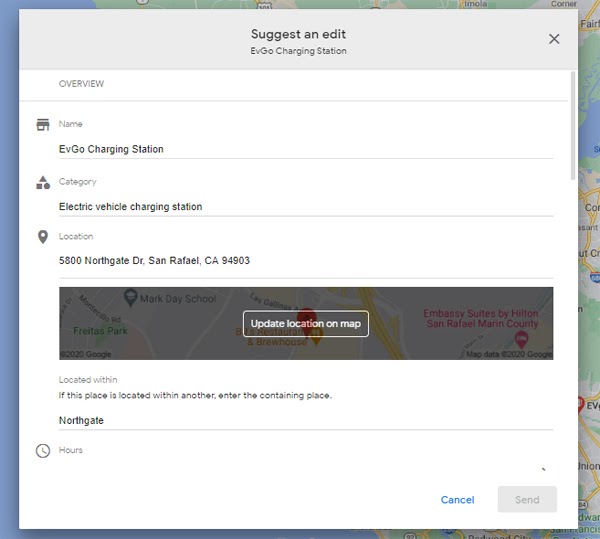
Also related to address, many EV Charging stations will find details on their listings that describe them as “located in” a public space. If the “located in” descriptor is wrong, look up the business on google.com/maps, click the “suggest an edit” button, and try to edit the information in this field:

If you see no correction within a couple of weeks of taking this action, contact Google My Business support and explain what’s going on.

Phone number

We’ll take our cue here from Google’s requirements of ATMs and kiosks. As I previously covered in my column on local product kiosks, the EV charging stations you’re marketing need a customer support phone number.

Again, this is one of those unusual grey areas. Normally, it’s standard advice for each location of a business to have a unique phone number. But, for EV charging stations, this obviously isn’t practical. Rather, be sure your listings have your help hotline number for customer service needs.

A word to the wise: Google has sometimes been prone to conflating listings with too-similar information. Having dozens, hundreds, or thousands of listings with the same brand AND phone number on them could potentially result in the accidental creation of duplicate listings. Large, multi-listing enterprises like EV charging brands might want to check out the automated duplicate detection and resolution services offered by Moz Local so that pesky duplicates aren’t interfering with listings management, visibility goals, and consumer direction.

Category

“Electric vehicle charging station” is the proper primary category for you, and my search through listings and GMB category databases is only finding one other related category, “electric vehicle charging station contractor” which may or may not be relevant to the business you’re marketing.

Hours of operation

Google’s guidelines state that gas stations should list the hours of operation that their pumps are available, and for most EV charging stations, this would presumably be 24 hours a day. As stated above, you’ll probably be uploading your data to Google via a bulk upload spreadsheet and the proper configuration for indicating 24-hours-a-day in the spreadsheet is 12:00AM-12:00AM.

URL

You’ll be allowed to include a website link on each listing you create. The best user experience I’m encountering on EV charger station listings is when the listing links to a landing page for the location I’m researching. On the flip side, you may get a ranking boost if you link to the brand’s homepage, instead, due to homepages typically having greater Page Authority than landing pages.

Photos/Videos

Make each listing stand out for customers by adding a few photos of the charger’s location. Given the fact that so many chargers are in vast parking lots, try to take some shots that illustrate the relationship of the station to the largest anchor business near it. This will help orient customers. And, given the newness of EV technology, uploading a video of how to use each type of charger would be extremely helpful to new electric vehicle owners.

Reviews

Looking around the SF Bay area, I couldn’t help noticing how few reviews these entities are receiving, meaning there are easy wins out there for any EV charger brand that makes a concerted review acquisition effort. If you’re building out landing pages on the brand’s website for each charging station locale, include a strong call to action and link to leave a review on Google on these pages. You can also use a free review link generator and then shorten the URL using a service like bitly for text or email-based review requests.

Just don’t ask for reviews in bulk; if you get too many at once, Google may filter them out as suspicious. And never incentivize reviews in any way — it can result in review loss, penalties, and legal actions.

Questions & Answers

Unsurprisingly, EV charging station listings show customers using Google’s Q&A feature to ask about costs and how to use the kiosks. These are leads for the brand and should be answered by the brand, rather than being left up to the public for responses of varying quality. If you’re using Moz Local to manage your listings, the dashboard will alert you each time a new question comes in on any of your listings.

Google Posts

Google Posts are a great way to make a brand stand out from less active competitors by microblogging persuasive content that appears on your listings, but for the typical EV charging brand, this feature is problematic. Google doesn’t allow large chains to post in bulk to their listings. There are some third-party services that facilitate hacks for this scenario.

Listings beyond Google

Google may be your dominant source of local business listings, but don’t hit the brakes there. Moz has mapped out the partners in our location data distribution network that currently support listings for EV charging stations. Talk to us about building your presence in key mapping applications like Apple Maps, search engines like Bing, aggregators like Infogroup, and mobile navigation providers like Navmii. Moz Local can help you get listed on multiple platforms so that potential customers can find your charging station locations via their preferred search methods.

Local search marketing tips for EV charging stations

JP Morgan predicts that EVs and HVs will make up 30% of total vehicle sales in the next five years and Statista estimates there are about 25,000 charging stations in the US. It’s big business, and while the convenience of charging at home can’t be beat, the presence of chargers and superchargers all over cities will do much to increase awareness of the rise of the EV, and to ease the transition away from fossil fuel transportation.

As a resident of California — the state with the most electric vehicles and also the state experiencing some of the worst devastation from Climate Change — every new charging station that pops up on Google Maps is a sign of hope to me. But I’ll be frank; I’m not a “car” person, and despite making a concerted effort over the past couple of years to understand how I could personally transition from a worried, gas-powered driver to a proud EV traveler has taught me that it’s a road paved with countless questions.

And that’s actually good news for EV charging station brands!

Whether you’re marketing EVgo, Blink, Tesla, ChargePoint, or the dozens of other charging solutions, your online marketing strategy is going to hinge on publishing content that solves consumers’ problems by answering their questions. Luckily for your industry, customers’ questions are so abundant that they are paving the way for you to develop absolutely fantastic website content that will support your organic and local rankings over time as you develop authority.

Here’s a simple six-step workflow for getting it right:

1. Survey customers

Making a minor investment in survey tech will let you directly ask the public what they want most from charging stations. Is it speed, location, more ports, better instructions, different payment options? Find out and document your learnings.

2. Analyze industry reviews and questions

Look at the common themes in your online reviews. For example, one thread I see running through the EV charging vertical is complaints about sitting in hot cars for 30+ minutes while charging up. When you think about it, gas stations provide shade at the pumps, though patrons are only there for ten minutes. If your customers are being inconvenienced in the summer heat, would properties permit you to build a canopy, or perhaps even better, plant some native trees to double down on your green goals?

Moz Local will surface the 100 most common words in your reviews for sentiment analysis purposes. Dig deeply into these for content inspiration and structural improvements.

And check out the positive and negative sentiment your competitors’ reviews contain. What is the competition getting wrong that you could get right? If you find opportunities like these, be sure you’re writing about them.

3. Fire up keyword research tools

  • How do electric car charging stations work?
  • Where can I charge my electric car?
  • What is the best EV charging station?
  • How to find free charging stations
  • How many miles does a Tesla get per charge?
  • Are EVgo stations free?
  • Can I use ChargePoint at EVgo?
  • What is a level 3 charging station?

Questions truly abound in the EV charging space. Moz Pro Keyword Explorer lets you type in keywords and phrases you feel could be important to the business you’re marketing, and then filter the results to see questions like the ones in my list, above. If you sign up for a free Moz community account, you can make 10 free queries a month or upgrade to a paid account for more robust keyword research.

Other free options include Google’s Ads Keyword Planner and the unpaid version of Answer the Public.

Document your findings so that you have created a list of questions around which you can base content publication.

4. Take a peek at Google Trends

Google Trends will show you interest in topics across time related to EV charging stations, and you can even see this broken out by regions of a country to help you localize your marketing. My glance at this data shows that interest in this subject took a hit when the COVID-19 pandemic emerged but is now steadily rising again. Glean further insights from this tool for topics you should be covering.

5. Analyze the competition

If you have a Moz Pro account, you can use Moz’s On-Page Grader feature not just to look at pages on your own website to see how to improve their optimization, but also to analyze what your competition is getting right and wrong. If you can find weaknesses in the strategy of a tough competitor, you can go one better with the actionable optimization tips On-Page Grader provides.

Look carefully at what your competitors are writing about on their websites and social accounts. If they’re covering a topic your keyword research hasn’t surfaced, note it down.

6. Get writing!

Now, take the list of questions and keyword phrases you’ve discovered, group them by topics, and begin creating pages for them on your website, or posts on the brand’s blog, providing answers. Some pages may be short, and others may be long — the rule of thumb is simply to cover each question thoroughly. You may find that some topics are best answered via other media, like short videos. That’s great, if you can produce them, but don’t forget to provide written transcripts.

Your findings can also fuel your social media posting, your Google posts, and provide the top FAQs you can ask and answer via Google Questions & Answers on your Google Business Profiles.

Finally, remember that marketing requires active promotion. Don’t just let your content sit on your website hoping someone will arrive to read it. Actively promote your best pieces via social media, to local print and online media journalists, and in local community hubs, like neighborhood websites and hyperlocal blogs. Work to build real relationships in the cities where you’re marketing your charging station locations so that you are always increasing awareness of your brand’s commitment to making towns and cities better places to live.

Have questions? Ask me in the comments. I’m personally rooting for the rapid spread of EV charging stations across the US and around the world, and if you’re marketing this model, I’d love to hear from you!


Sign up for The Moz Top 10, a semimonthly mailer updating you on the top ten hottest pieces of SEO news, tips, and rad links uncovered by the Moz team. Think of it as your exclusive digest of stuff you don't have time to hunt down but want to read!


from The Moz Blog https://ift.tt/36RGa3m
via IFTTT

Passkeys: What the Heck and Why?

These things called  passkeys  sure are making the rounds these days. They were a main attraction at  W3C TPAC 2022 , gained support in  Saf...