Monday, 8 February 2021

Local SEO Tips for Electric Vehicle Charging Stations

Posted by MiriamEllis

Some business models exist in the ditches of Google’s information highways, belonging in local search results, but not well addressed by the official guidelines. Electric vehicle (EV) charging stations exemplify this: They’re all over local packs, finders, and maps, but their models is a bit unusual, and Google has yet to update the guidelines to show exactly how to represent them in the Google My Business setting.

Today, we’ll pull together our own set of EV charging station best practices — based on Google’s rules for similar enterprises — and throw a few free local search marketing tips into the trunk as well.

How to handle your EV charging station Google My Business listings

Whether you’re an owner, in-house marketer, or agency staffer who’s been tasked with promoting a fleet of EV charging stations online, having a presence in Google’s local search results — including local packs, local finders, Google Business Profiles, and Google Maps — should be core to your digital strategy.

While Google’s helpful guidelines don’t specifically address EV charging stations, proof that they’re eligible for inclusion can be seen in the extra special features and categories Google has released for these models. For example, the above screenshot shows the charger icons, charger type designations, and wattage displays in the local results. In the US and UK, Google displays live charger availability data for some networks for consumer convenience. Even the map pins have special icons in them for EV charging stations.

Google definitely knows about them, and wants this industry to get listed.

If you’ve never set up a GMB listing before, Google’s own resources will walk you through the process of filling out and validating a profile for an individual location, but EV charging station marketers are most likely dealing with many locations at once. If you need to get 10 or more locations listed, you’ll be using Google’s bulk upload functionality, instead. You’ll also want to go for bulk verification of these large batches of listings.

But before you get started, here’s special guidance for handling some of the major fields you’ll be filling out for any EV charging station you’re marketing.

Business title

Google wants you to fill out this field with the exact name of the business as it appears in the real world. The majority of the listings I looked at in this sector were adding the words “charging station” to their brand name, which technically violates Google’s guidelines. Just as gas stations are supposed to list themselves as “Shell” or “Valero”, EV charging stations wanting to stick scrupulously to the guidelines should just be “EVgo” or “ChargePoint”.

According to the guidelines, Google wouldn’t want listings entitled “Shell Gas Station” or “EVgo Charging Station”, any more than they’d want “McDonald’s Fast Food Restaurant” or “Macy’s Department Store.”

But now for a home truth: Google says you’re only supposed to put your real-world brand in these titles, but they don’t take much action on enforcing this guideline, and having keywords in the business title that match search language is strongly believed to improve local rankings. So, if you adhere to the guidelines and remove “charging station” from your business titles, your rankings may decrease. This weighting of keywords in the business title is a longstanding issue Google needs to resolve.

Frankly, I think having the words “charging station” in the listing title might actually help users who are just now becoming accustomed to emergent EV technology and trying to understand where to get charged up, but my common sense and Google’s policies are often at odds.

Keep your business title free of other extraneous information like location information, or adjectives like “cheapest” or “best”.

Address

It’s a dominant trend for EV charging stations to be located in the parking lots of busy public spaces, like shopping centers, railroad stations, and business parks. Typically, to be eligible for a GMB listing, a business has to have its own address, but a look at Google’s local search engine results (including Google Maps) shows charging stations being permitted to use the address of the public space. For example, an EV charging station in a strip mall near me is using the same address as the Target that anchors the shopping center.

Additionally, businesses that host a charging station are allowed to have a link on their listings publicizing this feature.

Also related to address, many EV Charging stations will find details on their listings that describe them as “located in” a public space. If the “located in” descriptor is wrong, look up the business on google.com/maps, click the “suggest an edit” button, and try to edit the information in this field:
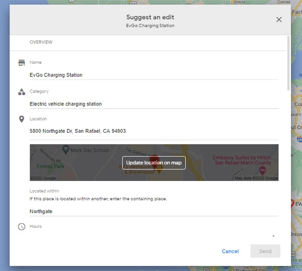
If you see no correction within a couple of weeks of taking this action, contact Google My Business support and explain what’s going on.

Phone number

We’ll take our cue here from Google’s requirements of ATMs and kiosks. As I previously covered in my column on local product kiosks, the EV charging stations you’re marketing need a customer support phone number.

Again, this is one of those unusual grey areas. Normally, it’s standard advice for each location of a business to have a unique phone number. But, for EV charging stations, this obviously isn’t practical. Rather, be sure your listings have your help hotline number for customer service needs.

A word to the wise: Google has sometimes been prone to conflating listings with too-similar information. Having dozens, hundreds, or thousands of listings with the same brand AND phone number on them could potentially result in the accidental creation of duplicate listings. Large, multi-listing enterprises like EV charging brands might want to check out the automated duplicate detection and resolution services offered by Moz Local so that pesky duplicates aren’t interfering with listings management, visibility goals, and consumer direction.

Category

“Electric vehicle charging station” is the proper primary category for you, and my search through listings and GMB category databases is only finding one other related category, “electric vehicle charging station contractor” which may or may not be relevant to the business you’re marketing.

Hours of operation

Google’s guidelines state that gas stations should list the hours of operation that their pumps are available, and for most EV charging stations, this would presumably be 24 hours a day. As stated above, you’ll probably be uploading your data to Google via a bulk upload spreadsheet and the proper configuration for indicating 24-hours-a-day in the spreadsheet is 12:00AM-12:00AM.

URL

You’ll be allowed to include a website link on each listing you create. The best user experience I’m encountering on EV charger station listings is when the listing links to a landing page for the location I’m researching. On the flip side, you may get a ranking boost if you link to the brand’s homepage, instead, due to homepages typically having greater Page Authority than landing pages.

Photos/Videos

Make each listing stand out for customers by adding a few photos of the charger’s location. Given the fact that so many chargers are in vast parking lots, try to take some shots that illustrate the relationship of the station to the largest anchor business near it. This will help orient customers. And, given the newness of EV technology, uploading a video of how to use each type of charger would be extremely helpful to new electric vehicle owners.

Reviews

Looking around the SF Bay area, I couldn’t help noticing how few reviews these entities are receiving, meaning there are easy wins out there for any EV charger brand that makes a concerted review acquisition effort. If you’re building out landing pages on the brand’s website for each charging station locale, include a strong call to action and link to leave a review on Google on these pages. You can also use a free review link generator and then shorten the URL using a service like bitly for text or email-based review requests.

Just don’t ask for reviews in bulk; if you get too many at once, Google may filter them out as suspicious. And never incentivize reviews in any way — it can result in review loss, penalties, and legal actions.

Questions & Answers

Unsurprisingly, EV charging station listings show customers using Google’s Q&A feature to ask about costs and how to use the kiosks. These are leads for the brand and should be answered by the brand, rather than being left up to the public for responses of varying quality. If you’re using Moz Local to manage your listings, the dashboard will alert you each time a new question comes in on any of your listings.

Google Posts

Google Posts are a great way to make a brand stand out from less active competitors by microblogging persuasive content that appears on your listings, but for the typical EV charging brand, this feature is problematic. Google doesn’t allow large chains to post in bulk to their listings. There are some third-party services that facilitate hacks for this scenario.

Listings beyond Google

Google may be your dominant source of local business listings, but don’t hit the brakes there. Moz has mapped out the partners in our location data distribution network that currently support listings for EV charging stations. Talk to us about building your presence in key mapping applications like Apple Maps, search engines like Bing, aggregators like Infogroup, and mobile navigation providers like Navmii. Moz Local can help you get listed on multiple platforms so that potential customers can find your charging station locations via their preferred search methods.

Local search marketing tips for EV charging stations

JP Morgan predicts that EVs and HVs will make up 30% of total vehicle sales in the next five years and Statista estimates there are about 25,000 charging stations in the US. It’s big business, and while the convenience of charging at home can’t be beat, the presence of chargers and superchargers all over cities will do much to increase awareness of the rise of the EV, and to ease the transition away from fossil fuel transportation.

As a resident of California — the state with the most electric vehicles and also the state experiencing some of the worst devastation from Climate Change — every new charging station that pops up on Google Maps is a sign of hope to me. But I’ll be frank; I’m not a “car” person, and despite making a concerted effort over the past couple of years to understand how I could personally transition from a worried, gas-powered driver to a proud EV traveler has taught me that it’s a road paved with countless questions.

And that’s actually good news for EV charging station brands!

Whether you’re marketing EVgo, Blink, Tesla, ChargePoint, or the dozens of other charging solutions, your online marketing strategy is going to hinge on publishing content that solves consumers’ problems by answering their questions. Luckily for your industry, customers’ questions are so abundant that they are paving the way for you to develop absolutely fantastic website content that will support your organic and local rankings over time as you develop authority.

Here’s a simple six-step workflow for getting it right:

1. Survey customers

Making a minor investment in survey tech will let you directly ask the public what they want most from charging stations. Is it speed, location, more ports, better instructions, different payment options? Find out and document your learnings.

2. Analyze industry reviews and questions

Look at the common themes in your online reviews. For example, one thread I see running through the EV charging vertical is complaints about sitting in hot cars for 30+ minutes while charging up. When you think about it, gas stations provide shade at the pumps, though patrons are only there for ten minutes. If your customers are being inconvenienced in the summer heat, would properties permit you to build a canopy, or perhaps even better, plant some native trees to double down on your green goals?

Moz Local will surface the 100 most common words in your reviews for sentiment analysis purposes. Dig deeply into these for content inspiration and structural improvements.

And check out the positive and negative sentiment your competitors’ reviews contain. What is the competition getting wrong that you could get right? If you find opportunities like these, be sure you’re writing about them.

3. Fire up keyword research tools

  • How do electric car charging stations work?
  • Where can I charge my electric car?
  • What is the best EV charging station?
  • How to find free charging stations
  • How many miles does a Tesla get per charge?
  • Are EVgo stations free?
  • Can I use ChargePoint at EVgo?
  • What is a level 3 charging station?

Questions truly abound in the EV charging space. Moz Pro Keyword Explorer lets you type in keywords and phrases you feel could be important to the business you’re marketing, and then filter the results to see questions like the ones in my list, above. If you sign up for a free Moz community account, you can make 10 free queries a month or upgrade to a paid account for more robust keyword research.

Other free options include Google’s Ads Keyword Planner and the unpaid version of Answer the Public.

Document your findings so that you have created a list of questions around which you can base content publication.

4. Take a peek at Google Trends

Google Trends will show you interest in topics across time related to EV charging stations, and you can even see this broken out by regions of a country to help you localize your marketing. My glance at this data shows that interest in this subject took a hit when the COVID-19 pandemic emerged but is now steadily rising again. Glean further insights from this tool for topics you should be covering.

5. Analyze the competition
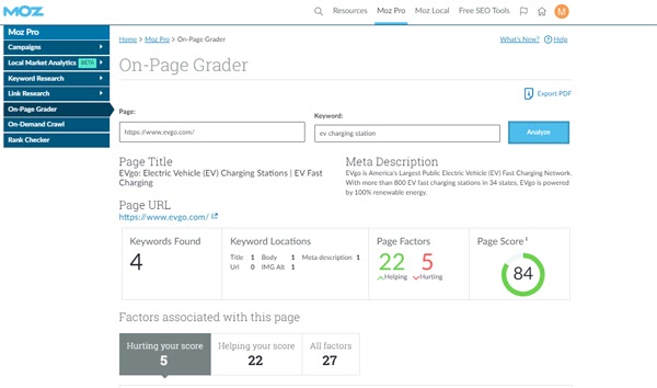
If you have a Moz Pro account, you can use Moz’s On-Page Grader feature not just to look at pages on your own website to see how to improve their optimization, but also to analyze what your competition is getting right and wrong. If you can find weaknesses in the strategy of a tough competitor, you can go one better with the actionable optimization tips On-Page Grader provides.

Look carefully at what your competitors are writing about on their websites and social accounts. If they’re covering a topic your keyword research hasn’t surfaced, note it down.

6. Get writing!

Now, take the list of questions and keyword phrases you’ve discovered, group them by topics, and begin creating pages for them on your website, or posts on the brand’s blog, providing answers. Some pages may be short, and others may be long — the rule of thumb is simply to cover each question thoroughly. You may find that some topics are best answered via other media, like short videos. That’s great, if you can produce them, but don’t forget to provide written transcripts.

Your findings can also fuel your social media posting, your Google posts, and provide the top FAQs you can ask and answer via Google Questions & Answers on your Google Business Profiles.

Finally, remember that marketing requires active promotion. Don’t just let your content sit on your website hoping someone will arrive to read it. Actively promote your best pieces via social media, to local print and online media journalists, and in local community hubs, like neighborhood websites and hyperlocal blogs. Work to build real relationships in the cities where you’re marketing your charging station locations so that you are always increasing awareness of your brand’s commitment to making towns and cities better places to live.

Have questions? Ask me in the comments. I’m personally rooting for the rapid spread of EV charging stations across the US and around the world, and if you’re marketing this model, I’d love to hear from you!


Sign up for The Moz Top 10, a semimonthly mailer updating you on the top ten hottest pieces of SEO news, tips, and rad links uncovered by the Moz team. Think of it as your exclusive digest of stuff you don't have time to hunt down but want to read!


from The Moz Blog https://ift.tt/36RGa3m
via IFTTT

Friday, 5 February 2021

Exploring the Complexities of Width and Height in CSS

The following article is co-authored by Uri Shaked and Michal Porag.

Let’s explore the complexities of how CSS computes the width and height dimensions of elements. This is based on countless late-night hours debugging and fiddling with lots of combinations of CSS properties, reading though the specs, and trying to figure out why some things seem to behave one way or another.

But before jumping in, let’s cover some basics so we’re all on the same page.

The basics

You have an element, and you want it to be 640px wide and 360px tall. These are just arbitrary numbers that conform to 16:9 pixel ratio. You can set them explicitly like this:

.element {
  width: 640px;
  height: 360px;
}

Now, the design calls for some padding inside that element. So you modify the CSS:

.element {
  width: 640px;
  height: 360px;
  padding: 10px;
}

What is the rendered width and height of the element now? I bet you can guess… it’s not 640×360px anymore! It’s actually 660×380px, because the padding adds 10px to each side (i.e. top, right, bottom and left), for an additional 20px on both the height and width.

This has to do with the box-sizing property: if it’s set to content-box (the default value), the rendered size of the element is the width and height plus the padding and border. That might mean that the rendered size is bigger than we intend which is funny because it might wind up that an element’s declared width and height values are completely different than what’s rendered.

That’s the power of The CSS Box Model. It calculates width and height like so:

/* Width */
width + padding-left + padding-right + border-left + border-right

/* Height */
height + padding-top + padding-bottom + border-top + border-bottom

What we just saw is how the dimensions for a block element are computed. Block elements include any element that naturally takes up the full width that’s available. So, by nature, it doesn’t matter how much content the element contains because its width is always 100%, that is, until we alter it. Think of elements like <p>, <article>, <main>, <div>, and so many more.

But now we ought to look at inline elements because they behave differently when it comes to The Box Model and how their dimensions are computed. After that, we’ll look at the relationship between parent and child elements, and how they affect the width and height computations of each other.

The curious case of inline elements

As we just saw, the padding and border of any element are both included in the element’s computed width and height dimensions. Funny enough, there are cases where the width and height properties have no effect whatsoever. Such is the case when working with inline elements.

An inline element is an element that’s width and height are determined by the content it contains. Inline elements, such as a <span>, will completely ignore the width and height as well the the left and right margin properties because, well, the content is what determines the dimensions. Here, sometimes a visual can help.

Just look at how nesting a block element inside of an inline element breaks the inline element’s shape simply because the block element is not defined by the amount of content it contains, but rather the amount of available space. You can really see that in action when we add a border to the inline element. Look how the inline element abruptly stops where the paragraph comes in, then continues after the paragraph.

The span sees the paragraph, which interrupts the inline flow of the span and essentially breaks out of it. Fascinating stuff!

But there’s more! Look how the inline element completely overlooks width and margin, even when those are declared right on it.

Crazy!

Parent and child elements

The parent-child relationship is a common pattern. A parent element is one that contains other elements nested inside it. And those nested elements are the parent element’s children.

<!-- The parent element -->
<div class="parent">
  <!-- The children -->
  <div class="child"></div>
  <div class="another-child"></div>
  <div class="twins">Whoa!</div>
</div>

The width and height of an element gets super interesting with parent and child elements. Let’s look at all the interesting quirks we get with this.

Relative units

Let’s start with relative units. A relative unit is computed by its context, or relation to other elements. Yeah, that’s sort of a convoluted definition. There are several different types of relative units, but let’s take percentages as an example. We can say that an element is 100% wide.

<div class="child">
  <!-- nothing yet -->
</div>
.parent {
  width: 100%;
}

Cool. If we plop that element onto an empty page, it will take up 100% of the available horizontal space. And what that 100% computes to depends on the width of the browser, right? 100% of a browser that’s 1,500 pixels is 1,500 pixels wide. 100% of a browser that’s 500 pixels is 500 pixels wide. That’s what we mean by a relative unit. The actual computed value is determined by the context in which it’s used.

So, the astute reader may already be thinking: Hey, so that’s sort of like a child element that’s set to a parent element’s width. And that would be correct. The width of the child at 100% will compute based on the actual width of the parent element that contains it.

Height works much the same way: it’s relative to the parent’s height. For example, two parent elements with different height dimensions but identical children result in children with different heights.

Padding and margin

The width and height of parent-child combinations get even more interesting when we look at other properties, such as padding and margin. Apparently, when we specify a percentage value for padding or margin, it is always relative to the width of the parent, even when dealing with vertical edges.

Some clever designers have taken advantage of it to create boxes of equal width and height, or boxes that keep a certain aspect ratio when the page resizes. This is particularly useful for video or image content, but can also be (ab)used in creative ways. Go ahead, type whatever you want into the editable element in this demo. The box maintains a proportional height and width, no matter how much (or little) content is added.

This technique for creating aspect ratio boxes is lovingly referred to as the “padding hack.” Chris has covered it extensively. But now that we have the aspect-ratio property gaining wide browser support, there’s less reason to reach for it.

display: inline and inline-block

Now that we’ve taken looks at how parent and child element dimensions are computed, we should check out two other interesting property values that affect an element’s width: min-content and max-content.

These properties tell the browser to look at the content of the element in order to determine its width. For instance, if we have the text: “hello CSS encyclopedia, nice to meet you!”, the browser would calculate the space that text would take up on the screen, and use it as the width.

The difference between min-content and max-content lies in how the browser does this calculation. For max-content, the browser pretends it has infinite space, and lays all the text in a single line while measuring its width.

For min-content, the browser pretends it has zero space, so it puts every word / child inline element in a different line. Let’s see this in action:

We actually saw max-content in action when we looked at the difference between block and inline elements. Inline elements, remember, are only as wide and tall as the content they contain. We can make most elements inline elements just by declaring display: inline; on it.

Cool. Another weapon we have is display: inline-block;. That creates an inline element, but enhanced with block-level computations in The Box Model. In other words, it’s an inline element that respects margin, width and height. The best of both worlds!

Cyclic percentage size

Did that last point make sense? Well, hopefully I won’t confuse you with this:

The child element in this example has a relative width of 33%. The parent element does not have a width declared on it. How the heck is the child’s computed width get calculated when there’s nothing relative to it?

To answer that, we have to look at how the browser calculates the size of the elements in this example. We haven’t defined a specific width for the parent element, so the browser uses the initial value for width , which is auto. And since the parent element’s display is set to inline-block, auto behaves like max-content. And max-content, as we saw, should mean the parent element is as wide as the content in it, which is everything inside the child element.

So, the browser looks at the element’s content (children) to determine its width. However, the width of the child also depends on the parent’s width! Gah, this is weird!

The CSS Box Sizing Module specification calls this cyclic percentage sizing. I’m not sure why it’s called that exactly, but it details the complex math the browser has to do to (1) determine the parent element’s width, and (2) reconcile that width to the relative width of the child.

The process is actually pretty cool once you get over the math stuff. The browser starts by calculating a temporary width for the child before its declared value is applied. The temporary width the browser uses for the child is auto which we saw behaves like max-content which, in turn, tells the browser that the child needs to be as wide as the content it contains. And right now, that’s not the declared 33% value.

That max-content value is what the browser uses to calculate the parent’s width. The parent, you see, needs to be at least as wide as the content that it contains, which is everything in the child at max-content. Once that resolves, the browser goes back to the child element and applies the 33% value that’s declared in the CSS.

This is how it looks:

There! Now we know how a child element can contribute to the computed value of its parent.

M&Ms: the min- and max- properties

Hey, so you’re probably aware that the following properties exist:

  • min-width
  • min-height
  • max-width
  • max-height

Well, those have a lot to do with an element’s width and height as well. They specify the limits an element’s size. It’s like saying, Hey, browser, make sure this element is never under this width/height or above this width/height.

So, even if we have declared an explicit width on an element, say 100%, we can still cap that value by giving it a max-width:

element {
  width: 100%;
  max-width: 800px;
}

This allows the browser to let the element take up as much space as it wants, up to 800 pixels. Let’s look what happens if we flip those values around and set the max-width to 100% and width to 800px:

element {
  width: 800px;
  max-width: 100%;
}

Hey look, it seems to result in the exact same behavior! The element takes up all the space it needs until it gets to 800 pixels.

Apparently, things start to get more complex as soon as we add a parent element into the mix. This is the same example as above, with one notable change: now each element is a child of an inline-block element. Suddenly, we see a striking difference between the two examples:

Why the difference? To understand, let’s consider how the browser calculates the width of the elements in this example.

We start with the parent element (.parent). It has a display property set to inline-block, and we didn’t specify a width value for it. Just like before, the browser looks at the size of its children to determine its width. Each box in this example is wrapped in the .parent element.

The first box (#container1) has a percentage width value of 100%. The width of the parent resolves to the width of the text within (the child’s max-content), limited by the value we specified by max-width, and that is used to calculate the width of the child as well.

The second box (#container2) has a set width of 800px, so its parent width is also 800px — just wide enough to fit its child. Then, the child’s max-width is resolved relative to the parent’s final width, that is 800px. So both the parent and the child are 800px wide in this case.

So, even though we initially saw the two boxes behave the same when we swapped width and max-width values, we now know that isn’t always true. In this case, introducing a parent element set to display: inline-block; threw it all off!

Adding min(), max() and clamp() into the mix

The min(), max() and clamp() are three useful CSS functions that let us define the size of elements responsively… without media queries!

  • min(): Returns the minimum value of its arguments. The arguments can be given in different units, and we can even mix and match absolute and relative units, like min(800px, 100%).
  • max(): Returns the maximum value of its arguments. Just like min(), you can mix and match different units.
  • clamp(): A shorthand function for doing min and max at once: clamp(MIN, VAL, MAX) is resolved as max(MIN, min(VAL, MAX)). In other words, it will return VAL, unless it exceeds the boundaries defined by MIN and MAX, in which case it’ll return the corresponding boundary value.

Like this. Check out how we can effectively “re-write” the max-width example from above using a single CSS property:

.element {
  width: min(800px, 100%);
}

/* ...is equivalent to: */
.element {
  width: 800px;
  max-width: 100%;
}

That would set the width of the element to 800px, but make sure we don’t exceed the width of the parent (100%). Just like before, if we wrap the element with an inline-block parent, we can observe it behaving differently than the max-width variation:

The width of the children (800px) is the same. However, if you enlarge the screen (or use CodePen’s 0.5x button to zoom out), you will notice that the second parent is actually larger.

It boils down to how the browser calculates the parent’s width: we didn’t specify a width for the parent, and as child’s width value is using relative units, the browser ignores it while calculating the parent’s width and uses the max-content child of the child, dictated by the “very long … long” text.

Wrapping up

Phew! It’s crazy that something as seemingly simple as width and height actually have a lot going on. Sure, we can set explicit width and height values on an element, but the actual values that render often end up being something completely different.

That’s the beauty (and, frankly, the frustration) with CSS. It’s so carefully considered and accounts for so many edge cases. I mean, the concept of The Box Model itself is wonderfully complex and elegant at the same time. Where else can we explicitly declare something in code and have it interpreted in different ways? The width isn’t always the width.

And we haven’t even touched on some other contributing factors to an element’s dimensions. Modern layout techniques, like CSS Flexbox and Grid introduce axes and track lines that also determine the rendered size of an element.


Authors: Uri Shaked and Michal Porag


The post Exploring the Complexities of Width and Height in CSS appeared first on CSS-Tricks.

You can support CSS-Tricks by being an MVP Supporter.


from CSS-Tricks https://ift.tt/2YPbewa
via IFTTT

Weekly Platform News: The :not() pseudo-class, Video Media Queries, clip-path: path() Support

Hey, we’re back with weekly updates about the browser landscape from Šime Vidas.

In this week’s update, the CSS :not pseudo class can accept complex selectors, how to disable smooth scrolling when using “Find on page…” in Chrome, Safari’s support for there media attribute on <video> elements, and the long-awaited debut of the path() function for the CSS clip-path property.

Let’s jump into the news…

The enhanced :not() pseudo-class enables new kinds of powerful selectors

After a years-long wait, the enhanced :not() pseudo-class has finally shipped in Chrome and Firefox, and is now supported in all major browser engines. This new version of :not() accepts complex selectors and even entire selector lists.

For example, you can now select all <p> elements that are not contained within an <article> element.

/* select all <p>s that are descendants of <article> */
article p {
}

/* NEW! */
/* select all <p>s that are not descendants of <article> */
p:not(article *) {
}

In another example, you may want to select the first list item that does not have the hidden attribute (or any other attribute, for that matter). The best selector for this task would be :nth-child(1 of :not([hidden])), but the of notation is still only supported in Safari. Luckily, this unsupported selector can now be re-written using only the enhanced :not() pseudo-class.

/* select all non-hidden elements that are not preceded by a non-hidden sibling (i.e., select the first non-hidden child */
:not([hidden]):not(:not([hidden]) ~ :not([hidden])) {
}

The HTTP Refresh header can be an accessibility issue

The HTTP Refresh header (and equivalent HTML <meta> tag) is a very old and widely supported non-standard feature that instructs the browser to automatically and periodically reload the page after a given amount of time.

<!-- refresh page after 60 seconds -->
<meta http-equiv="refresh" content="60">

According to Google’s data, the <meta http-equiv="refresh"> tag is used by a whopping 2.8% of page loads in Chrome (down from 4% a year ago). All these websites risk failing several success criteria of the Web Content Accessibility Guidelines (WCAG):

If the time interval is too short, and there is no way to turn auto-refresh off, people who are blind will not have enough time to make their screen readers read the page before the page refreshes unexpectedly and causes the screen reader to begin reading at the top.

However, WCAG does allow using the <meta http-equiv="refresh"> tag specifically with the value 0 to perform a client-side redirect in the case that the author does not control the server and hence cannot perform a proper HTTP redirect.

(via Stefan Judis)

How to disable smooth scrolling for the “Find on page…” feature in Chrome

CSS scroll-behavior: smooth is supported in Chrome and Firefox. When this declaration is set on the <html> element, the browser scrolls the page “in a smooth fashion.” This applies to navigations, the standard scrolling APIs (e.g., window.scrollTo({ top: 0 })), and scroll snapping operations (CSS Scroll Snap).

Unfortunately, Chrome erroneously keeps smooth scrolling enabled even when the user performs a text search on the page (“Find on page…” feature). Some people find this annoying. Until that is fixed, you can use Christian Schaefer’s clever CSS workaround that effectively disables smooth scrolling for the “Find on page…” feature only.

@keyframes smoothscroll1 {
  from,
  to {
    scroll-behavior: smooth;
  }
}

@keyframes smoothscroll2 {
  from,
  to {
    scroll-behavior: smooth;
  }
}

html {
  animation: smoothscroll1 1s;
}

html:focus-within {
  animation-name: smoothscroll2;
  scroll-behavior: smooth;
}

In the following demo, notice how clicking the links scrolls the page smoothly while searching for the words “top” and “bottom” scrolls the page instantly.

Safari still supports the media attribute on video sources

With the HTML <video> element, it is possible to declare multiple video sources of different MIME types and encodings. This allows websites to use more modern and efficient video formats in supporting browsers, while providing a fallback for other browsers.

<video>
  <source src="/flower.webm" type="video/webm">
  <source src="/flower.mp4" type="video/mp4">
</video>

In the past, browsers also supported the media attribute on video sources. For example, a web page could load a higher-resolution video if the user’s viewport exceeded a certain size.

<video>
  <source media="(min-width: 1200px)" src="/large.mp4" type="video/mp4">
  <source src="/small.mp4" type="video/mp4">
</video>

The above syntax is in fact still supported in Safari today, but it was removed from other browsers around 2014 because it was not considered a good feature:

It is not appropriate for choosing between low resolution and high resolution because the environment can change (e.g., the user might fullscreen the video after it has begun loading and want high resolution). Also, bandwidth is not available in media queries, but even if it was, the user agent is in a better position to determine what is appropriate than the author.

Scott Jehl (Filament Group) argues that the removal of this feature was a mistake and that websites should be able to deliver responsive video sources using <video> alone.

For every video we embed in HTML, we’re stuck with the choice of serving source files that are potentially too large or small for many users’ devices … or resorting to more complicated server-side or scripted or third-party solutions to deliver a correct size.

Scott has written a proposal for the reintroduction of media in video <source> elements and is welcoming feedback.

The CSS clip-path: path() function ships in Chrome

It wasn’t mentioned in the latest “New in Chrome 88” article, but Chrome just shipped the path() function for the CSS clip-path property, which means that this feature is now supported in all three major browser engines (Safari, Firefox, and Chrome).

The path() function is defined in the CSS Shapes module, and it accepts an SVG path string. Chris calls this the ultimate syntax for the clip-path property because it can clip an element with “literally any shape.” For example, here’s a photo clipped with a heart shape:


The post Weekly Platform News: The :not() pseudo-class, Video Media Queries, clip-path: path() Support appeared first on CSS-Tricks.

You can support CSS-Tricks by being an MVP Supporter.


from CSS-Tricks https://ift.tt/36K49RK
via IFTTT

Some React Blog Posts I’ve Bookmarked and Read Lately

  • The React Hooks Announcement In Retrospect: 2 Years Later — Ryan Carniato considers hooks to be the most significant turning point in front end in the past five years, but he also says hooks have muddied the waters as well.
  • Mediator Component in React — Robin Wieruch’s article made me think just how un-opinionated React is and how architecturally on-your-own you are. It’s tough to find the right abstractions.
  • No One Ever Got Fired for Choosing React — Jake Lazaroff’s article is a good balance to the above. Sometimes you pick a library like React because it solves problems you’re likely to run into and lets you get to work.
  • A React “if component — I kinda like how JSX does conditional rendering, but hey, a lightweight abstraction like this might just float your boat.
  • State of the React Ecosystem in 2021 — Hooks are big. State management is all over the place, and state machines are growing in popularity. webpack is still the main bundler. Everyone is holding their breath about Suspense… so suspenseful.
  • Blitz.js — “The Fullstack React Framework” — interesting to see a framework built on top of another framework (Next.js).
  • Introducing Zero-Bundle-Size React Server Components — Feels like it will be a big deal, but will shine brightest when frameworks and hosts zero-in on offerings around it. I’m sure Vercel and Netlify are all  👀.

The post Some React Blog Posts I’ve Bookmarked and Read Lately appeared first on CSS-Tricks.

You can support CSS-Tricks by being an MVP Supporter.


from CSS-Tricks https://ift.tt/3jxuZC9
via IFTTT

Using STAT to Identify Featured Snippet Opportunities

Posted by Zoe.Pegler

Winning the featured snippet for a target keyword means increased traffic to that page, and you can use STAT to achieve those wins. In this week's episode of Whiteboard Friday, Moz Learning and Development Specialist Zoe Pegler walks you through how you can do so in five easy steps.

Anatomy of a Perfect Pitch Email

Click on the whiteboard image above to open a high resolution version in a new tab!

Video Transcription

Hi. I'm Zoe from Moz's Learning Team. Today I'm going to be showing you how to use STAT to identify featured snippet opportunities. If you're not familiar with STAT, it's a ranking tool which is very good at pulling big data.

What's a featured snippet? 


For those of you that might not know what a featured snippet is, it's one of those answer boxes that appear at the top of a search results page. It's the result that shows up directly beneath the ads after the search is performed. So, for example, if you did a search for something like "Is coffee good for you," you're going to see an answer box saying, "Recent studies found that coffee drinkers are less likely to die from some of the leading causes of death."

Websites that have URLs ranked in the featured snippet often experience heightened brand visibility and the majority of available traffic from the associated keyword. Where do you start if you want to become a part of that featured snippet box? How do you target those opportunities? Well, the first step here is keyword research.

1. Upload keywords to STAT and filter

You want to discover keywords that you can start monitoring optimizing for. Ideally, you want to find keywords that you rank on page one for that also have a featured snippet. STAT's keywords tab is a great place to start with this. In this feature, you can upload a bunch of keywords, and once you've allowed some time for the data to gather, you can really dig into what keywords you have that are triggering answer boxes and what opportunities there are.

There's an extremely useful feature in STAT where you can filter a table of keywords to show earned SERP features and specifically answers. You can filter for specific answer subtypes too. STAT currently parse lists, paragraphs, tables, carousels, and videos.

So you can check out all of these. You should also filter for keywords specifically on page one. So do that. Filter the "Rank" column to show results ranking between one and 10. Once you have found all of those keywords, there's a really smart, useful way of collecting them all together, and that's by putting them into a dynamic tag.

2. Create a dynamic tag

This lets you group those keywords together and label them. You could call this tag featured snippet opportunities for example. The magic of putting the keywords into that dynamic tag is that it acts like a smart playlist. These fancy segments automatically populate each day with keywords that match the specific criteria you set for them, making it quick and easy to see which of your keywords are featured snippet opportunities.

Being able to segment keywords into these dynamic tags is what makes STAT so much more valuable. Being able to create reports in granular keyword levels is powerful stuff.

3. Check the data set over time

Okay, so what is the next step to prioritize your featured snippet opportunities by the highest potential ROI keywords? It's usually much easier to take a featured snippet or to steal one if you're also on page  one.

Taking a look at STAT's SERP Features tab can help out here. There's a nifty graph which allows you to see how answer boxes appear if your keywords have changed over time. Using this will help you to access opportunity. You can then start pulling out and comparing some of that data and digging into things like average monthly search volume, current featured snippet URLs, and the featured snippet type.

Is it a paragraph, a list, or a table? Is there any markup? What's your rank? How does the page look in general? You might want to start investigating which long-tail keywords you could potentially optimize your site for. There are a couple of reports you can pull in STAT which can definitely help you in this research.

4. Set up reports

The People Also Ask report will show you questions and their rank within the box as well as the URL sourced in each answer. It's worth taking a look at the Related Searches report as well to see related search queries offered by Google which users may also be searching. Once you've identified long-tail keywords you want to track and keep an eye on, you can copy and paste those keywords into Google Keyword Planner or even back into STAT.

That way you can see what the rankings, search volume, and CPC look like. You can use one of those smart dynamic tags in STAT to group and label them again as you start optimizing on the keywords you think will be valuable to your site. Once you've identified and optimized your site, you'll want to keep careful watch over your hard work, so monitor.

5. Set up and monitor alerts

I recommend setting up alerts for this. STAT lets you do this so you'll be notified any time your ranking goes up or down for your featured snippet target keywords, meaning you're not going to miss seeing an opportunity. I hope this has been helpful and you're feeling more prepared to try some of this.

If you already have a STAT subscription and want to get even more familiar with the tool features, think about taking the STAT Fundamentals Certification course. Have a great day, and thank you for watching this edition of Whiteboard Friday.

Video transcription by Speechpad.com


Sign up for The Moz Top 10, a semimonthly mailer updating you on the top ten hottest pieces of SEO news, tips, and rad links uncovered by the Moz team. Think of it as your exclusive digest of stuff you don't have time to hunt down but want to read!


from The Moz Blog https://ift.tt/39Prqng
via IFTTT

Thursday, 4 February 2021

Some Typography Blog Posts I’ve Bookmarked and Read Lately

  • Font-size: An Unexpectedly Complex CSS Property — From Manish Goregaokar in 2017. Of many oddities, I found the one where font: medium monospace renders at 13px where font: medium sans-serif renders at 16px particularly weird.
  • The good line-height — Since CSS supports unitless line-height, you probably shouldn’t be setting a hard number anyway.
  • Time to Say Goodbye to Google Fonts — Simon Wicki doesn’t mean don’t use them, they mean self-host them. Browsers are starting to isolate cache on a per-domain basis so that old argument that you buy speed because “users probably already have it cached” doesn’t hold up. I expected to hear about stuff like having more control over font loading, but this is just about the cache.
  • My Favorite Typefaces of 2020 — John Boardley’s picks for the past year. Have you seen these “color fonts”? They are so cool. Check out LiebeHeide, it looks like real pen-on-paper.
  • How to avoid layout shifts caused by web fonts — We’ve got CLS (Cumulative Layout Shift) now and it’s such an important performance metric that will soon start affecting SEO. And because we have CSS control over font loading via font-display, that means if we set things up such that font loading shifts the page, that’s bad. I like Simon Hearne’s suggestion that we tweak both our custom font and fallback font to match perfectly. I think perfect fallback fonts are one of the best CSS tricks.
  • How to pick a Typeface for User Interface and App Design? — Oliver Schöndorfer makes the case for “functional text” which is everything that isn’t body text (e.g. paragraphs of text) or display text (e.g. headers). “Clarity is key.”

The post Some Typography Blog Posts I’ve Bookmarked and Read Lately appeared first on CSS-Tricks.

You can support CSS-Tricks by being an MVP Supporter.


from CSS-Tricks https://ift.tt/2YHYVln
via IFTTT

Algolia

Algolia is for search. Literally any website can take advantage of Algolia-powered search. You put JSON data (“records”) in, and then you can search them at lightning speed. The magic of Algolia is that they help you with both of those things: getting data in and getting search results out.

As far as getting data in, there are all sorts of ways. The most likely situation is that you already have data somewhere and you just need to give it to Algolia. They’ve got great docs on that. You basically write an integration that updates Algolia as you update your own data. There are so many things to help with this though. Got a WordPress site? They’ve got a PHP API client and people have built plugins around it.

\

Got a Rails site? They have integrations for you. What about a Jamstack site? No problem, they’ve got a Netlify build plugin. So, for example, your Jekyll site can have great search.

One way, and I’ve used this myself plenty of times, is literally entering records manually. While manually typing in records isn’t particularly scalable, I like that it’s possible.

So that’s all the “getting data in” part. Now the fun part: building a search UI experience. Great news here too: there is lots of help to make this awesome.

The core of it is InstantSearch.js, which Algolia provides directly. That native version also has versions in React, Vue, and Angular (you could make it work with anything). Wanna see it work super quickly? Try their Create InstantSearchApp flow, which will spin up a search UI super quickly for you.

While you don’t have to use any particular library, I find them very easy to use, very flexible configuration-wise, and no problem to style. Wanna see? CDNjs has everything on it in an Algolia index, so here’s a Pen that connects to that and provides a search UI:

You can see in the code how I’m controlling the number of results, the template and styles the results are shown in, and what happens when a search result is selected. That’s powerful stuff.

This is just the surface of Algolia though. Algolia is a very mature platform with all kinds of bells and whistles you can take advantage of. You can tweak algorithms, you can dig into analytics, you can take advantage of AI, you can use it on native mobile apps… and all with real customer support along the way.


The post Algolia appeared first on CSS-Tricks.

You can support CSS-Tricks by being an MVP Supporter.


from CSS-Tricks https://ift.tt/3tsBbjm
via IFTTT

Passkeys: What the Heck and Why?

These things called  passkeys  sure are making the rounds these days. They were a main attraction at  W3C TPAC 2022 , gained support in  Saf...