Cassie Evans has a great intro to motion paths. That is, being able to animate an element along a path. Not just up/down/left/right, but whatever curvy/wiggly/weird path you want.
It's an interesting subject because there are so many different technologies helping to do it over time. SMIL, JavaScript-powered animation libraries, native JavaScript APIs, and even CSS via offset-path and friends. I think offset-path is funny - it was changed to that name from motion-path as you don't technically have to apply motion to an element you place on a path in this way.
There's no clear winner. I'm (perhaps obviously) a fan of doing stuff like this in CSS whenever possible, but the browser support there is essentially Chrome-only. Plus seeing SVG path values in CSS always feels a smidge uncomfortable because of the unitless numbers. SMIL feels like essentially dead technology, but at least then you're in SVG-land and the paths make good sense in that context. If browser support is vital, you have to use a library.
I do think there is untapped cool design possibility in motion paths. It's not just for landing space ships, but can be for practical stuff like how a modal enters a page.
Lynn Fisher walks us step-by-step through the redesign process of her latest outstanding personal website. In this design, increasing the width of the browser window will cause the illustrations on the page crack to open and reveal more within them:
This case study reminded me that Lynn also has an archive of every case study and project that she’s made over the years and that it's most certainly worth checking out.
As is the rule in WebGL, anything that seems like it should be simple is actually quite complicated. Drawing lines, debugging shaders,text rendering… they are all damn hard to do well in WebGL.
Isn’t that weird? WebGL doesn't have a built-in function for rendering text. Although text seems like the most basic of functionalities. When it comes down to actually rendering it, things get complicated. How do you account for the immense amount of glyphs for every language? How do you work with fixed-width, or proportional-width fonts? What do you do when text needs to be rendered top-to-bottom, left-to-right, or right-to-left? Mathematical equations, diagrams, sheet music?
Suddenly it starts to make sense why text rendering has no place in a low-level graphics API like WebGL. Text rendering is a complex problem with a lot of nuances. If we want to render text, we need to get creative. Fortunately, a lot of smart folks already came up with a wide range of techniques for all our WebGL text needs.
We'll learn at some of those techniques in this article, including how to generate the assets they need and how to use them with ThreeJS, a JavaScript 3D library that includes a WebGL renderer. As a bonus, each technique is going to have a demo showcasing use cases.
Although this article is all about text inside WebGL, the first thing you should consider is whether you can get away with using HMTL text or canvas overlayed on top of your WebGL canvas. The text can't be occluded with the 3D geometry as an overlay, but you can get styling and accessibility out of the box. That's all you need in a lot of cases.
Font geometries
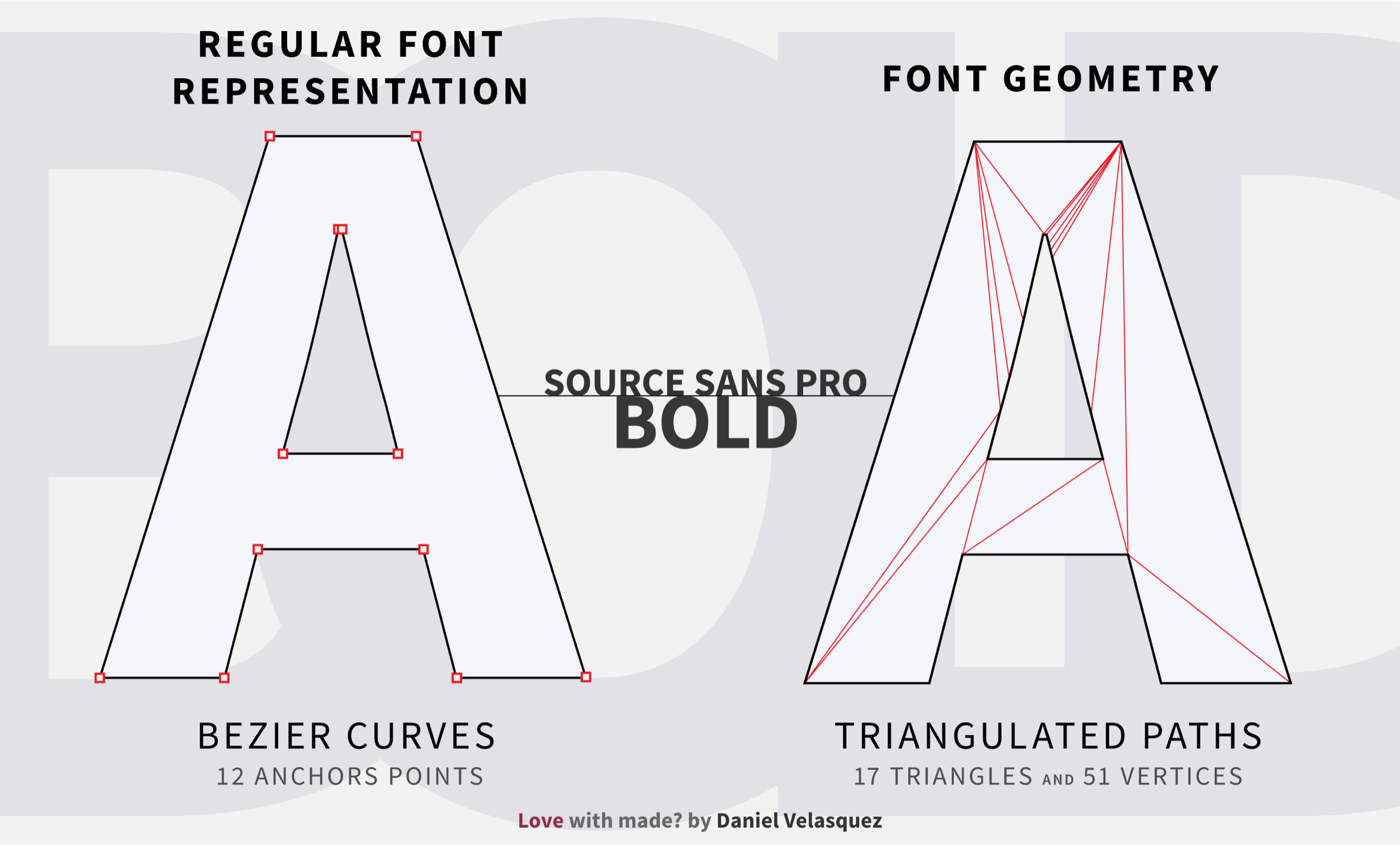
One of the common ways to render text is to build the glyphs with a series of triangles, much like a regular model. After all, rendering points, lines and triangles are a strength of WebGL.
When creating a string, each glyph is made by reading the triangles from a font file of triangulated points. From there, you could extrude the glyph to make it 3D, or scale the glyphs via matrix operations.
Regular font representation (left) and font geometry (right)
Font geometry works best for a small amount of text. That’s because each glyph contains many triangles, which causes drawing to become problematic.
Rendering this exact paragraph you are reading right now with font geometry creates 185,084 triangles and 555,252 vertices. This is just 259 letters. Write the whole article using a font geometry and your computer fan might as well become an airplane turbine.
Although the number of triangles varies by the precision of the triangulation and the typeface in use, rendering lots of text will probably always be a bottleneck when working with font geometry.
How to create a font geometry from a font file
If it were as easy as choosing the font you want and rendering the text. I wouldn't be writing this article. Regular font formats define glyphs with Bezier curves. On the flip side, drawing those in WebGL is extremely expensive on the CPU and is also complicated to do. If we want to render text, we need to create triangles (triangulation) out of Bezier curves.
I've found a few triangulation methods, but by no means are any of them perfect and they may not work with every font. But at least they'll get you started for triangulating your own typefaces.
Method 1: Automatic and easy
If you are using ThreeJS, you pass your typeface through FaceType.js to read the parametric curves from your font file and put them into a .json file. The font geometry features in ThreeJS take care of triangulating the points for you:
const geometry = new THREE.FontGeometry("Hello There", {font: font, size: 80})
Alternatively, if you are not using ThreeJS and don't need to have real-time triangulation. You could save yourself the pain of a manual process by using ThreeJS to triangulate the font for you. Then you can extract the vertices and indices from the geometry, and load them in your WebGL application of choice.
Method 2: Manual and painful
The manual option for triangulating a font file is extremely complicated and convoluted, at least initially. It would require a whole article just to explain it in detail. That said, we'll quickly go over the steps of a basic implementation I grabbed from StackOverflow.
The implementation basically breaks down like this:
Add OpenType.js and Earcut.js to your project.
Get Bezier curves from your .tff font file using OpenType.js.
Convert Bezier curves into closed shapes and sort them by descending area.
Determine the indices for the holes by figuring out which shapes are inside other shapes.
Send all of the points to Earcut with the hole indices as a second parameter.
Use Earcut's result as the indices for your geometry.
Breath out.
Yeah, it's a lot. And this implementation may not work for all typefaces. It'll get you started nonetheless.
Using text geometries in ThreeJS
Thankfully, ThreeJS supports text geometries out of the box. Give it a .json of your favorite font's Bezier curves and ThreeJS takes care of triangulating the vertices for you in runtime.
var loader = new THREE.FontLoader();
var font;
var text = "Hello World"
var loader = new THREE.FontLoader();
loader.load('fonts/helvetiker_regular.typeface.json', function (helvetiker) {
  font = helvetiker;
  var geometry = new THREE.TextGeometry(text, {
    font: font,
    size: 80,
    height: 5,
  });
}
Advantages
It’s easily extruded to create 3D strings.
Scaling is made easier with matrix operations.
It provides great quality depending on the amount of triangles used.
Disadvantages
This doesn't scale well with large amounts of text due to the high triangle count. Since each character is defined by a lot of triangles, even rendering something as brief as "Hello World" results in 7,396 triangles and 22,188 vertices.
This doesn't lend itself to common text effects.
Anti-aliasing depends on your post-processing aliasing or your browser default.
Scaling things too big might show the triangles.
Demo: Fading Letters
In the following demo, I took advantage of how easy it is to create 3D text using font geometries. Inside a vertex shader, the extrusion is increased and decreased as time goes on. Pair that with fog and standard material and you get these ghostly letters coming in and out of the void.
Notice how with a low amount of letters the amount of triangles is already in the tens of thousands!
Text (and canvas) textures
Making text textures is probably the simplest and oldest way to draw text in WebGL. Open up Photoshop or some other raster graphics editor, draw an image with some text on it, then render these textures onto a quad and you are done!
Alternatively, you could use the canvas to create the textures on demand at runtime. You’re able to render the canvas as a texture onto a quad as well.
Aside for being the least complicated technique of the bunch. Text textures and canvas textures have the benefit of only needed one quad per texture, or given piece of text. If you really wanted to, you could write the entire British Encyclopedia on a single texture. That way, you only have to render a single quad, six vertices and two faces. Of course, you would do it in a scale, but the idea still remains: You can batch multiple glyphs into same quad. Both text and canvas textures experience have issues with scaling, particularly when working with lots of text.
For text textures, the user has to download all the textures that make up the text, then keep them in memory. For canvas textures, the user doesn't have to download anything — but now the user's computer has to do all the rasterizing at runtime, and you need to keep track of where every word is located in the canvas. Plus, updating a big canvas can be really slow.
How to create and use a text texture
Text textures don't have anything fancy going on for them. Open up your favorite raster graphics editor, draw some text on the canvas and export it as an image. Then you can load it as a texture, and map it on a plane:
// Load texture
let texture = ;
const geometry = new THREE.PlaneBufferGeometry();
const material new THREE.MeshBasicMaterial({map: texture});
this.scene.add(new Mesh(geometry,material));
If your WebGL app has a lot of text, downloading a huge sprite sheet of text might not be ideal, especially for users on slow connections. To avoid the download time, you can rasterize things on demand using an offscreen canvas then sample that canvas as a texture.
Let’s trade download time for performance since rasterizing lots of text takes more than a moment.
function createTextCanvas(string, parameters = {}){

    const canvas = document.createElement("canvas");
    const ctx = canvas.getContext("2d");

    // Prepare the font to be able to measure
    let fontSize = parameters.fontSize || 56;
    ctx.font = `${fontSize}px monospace`;

    const textMetrics = ctx.measureText(text);

    let width = textMetrics.width;
    let height = fontSize;

    // Resize canvas to match text size
    canvas.width = width;
    canvas.height = height;
    canvas.style.width = width + "px";
    canvas.style.height = height + "px";

    // Re-apply font since canvas is resized.
    ctx.font = `${fontSize}px monospace`;
    ctx.textAlign = parameters.align || "center" ;
    ctx.textBaseline = parameters.baseline || "middle";

    // Make the canvas transparent for simplicity
    ctx.fillStyle = "transparent";
    ctx.fillRect(0, 0, ctx.canvas.width, ctx.canvas.height);

    ctx.fillStyle = parameters.color || "white";
    ctx.fillText(text, width / 2, height / 2);

    return canvas;
}

let texture = new THREE.Texture(createTextCanvas("This is text"));
Now you can use the texture on a plane, like the previous snippet. Or you could create a sprite instead.
As an alternative, you could use more efficient libraries to create texture or sprites, like three-text2d or three-spritetext. And if you want text multi-line text, you should check out this amazing tutorial.
Advantages
This provides great 1-to-1 quality with static text.
There’s a low vertex/face count. Each string can use as little as six vertices and two faces.
It’s easy to implement texture on a quad.
It’s fairly trivial to add effects, like borders and glows, using canvas or a graphics editor.
Canvas makes it easy to create multi-line text.
Disadvantages
Looks blurry if scaled, rotated or transformed after rasterizing.
On-non retina, text looks crunchy.
You have to rasterize all the strings used. A lot of strings means a lot of data to download.
On-demand rasterizing with canvas can be slow if you keep constantly updating the canvas.
Demo: Canvas texture
Canvas textures work well with a limited amount of text that doesn’t change often. So I built a simple wall of text with the quads re-using the same texture.
Bitmap fonts
Both font geometries and text textures experience the same problems handling lots of text. Having one million vertices per piece of text is super inefficient, and creating one texture per piece of text doesn't really scale.
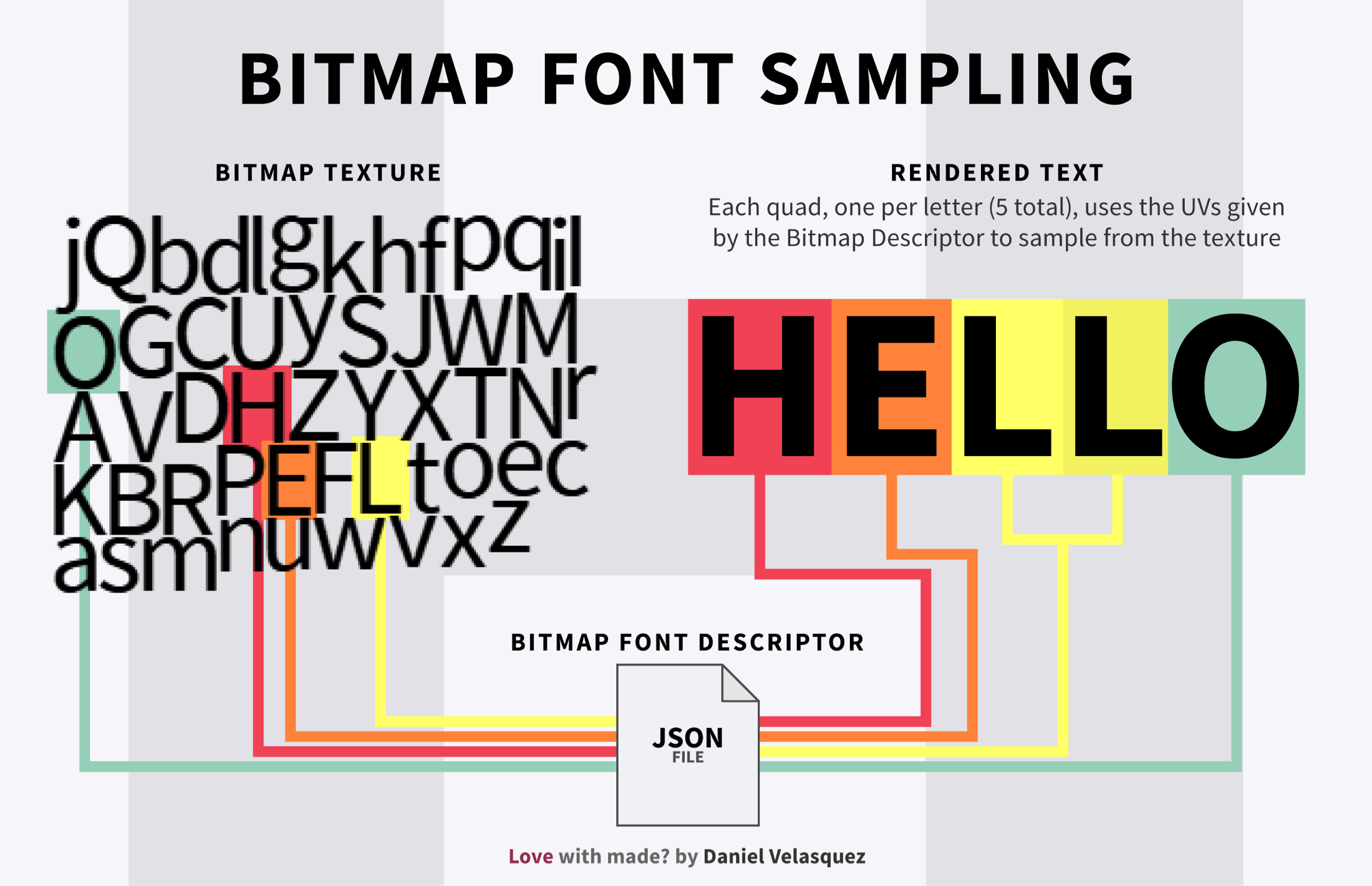
Bitmap fonts solve this issue by rasterizing all unique glyphs into a single texture, called a texture atlas. This means you can assemble any given string at runtime by creating a quad for each glyph and sampling the section of the texture atlas.
This means users only have to download and use a single texture for all of the text. It also means you only need to render as little as one quad per glyph:
A visual of bitmap font sampling
Rendering this whole article would be approximately 117,272 vertices and 58,636 triangles. That's 3.1 times more efficient compared to a font geometry rendering just a single paragraph. That a huge improvement!
Because bitmap fonts rasterize the glyph into a texture, they suffer from the same problem as regular images. Zoom in or scale and you start seeing a pixelated and blurry mess. If you want text at a different size, you should send a secondary bitmap with the glyphs on that specific size. Or you could use a Signed Distance Field (SDF) which we’ll cover in the next section.
How to create bitmap fonts
There are a lot of tools to generate bitmaps. Here are some of the more relevant options out there:
ShoeBox - This is an tool for dealing with sprites, including bitmap fonts.
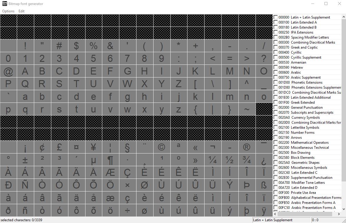
We'll use Anglecode's bmfont for our example because I think it's the easiest one to get started. At the bottom of this section, you can find other tools if you think it lacks the functionality you are looking for.
When you open the app, you'll see a screen full of letters that you can select to use.The nice thing about this is that you are able to grab just the glyphs you need instead of sending Greek symbols.
The app’s sidebar allows you to choose and select groups of glyphs.
The BmFont application
Ready to export? Go to Options → Save bitmap as. And done!
But we’re getting a little ahead of ourselves. Before exporting, there are a few important settings you should check.
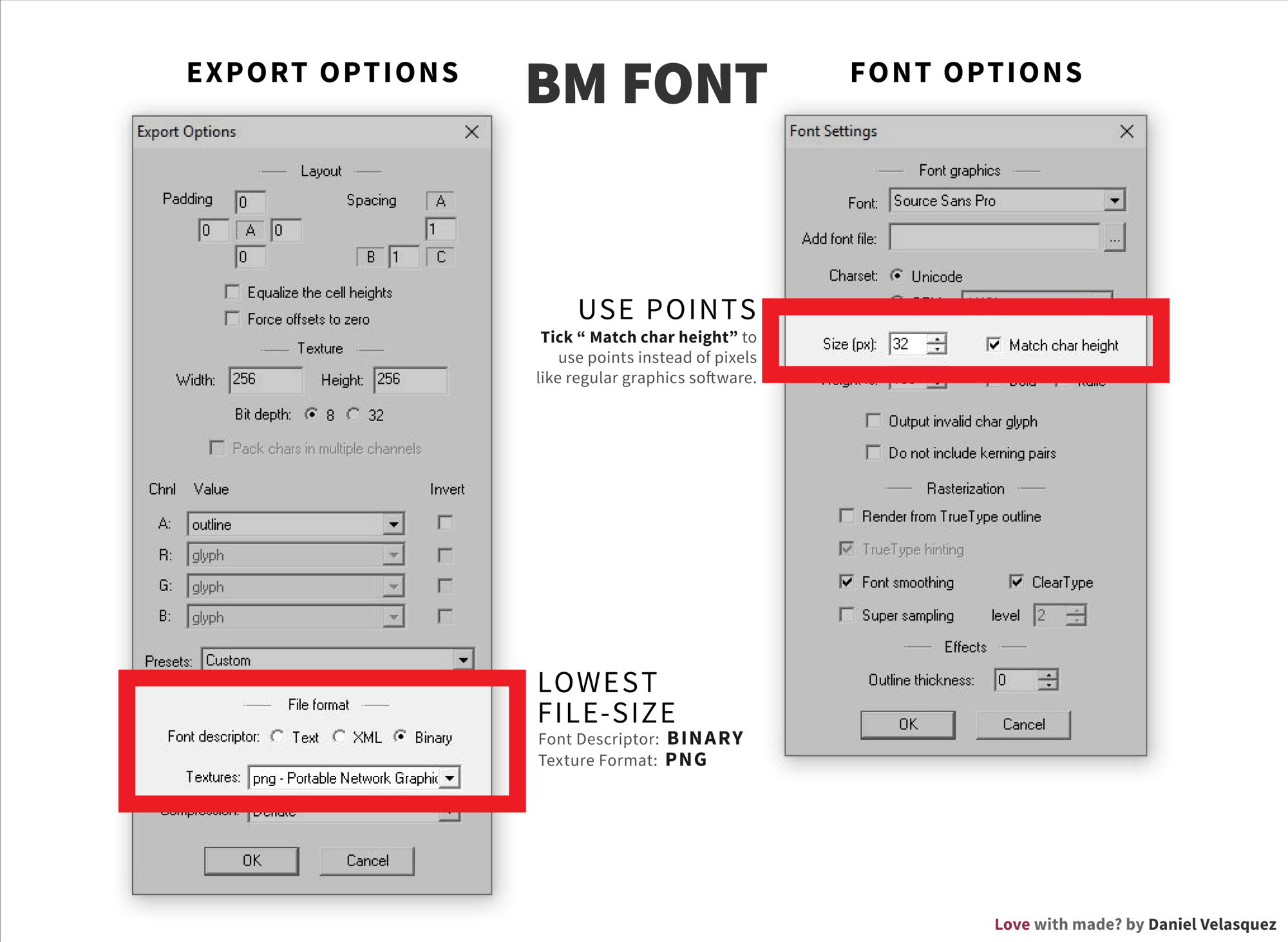
Export and Font Option settings
Font settings: This let you choose the font and size you want to use. The most important item here is "Match char height." By default, the app’s "size" option uses pixels instead of points. You'll see a substantial difference between your graphics editor's font size and the font size that is generated. Select the "Match char height" options if you want your glyphs to make sense.
Export settings: For the export, make sure the texture size is a power of two (e.g. 16x16, 32x32, 64x64, etc.). Then you are able to take advantage of "Linear Mipmap linear" filtering, if needed.
At the bottom of the settings, you'll see the "file format" section. Choosing either option here is fine as long as you can read the file and create the glyphs.
If you are looking for the smallest file size. I ran a ultra non-scientific test where I created a bitmap of all lowecase and uppercase Latin characters and compared each option. For Font Descriptors, the most efficient format is Binary.
Font Descriptor Format
File Size
Binary
3 KB
Raw Text
11 KB
XML
12 KB
Texture Format
File Size
PNG
7 KB
Targa
64 KB
DirectDraw Surface
65 KB
PNG is the smallest file size for Text Texture.
Of course, it's a little more complicated than just file sizes. To get a better idea of which option to use, you should look into parsing time and run-time performance. If you would like to know the pros and cons of each formats, check out this discussion.
How to use bitmap fonts
Creating bitmap font geometry is a bit more involved than just using a texture because we have to construct the string ourselves. Each glyph has its own height and width, and samples a different section of the texture. We have to create a quad for each glyph on our string so we can give them the correct UVs to sample it's glyph.
You can use three-bmfont-text in ThreeJS to create strings using bitmaps, SDFs and MSDFs. It takes care of multi-line text, and batching all glyphs onto a single geometry. Note that it needs to be installed in a project from npm.
var createGeometry = require('three-bmfont-text')
var loadFont = require('load-bmfont')

loadFont('fonts/Arial.fnt', function(err, font) {
  // create a geometry of packed bitmap glyphs,
  // word wrapped to 300px and right-aligned
  var geometry = createGeometry({
    font: font,
    text: "My Text"
  })

  var textureLoader = new THREE.TextureLoader();
  textureLoader.load('fonts/Arial.png', function (texture) {
    // we can use a simple ThreeJS material
    var material = new THREE.MeshBasicMaterial({
      map: texture,
      transparent: true,
      color: 0xaaffff
    })

    // now do something with our mesh!
    var mesh = new THREE.Mesh(geometry, material)
  })
})
Depending whenever your text is drawn as as full black or full white, use the invert option.
Advantages
It’s fast and simple to render.
It’s a 1:1 ratio and resolution independent.
It can render any string, given the glyphs.
It’s good for lots of text that needs to change often.
It’s works extremely well with a limited number of glyphs.
It’s includes support for things like kerning, line height and word-wrapping at run-time.
Disadvantages
It only accepts a limited set of characters and styles.
It requires pre-rasterizing glyphs and extra bin packing for optimal usage.
It’s blurry and pixelated at large scales, and can also be rotated or transformed.
There’s only one quad per rendered glyph.
Interactive Demo: The Shining Credits
Raster bitmap fonts work great for movie credits because we only need a few sizes and styles. The drawback is that the text isn’t great with responsive designs because it’ll look blurry and pixelated at larger sizes.
For the mouse effect, I’m making calculations by mapping the mouse position to the size of the view then calculating the distance from the mouse to the text position. I’m also rotating the text when it hits specific points on the z-axis and y-axis.
Signed distance fields
Much like bitmap fonts, signed distance field (SDF) fonts are also a texture atlas. Unique glyphs are batch into a single "texture atlas" that can create any string at runtime.
But instead of storing the rasterized glyph on the texture the way bitmap fonts do, the glyph's SDF is generated and stored instead which allows for a high resolution shape from a low resolution image.
Like polygonal meshes (font geometries), SDFs represent shapes. Each pixel on an SDF stores the distance to the closest surface. The sign indicates whenever the pixel is inside or outside the shape. If the sign is negative, then the pixel is inside; if it’s positive, then the pixel is outside. This video illustrates the concept nicely.
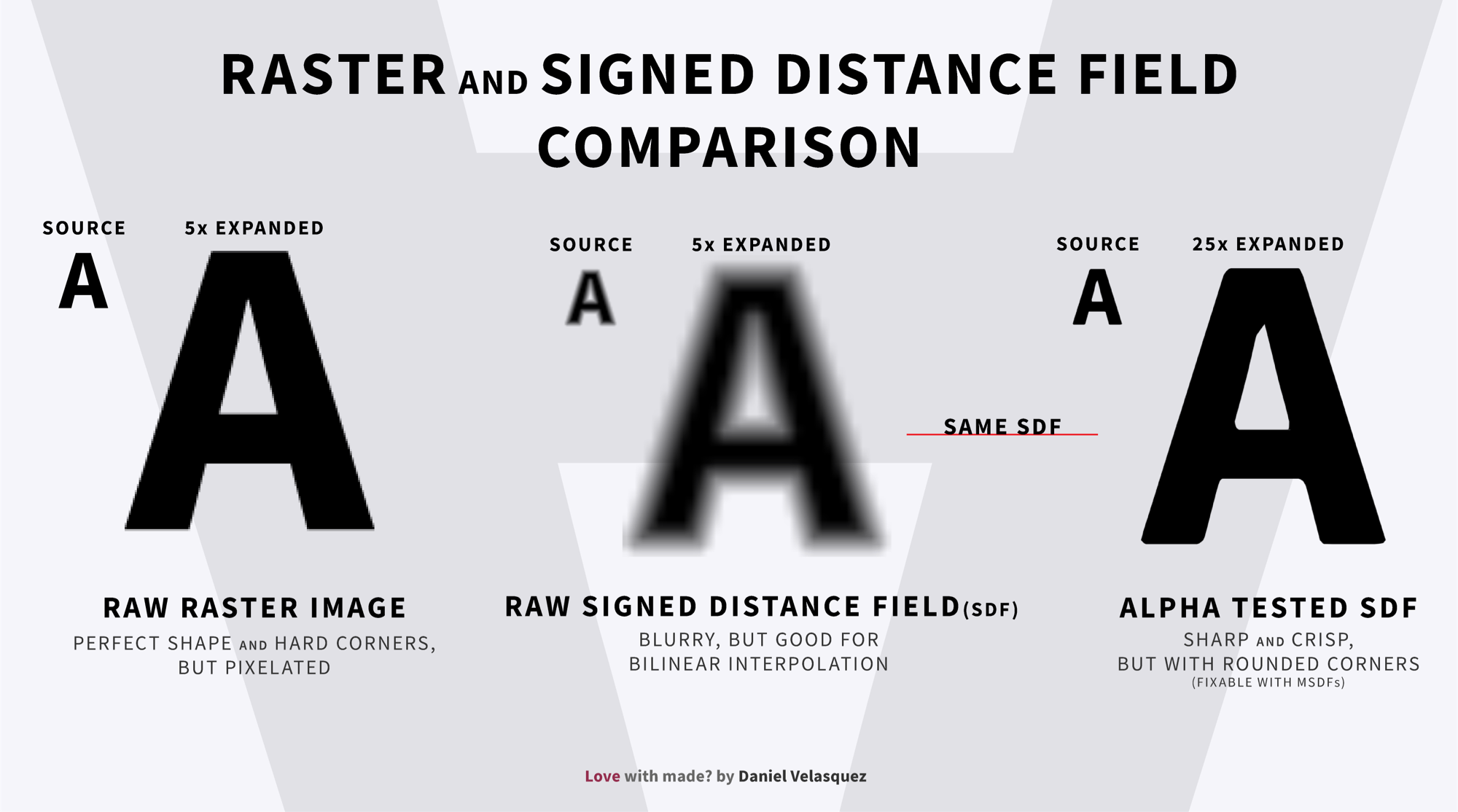
Because an SDF stores distance in each pixel, the raw result looks like a blurry version of the original shape. To output the hard shape you’ll need to alpha test it at 0.5 which is the border of the glyph. Take a look at how the SDF of the letter "A" compares to it's regular raster image:
Raster text beside of a raw and an alpha tested SDF
As I mentioned earlier, the big benefit of SDFs is being able to render high resolution shapes from low resolution SDF. This means you can create a 16pt font SDF and scale the text up to 100pt or more without losing much crispness.
SDFs are good at scaling because you can almost perfectly reconstruct the distance with bilinear interpolation, which is a fancy way of saying we can get values between two points. In this case, bilinear interpolating between two pixels on a regular bitmap font gives us the in-between color, resulting in a linear blur.
On an SDF, bilinear interpolating between two pixels provides the in-between distance to the nearest edge. Since these two pixel distances are similar to begin with, the resulting value doesn't lose much information about the glyph. This also means the bigger the SDF, the more accurate and less information is lost.
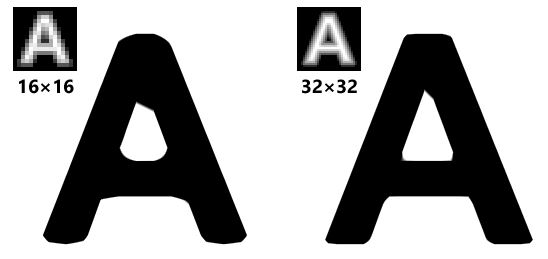
However, this process comes with a caveat. If the rate change between pixels is not linear — like in the case of sharp corners — bilinear interpolation gives out an inaccurate value, resulting in chipped or rounded corners when scaling an SDF much higher than its original size.
SDF rounded corners
Aside from bumping the texture side, the only real solution is to use multi-channel SDFs, which is what we’ll cover in the next section.
If you want to take a deeper dive into the science behind SDFs, check out the Chris Green’s Master’s thesis (PDF) on the topic.
Advantages
They maintain crispness, even when rotated, scaled or transformed.
They are ideal for dynamic text.
They provide good quality to the size ratio. A single texture can be used to render tiny and huge font sizes without losing much quality.
They have a low vertex count of only four vertices per glyph.
Antialiasing is inexpensive as is making borders, drop shadows and all kinds of effects with alpha testing.
They’re smaller than MSDFs (which we’ll see in a bit).
Disadvantages
The can result in rounded or chipped corners when the texture is sampled beyond its resolution. (Again, we’ll see how MSDFs can prevent that.)
They’re ineffective at tiny font sizes.
They can only be used with monochrome glyphs.
Multi-channel signed distance fields
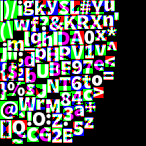
Multi-channel signed distance field (MSDF) fonts is a bit of a mouthful and a fairly recent variation on SDFs that is capable of producing near-perfect sharp corners by using all three color channels. They do look quite mind blowing at first but don't let that put you off because they are easy to use than they appear.
A multi-channel signed distance field file can look a little spooky at first.
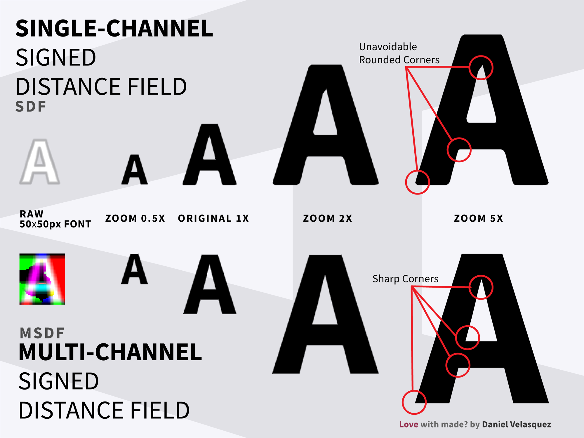
Using all three color channels does result in a heavier image, but that’s what gives MSDFs a far better quality-to-space ratio than regular SDFs. The following image shows the difference between an SDF and an MSDF for a font that has been scaled up to 50px.
The SDF font results in rounded corners, even at 1x zoom, while the MSDF font retains sharp edges, even at 5x zoom.
They support a higher quality and space ratio than SDFs. and are often the better choice.
They maintain sharp corners when scaled.
Disadvantages
They may contain small artifacts but those can be avoided by bumping up the texture size of the glyph.
They requires filtering the median of the three values at runtime which is a bit expensive.
They are only compatible with monochrome glyphs.
How to create MSDF fonts
The quickest way to create an MSDF font is to use the msdf-bmfont-web tool. It has most of the relevant customization options and it gets the job done in seconds, all in the browser. Alternatively, there are a number of Google Fonts that have already been converted into MSDF by the folks at A-Frame.
If you are also looking to generate SDFs or your typeface, it requires some special tweaking thanks to some problematic glyphs. The msdf-bmfont-xml CLI gives you a wide range of options, without making things overly confusing. Let’s take a look at how you would use it.
First, you'll need to install globally it from npm:
Those options are worth digging into a bit. While msdf-bmfont-xml provides a lot of options to fine-tune your font, there are really just a few options you'll probably need to correctly generate an MSDF:
-t <type> or <code>--field-type <msdf or sdf>: msdf-bmfont-xml generates MSDFs glyph atlases by default. If you want to generate an SDF instead, you need to specify it by using -t sdf.
-f <xml or json> or --output-type <xml or json>: msdf-bmfont-xml generates an XML font file that you would have to parse to JSON at runtime. You can avoid this parsing step by exporting JSON straight away.
-s, --font-size <fontSize>: Some artifacts and imperfections might show up if the font size is super small. Bumping up the font size will get rid of them most of the time. This example shows a small imperfection in the letter "M."
-m <w,h> or --texture-size <w,h>: If all your characters don't fit in the same texture, a second texture is created to fit them in. Unless you are trying to take advantage of a multi-page glyph atlas, I recommend increasing the texture size so that it fits over all of the characters on one texture to avoid extra work.
There are other tools that help generate MSDF and SDF fonts:
msdf-bmfont-web: A web tool to create MSDFs (but not SDFs) quickly and easily
msdf-bmfont: A Node tool using Cairo and node-canvas
msdfgen: The original command line tool that all other MSDF tools are based from
Hiero: A tool for generating both bitmaps and SDF fonts
How to use SDF and MSDF fonts
Because SDF and MSDF fonts are also glyph atlases, we can use three-bmfont-text like we did for bitmap fonts. The only difference is that we have to get the glyph our of the distance fields with a fragment shader.
Here’s how that works for SDF fonts. Since our distance field has a value greater than .5 outside our glyph and less than 0.5 inside our glyph, we need to alpha test in a fragment shader on each pixel to make sure we only render pixels with a distance less than 0.5, rendering just the inside of the glyphs.
const fragmentShader = `

  uniform vec3 color;
  uniform sampler2D map;
  varying vec2 vUv;

  void main(){
    vec4 texColor = texture2D(map, vUv);
    // Only render the inside of the glyph.
    float alpha = step(0.5, texColor.a);

    gl_FragColor = vec4(color, alpha);
    if (gl_FragColor.a < 0.0001) discard;
  }
`;

const vertexShader = `
  varying vec2 vUv;
  void main {
    gl_Position = projectionMatrix * modelViewMatrix * position;
    vUv = uv;
  }
`;

let material = new THREE.ShaderMaterial({
  fragmentShader, vertexShader,
  uniforms: {
    map: new THREE.Uniform(glyphs),
    color: new THREE.Uniform(new THREE.Color(0xff0000))
  }
})
Similarly, we can import the font from three-bmfont-text which comes with antialiasing out of the box. Then we can use it directly on a RawShaderMaterial:
let SDFShader = require('three-bmfont-text/shaders/sdf');
let material = new THREE.RawShaderMaterial(MSDFShader({
  map: texture,
  transparent: true,
  color: 0x000000
}));
MSDF fonts are a little different. They recreate sharp corners by the intersections of two color channels. Two or more color channels have to agree on it. Before doing any alpha texting, we need to get the median of the three color channels to see where they agree:
const fragmentShader = `

  uniform vec3 color;
  uniform sampler2D map;
  varying vec2 vUv;

  float median(float r, float g, float b) {
    return max(min(r, g), min(max(r, g), b));
  }

  void main(){
    vec4 texColor = texture2D(map, vUv);
    // Only render the inside of the glyph.
    float sigDist = median(texColor.r, texColor.g, texColor.b) - 0.5;
    float alpha = step(0.5, sigDist);
    gl_FragColor = vec4(color, alpha);
    if (gl_FragColor.a < 0.0001) discard;
  }
`;
const vertexShader = `
  varying vec2 vUv;
  void main {
    gl_Position = projectionMatrix * modelViewMatrix * position;
    vUv = uv;
  }
`;

let material = new THREE.ShaderMaterial({
  fragmentShader, vertexShader,
  uniforms: {
    map: new THREE.Uniform(glyphs),
    color: new THREE.Uniform(new THREE.Color(0xff0000))
  }
})
Again, we can also import from three-bmfont-text using its MSDFShader which also comes with antialiasing out of the box. Then we can use it directly on a RawShaderMaterial:
let MSDFShader = require('three-bmfont-text/shaders/msdf');
let material = new THREE.RawShaderMaterial(MSDFShader({
  map: texture,
  transparent: true,
  color: 0x000000
}));
Demo: Star Wars intro
The Star Wars drawl intro is a good example where MSDF and SDF fonts work well because the effect needs the text to come in multiple sizes. We can use a single MSDF and the text always looks sharp! Although, sadly, three-bm-font doesn’t support justified text yet. Applying left justification would make for a more balanced presentation.
For the light saber effect, I’m raycasting an invisible plane the size of the plane, drawing onto a canvas that’s the same size, and sampling that canvas by mapping the scene position to the texture coordinates.
Bonus tip: Generating 3D text with height maps
Aside from font geometries, all the techniques we’ve covered generate strings or glyphs on a single quad. If you want to build 3D geometries out of a flat texture, your best choice is to use a height map.
A height map is a technique where the geometry height is bumped up using a texture. This is normally used to generate mountains in games, but it turns out to be useful rendering text as well.
The only caveat is that you’ll need a lot of faces for the text to look smooth.
Further reading
Different situations call for different techniques. Nothing we saw here is a silver bullet and they all have their advantages and disadvantages.
There are a lot of tools and libraries out there to help make the most of WebGL text, most of which actually originate from outside WebGL. If you want to keep learning, I highly recommend you go beyond WebGL and check out some of these links:
The title. When you're building a website from JavaScript-powered components anyway, that is a moment to talk about how to do styling, because it opens some doors to JavaScript-powered styles that you probably wouldn't otherwise choose.
The personal experience and pragmatism. Drawing on five years of consulting, he's seeing that component re-use and style understandability is suffering, not improving, partly due to every team having different approaches. He says "it's a little bit of everybody's fault" and sees the perspective of others who like parts of what JavaScript-powered styles can bring, like less dependence on specificity.
The fresh thinking. Since JavaScript-powered websites are all built by nested components anyway, why not use that architecture for styling? The thesis of the article is really about building UI components that, on purpose, don't involve application logic but exist just for styling, and using a combination of clever CSS and JavaScript power to the kind of styling you need.
How does Google decide what goes into the local pack? It doesn't have to be a black box — there's logic behind the order. In this week's Whiteboard Friday, renowned local SEO expert Mary Bowling lays out the three factors that drive Google's local algorithm and local rankings in a simple and concise way anyone can understand.
Click on the whiteboard image above to open a high resolution version in a new tab!
Video Transcription
Hi, Moz fans. This is Mary Bowling from Ignitor Digital, and today I want to talk to you about the local algorithm. I'd like to make this as simple as possible for people to understand, because I think it's a very confusing thing for a lot of SEOs who don't do this every day.
The local algorithm has always been based on relevance, prominence, and proximity.
1. Relevance
For relevance, what the algorithm is asking is, "Does this business do or sell or have the attributes that the searcher is looking for?" That's pretty simple. So that gives us all these businesses over here that might be relevant. For prominence, the algorithm is asking, "Which businesses are the most popular and the most well regarded in their local market area?"
2. Proximity
For proximity, the question really is, "Is the business close enough to the searcher to be considered to be a good answer for this query?" This is what trips people up. This is what really defines the local algorithm — proximity. So I'm going to try to explain that in very simple terms here today.
Let's say we have a searcher in a particular location, and she's really hungry today and she wants some egg rolls. So her query is egg rolls. If she were to ask for egg rolls near me, these businesses are the ones that the algorithm would favor.
3. Prominence
They are the closest to her, and Google would rank them most likely by their prominence. If she were to ask for something in a particular place, let's say this is a downtown area and she asked for egg rolls downtown because she didn't want to be away from work too long, then the algorithm is actually going to favor the businesses that sell egg rolls in the downtown area even though that's further away from where the searcher is.
If she were to ask for egg rolls open now, there might be a business here and a business here and a business here that are open now, and they would be the ones that the algorithm would consider. So relevance is kicking in on the query. If she were to ask for the cheapest egg rolls, that might be here and here.
If she were to ask for the best egg rolls, that might be very, very far away, or it could be a combination of all kinds of locations. So you really need to think of proximity as a fluid thing. It's like a rubber band, and depending on...
the query,
the searcher's location,
the relevance to the query,
and the prominence of the business
....is what Google is going to show in that local pack.
I hope that makes it much clearer to those of you who haven't understood the Local Algorithm. If you have some comments or suggestions, please make them below and thanks for listening.
Sign up for The Moz Top 10, a semimonthly mailer updating you on the top ten hottest pieces of SEO news, tips, and rad links uncovered by the Moz team. Think of it as your exclusive digest of stuff you don't have time to hunt down but want to read!
from The Moz Blog https://ift.tt/3698R8Y
via IFTTT
In this week's roundup: DuckDuckGo gets smarter encryption, a fight over the sale of dot org domains, and a new browser engine is in the works.
Let's get into the news!
DuckDuckGo upgrades and open-sources its encryption
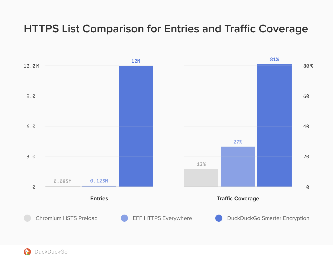
DuckDuckGo has open-sourced its “Smarter Encryption” technology that enables upgrading from HTTP to HTTPS, and Pinterest (a popular social network) is already using it for outbound traffic — when people navigate from Pinterest to other websites — with great results: Their outbound HTTPS traffic increased from 60% to 80%.
DuckDuckGo uses its crawler to automatically generate and maintain a huge list of websites that support HTTPS, approximately 12 million entries. For comparison, Chromium’s HSTS Preload List contains only about 85 thousand entries.
A coalition of organizations consisting of EFF, Wikimedia, and many others, are urging the Internet Society to stop the sale of the nonprofit organization that operates the .org domain to an investment firm.
Non-governmental organizations (NGOs) all over the world rely on the .org top-level domain. [...] We cannot afford to put them into the hands of a private equity firm that has not earned the trust of the NGO community.
In a separate blog post, Mark Surman (CEO of Mozilla Foundation) urges the Internet Society to “step back and provide public answers to questions of interest to the public and the millions of organizations that have made dot org their home online for the last 15 years.”
Ekioh (a company from Cambridge, U.K.) is developing an entirely new browser engine for their Flow browser, which also includes Mozilla’s SpiderMonkey as its JavaScript engine. The browser can already run web apps such as Gmail (mostly), and the company plans to release it on desktop soon.
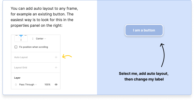
Here’s a fresh update to my favorite design tool that is thoroughly exciting: Auto layout! That means we can make frames that resize based on the size of the content within it. That's particularly useful for buttons in a design system where you want to drop a button on the page and then keep its left and right padding equal.
However! The other exciting part of this update is that content can now be nudged down based on the content above it, too — just like on a webpage. If you’re interested in trying out this feature then I’d recommend just booting up Figma where you can immediately hop over to a playground that explains how this game-changing new feature works with a handy step-by-step tutorial.