Monday 31 August 2020

Ground Rules for Web Animations

Animations can make a site stand out. Or, they can just as easily kill the experience. When working with web animations, there are a few things that could go wrong like adding animations that serve no purpose, setting durations that are  too long or too quick, or not using right type of animation in the first place. Even if all of these things are done correctly, an animation  style may not feel good, especially if they are not in sync with other animations or in line with the overall personality of the site.

Another important thing to note is that not all digital experiences should share the exact same animations. A marketing website might need different animations than a product website or a mobile app. Although the same basic principles of motion apply for all, there’re some nuances based on content type and screen size. 

For example, say you want to make a boring form more exciting to fill out. You add some delightful animations in each step moving forward, but is that a good idea for a form you know a user needs to visit and fill often? Watching the same animations over and over could get annoying in that case.

Clearly, there are conditions and considerations that will serve animations well. In this article, we’ll discuss about adding animations into product websites. Let’s dig into that a bit and lay down some ground rules for working with them. Not so much a manifesto, but more like a baseline we can reference and sort of rally around.

First off, what’s a good situation for an animation?

When used well, an animation is almost like content — it provides context and has meaning that helps inform the user that something has happened and even what to expect next. Here are a few good situations where animation can do exactly that.

Transitioning UI blocks

This might be the most common use case for animations. When a UI block is moved from its original position, or is added or removed from the DOM, it’s a good idea to let users see that happen.

It’s easy to see the change with animation
…but it’s hard to figure out what changed without it.

Loading content

A loading animation is something we’ve all seen and encountered at some point in time! If not, a quick trip to CodePen shows you just how popular loading animations are. They’re ideal as placehholders for content, where users are not only given a hint at what to expect when the content loads, but confidence that something is being loaded at all.

Besides making the site feel fast, it also avoids janky content reflow, which can be super disorienting as elements render at different times.

Loading placeholders are best, of course, when you know the height of content blocks ahead of time.

Hinting

This is generally a one-time animation where the point is to give users a hint for where to look or what to do next. Some UIs are complex by nature. A little glow or ripple can help guide users through the process of completing a task or calling out a particular feature.

It doesn’t have to be all up in the user’s face. Instead, a little visual hint that informs without taking over the entire experience will do just fine.

Micro-interactions

Generally used on individual elements, micro-interactions give users instant visual feedback after performing an action. They instill confidence that a performed action has taken place and that something happened as a result — all while adding a little delight at the same time. 

These do not have to be fancy, like Twitter’s heart animation, but they totally should indicate some kind of feedback or response to the user’s action. Just check out how subtle — yet delightful — that is when a user does something as small as adding an item from one line to another:

It’s small, but that little bounce provides instant feedback to user’s action.
Um, ok, so what just happened? It’s hard to tell when there’s no response.

OK, so when should we avoid animations?

We’ve just seen handful of situations where animations make a lot of sense. Let’s spell out the opposite conditions where animations generally contribute very little or nothing to the user experience. In other words, they become noticeable for bad reasons and are probably best left out of the equation.

Route transitions

Yes, we usually don’t see these sorts of animations on product websites but it’s worth mentioning to understand why they don’t make sense. These transitions work better on mobile apps because of the small screen area. On desktop screens there’s much larger area to animate. To animate the whole content smoothly, you’ll require to set more duration than on mobile screen. This will simply annoy the users making them wait to see the content as they are already used to see instant content visibility on the web. And in the worst cases, route transitions can not only be distracting, but a severe accessibility concern when it comes to motion sensitivity.

On initial load of page content

You may do it in marketing websites when you want to educate users or move their focus  to a particular block. For product websites, it will be again annoying to see the same animation each time users navigates between pages.

When it’s unexpected

It’s a good idea to consider a user’s state of mind while they use a particular feature. Is visual feedback expected where the animation is being used? If not, it can confuse more than it helps.

For example, checkout this calculator app. There’s nothing new in the UI pattern when numbers are entered and calculations run. Users already know where to focus. There’s no point in making users wait before they can see results or surprise them with something that provides no additional meaning or benefit.

A snappy change without an animation is perfect in this case. The button hover and active states are more than enough.

When you’re unsure how well it performs

It’s worth bearing in mind that not all devices, internet connections, and browsers are equal in the eyes of animation. Eric Bailey sums this up nicely in his deep-dive on the prefers-reduced-motion media query:

We also need to acknowledge that not every device that can access the web can also render animation, or render animation smoothly. When animation is used on a low-power or low quality device that “technically” supports it, the overall user experience suffers. Some people even deliberately seek this experience out as a feature.

The heading above that quote is a sage reminder: Animation is progressive enhancement. If we plan on using an animation — especially ones that threaten to dominate the experience — we’ve gotta at least consider a way to opt out of it and whether the experience still works without the animation. prefers-reduced-motion is the best place to start.

When the purpose isn’t clear

Lastly, I’d say don’t add animations wherever you’re not absolutely sure about the purpose it serves. Superfluous animation can be distracting and hurt more than it helps. This tweet from 2018 is still very true:

How long should an animation last?

The length of an animation is just as important as the type of animation being used. Wait too long, and the animation can appear to drag on. Go too fast, and the nice details of the animation can get lost (in best cases) or completely disorient the user (in worse cases).

So, how long should we set the duration of an animation? I’ll give you a classic answer: It depends.

The bigger the distance, generally the longer the duration

Animations (like the ones we looked at earlier) can be limited to a short duration. But if we’re taking about a massive transition where an object is traveling a long distance, we may feel it needs something a little longer to make sure things don’t move too fast. But avoid using duration longer than 400ms.

Check out this example. Notice how the content takes a little longer to transition because it has a greater distance to travel. But also notice that the it doesn’t have to last too long because the object that leaves fades into the object that enters, and the object that enters comes at a shorter distance rather than making it travel across the entire screen.

Goes to show that even big animations can be optimized in ways that make it feel shorter without getting lost in the mix.

Use a shorter duration when the user triggers the action

This is important and a common mistake. If the user already expects something to happen — and the focus is already clearly where it should be — then there’s no point in making the user wait seconds to complete what they already expect.

Instant reaction to what user is expecting
Making user wait…

On the other hand, if the change is automatically triggered by the system, a longer duration makes sense, as it will allow the user to catch up to speed with the change taking place. Think of tooltips or modals that are not triggered by the user do not require a their immediate attention.

Less distracting with subtle entrance
Too distracting with short animation duration

Enter and exit animations can have different durations 

Sometimes it makes sense to keep the animation for an object that is entering view a little faster than an animation for an object that is exiting, especially when the user is expecting to see that content change.

Take the previous example of dropdown menu. When a user clicks on it, they’d want to see the menu items right away — at least, I wouldn’t have to wait to see menu items. When the user clicks, let the submenu enter quickly and then smoothly leave when it’s dismissed so that it avoids distracting the user on the way out, when it’s no longer needed.

But this does not apply for large UI blocks. On larger blocks, for most cases, a duration longer than 200ms is required. In such cases, reversing the durations and letting a block exit faster than it entered ensures it won’t block the existing page view.

Doesn’t block the page view on exit
Blocks the page view on exit

Animation duration across the product should be in sync with each other and with the brand’s personality

I’ve came across many products where one feature has really nice animations and another is simply too quick, slow or lacks any animation at all. 

Even worse is when animations within the same feature aren’t in sync.

Notice how the sidebar animates when it enters view, but also how it is totally out of sync with the animation that changes the width of the main content. It feels unnatural when they aren’t in harmony.

That’s where having a style guide with thoughtful animation guidelines that can be used consistently across the experience can be a huge help.

How simple is too simple? Or how complex is too complex?

The complexity of an animation ought to be based on how frequently users are expected to encounter it, among the other things we’ve looked at so far. The more often users are expected to see it, the simpler the animation should be. This should override the previous rules of duration where necessary.

For example, the below animation would work in a main menu, but using the same staggering effect in drop-down menus across the product is just too much to take in. There is indeed a point of diminishing returns in animations, just as there is in economics.

But, hey, if this sort of complex animation is used sparingly in intentional instances, then it can be incredibly delightful!

But yes, you can be creative with the animations where there’s a decision pending at the user or while processing data. This makes waiting times more engaging, like when network breaks or a wrong passcode is submitted.

Which easing function should you use?

Ease? Ease in? Ease out? Ease in and out? Some cubic bezier curve?

The right easing adheres to the laws of physics. Disney’s principles of animation is the gold standard when it comes to that.

For enter animations, use bounce effect if you want immediate attention of the user, otherwise use a smooth acceleration (and deceleration, for that matter) that is incremental rather than linear. Bouncing should reflect gravity. Brandon Gregory’s post on natural-feeling animations provides all kinds of examples that fall in line with the laws of physics.

You can refer to this Gist by Adam Argyle for defining easings in CSS.

Lights, camera, and… intentional action!

Attention to detail is what separates outstanding animations from ordinary (or even straight up broken) ones. If you’re in the process of learning web animations or currently working on a project that calls for them, I sure hope this post can serve as a set of useful ground rules to help you get the most out of your work.

Apart from the rules, I’d also mention that good animations take time and practice. Sure, a lot of the stuff I covered here is somewhat anecdotal and based on personal experience, but that’s the result of developing an eye for animations after years of working with them. Learn, try, improve, and keep learning. Otherwise, you may end up with a collection of animations that deliver poor user experiences and even hurt the accessibility of your site.


The post Ground Rules for Web Animations appeared first on CSS-Tricks.

You can support CSS-Tricks by being an MVP Supporter.


from CSS-Tricks https://ift.tt/2GaVBch
via IFTTT

Title Tags SEO: When to Include Your Brand and/or Boilerplate

Posted by Cyrus-Shepard

If your websites are like most, they include a fair amount of extra "stuff" in the title tags: things like your brand name or repeating boilerplate text that appears across multiple pages.

Should you include these elements in your titles automatically?

To be fair, most sites do.

Alternatively, could it help your SEO to actually include less information in your titles? (Or at least in specific circumstances?)

We know from a handful of studies that titles of a certain length tend to perform better. A now-famous study from the engineers at Etsy showed how shorter titles performed better than longer ones. SEOs speculate that this could be because shorter titles can have more focused relevancy (by focusing on core keywords), might earn higher click-through rates, or some other reason we can't imagine.

When choosing which part of a title to shorten, brand names and boilerplate text are obvious choices. But how do you determine if this is something you should consider for your own SEO?

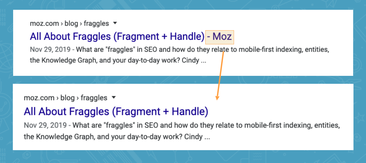
Here's an example of a brand's site name at the end of every title:

We've all seen sites like this. Heck, most of us do this on our own sites. The question is, does having our brand/site name at the end of every title actually help, or hurt?

But first, we also have to consider other types of boilerplate.

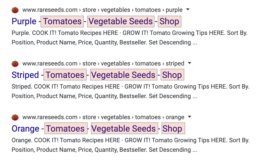
What is boilerplate? Boilerplate simply means standardized, non-unique pieces of text that are used over and over again. This often includes things like categories, product categories, author tags, and taglines.

In this example below, the boilerplate text on every title includes "Tomatoes - Vegetable Seeds - Shop."

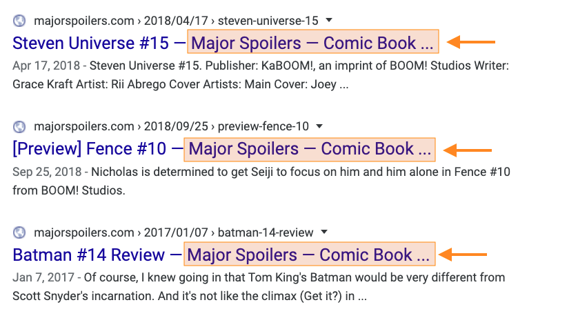
Sometimes boilerplate material can become quite long. The comic book review site Major Spoilers (awesome name!) often includes the same 65-character boilerplate on many pages:

"Major Spoilers – Comic Book Reviews, News, Previews, and Podcasts"

Of course, at this length, it's so long that Google truncates every single title:

The problems that boilerplate can cause your SEO are threefold:

  1. Relevancy: Unnecessary words can make your title less relevant, both to search engines and users. For search engines, this could mean lower rankings. For users, this could result in fewer clicks.
  2. Uniqueness: Titles that share the same repeating text, and only vary from one another by a word or two, aren't very unique. While this isn't necessarily a problem, it goes against most SEO best practices, where uniqueness is key.
  3. Length: Boilerplate means you have less room to display other words in your title, and Google will often cut these off if they go beyond a certain length.

Experiment #1: Remove category from title

We decided to run a couple of boilerplate experiments here at Moz, to see if we could increase our rankings and traffic by removing some of the repeating parts of our titles.

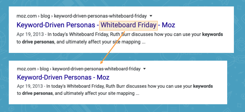
We started with our Whiteboard Friday blog posts. Every time Moz publishes a new Whiteboard Friday, we traditionally include "Whiteboard Friday" in the title.

What would happen if we removed this from the titles?

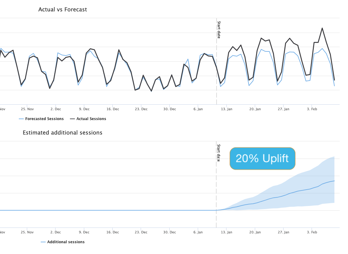
Using an A/B split test methodology — where we rolled the test out on 50% of the titles and used the other 50% as a control — we saw an amazing 20% uplift from this experiment.

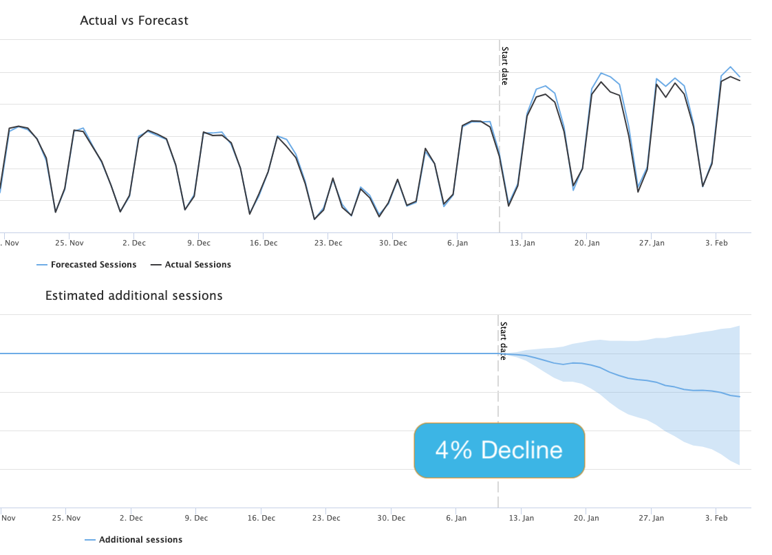
This chart represents the cumulative impact of the test on organic traffic. The central blue line is the best estimate of how the variant pages, with the change applied, performed compared to how we would have expected without any changes applied. The blue shaded region represents our 95% confidence interval: there is a 95% probability that the actual outcome is somewhere in this region. If this region is wholly above or below the horizontal axis, that represents a statistically significant test.

Honestly, the results surprised us. Whiteboard Friday is a popular brand (so we thought) but removing this boilerplate from our titles produced a significant uplift in traffic to those pages.

At this point, we got cocky…

Experiment #2: Remove brand from title

If removing the category name from Whiteboard Friday posts produced such a significant uplift, what if we removed our brand name from all titles?

For this A/B experiment, we did exactly that—removing the word "Moz" from 50% of our titles and measuring the results.

Crazy, right? If it worked by removing "Whiteboard Friday" would we see the same uplift by removing "Moz?"

Sadly, Google had other plans:

While this A/B test never reached full statistical significance, we actually saw a 4% decline in traffic by removing our brand from our title tags.

Boo!

So why did this test not produce the same gains? To be honest, I've removed the brand name from other site's titles and seen as much as a 20% uplift.

It turns out that whether or not removing brand/boilerplate will be beneficial to your SEO depends on a few key factors, which you can gauge in advance.

How to know if removing boilerplate may succeed

Over 10 years of experience and literally millions of title tags, I've found that there are basically four factors that influence whether or not removing boilerplate from your titles might be beneficial:

  1. Brand Strength: Popular brand names in titles almost always perform better than unknown brands, even when people aren't searching for your brand specifically. Amazon's brand recognition, for example, likely gives a significant boost to including "Amazon" in every title, even when people aren't specifically searching Amazon. Less recognizable brands, however, don't always get the same boost, and can actually lead to fewer visits based on relevancy, length, and clickability (described next.)
  2. Relevancy: Are your boilerplate/brand keywords relevant to what your users search for? For example, if you're site is about television repair, then boilerplate titles that say "Brad's TV Repair" are going to be much more relevant than boilerplate that simply say "Brads." (We'll explore a way to determine your boilerplate's brand strength and relevancy in the next section.)
  3. Length: In general, long boilerplate has the potential to do more harm than short boilerplate/brand words. Long boilerplate can dilute the relevance of your titles. So if you include "Buy Brad's TVs, Television Repair, High Definition Servicing, Audio and Visual Equipment for Sale in Houston Texas and Surrounding Areas" - you may want to rethink your boilerplate.
  4. Clickability: Sometimes, boilerplate can make your titles more clickable, even if they aren't terribly relevant. Words like "Sale", "Solved", "Free", "2020", "New", and many others can lead to an increase in click-through rates (CTR.) Sometimes you can't tell until you test, but in many cases even adding clickable elements to your boilerplate can lead to significant gains.

Simple technique for determining your brand strength and boilerplate relevancy

This simple technique will also show why removing "Whiteboard Friday" led to an increase in traffic while removing "Moz" from titles did not.

Here's what you want to do: for each piece of boilerplate, determine the number of URLs on your site that rank/receive traffic for those keywords.

For this, we'll use Google Search Console.

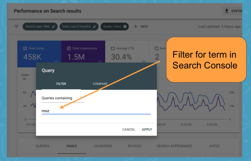
Simply enter your boilerplate/brand as a query filter (you may need to break it into chunks for longer boilerplate) and see how many URLs receive traffic for queries that include that keyword.

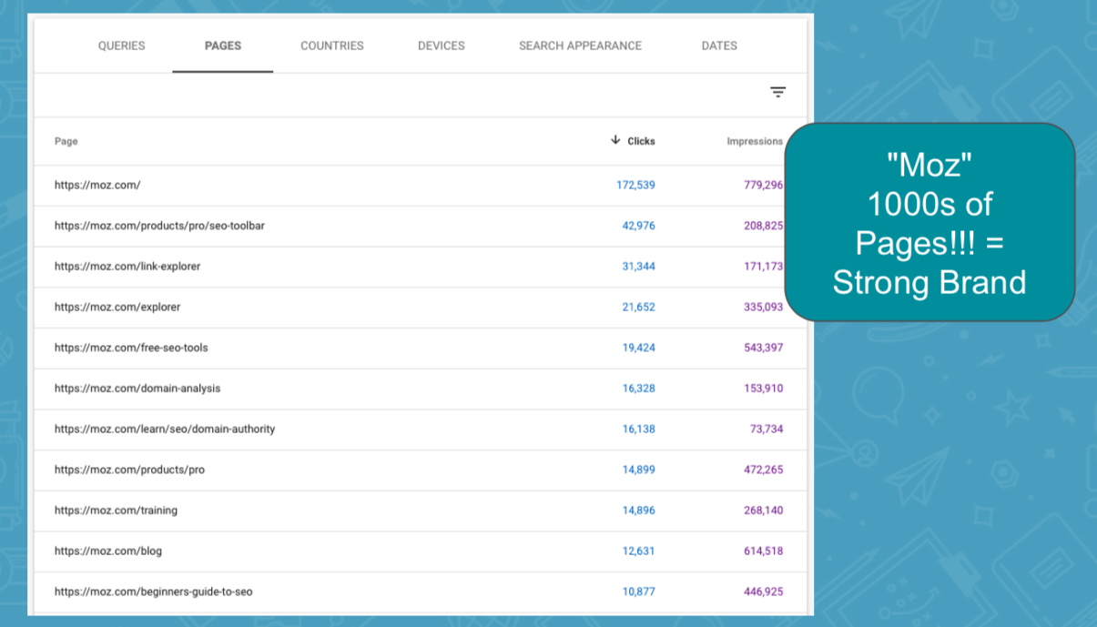
When we filter for keywords that contain our "moz" brand name, we find thousands of ranking URLs.

People are searching for things like:

  • Moz DA Checker
  • Moz Pro
  • Moz SEO
  • Moz Blog
  • Etc., etc.

As our brand name is part of so many queries and leads to visits across thousands of pages, this tells us that "Moz" is a very strong brand, and we'd likely be smart to include it as part of our title tags.

"Moz" is also very short at only 3 characters, which doesn't hurt either.

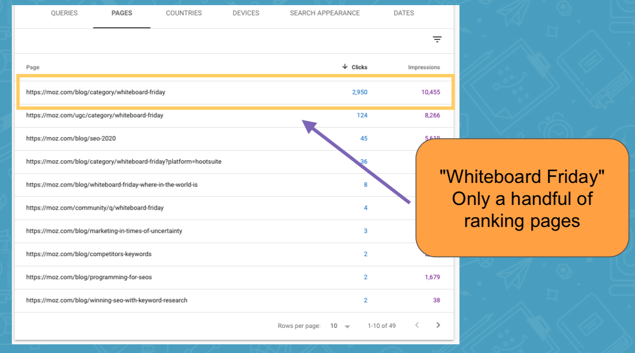
So what happens when we try this same technique with "Whiteboard Friday" — the boilerplate that led to a 20% uplift when we removed it? We see a very different result:

In this case, almost all the traffic for "Whiteboard Friday" search terms goes to only one or two pages.

For most Whiteboard Friday posts, the term is simply irrelevant. It's not what people are searching for, and the brand isn't strong enough to produce additional uplift.

Also, at 17 characters long, this boilerplate added significant length to each of our titles, in addition to possibly diluting the relevancy for what the posts were ranking for.

Final thoughts + bonus free title tag webinar

These tips can't tell you definitively whether you should or shouldn't include boilerplate or brand in your title tags, but they should give you a pretty good idea of when you should test things out.

Remember: Always test and evaluate before making any SEO change permanent. At least know the impact of the change you are making.

Also, please don't be under the impression that you should always remove boilerplate from your titles. In some instances, actually adding boilerplate can produce an uplift, particularly when the boilerplate is:

  1. Recognizable: For example a strong brand
  2. Relevant: The right keywords
  3. Clickable: Encourages a high CTR
  4. Succinct: Not overly long


If you found value in the tips, and want to learn even more ways to optimize your title tags, we've made available a free webinar for you: SEO Master Class: Advanced Title Tag Optimization (For Any Site).

If you've got 40 minutes, it's definitely worth a watch.

Watch Free Webinar

Best of luck with your SEO!


Sign up for The Moz Top 10, a semimonthly mailer updating you on the top ten hottest pieces of SEO news, tips, and rad links uncovered by the Moz team. Think of it as your exclusive digest of stuff you don't have time to hunt down but want to read!


from The Moz Blog https://ift.tt/2QDVQyz
via IFTTT

Friday 28 August 2020

Number Scrubbing

If you use <input type="number">, some browsers give you an input that has UI for incrementing the number, like up/down arrows (often called “spinners”).

That’s a bit helpful sometimes. But people have certainly explored fancier ways of updating that number. “Scrubbing” is one of those ways. I always think of Photoshop here, which has supported this interaction for a long time:

I saw a demo from Dominik Jančík the other day where they do this within a block of code. See how (if you’re on a device with a mouse) you can hover over the numbers and “scrub” from left to right to increase or decrease the numbers:

Dominik inquired about putting it on CodePen itself. I think that would be cool too, but I’m also a little leery of changes to the core editor, as I’ve been snakebitten by it before. It’s the perfect sort of thing for a CodeMirror and/or Monaco and/or Ace plugin, though, if anyone is so inclined.

It must already exist somehow for Ace because the Khan Academy editor supports it in their editor.

I poked around looking for other examples, and came across a good one from Fabrice Weinberg with lots of options:

I thought I had a memory of Lea Verou’s Dabblet doing this, but I think I remembered wrong. It does do some cool popups though:

It also supports + and + for incrementing numbers. CodePen does that! We support Emmet, which powers that feature.

Key Binding Increment
Ctrl+ Number + 1
Ctrl+ Number – 1
Ctr+Alt+ Number + 10
Ctrl+Alt+ Number – 10
Alt+ Number + 0.1
Alt+ Number – 0.1

Y’all ever run across a number scrubber UX that you really like?


The post Number Scrubbing appeared first on CSS-Tricks.

You can support CSS-Tricks by being an MVP Supporter.


from CSS-Tricks https://ift.tt/3gDgCsE
via IFTTT

a11y is web accessibility

Eric Bailey eviscerates the notion that the term “a11y” isn’t accessible. It’s a hot take that I’ve had myself, embarrassingly enough.

I never see people asking why WWI is written out the way it is, either. Won’t people confuse that with the first Wonder Woman movie? Or the first season of Westworld? Or some new Weight Watchers product? I also never see people questioning technical numeronyms like P2P, S3, or W3C?

If you are seeing the term for the first time and are confused, it’s extremely easy to search for and figure out. There are heaping piles of examples of people using it for very legitimate sites, products, conferences, and more. It’s no more of a spell-checking foul as any other industry jargon and easy enough to ignore.

Plus, you can always introduce it with semantic HTML:

Like any other abbreviation, I observe the Web Content Accessibility Guideline’s (WCAG) Success Criterion 3.1.4. Like any other acronym or industry jargon, I spell out the term in full the first time it appears in my writing, then follow it up with the acronym it represents:

Accessibility (<abbr>a11y</abbr>)

It reminds me of the term serverless. The obligatory hot take on it is that servers are still in use, but the quicker you get over it, the quicker you can get to realizing it’s a powerful industry-changing idea.


The post a11y is web accessibility appeared first on CSS-Tricks.

You can support CSS-Tricks by being an MVP Supporter.


from CSS-Tricks https://ift.tt/34JoS84
via IFTTT

Here’s How I Solved a Weird Bug Using Tried and True Debugging Strategies

Remember the last time you dealt with a UI-related bug that left you scratching your head for hours? Maybe the issue was happening at random, or occurring under specific circumstances (device, OS, browser, user action), or was just hidden in one of the many front-end technologies that are part of the project?

I was recently reminded of how convoluted UI bugs can be. I recently fixed an interesting bug that was affecting some SVGs in Safari browsers with no obvious pattern or reason. I had searched for any similar issues to get some clue about what was going on, but I found no useful results. Despite the obstacles, I managed to fix it.

I analyzed the problem by using some useful debugging strategies that I’ll also cover in the article. After I submitted the fix, I was reminded of the advice Chris has tweeted out a while back.

…and here we are.

Here’s the problem

I found the following bug on a project I’ve been working on. This was on a live site.

I reproduced this issue with any paint event, for example, resizing the screen.

I created a CodePen example to demonstrate the issue so you can check it out for yourself. If we open the example in Safari, the buttons might look as expected on load. But if we click on the first two larger buttons, the issue rears its ugly head. 

Whenever a browser paint event happens, the SVG in the larger buttons render incorrectly. It simply gets cut off. It might happen randomly on load. It might even happen when the screen is resized. Whatever the situation, it happens!

Ugh, why is the SVG icon getting cut off?!

Here’s how I approached the problem.

First off, let’s consider the environment

It’s always a good idea to go over the details of the project to understand the environment and conditions under which the bug is present.

  • This particular project is using React (but is not required for following this article).
  • The SVGs are imported as React components and are inlined in HTML by webpack.
  • The SVGs have been exported from a design tool and have no syntax errors.
  • The SVGs have some CSS applied to them from a stylesheet.
  • The affected SVGs are positioned inside a <button> HTML element.
  • The issue occurs only in Safari (and was noticed on version 13).

Down the rabbit hole

Let’s take a look at the issue and see if we can make some assumptions about what is going on. Bugs like this one get convoluted, and we won’t immediately know what is going on. We don’t have to be 100% correct in our first try because we’ll go step-by-step and form hypotheses that we can test to narrow down the possible causes. 

Forming a hypothesis

At first, this looks like a CSS issue. Some styles might be applied on a hover event that breaks the layout or the overflow property of the SVG graphic. It also looks like the issue is happening at random, whenever Safari renders the page (paint event when resizing the screen, hover, click, etc.).

Let’s start with the simple and most obvious route and assume that CSS is the cause of the issue. We can consider the possibility that there is a bug in the Safari browser that causes SVG to render incorrectly when some specific style applies to the SVG element, like a flex layout, for example.

By doing so, we’ve formed a hypothesis. Our next step is to set up a test that is either going to confirm or contradict the hypothesis. Each test result will produce new facts about the bug and help form further hypotheses. 

Problem simplification

We’ll use a debugging strategy called problem simplification to try and pinpoint the issue. Cornell University’s CS lecture describes this strategy as “an approach to gradually eliminate portions of the code that are not relevant to the bug.”

By assuming the issue lies within CSS, we can end up pinpointing the issue or eliminating the CSS from the equation, reducing the number of possible causes and the complexity of the problem. 

Let’s try and confirm our hypothesis. If we temporarily exclude all non-browser stylesheets, the issue should not occur. I did that in my source code by commenting out the following line of code in my project.

import 'css/app.css';

I have created a handy CodePen example to demonstrate these elements without CSS included. In React, we are importing SVG graphics as components, and they are inlined in HTML using webpack.

If we open this pen on Safari and click on the button, we are still getting the issue. It still happens when the page loads, but on CodePen we have to force it by clicking the button. We can conclude that the CSS isn’t the culprit, but we can also see that only the two out of five buttons break under this condition. Let’s keep this in mind and move on to the next hypothesis.

The same SVG elements still break with excluded stylesheets (Safari 13)

Isolating the issue

Our next hypothesis states that Safari has a bug when rendering SVG inside an HTML <button> element. Since the issue has occurred on the first two buttons, we’ll isolate the first button and see what happens.

Sarah Drasner explains the importance of isolation and I highly recommend reading her article if you want to learn more about debugging tools and other approaches.

Isolation is possibly the strongest core tenets in all of debugging. Our codebases can be sprawling, with different libraries, frameworks, and they can include many contributors, even people who aren’t working on the project anymore. Isolating the problem helps us slowly whittle away non-essential parts of the problem so that we can singularly focus on a solution.

A “reduced test case” it is also often called. 

I moved this button to a separate and empty test route (blank page). I created the following CodePen to demonstrate that state. Even though we’ve concluded that the CSS is not the cause of the issue, we should keep it excluded until we’ve found out the real cause of the bug, to keep the problem simple as possible.

If we open this pen in Safari, we can see that we can no longer reproduce the issue and the SVG graphic displays as expected after clicking the button. We shouldn’t consider this change as an acceptable bug fix, but it gives a good starting point in creating a minimal reproducible example.

A minimal reproducible example

The main difference between the previous two examples is the button combination. After trying out all possible combinations, we can conclude that this issue occurs only when a paint event occurs on a larger SVG graphic that is alongside a smaller SVG graphic on the same page.

We created a minimal reproducible example that allows us to reproduce the bug without any unnecessary elements. With minimal reproducible example, we can study the issue in more detail and accurately pinpoint the part of the code causing it.

I’ve created the following CodePen to demonstrate the minimal reproducible example.

If we open this demo in Safari and click on a button, we can see the issue in action and form a hypothesis that these two SVGs somehow conflict with one another. If we overlay the second SVG graphic over the first, we can see that the size of the cropped circle on the first SVG graphic matches the exact dimensions of the smaller SVG graphic.

Edited image that compares the smaller SVG graphic to the first SVG graphic with the bug present

Divide and conquer

We’ve narrowed down the issue to the combination of two SVG graphics. Now we’re going to narrow things down to the specific SVG code that’s messing things up. If we only have a basic understanding of SVG code and want to pinpoint the issue, we can use a binary tree search strategy with a divide-and-conquer approach. Cornell University’s CS lecture describes this approach:

For example, starting from a large piece of code, place a check halfway through the code. If the error doesn’t show up at that point, it means the bug occurs in the second half; otherwise, it is in the first half. 

In SVG, we can try deleting <filter> (and also <defs> since it’s empty anyway) from the first SVG. Let’s first check what <filter> does. This article by Sara Soueidan explains it best.

Just like linear gradients, masks, patterns, and other graphical effects in SVG, filters have a conveniently-named dedicated element: the <filter> element.

A <filter> element is never rendered directly; its only usage is as something that can be referenced using the filter attribute in SVG, or the url() function in CSS.

In our SVG, <filter> applies a slight inset shadow at the bottom of the SVG graphic. After we delete it from the first SVG graphic, we expect the inner shadow to be gone. If the issue persists, we can conclude that something is wrong with the rest of the SVG markup.

I’ve created the following CodePen to showcase this test.

As we can see, the issue persists anyway. The inset bottom shadow is displayed even though we’ve removed the code. Not only that, now the bug appears on every browser. We can conclude that the issue lies within the rest of the SVG code. If we delete the remaining id from <g filter="url(#filter0_ii)">, the shadow is fully removed. What is going on?

Let’s take another look at the previously mentioned definition of the <filter> property and notice the following detail:

A <filter> element is never rendered directly; its only usage is as something that can be referenced using the filter attribute in SVG.

(Emphasis mine)

So we can conclude that the filter definition from the second SVG graphic is being applied to the first SVG graphic and causing the error.

Fixing the issue

We now know that issue is related to the <filter> property. We also know that both SVGs have the filter property since they use it for the inset shadow on the circle shape. Let’s compare the code between the two SVGs and see if we can explain and fix the issue.

I’ve simplified the code for both SVG graphics so we can clearly see what is going on. The following snippet shows the code for the first SVG.

<svg width="46" height="46" viewBox="0 0 46 46">
  <g filter="url(#filter0_ii)">
    <!-- ... -->
  </g>
  <!-- ... -->
  <defs>
    <filter id="filter0_ii" x="0" y="0" width="46" height="46">
      <!-- ... -->
    </filter>
  </defs>
</svg>

And the following snippet shows the code for the second SVG graphic.

<svg width="28" height="28" viewBox="0 0 28 28">
  <g filter="url(#filter0_ii)">
    <!-- ... -->
  </g>
  <!-- ... -->
  <defs>
    <filter id="filter0_ii" x="0" y="0" width="28" height="28">
      <!-- ... -->
    </filter>
  </defs>
</svg>

We can notice that the generated SVGs use the same id property id=filter0_ii. Safari applied the filter definition it read last (which, in our case, is the second SVG markup) and caused the first SVG to become cropped to the size of the second filter (from 46px to 28px). The id property should have a unique value in DOM. By having two or more id properties on a page, browsers cannot understand which reference to apply, and the filter property redefines on each paint event, dependent on the racing condition that causes the issue to appear randomly.

Let’s try assigning unique id attribute values to each SVG graphic and see if that fixes the issue.

If we open the CodePen example in Safari and click the button, we can see that we fixed the issue by assigning a unique ID to <filter> property in each SVG graphic file. If we think about the fact that we have non-unique value for an attribute like id, it means that this issue should be present on all browsers. For some reason, other browsers (including Chrome and Firefox) seem to handle this edge-case without any bugs, although this might be just a coincidence.

Wrapping up

That was quite a ride! We started barely knowing anything about an issue that seemingly occurred at random, to fully understanding and fixing it. Debugging UI and understanding visual bugs can be difficult if the cause of the issue is unclear or convoluted. Luckily, some useful debugging strategies can help us out.

First, we simplified the problem by forming hypotheses which helped us eliminate the components that were unrelated to the issue (style, markup, dynamic events, etc.). After that, we isolated the markup and found the minimal reproducible example which allowed us to focus on a single chunk of code. Finally, we pinpointed the issue with a divide-and-conquer strategy, and fixed it.

Thank you for taking the time to read this article. Before I go, I’d like to leave you with one final debugging strategy that is also featured in Cornell University’s CS lecture

Remember to take a break, relax and clear your mind between debugging attempts.

 If too much time is spent on a bug, the programmer becomes tired and debugging may become counterproductive. Take a break, clear your mind; after some rest, try to think about the problem from a different perspective.

References


The post Here’s How I Solved a Weird Bug Using Tried and True Debugging Strategies appeared first on CSS-Tricks.

You can support CSS-Tricks by being an MVP Supporter.


from CSS-Tricks https://ift.tt/3lqiWXJ
via IFTTT

Copy the Browser’s Native Focus Styles

Remy documented this the other day. Firefox supports a Highlight keyword and both Chrome and Safari support a -webkit-focus-ring-color keyword. So if you, for example, have removed focus from something and want to put it back in the same style as the browser default, or want to apply a focus style to an element when it isn’t directly in focus itself, this can be useful.

For example:

button:focus + span {
  outline: 5px auto Highlight;
  outline: 5px auto -webkit-focus-ring-color;
}

Looks good to me. It’s especially helpful with the sorta weird new Chrome double-outline style that would be slightly tricky to replicate otherwise.

Chrome 84
Safari 13.1
Firefox 80

The post Copy the Browser’s Native Focus Styles appeared first on CSS-Tricks.

You can support CSS-Tricks by being an MVP Supporter.


from CSS-Tricks https://ift.tt/3jp3GbO
via IFTTT

Google Ads Mistakes to Avoid — Best of Whiteboard Friday

Posted by DiTomaso

Contrary to popular belief, SEO and PPC aren't at opposite ends of the spectrum. There are plenty of ways the two search disciplines can work together for benefits all around, especially when it comes to optimizing your Google Ads. In this informative Whiteboard Friday episode from last Spring, MozCon speaker and Kick Point President Dana DiTomaso explains how you can harness the power of both SEO and PPC for a better Google experience overall.

Click on the whiteboard image above to open a high-resolution version in a new tab!

Video Transcription

Hey, Moz readers. My name is Dana DiTomaso, and I'm President and partner at Kick Point. We're a digital marketing agency way up in the frozen wilds of Edmonton, Alberta. Today I'm going be talking to you about PPC, and I know you're thinking, "This is an SEO blog. What are you doing here talking about PPC?"

But one of my resolutions for 2019 is to bring together SEO and PPC people, because SEO can learn a lot from PPC, and yes, PPC, you also can learn a lot from SEO. I know PPC people are like, "We just do paid. It's so great." But trust me, both can work together. In our agency, we do both SEO and PPC, and we work with a lot of companies who have one person, sometimes two and they're doing everything.

One of the things we try to do is help them run better Ads campaigns. Here I have tips on things that we see all the time, when we start working with a new Ads account, that we end up fixing, and hopefully I can pass this on to you so you can fix it before you have to call an agency to come and fix it for you. One of the things is this is actually a much longer piece than what I can present on this whiteboard. There's only so much room.

There is actually a blog post on our website, which you can find here. Please check that out and that will have the full nine tips. But I'm just going to break it down to a few today.

1. Too many keywords

First thing, too many keywords. We see this a lot where people, in Google it says make sure to put together keywords that have the same sort of theme.

But your theme can be really specific, or it can be kind of vague. This is an example, a real example that we got, where the keyword examples were all lawyer themes, so "defense lawyer," "criminal lawyer,""dui lawyer," "assault lawyer," "sexual assault lawyer." Technically, they all have the same theme of "lawyer,"but that's way too vague for it to be all in one single ad group, because what kind of ad are you going to show?

"We are lawyers. Call us." It's not specific enough. Take for example "dui lawyer,"which I know is a really very competitive niche, and then you can do [dui lawyer], [dui lawyer seattle], and then "dui lawyer" and +dui+lawyer+seattle spelled out a little bit differently. I'll talk about that in a second. By taking this one thing and then breaking it down into a much more specific ad group, you can really have much more control.

This is a consistent theme in all the tips I talk about is much more control over where you're spending your money, what keywords you're spending it on, what your ads are, having a much better landing page to ad match, which is also really important. It just makes your ad life so much easier when you've got it in all of those ad groups. I know it might seem intimidating. It's like, "Well, I have three ad groups now.If I follow your tips, I'm going to have 40."

But at the same time, it's way easier to manage 40 well organized groups than it is to manage 3 really badly organized groups. Keep that in mind.

2. Picking the right match type

The next thing is picking the right match type. You can see here I've got this bracket stuff and this phrase stuff and these plus signs. There are really four match types.

Broad match

There's broad match, which is terrible and don't ever use it. Broad match is just you writing out the keyword, and then Google just displays it for whatever it feels like is relevant to that particular search. For example, we've seen examples where it's like a catering company and they'll have "catering" as a keyword, and they're showing up for all sorts of phrases in catering where they can't provide catering, so searching for a venue that only does in-house catering. Or they're spending money on a catering conference or just totally irrelevant stuff. Do not use broad match.

Broad match modifier (BMM)

The upgrade from that is what's called broad match modifier or BMM, and that's where these plus signs come in. This is really the words dui, lawyer, and seattle in any order, but they all have to exist and other things can exist around that. It could be, "I need a DUI lawyer in Seattle." "I live in Seattle. I need a DUI lawyer." That would also work for that particular keyword.

Phrase match

The next type is phrase, and that's in the quotes. This "dui lawyer" is the example here, and then you can have anything before it or you can have anything after it, but you can't have something in between it. It couldn't be "dui who is really great at being a lawyer" for example. Weak example, but you get the idea. You can't just shove stuff in the middle of a phrase match.

Exact match

Then exact match is what's in the brackets here, and that is just those words and nothing else. If I have [dui lawyer], this keyword, if I didn't have [dui lawyer seattle], this keyword would not trigger if somebody searches [dui lawyer seattle]. That's as specific as possible. You really want to try that for your most competitive keywords.

This is the really expensive stuff, because you do not want to waste one single penny on anything that is irrelevant to that particular search. This is your head on, it's really expensive every click. I've got to make sure I'm getting the most money possible for those clicks. That's where you really want to use exact match.

3. Only one ad per group

Next, tips. The next thing is what we see is a lot of people who have only one ad per group.

Have at least 3 ads per group

This is not a tip. This is a criticism up here. The thing is that maybe, again, you think it's easy for management, but it's really hard to see what's going to work, because if you're not always testing, how are you going to know if you could do better? Make sure to have at least three ads per group.

Add emotional triggers into your ad copy

Then look at your ad copy. We see a lot of just generic like, "We are the best lawyers. Call us." There's nothing there that says I need to call these people. Really think about how you can add those emotional triggers into your copy. Talk to your client or your team, if you work in-house, and find out what are the things that people say when they call. What are the things where they say, "Wow, you really helped me with this" or, "I was feeling like this and then you came in and I just felt so much better."

That can really help to spice up your ads. We don't want to get too fancy with this, but we certainly want to make something that's going to help you stand out. Really add those emotional triggers into your ad copy.

Make sure to have a call to action

Then the next thing is making sure to have a call to action, which seems basic because you think it's an ad. If you click it, that's the call to action. But sometimes people on the Internet, they're not necessarily thinking. You just want to say, "You know what? Just call me or email me or we're open 24 hours."

Just be really specific on what you want the person to do when they look at the ad. Just spell it out for them. I know it seems silly. Just tell them. Just tell them what you want them to do. That's all you need to do.

Use extensions!

Then make sure you add in all of the extensions. In Google Ads, if you're not super familiar with the platform, there's a section called Extensions. These are things like when the address shows up under an ad, or you've got those little links that come up, or you've got somebody saying we're open 24 hours, for example. There are all sorts of different extensions that you can use. Just put in all the extensions that you possibly can for every single one of your groups.

Then they won't all trigger all at the same time, but at least they're there and it's possible that they could trigger. If they do, that's give your ad more real estate versus your competition, which is really great on mobile because ads take up a lot of space at the top of a mobile search. You want to make sure to shove your competition as far as you possibly can down that search so you own as much of that property as you possibly can. One thing that I do see people doing incorrectly with extensions, though, is setting extensions at say the campaign level, and then you have different ad groups that cover different themes.

Going back to this example over here, with the different types of lawyers, let's say you had an extension that talks specifically about DUI law, but then it was triggering on say sexual assault law. You don't want that to happen. Make sure you have really fine-tuned control over your different extensions so you're showing the right extension with the right type of keyword and the right type of ad. The other thing that we see a lot is where people have location extensions and they're showing all the location extensions where they should not be showing all the location extensions.

You've got an ad group for, say, Seattle, and it's talking about this new home development that you have, and because you just loaded in all of your location extensions, suddenly you're showing extensions for something in say San Francisco. It's just because you haven't filtered properly. Really double-check to make sure that you've got your filter set up properly for your location extensions and that you're showing the right location extension for the right ad.

I know that Google says, "We'll pick the locations closest to the client." But you don't know where that person is searching right there. They could be in San Francisco at that moment and searching for new home builds in Seattle, because maybe they're thinking about moving from San Francisco to Seattle. You don't want them to see the stuff that's there. You want them to see the stuff that's at the place where they're intending to be. Really make sure you control that.

4. Keep display and search separate

Last, but not least, keep display and search separate.

By default, Google so helpfully says, "We'll just show your ads everywhere. It's totally cool. This is what we want everyone to do." Don't do that. This is what makes Google money. It does not make you money. The reason why is because display network, which is where you're going to a website and then you see an ad, and search network, when you type in the stuff and you see an ad, are two totally different beasts.

Avoid showing text ads on the display network for greater campaign control

It's really a different type of experience. To be honest, if you take your search campaigns, which are text-based ads, and now you're showing them on websites, you're showing a boring text ad on a website that already has like 50 blinky things and click here. They're probably not seeing us and maybe they have an ad blocker installed. But if they are, certainly your text ad, which is kind of boring and not intended for that medium, is not going to be the thing that stands out.

Really you're just wasting your money because you'll end up with lower relevancy, less clicks, and then Google thinks that your group is bad. Then you'll end up paying more because Google thinks your group is bad. It really gives you that extra control by saying, "This is the search campaign. It's only on search. This is the display campaign. It's only on display." Keep the two of them totally separate. Then you have lots of control over the search ads being for search and the display ads being for display.

Don't mix those two up. Make sure to uncheck that by default. Definitely there are more tips on our blog here. But I hope that this will help you get started. SEOs, if you've never done a PPC campaign in your life, I recommend just setting one up. Put 50 bucks behind that thing. Just try it out, because I think what will really help you is understanding more of how people search, because as we get less and less keyword data from the different tools that we use to figure out what the heck are people googling when they try to search for our business, ads give you some of that data back.

That's where ads can be a really great ally in trying to get better SEO results. I hope you found this enjoyable. Thanks so much.

Video transcription by Speechpad.com


Ready for more?

You'll uncover even more SEO goodness in the MozCon 2020 video bundle. At this year's special low price of $129, this is invaluable content you can access again and again throughout the year to inspire and ignite your SEO strategy:

  • 21 full-length videos from some of the brightest minds in digital marketing
  • Instant downloads and streaming to your computer, tablet, or mobile device
  • Downloadable slide decks for presentations

Get my MozCon 2020 video bundle


Sign up for The Moz Top 10, a semimonthly mailer updating you on the top ten hottest pieces of SEO news, tips, and rad links uncovered by the Moz team. Think of it as your exclusive digest of stuff you don't have time to hunt down but want to read!


from The Moz Blog https://ift.tt/2YHkink
via IFTTT

Thursday 27 August 2020

Deeper DX

Shawn Wang thinks there are deeper, perhaps more uncomfortable, places to go with developer experience (DX) beyond the surface-level stuff that we recently covered. Sure, sure, documentation, CLIs, good demos. But there are much harder questions to answer that are part of the real DX. Shawn lists eight really good ones. I’ll share this one:

No product launches feature complete. Nobody expects you to. The true test is whether you address it up front or hide it like a dirty secret. As developers explore your offering, they will find things they want, that you don’t have, and will tell you about it. How long do you make developers dig to find known holes in your product? Do developers have confidence you will ship or reject these features promptly, or are they for a “v2” that will never come?

Direct Link to ArticlePermalink


The post Deeper DX appeared first on CSS-Tricks.

You can support CSS-Tricks by being an MVP Supporter.


from CSS-Tricks https://ift.tt/34IKOQP
via IFTTT

Going Jamstack with React, Serverless, and Airtable

The best way to learn is to build. Let’s learn about this hot new buzzword, Jamstack, by building a site with React, Netlify (Serverless) Functions, and Airtable. One of the ingredients of Jamstack is static hosting, but that doesn’t mean everything on the site has to be static. In fact, we’re going to build an app with full-on CRUD capability, just like a tutorial for any web technology with more traditional server-side access might.

Why these technologies, you ask?

You might already know this, but the “JAM” in Jamstack stands for JavaScript, APIs, and Markup. These technologies individually are not new, so the Jamstack is really just a new and creative way to combine them. You can read more about it over at the Jamstack site.

One of the most important benefits of Jamstack is ease of deployment and hosting, which heavily influence the technologies we are using. By incorporating Netlify Functions (for backend CRUD operations with Airtable), we will be able to deploy our full-stack application to Netlify. The simplicity of this process is the beauty of the Jamstack.

As far as the database, I chose Airtable because I wanted something that was easy to get started with. I also didn’t want to get bogged down in technical database details, so Airtable fits perfectly. Here’s a few of the benefits of Airtable:

  1. You don’t have to deploy or host a database yourself
  2. It comes with an Excel-like GUI for viewing and editing data
  3. There’s a nice JavaScript SDK

What we’re building

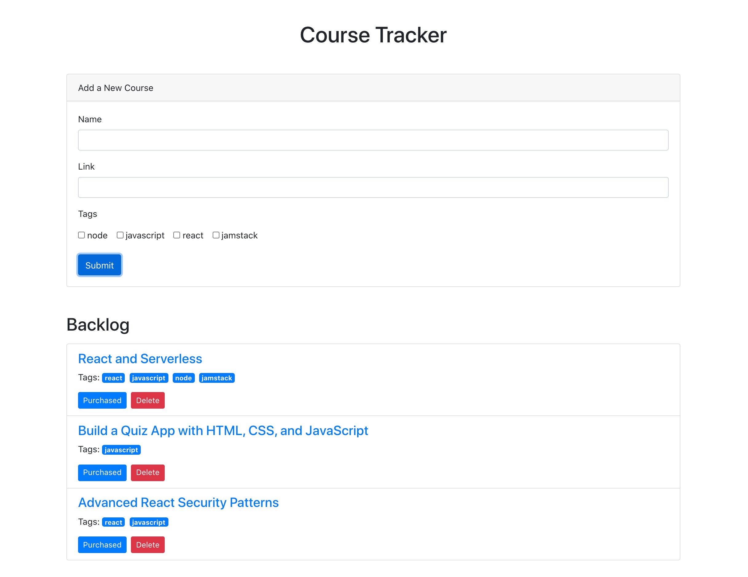
For context going forward, we are going to build an app where you can use to track online courses that you want to take. Personally, I take lots of online courses, and sometimes it’s hard to keep up with the ones in my backlog. This app will let track those courses, similar to a Netflix queue.


One of the reasons I take lots of online courses is because I make courses. In fact, I have a new one available where you can learn how to build secure and production-ready Jamstack applications using React and Netlify (Serverless) Functions. We’ll cover authentication, data storage in Airtable, Styled Components, Continuous Integration with Netlify, and more! Check it out  →

Airtable setup

Let me start by clarifying that Airtable calls their databases “bases.” So, to get started with Airtable, we’ll need to do a couple of things.

  1. Sign up for a free account
  2. Create a new “base”
  3. Define a new table for storing courses

Next, let’s create a new database. We’ll log into Airtable, click on “Add a Base” and choose the “Start From Scratch” option. I named my new base “JAMstack Demos” so that I can use it for different projects in the future.

Next, let’s click on the base to open it.

You’ll notice that this looks very similar to an Excel or Google Sheets document. This is really nice for being able tower with data right inside of the dashboard. There are few columns already created, but we add our own. Here are the columns we need and their types:

  1. name (single line text)
  2. link (single line text)
  3. tags (multiple select)
  4. purchased (checkbox)

We should add a few tags to the tags column while we’re at it. I added “node,” “react,” “jamstack,” and “javascript” as a start. Feel free to add any tags that make sense for the types of classes you might be interested in.

I also added a few rows of data in the name column based on my favorite online courses:

  1. Build 20 React Apps
  2. Advanced React Security Patterns
  3. React and Serverless

The last thing to do is rename the table itself. It’s called “Table 1” by default. I renamed it to “courses” instead.

Locating Airtable credentials

Before we get into writing code, there are a couple of pieces of information we need to get from Airtable. The first is your API Key. The easiest way to get this is to go your account page and look in the “Overview” section.

Next, we need the ID of the base we just created. I would recommend heading to the Airtable API page because you’ll see a list of your bases. Click on the base you just created, and you should see the base ID listed. The documentation for the Airtable API is really handy and has more detailed instructions for find the ID of a base.

Lastly, we need the table’s name. Again, I named mine “courses” but use whatever you named yours if it’s different.

Project setup

To help speed things along, I’ve created a starter project for us in the main repository. You’ll need to do a few things to follow along from here:

  1. Fork the repository by clicking the fork button
  2. Clone the new repository locally
  3. Check out the starter branch with git checkout starter

There are lots of files already there. The majority of the files come from a standard create-react-app application with a few exceptions. There is also a functions directory which will host all of our serverless functions. Lastly, there’s a netlify.toml configuration file that tells Netlify where our serverless functions live. Also in this config is a redirect that simplifies the path we use to call our functions. More on this soon.

The last piece of the setup is to incorporate environment variables that we can use in our serverless functions. To do this install the dotenv package.

npm install dotenv

Then, create a .env file in the root of the repository with the following. Make sure to use your own API key, base ID, and table name that you found earlier.

AIRTABLE_API_KEY=<YOUR_API_KEY>
AIRTABLE_BASE_ID=<YOUR_BASE_ID>
AIRTABLE_TABLE_NAME=<YOUR_TABLE_NAME>

Now let’s write some code!

Setting up serverless functions

To create serverless functions with Netlify, we need to create a JavaScript file inside of our /functions directory. There are already some files included in this starter directory. Let’s look in the courses.js file first.

const  formattedReturn  =  require('./formattedReturn');
const  getCourses  =  require('./getCourses');
const  createCourse  =  require('./createCourse');
const  deleteCourse  =  require('./deleteCourse');
const  updateCourse  =  require('./updateCourse');
exports.handler  =  async  (event)  =>  {
  return  formattedReturn(200, 'Hello World');
};

The core part of a serverless function is the exports.handler function. This is where we handle the incoming request and respond to it. In this case, we are accepting an event parameter which we will use in just a moment.

We are returning a call inside the handler to the formattedReturn function, which makes it a bit simpler to return a status and body data. Here’s what that function looks like for reference.

module.exports  =  (statusCode, body)  =>  {
  return  {
    statusCode,
    body: JSON.stringify(body),
  };
};

Notice also that we are importing several helper functions to handle the interaction with Airtable. We can decide which one of these to call based on the HTTP method of the incoming request.

  • HTTP GET → getCourses
  • HTTP POST → createCourse
  • HTTP PUT → updateCourse
  • HTTP DELETE → deleteCourse

Let’s update this function to call the appropriate helper function based on the HTTP method in the event parameter. If the request doesn’t match one of the methods we are expecting, we can return a 405 status code (method not allowed).

exports.handler = async (event) => {
  if (event.httpMethod === 'GET') {
    return await getCourses(event);
  } else if (event.httpMethod === 'POST') {
    return await createCourse(event);
  } else if (event.httpMethod === 'PUT') {
    return await updateCourse(event);
  } else if (event.httpMethod === 'DELETE') {
    return await deleteCourse(event);
  } else {
    return formattedReturn(405, {});
  }
};

Updating the Airtable configuration file

Since we are going to be interacting with Airtable in each of the different helper files, let’s configure it once and reuse it. Open the airtable.js file.

In this file, we want to get a reference to the courses table we created earlier. To do that, we create a reference to our Airtable base using the API key and the base ID. Then, we use the base to get a reference to the table and export it.

require('dotenv').config();
var Airtable = require('airtable');
var base = new Airtable({ apiKey: process.env.AIRTABLE_API_KEY }).base(
  process.env.AIRTABLE_BASE_ID
);
const table = base(process.env.AIRTABLE_TABLE_NAME);
module.exports = { table };

Getting courses

With the Airtable config in place, we can now open up the getCourses.js file and retrieve courses from our table by calling table.select().firstPage(). The Airtable API uses pagination so, in this case, we are specifying that we want the first page of records (which is 20 records by default).

const courses = await table.select().firstPage();
return formattedReturn(200, courses);

Just like with any async/await call, we need to handle errors. Let’s surround this snippet with a try/catch.

try {
  const courses = await table.select().firstPage();
  return formattedReturn(200, courses);
} catch (err) {
  console.error(err);
  return formattedReturn(500, {});
}

Airtable returns back a lot of extra information in its records. I prefer to simplify these records with only the record ID and the values for each of the table columns we created above. These values are found in the fields property. To do this, I used the an Array map to format the data the way I want.

const { table } = require('./airtable');
const formattedReturn = require('./formattedReturn');
module.exports = async (event) => {
  try {
    const courses = await table.select().firstPage();
    const formattedCourses = courses.map((course) => ({
      id: course.id,
      ...course.fields,
    }));
    return formattedReturn(200, formattedCourses);
  } catch (err) {
    console.error(err);
    return formattedReturn(500, {});
  }
};

How do we test this out? Well, the netlify-cli provides us a netlify dev command to run our serverless functions (and our front-end) locally. First, install the CLI:

npm install -g netlify-cli

Then, run the netlify dev command inside of the directory.

This beautiful command does a few things for us:

  • Runs the serverless functions
  • Runs a web server for your site
  • Creates a proxy for front end and serverless functions to talk to each other on Port 8888.

Let’s open up the following URL to see if this works:

We are able to use /api/* for our API because of the redirect configuration in the netlify.toml file.

If successful, we should see our data displayed in the browser.

Creating courses

Let’s add the functionality to create a course by opening up the createCourse.js file. We need to grab the properties from the incoming POST body and use them to create a new record by calling table.create().

The incoming event.body comes in a regular string which means we need to parse it to get a JavaScript object.

const fields = JSON.parse(event.body);

Then, we use those fields to create a new course. Notice that the create() function accepts an array which allows us to create multiple records at once.

const createdCourse = await table.create([{ fields }]);

Then, we can return the createdCourse:

return formattedReturn(200, createdCourse);

And, of course, we should wrap things with a try/catch:

const { table } = require('./airtable');
const formattedReturn = require('./formattedReturn');
module.exports = async (event) => {
  const fields = JSON.parse(event.body);
  try {
    const createdCourse = await table.create([{ fields }]);
    return formattedReturn(200, createdCourse);
  } catch (err) {
    console.error(err);
    return formattedReturn(500, {});
  }
};

Since we can’t perform a POST, PUT, or DELETE directly in the browser web address (like we did for the GET), we need to use a separate tool for testing our endpoints from now on. I prefer Postman, but I’ve heard good things about Insomnia as well.

Inside of Postman, I need the following configuration.

  • url: localhost:8888/api/courses
  • method: POST
  • body: JSON object with name, link, and tags

After running the request, we should see the new course record is returned.

We can also check the Airtable GUI to see the new record.

Tip: Copy and paste the ID from the new record to use in the next two functions.

Updating courses

Now, let’s turn to updating an existing course. From the incoming request body, we need the id of the record as well as the other field values.

We can specifically grab the id value using object destructuring, like so:

const {id} = JSON.parse(event.body);

Then, we can use the spread operator to grab the rest of the values and assign it to a variable called fields:

const {id, ...fields} = JSON.parse(event.body);

From there, we call the update() function which takes an array of objects (each with an id and fields property) to be updated:

const updatedCourse = await table.update([{id, fields}]);

Here’s the full file with all that together:

const { table } = require('./airtable');
const formattedReturn = require('./formattedReturn');
module.exports = async (event) => {
  const { id, ...fields } = JSON.parse(event.body);
  try {
    const updatedCourse = await table.update([{ id, fields }]);
    return formattedReturn(200, updatedCourse);
  } catch (err) {
    console.error(err);
    return formattedReturn(500, {});
  }
};

To test this out, we’ll turn back to Postman for the PUT request:

  • url: localhost:8888/api/courses
  • method: PUT
  • body: JSON object with id (the id from the course we just created) and the fields we want to update (name, link, and tags)

I decided to append “Updated!!!” to the name of a course once it’s been updated.

We can also see the change in the Airtable GUI.

Deleting courses

Lastly, we need to add delete functionality. Open the deleteCourse.js file. We will need to get the id from the request body and use it to call the destroy() function.

const { id } = JSON.parse(event.body);
const deletedCourse = await table.destroy(id);

The final file looks like this:

const { table } = require('./airtable');
const formattedReturn = require('./formattedReturn');
module.exports = async (event) => {
  const { id } = JSON.parse(event.body);
  try {
    const deletedCourse = await table.destroy(id);
    return formattedReturn(200, deletedCourse);
  } catch (err) {
    console.error(err);
    return formattedReturn(500, {});
  }
};

Here’s the configuration for the Delete request in Postman.

  • url: localhost:8888/api/courses
  • method: PUT
  • body: JSON object with an id (the same id from the course we just updated)

And, of course, we can double-check that the record was removed by looking at the Airtable GUI.

Displaying a list of courses in React

Whew, we have built our entire back end! Now, let’s move on to the front end. The majority of the code is already written. We just need to write the parts that interact with our serverless functions. Let’s start by displaying a list of courses.

Open the App.js file and find the loadCourses function. Inside, we need to make a call to our serverless function to retrieve the list of courses. For this app, we are going to make an HTTP request using fetch, which is built right in.

Thanks to the netlify dev command, we can make our request using a relative path to the endpoint. The beautiful thing is that this means we don’t need to make any changes after deploying our application!

const res = await fetch('/api/courses');
const courses = await res.json();

Then, store the list of courses in the courses state variable.

setCourses(courses)

Put it all together and wrap it with a try/catch:

const loadCourses = async () => {
  try {
    const res = await fetch('/api/courses');
    const courses = await res.json();
    setCourses(courses);
  } catch (error) {
    console.error(error);
  }
};

Open up localhost:8888 in the browser and we should our list of courses.

Adding courses in React

Now that we have the ability to view our courses, we need the functionality to create new courses. Open up the CourseForm.js file and look for the submitCourse function. Here, we’ll need to make a POST request to the API and send the inputs from the form in the body.

The JavaScript Fetch API makes GET requests by default, so to send a POST, we need to pass a configuration object with the request. This options object will have these two properties.

  1. method → POST
  2. body → a stringified version of the input data
await fetch('/api/courses', {
  method: 'POST',
  body: JSON.stringify({
    name,
    link,
    tags,
  }),
});

Then, surround the call with try/catch and the entire function looks like this:

const submitCourse = async (e) => {
  e.preventDefault();
  try {
    await fetch('/api/courses', {
      method: 'POST',
      body: JSON.stringify({
        name,
        link,
        tags,
      }),
    });
    resetForm();
    courseAdded();
  } catch (err) {
    console.error(err);
  }
};

Test this out in the browser. Fill in the form and submit it.

After submitting the form, the form should be reset, and the list of courses should update with the newly added course.

Updating purchased courses in React

The list of courses is split into two different sections: one with courses that have been purchased and one with courses that haven’t been purchased. We can add the functionality to mark a course “purchased” so it appears in the right section. To do this, we’ll send a PUT request to the API.

Open the Course.js file and look for the markCoursePurchased function. In here, we’ll make the PUT request and include both the id of the course as well as the properties of the course with the purchased property set to true. We can do this by passing in all of the properties of the course with the spread operator and then overriding the purchased property to be true.

const markCoursePurchased = async () => {
  try {
    await fetch('/api/courses', {
      method: 'PUT',
      body: JSON.stringify({ ...course, purchased: true }),
    });
    refreshCourses();
  } catch (err) {
    console.error(err);
  }
};

To test this out, click the button to mark one of the courses as purchased and the list of courses should update to display the course in the purchased section.

Deleting courses in React

And, following with our CRUD model, we will add the ability to delete courses. To do this, locate the deleteCourse function in the Course.js file we just edited. We will need to make a DELETE request to the API and pass along the id of the course we want to delete.

const deleteCourse = async () => {
  try {
    await fetch('/api/courses', {
      method: 'DELETE',
      body: JSON.stringify({ id: course.id }),
    });
    refreshCourses();
  } catch (err) {
    console.error(err);
  }
};

To test this out, click the “Delete” button next to the course and the course should disappear from the list. We can also verify it is gone completely by checking the Airtable dashboard.

Deploying to Netlify

Now, that we have all of the CRUD functionality we need on the front and back end, it’s time to deploy this thing to Netlify. Hopefully, you’re as excited as I am about now easy this is. Just make sure everything is pushed up to GitHub before we move into deployment.

If you don’t have a Netlify, account, you’ll need to create one (like Airtable, it’s free). Then, in the dashboard, click the “New site from Git” option. Select GitHub, authenticate it, then select the project repo.

Next, we need to tell Netlify which branch to deploy from. We have two options here.

  1. Use the starter branch that we’ve been working in
  2. Choose the master branch with the final version of the code

For now, I would choose the starter branch to ensure that the code works. Then, we need to choose a command that builds the app and the publish directory that serves it.

  1. Build command: npm run build
  2. Publish directory: build

Netlify recently shipped an update that treats React warnings as errors during the build proces. which may cause the build to fail. I have updated the build command to CI = npm run build to account for this.

Lastly, click on the “Show Advanced” button, and add the environment variables. These should be exactly as they were in the local .env that we created.

The site should automatically start building.

We can click on the “Deploys” tab in Netlify tab and track the build progress, although it does go pretty fast. When it is complete, our shiny new app is deployed for the world can see!

Welcome to the Jamstack!

The Jamstack is a fun new place to be. I love it because it makes building and hosting fully-functional, full-stack applications like this pretty trivial. I love that Jamstack makes us mighty, all-powerful front-end developers!

I hope you see the same power and ease with the combination of technology we used here. Again, Jamstack doesn’t require that we use Airtable, React or Netlify, but we can, and they’re all freely available and easy to set up. Check out Chris’ serverless site for a whole slew of other services, resources, and ideas for working in the Jamstack. And feel free to drop questions and feedback in the comments here!


The post Going Jamstack with React, Serverless, and Airtable appeared first on CSS-Tricks.

You can support CSS-Tricks by being an MVP Supporter.


from CSS-Tricks https://ift.tt/2D2QLg0
via IFTTT

Passkeys: What the Heck and Why?

These things called  passkeys  sure are making the rounds these days. They were a main attraction at  W3C TPAC 2022 , gained support in  Saf...