Wednesday, 3 March 2021

10 Steps to Blend STAT Ranking Data with Site Performance Metrics

Posted by AndrewMiller

Too often, we assume that SEO best practices will work in any industry against any competitive set. But most best practices go untested and may not be “best” in every situation.

We all know that tactics that worked in 2020 won’t necessarily move the needle in 2021 as Core Web Vitals (CWV) and other signals shuffle to the front. We have to do better for our businesses and our clients.

I’m a data nerd at heart with lots of battle scars from 15 years in SEO. The idea of analyzing thousands of local SERPs sounded like too much fun to pass up. I found some surprising correlations, and just as importantly, built a methodology and data set that can be updated quarterly to show changes over time.

I analyzed 50,000+ SERPs in the retail banking sector so I could make sense of the massive shifts in rankings and search behaviors during the lockdown period. We have a lot of historical data for bank websites, so comparing pre/post COVID data would be easier than starting from scratch.

I’ll share how I did it below. But first, I want to share WHY I think sharing this type of research is so important for the SEO community.

Why validate SEO best practices with data?

It’s a great time to be an SEO. We have amazing tools and can gather more data than ever. We have thriving communities and excellent basic training materials.

Yet, we often see our craft distilled into overly-simplified “best practices” that are assumed to be universally true. But if there’s one universal truth in SEO, it’s that there are no universal truths. A best practice can be misinterpreted or outdated, leading to missed opportunities or outright harm to a business.

Using the increasing importance of CWV as an example, SEOs have an opportunity (and obligation) to separate fact from fiction. We need to know if, and by how much, CWV will impact rankings over time so we can prioritize our efforts.

We can elevate our SEO game individually and collectively by testing and validating best practices with research. It just takes a curious mind, the right tools, and a willingness to accept the results rather than force a narrative.

Failing to validate best practices is a liability for SEO practitioners and shows an unwillingness to challenge assumptions. In my experience, a lack of data can lead to a senior stakeholders’ opinions carrying more weight than an SEO expert’s recommendations.

Start by asking the right questions

Real insight comes from combining data from multiple sources to answer critical questions and ensure your strategies are backed by valid data. In my analysis of local banks, I started by listing the questions I wanted to know the answers to:

  • What characteristics are shared by top-ranking local bank websites?
  • Who are banks actually competing against in the SERPs? Is it primarily other banks?
  • How do competitive SERPS change based on when/where/how users search?
  • How can smaller, local businesses gain an edge over larger competitors from outside their region?
  • How does SERP composition affect a bank’s ability to rank well for targeted keywords?
  • How important are Core Web Vitals (CWV) for rankings? How does this change over time?

You could run this same analysis by replacing “banks” with other local business categories. The list of potential questions is endless so you can adjust them based on your needs.

Here’s an important reminder - be prepared to accept the answers even if they are inconclusive or contradictory to your assumptions. Data-driven SEOs have to avoid confirmation bias if we’re going to remain objective.

Here’s how I analyzed 50,000 search results in a few hours

I combined three of my favorite tools to analyze SERPs at scale and gather the data needed to answer my questions:

  • STAT to generated ranking reports for select keywords
  • Screaming Frog to crawl websites and gather technical SEO data
  • Power BI to analyze the large data sets and create simple visualizations

Step 1: Determine your data needs

I used US Census Bureau data to identify all cities with populations over 100,000, because I wanted a representation of local bank SERPs across the country. My list ended up including 314 separate cities, but you could customize your list to suit your needs.

I also wanted to gather data for desktop and mobile searches to compare SERP differences between the device types.

Step 2: Identify your keywords

I chose “banks near me” and “banks in {city, st}” based on their strong local intent and high search volumes, compared to more specific keywords for banking services.

Step 3: Generate a STAT import file in .csv format

Once you have your keywords and market list, it’s time to prepare the bulk upload for STAT. Use the template provided in the link to create a .csv file with the following fields:

  • Project: The name of the new STAT project, or an existing project.
  • Folder: The name of the new folder, or an existing folder. (This is an optional column that you can leave blank.)
  • Site: The domain name for the site you want to track. Note, for our purposes you can enter any URL you want to track here. The Top 20 Report will include all ranking URLs for the target keywords even if they aren’t listed in your “Site” column.
  • Keyword: The search query you’re adding.
  • Tags: Enter as many keyword tags as you want, separated by commas. I used “city” and “near me” as tags to distinguish between the query types. (This is an optional column that you can leave blank.)
  • Market: Specify the market (country and language) in which you would like to track the keyword. I used “US-en” for US English.
  • Location: If you want to track the keyword in a specific location, specify the city, state, province, ZIP code, and/or postal code. I used the city and state list in “city, st” format.
  • Device: Select whether you would like Desktop or Smartphone results. I selected both.

Each market, location, and device type will multiply the number of keywords you must track. I ended up with 1,256 keywords (314 markets X 2 keywords X 2 devices) in my import file.

Once your file is complete, you can import to STAT and begin tracking.

Step 4: Run a Top 20 Report in STAT for all keywords

STAT’s built-in Google SERP Top 20 Comparison report captures the top 20 organic results from each SERP at different intervals (daily, weekly, monthly, etc.) to look at changes over time. I did not need daily data so I simply let it run on two consecutive days and removed the data I did not need. I re-run the same report quarterly to track changes over time.

Watch the video below to learn how to set up this report! 

My 1,256 keywords generated over 25,000 rows of data per day. Each row is a different organic listing and includes the keyword, monthly search volume, rank (includes the local pack), base rank (does not include the local pack), https/http protocol of the ranking URL, the ranking URL, and your tags.

Here’s an example of the raw output in CSV format:

It’s easy to see how useful this data is by itself but it becomes even more powerful when we clean it up and start crawling the ranking URLs.

Step 5: Clean up and normalize your STAT URLs data

At this point you may have invested 1-2 hours in gathering the initial data. This step is a bit more time consuming, but data cleansing allows you to run more advanced analysis and uncover more useful insights in Screaming Frog.

Here are the changes I made to the STAT rankings data to prepare for the next steps in Screaming Frog and Power BI. You’ll end up with multiple columns of URLs. Each serves a purpose later.

  1. Duplicate the Ranking URL column to a new column called Normalized URL.
  2. Remove URL parameters from the Normalized URL fields by using Excel’s text to columns tool and separating by “?”. I deleted the new columns(s) containing the URL parameters because they were not helpful in my analysis.
  3. Duplicate the new, clean Normalized URL column to a new column called TLD. Use the text to columns tool on the TLD column and separate by “/” to remove everything except the domain name and subdomains. Delete the new columns. I chose to keep the subdomains in my TLD column but you can remove them if it helps your analysis.
  4. Finally, create one more column called Full URL that will eventually become the list of URLs that you’ll crawl in Screaming Frog. To generate the Full URL, simply use Excel’s concatenate function to combine the Protocol and Normalized URL columns. Your formula will look something like this: =concatenate(A1, “://”, C1) to include the “://” in a valid URL string.

The 25,000+ rows in my data set are well within Excel’s limitations, so I am able to manipulate the data easily in one place. You may need to use a database (I like BigQuery) as your data sets grow.

Step 6: Categorize your SERP results by website type

Skimming through the SERP results, it’s easy to see that banks are not the only type of website that rank for keywords with local search intent. Since one of my initial questions was SERP composition, I had to identify all of the different types of websites and label each one for further analysis.

This step is by far the most time consuming and insightful. I spent 3 hours categorizing the initial batch of 25,000+ URLs into one of the following categories:

  • Institution (banks and credit union websites)
  • Directory (aggregators, local business directories, etc.)
  • Reviews (local and national sites like Yelp.com)
  • Education (content about banks on .edu domains)
  • Government (content about banks on .gov domains and municipal sites)
  • Jobs (careers sites and job aggregators)
  • News (local and national news sites with banking content)
  • Food Banks (yes, plenty of food banks rank for “banks near me” keywords)
  • Real Estate (commercial and residential real estate listings)
  • Search Engines (ranked content belonging to a search engine)
  • Social Media (ranked content on social media sites)
  • Other (completely random results not related to any of the above)

Your local SERPs will likely contain many of these website types and other unrelated categories such as food banks. Speed up the process by sorting and filtering your TLD and Normalized URL columns to categorize multiple rows simultaneously. For example, all the yelp.com rankings can be categorized as “Reviews” with a quick copy/paste.

At this point, your rankings data set is complete and you are ready to begin crawling the top-ranking sites in your industry to see what they have in common.

Step 7: Crawl your target websites with Screaming Frog

My initial STAT data identified over 6,600 unique pages from local bank websites that ranked in the top 20 organic search results. This is far too many pages to evaluate manually. Enter Screaming Frog, a crawler that mimics Google’s web crawler and extracts tons of SEO data from websites.

I configured Screaming Frog to crawl each of the 6,600 ranking pages for a larger analysis of characteristics shared by top-ranking bank websites. Don’t just let SF loose though. Be sure to configure it properly to save time and avoid crawling unnecessary pages.

These settings ensure we’ll get all the info we need to answer our questions in one crawl:

List Mode: Paste in a de-duplicated Full URL list from your STAT data. In my case, this was 6,600+ URLs.

Database Storage Mode: It may be a bit slower than Memory (RAM) Storage, but saving your crawl results on your hard disk ensures you won’t lose your results if you make a mistake (like I have many times) and close your report before you finish analyzing the data.

Limit Crawl Depth: Set this to 0 (zero) so the spider will only crawl the URLs on your list without following internal links to other pages on those domains.

APIs: I highly recommend using the Pagespeed Insights Integration to pull Lighthouse speed metrics directly into your crawl data. If you have a Moz account with API access, you can also pull link and domain data from the Moz API with the built-in integration.

Once you have configured the spider, let it rip! It could take several minutes to several hours depending on how many URLs you’re crawling and your computer’s speed and memory constraints. Just be patient! You might try running larger crawls overnight or on an extra computer to avoid bogging your primary machine down.

Step 8: Export your Screaming Frog crawl data to Excel

Dumping your crawl data into Excel is remarkably easy.

Step 9: Join your data sets in Power BI

At this point, you should have two data sources in Excel: one for your STAT rankings data and another for your Screaming Frog crawl data. Our goal is to combine the two data sources to see how organic search rank may be influenced by on-page SEO elements and site performance. To do this, we must first merge the data.

If you have access to a Windows PC, the free version of Power BI is powerful enough to get you started. Begin by loading your two data sources into a new project using the Get Data wizard.

Once your data sets are loaded, it’s time to make the magic happen by creating relationships in your data to unlock correlations between rankings and site characteristics. To combine your data in Power BI, create a many-to-many relationship between your STAT Full URL and Screaming Frog Original URL fields. 

If you are new to BI tools and data visualization, don’t worry! There are lots of helpful tutorials and videos just a quick search away. At this point, it’s really hard to break anything and you can experiment with lots of ways to analyze your data and share insights with many types of charts and graphs.

I should note that Power BI is my preferred data visualization tool but you may be able to use Tableau or some equally powerful. Google Data Studio was not an option for this analysis because it only allows for left outer joins of the multiple data sources and does not support “many-to-many” relationships. It’s a technical way of saying Data Studio isn’t flexible enough to create the data relationships that we need.

Step 10: Analyze and visualize!

Power BI’s built-in visualizations allow you to quickly summarize and present data. This is where we can start analyzing the data to answer the questions we came up with earlier.

Results — what did we learn?

Here are a couple examples of the insights gleaned from merging our rankings and crawl data. Spoiler alert — CWV doesn’t strongly impact organic rankings….yet!

Who are banks actually competing against in the SERPs? Is it primarily other banks?

On desktops, about 67% of organic search results belong to financial institutions (banks and credit unions) with heavy competition from reviews sites (7%) and online directories (22%). This information helps shape our SEO strategies for banks by exposing opportunities to monitor and maintain listings in relevant directories and reviews sites.

Okay, now let’s mash up our data sources to see how the distribution of website categories varies by rank on desktop devices. Suddenly, we can see that financial institutions actually occupy the majority of the top 3 results while reviews sites and directories are more prevalent in positions 4-10.

How important are Core Web Vitals (CWV) for rankings? How does this change over time?

Site performance and site speed are hot topics in SEO and will only become more important as CWV becomes a ranking signal in May this year. We can begin to understand the relationships between site speed and rankings by comparing STAT rankings and Pagespeed Insights data from Screaming Frog reports.

As of January 2021, sites with higher Lighthouse Performance Scores (i.e. they load faster) tend to rank better than sites with lower scores. This could help justify investments in site speed and site performance.

Some CWV elements correlate more closely with better rankings and others are more scattered. This isn’t to say CWV aren’t important or meaningful, but rather it’s a starting point for further analysis after May.

So what? What can we learn from this type of analysis?

Separately, STAT and Screaming Frog are incredibly powerful SEO tools. The data they provide are useful if you happen to be an SEO but the ability to merge data and extract relationships will multiply your value in any organization that values data, and acts on insights.

Besides validating some generally accepted SEO knowledge with data (“faster sites are rewarded with better rankings”), better use of relational data can also help us avoid spending valuable time on less important tactics (“improve Cumulative Layout Shift at all costs!”).

Of course, correlation does not imply causation, and aggregated data does not guarantee an outcome for individual sites. But if you’re a bank marketing professional responsible for customer acquisition from organic channels, you’ll need to bring this type of data to your stakeholders to justify increased investments in SEO.

By sharing the tools and methodology, I hope others will take it further by building and contributing their additional findings to the SEO community. What other datasets can we combine to deepen our understanding of SERPs on a larger scale? Let me know your thoughts in the comments!


Sign up for The Moz Top 10, a semimonthly mailer updating you on the top ten hottest pieces of SEO news, tips, and rad links uncovered by the Moz team. Think of it as your exclusive digest of stuff you don't have time to hunt down but want to read!


from The Moz Blog https://ift.tt/2OlUWJ1
via IFTTT

Tuesday, 2 March 2021

How to Animate the Details Element

Here’s a nice simple demo from Moritz Gießmann on animating the triangle of a <details> element, which is the affordance that tells people this thing can be opened. Animating it, then is another kind of affordance that tells people this thing is opening now.

The tricks?

  1. Turn off the default triangle: details summary::-webkit-details-marker { display:none; }. You can’t animate that one.
  2. Make a replacement triangle with the CSS border trick and a pseudo element.
  3. Animate the new triangle when the state is open: details[open] > summary::before { transform: rotate(90deg); }.

This only animates the triangle. The content inside still “snaps” open. Wanna smooth things out? Louis Hoebregts’ “How to Animate the Details Element Using WAAPI” covers that.

Here’s a fork where I’ll combine them just because:

I see Moritz put the cursor: pointer; on the summary as well like Greg Gibson suggests.


The post How to Animate the Details Element appeared first on CSS-Tricks.

You can support CSS-Tricks by being an MVP Supporter.


from CSS-Tricks https://ift.tt/3095HRP
via IFTTT

The Best Font Loading Strategies and How to Execute Them

Zach Leatherman wrote up a comprehensive list of font loading strategies that have been widely shared in the web development field. I took a look at this list before, but got so scared (and confused), that I decided not to do anything at all. I don’t know how to begin loading fonts the best way and I don’t want to feel like an idiot going through this list.

Today, I gave myself time to sit down and figure it out. In this article, I want to share with you the best loading strategies and how to execute all of them.

The best strategies

Zach recommends two strategies in his article:

  1. FOUT with Class – Best approach for most situations. (This works whether we use a font-hosting company or hosting our own fonts.)
  2. Critical FOFT – Most performant approach. (This only works if we host our own fonts.)

Before we dive into these two strategies, we need to clear up the acronyms so you understand what Zach is saying.

FOIT, FOUT, FOFT

The acronyms are as follows:

  • FOIT means flash of invisible text. When web fonts are loading, we hide text so users don’t see anything. We only show the text when web fonts are loaded.
  • FOUT means flash of unstyled text. When web fonts are loading, we show users a system font. When the web font gets loaded, we change the text back to the desired web font.
  • FOFT means flash of faux text. This one is complicated and warrants more explanation. We’ll talk about it in detail when we hit the FOFT section.

Self-hosted fonts vs. cloud-hosted fonts

There are two main ways to host fonts:

  1. Use a cloud provider.
  2. Self-host the fonts.

How we load fonts differs greatly depending on which option you choose.

Loading fonts with cloud-hosted fonts

It’s often easier to cloud-hosted fonts. The provider will give us a link to load the fonts. We can simply plunk this link into our HTML and we’ll get our web font. Here’s an example where we load web fonts from Adobe Fonts now (previously known as Typekit).

<link rel="stylesheet" href="https://use.typekit.net/your-kit-id.css">

Unfortunately, this isn’t the best approach. The href blocks the browser. If loading the web font hangs, users won’t be able to do anything while they wait.

Typekit used to provide JavaScript that loads a font asynchronously. It’s a pity they don’t show this JavaScript version anymore. (The code still works though, but I have no idea when, or if, it will stop working.)

Loading fonts from Google Fonts is slightly better because it provides font-display: swap. Here’s an example where we load Lato from Google Fonts. (The display=swap parameter triggers font-display: swap).

<link
  href="https://fonts.googleapis.com/css2?family=Lato:ital,wght@0,400;0,700;1,400;1,700&display=swap"
  rel="stylesheet"
/>

Loading fonts with self-hosted fonts

You can only self-host your fonts if you have the license to do so. Since fonts can be expensive, most people choose to use a cloud provider instead.

There’s a cheap way to get fonts though. Design Cuts runs font deals occasionally where you can get insanely high-quality fonts for just $29 per bundle. Each bundle can contain up to 12 fonts. I managed to get classics like Claredon, DIN, Futura, and a whole slew of fonts I can play around by camping on their newsletter for these deals.

If we want to self-host fonts, we need to understand two more concepts: @font-face and font-display: swap.

@font-face

@font-face lets us declare fonts in CSS. If we want to self-host fonts, we need to use @font-face to declare your fonts.

In this declaration, we can specify four things:

  • font-family: This tells CSS (and JavaScript) the name of our font.
  • src: Path to find the font so they can get loaded
  • font-weight: The font weight. Defaults to 400 if omitted.
  • font-style: Whether to italicize the font. Defaults to normal if omitted.

For src, we need to specify several font formats. For a practical level of browser support, we can use woff2 and woff.

Here’s an example where we load Lato via @font-face.

@font-face {
  font-family: Lato;
  src: url('path-to-lato.woff2') format('woff2'),
       url('path-to-lato.woff') format('woff');
}

@font-face {
  font-family: Lato;
  src: url('path-to-lato-bold.woff2') format('woff2'),
       url('path-to-lato-bold.woff') format('woff');
  font-weight: 700;
}

@font-face {
  font-family: Lato;
  src: url('path-to-lato-italic.woff2') format('woff2'),
       url('path-to-lato-italic.woff') format('woff');
  font-style: italic;
}

@font-face {
  font-family: Lato;
  src: url('path-to-lato-bold-italic.woff2') format('woff2'),
       url('path-to-lato-bold-italic.woff') format('woff');
  font-weight: 700;
  font-style: italic;
}

If you don’t have woff2 or woff files, you can upload your font files (either Opentype or Truetype) into a font-face generator to get them.

Next, we declare the web font in a font-family property.

html {
  font-family: Lato, sans-serif;
}

When browsers parse an element with the web font, they trigger a download for the web font.

font-display: swap

font-display takes one of four possible values: auto, swap, fallback, and optional. swap instructs browsers to display the fallback text before web fonts get loaded. In other words, swap triggers FOUT for self-hosted fonts. Find out about other values from in the CSS-Tricks almanac.

Browser support for font-display: swap is pretty good nowadays so we can use it in our projects.

This browser support data is from Caniuse, which has more detail. A number indicates that browser supports the feature at that version and up.

Desktop

Chrome Firefox IE Edge Safari
60 58 No 79 11.1

Mobile / Tablet

Android Chrome Android Firefox Android iOS Safari
88 85 81 11.3-11.4

FOUT vs. FOUT with Class

FOUT means flash of unstyled text. You always want FOUT over FOIT (flash of invisible text) because it’s better for users to read words written with system fonts compared to words written with invisible ink. We mentioned earlier that font-display: swap gives you the ability to use FOUT natively.

FOUT with Class gives you the same results—FOUT—but it uses JavaScript to load the fonts. The mechanics are as follows:

  • First: Load system fonts.
  • Second: Load web fonts via JavaScript.
  • Third: When web fonts are loaded, add a class to the <html> tag.
  • Fourth: Switch the system font with the loaded web font.

Zach recommends loading fonts via JavaScript even though font-display: swap enjoys good browser support. In other words, Zach recommends FOUT with Class over @font-face + font-display: swap.

He recommends FOUT with Class because of these three reasons:

  1. We can group repaints.
  2. We can adapt to user preferences.
  3. We can skip font-loading altogether if users have a slow connection.

I’ll let you dive deeper into the reasons in another article. While writing this article, I found a fourth reason to prefer FOUT with Class: We can skip font-loading when users already have the font loaded in their system. (We do this with sessionStorage as we’ll see below.)

FOUT with Class (for cloud-hosted fonts)

First, we want to load our fonts as usual from your cloud-hosting company. Here’s an example where I loaded Lato from Google Fonts:

<head>
  <link
    href="https://fonts.googleapis.com/css2?family=Lato:ital,wght@0,400;0,700;1,400;1,700&display=swap"
    rel="stylesheet"
  />
</head>

Next, we want to load fonts via JavaScript. We’ll inject a script into the <head> section since the code footprint is small, and it’s going to be asynchronous anyway.

<head>
  <link
    href="https://fonts.googleapis.com/css2?family=Lato:ital,wght@0,400;0,700;1,400;1,700&display=swap"
    rel="stylesheet"
  />
  <script src="js/load-fonts.js"></script>
</head>

In load-fonts.js, we want to use the CSS Font Loading API to load the font. Here, we can use Promise.all to load all fonts simultaneously. When we do this, we’re grouping repaints.

The code looks like this:

if ('fonts' in document) {
  Promise.all([
    document.fonts.load('1em Lato'),
    document.fonts.load('700 1em Lato'),
    document.fonts.load('italic 1em Lato'),
    document.fonts.load('italic 700 1em Lato')
  ]).then(_ => () {
    document.documentElement.classList.add('fonts-loaded')
  })
}

When fonts are loaded, we want to change the body text to the web font. We can do this via CSS by using the .fonts-loaded class.

/* System font before [[webfont]]s get loaded */
body {
  font-family: sans-serif;
}

/* Use [[webfont]] when [[webfont]] gets loaded*/
.fonts-loaded body {
  font-family: Lato,  sans-serif;
}

Pay attention here: We need to use the .fonts-loaded class with this approach.

We cannot write the web font directly in the <body>‘s font-family; doing this will trigger fonts to download, which means you’re using @font-face + font-display: swap. It also means the JavaScript is redundant.

/* DO NOT DO THIS */
body {
  font-family: Lato, sans-serif;
}

If users visit additional pages on the site, they already have the fonts loaded in their browser. We can skip the font-loading process (to speed things up) by using sessionStorage.

if (sessionStorage.fontsLoaded) {
  document.documentElement.classList.add('fonts-loaded')
} else {
  if ('fonts' in document) {
  Promise.all([
    document.fonts.load('1em Lato'),
    document.fonts.load('700 1em Lato'),
    document.fonts.load('italic 1em Lato'),
    document.fonts.load('italic 700 1em Lato')
  ]).then(_ => () {
    document.documentElement.classList.add('fonts-loaded')
  })
  }
}

If we want to optimize the JavaScript for readability, we can use an early return pattern to reduce indentation.

function loadFonts () {
  if (sessionStorage.fontsLoaded) {
    document.documentElement.classList.add('fonts-loaded')
    return 
  } 
  
if ('fonts' in document) {
  Promise.all([
    document.fonts.load('1em Lato'),
    document.fonts.load('700 1em Lato'),
    document.fonts.load('italic 1em Lato'),
    document.fonts.load('italic 700 1em Lato')
  ]).then(_ => () {
    document.documentElement.classList.add('fonts-loaded')
  })  
}

loadFonts()

FOUT with Class (for self-hosted fonts)

First, we want to load our fonts as usual via @font-face. The font-display: swap property is optional since we’re loading fonts via JavaScript.

@font-face {
  font-family: Lato;
  src: url('path-to-lato.woff2') format('woff2'),
       url('path-to-lato.woff') format('woff');
}

/* Other @font-face declarations */

Next, we load the web fonts via JavaScript.

if ('fonts' in document) {
  Promise.all([
    document.fonts.load('1em Lato'),
    document.fonts.load('700 1em Lato'),
    document.fonts.load('italic 1em Lato'),
    document.fonts.load('italic 700 1em Lato')
  ]).then(_ => () {
    document.documentElement.classList.add('fonts-loaded')
  })
}

Then we want to change the body text to the web font via CSS:

/* System font before webfont is loaded */
body {
  font-family: sans-serif;
}

/* Use webfont when it loads */
.fonts-loaded body {
  font-family: Lato,  sans-serif;
}

Finally, we skip font loading for repeat visits.

if ('fonts' in document) {
  Promise.all([
    document.fonts.load('1em Lato'),
    document.fonts.load('700 1em Lato'),
    document.fonts.load('italic 1em Lato'),
    document.fonts.load('italic 700 1em Lato')
  ]).then(_ => () {
    document.documentElement.classList.add('fonts-loaded')
  })
}

CSS Font Loader API vs. FontFaceObserver

The CSS Font Loader API has pretty good browser support, but it’s a pretty cranky API.

This browser support data is from Caniuse, which has more detail. A number indicates that browser supports the feature at that version and up.

Desktop

Chrome Firefox IE Edge Safari
35 41 No 79 10

Mobile / Tablet

Android Chrome Android Firefox Android iOS Safari
88 85 81 10.0-10.2

So, if you need to support older browsers (like IE 11 and below), or if you find the API weird and unwieldy, you might want to use Bramstein’s FontFaceObserver. It’s super lightweight so there’s not much harm.

The code looks like this. (It’s much nicer compared to the CSS Font Loader API).

new FontFaceObserver('lato')
  .load()
  .then(_ => {
    document.documentElement.classList.add('fonts-loaded')
  })

Make sure to use fontfaceobserver.standalone.js if you intend to it to load fonts on browsers that don’t support Promises.

FOFT

FOFT means flash of faux text. The idea here is we split font loading into three stages:

  • Step 1: Use fallback font when web fonts aren’t loaded yet.
  • Step 2: Load the Roman (also called “book” or “regular”) version of the font first. This replaces most of the text. Bold and italics will be faked by the browser (hence “faux text”).
  • Step 3: Load the rest of the fonts

Note: Zach also calls this Standard FOFT.

Using Standard FOFT

First, we load the Roman font.

@font-face {
  font-family: LatoInitial;
  src: url('path-to-lato.woff2') format('woff2'),
       url('path-to-lato.woff') format('woff');
  unicode-range: U+65-90, U+97-122;
}

.fonts-loaded-1 body {
  font-family: LatoInitial;
}
if('fonts' in document) {
  document.fonts.load("1em LatoInitial")
    .then(_ => {
      document.documentElement.classList.add('fonts-loaded-1')
    })
}

Then, we load other fonts.

Pay attention here: we’re loading Lato again, but this time, we set font-family to Lato instead of LatoInitial.

/* Load this first */
@font-face {
  font-family: LatoInitial;
  src: url('path-to-lato.woff2') format('woff2'),
       url('path-to-lato.woff') format('woff');
  unicode-range: U+65-90, U+97-122;
}

/* Load these afterwards */
@font-face {
  font-family: Lato;
  src: url('path-to-lato.woff2') format('woff2'),
       url('path-to-lato.woff') format('woff');
  unicode-range: U+65-90, U+97-122;
}

/* Other @font-face for different weights and styles*/

.fonts-loaded-1 body {
  font-family: LatoInitial;
}

.fonts-loaded-2 body {
  font-family: Lato;
}
if ('fonts' in document) {
  document.fonts.load('1em LatoInitial')
    .then(_ => {
      document.documentElement.classList.add('fonts-loaded-1')

      Promise.all([
        document.fonts.load('400 1em Lato'),
        document.fonts.load('700 1em Lato'),
        document.fonts.load('italic 1em Lato'),
        document.fonts.load('italic 700 1em Lato')
      ]).then(_ => {
        document.documentElement.classList.add('fonts-loaded-2')
      })
    })
}

Again, we can optimize it for repeat views.

Here, we can add fonts-loaded-2 to the <html> straightaway since fonts are already loaded.

function loadFonts () {
  if (sessionStorage.fontsLoaded) {
    document.documentElement.classList.add('fonts-loaded-2')
    return
  }

  if ('fonts' in document) {
    document.fonts.load('1em Lato')
      .then(_ => {
        document.documentElement.classList.add('fonts-loaded-1')

        Promise.all([
          document.fonts.load('400 1em Lato'),
          document.fonts.load('700 1em Lato'),
          document.fonts.load('italic 1em Lato'),
          document.fonts.load('italic 700 1em Lato')
        ]).then(_ => {
          document.documentElement.classList.add('fonts-loaded-2')

          // Optimization for Repeat Views
          sessionStorage.fontsLoaded = true
        })
      })
  }
}

Critical FOFT

The “critical” part comes from ‘critical css” (I believe) – where we load only essential CSS before loading the rest. We do this because it improves performance.
When it comes to typography, the only critical things are letters A to Z (both capitals and small letters). We can create a subset of these fonts with unicode-range.

When we create this subset, we can also create a separate font file with the necessary characters.

Here’s what @font-face declaration looks like:

@font-face {
  font-family: LatoSubset;
  src: url('path-to-optimized-lato.woff2') format('woff2'),
       url('path-to-optimized-lato.woff') format('woff');
  unicode-range: U+65-90, U+97-122;
}

We load this subset first.

.fonts-loaded-1 body {
  font-family: LatoSubset;
}
if('fonts' in document) {
  document.fonts.load('1em LatoSubset')
    .then(_ => {
      document.documentElement.classList.add('fonts-loaded-1')
    })
}

And we load other font files later.

.fonts-loaded-2 body {
  font-family: Lato;
}
if ('fonts' in document) {
  document.fonts.load('1em LatoSubset')
    .then(_ => {
      document.documentElement.classList.add('fonts-loaded-1')

      Promise.all([
        document.fonts.load('400 1em Lato'),
        document.fonts.load('700 1em Lato'),
        document.fonts.load('italic 1em Lato'),
        document.fonts.load('italic 700 1em Lato')
      ]).then(_ => {
        document.documentElement.classList.add('fonts-loaded-2')
      })
    })
}

Again, we can optimize it for repeat views:

function loadFonts () {
  if (sessionStorage.fontsLoaded) {
    document.documentElement.classList.add('fonts-loaded-2')
    return
  }

  if ('fonts' in document) {
    document.fonts.load('1em LatoSubset')
      .then(_ => {
        document.documentElement.classList.add('fonts-loaded-1')

        Promise.all([
          document.fonts.load('400 1em Lato'),
          document.fonts.load('700 1em Lato'),
          document.fonts.load('italic 1em Lato'),
          document.fonts.load('italic 700 1em Lato')
        ]).then(_ => {
          document.documentElement.classList.add('fonts-loaded-2')

          // Optimization for Repeat Views
          sessionStorage.fontsLoaded = true
        })
      })
  }
}

Critical FOFT variants

Zach proposed two additional Critical FOFT variants:

  • Critical FOFT with Data URI
  • Critical FOFT with Preload

Critical FOFT with data URIs

In this variant, we load the critical font (the subsetted roman font) with data URIs instead of a normal link. Here’s what it looks like. (And it’s scary.)

@font-face {
  font-family: LatoSubset;
  src: url("data:application/x-font-woff;charset=utf-8;base64,d09GRgABAAAAABVwAA0AAAAAG+QAARqgAAAAAAAAAAAAAAAAAAAAAAAAAABHREVGAAABMAAAABYAAAAWABEANkdQT1MAAAFIAAACkQAAA9wvekOPT1MvMgAAA9wAAABcAAAAYNjUqmVjbWFwAAAEOAAAADgAAABEAIcBBGdhc3AAAARwAAAACAAAAAgAAAAQZ2x5ZgAABHgAAA8EAAAUUN1x8mZoZWFkAAATfAAAADYAAAA2DA2UbWhoZWEAABO0AAAAHgAAACQPOga/aG10eAAAE9QAAADIAAAA2PXwFPVsb2NhAAAUnAAAAG4AAABuhQSA721heHAAABUMAAAAGgAAACAAOgBgbmFtZQAAFSgAAAA0AAAANAI2Codwb3N0AAAVXAAAABMAAAAg/3QAegABAAAADAAAAAAAAAACAAEAAQA1AAEAAHicTZO/SxthGMe/d4k2NFbSFE2Maaq2tJ4/qtE4dwnBoUgoHUq5pWBBaCv0h4OCS2MLGUuXIhlKhwxFMnVwcAvB4SiSQSRkOEK9xan/wdvPRYQSnrzv3fu8n8/7vO97siRd1z0tyS6WHj/V8OsXHzY1rCjvZYzCcevVy3ebioW9fkRl99sYUepn5vTZWtOhdW7v6MJas+aIDeujdW5d2GV7x/4VSUaKkSf8ipFN4rK/EdnjaQ9KDuKArimuId1QQjeV1C2NaFQppTWmjMaV1W1N6K7ua1qOZjSreeW1rAJzouZUMSLOc4I2SYyYbY2aY6XMltLmpzLmmfLmQAViSDajcbOinDnUHWKCmDZNOcQM/VnaOdp52kUigaOBowG/Ab8Bvwy7BHsd9gNIXUhdSF0IXWZ38X3RErkF2hjO9zhLyprfZPfI7pHdI7tHdk+DZITrrsH1NMabDHPHWcUg9jb2NvY29jZZHtWdsjthJVHmxIi4CeuvkVHDwrkYB4uDxdGUeUSFLhW6GB0qdLE6VOjqoXlOlS7rXWW9b7Vs3rDmVa2YT5yOzS6O8b+Fx8Pj4VnH4+Hx8FTxVPFU8VQ1ybqnyJ02dVx1XFVcdVxVXHVcX7XAyhfp580JLg/XCa4DbqJtvkP/BrUO1YfqQ/Uh1iD5UHwI7fCG4okRCSJJ/L//kzCvzmABbt4cUdcxniNulM1NuDrNyx27PNGs2YXiQnGhuDjLVFGhigo0lyoqEF2qqLCGXSqoQN6H/IMqtqHv9+9iC3ILagtqC2IHYgdiB0oHQofZf5h5xowzRej5MP7y5PMVpNinNL28CaA2eRtwBllmDcBqwmrCCm9peEOb/VtzwEjASMBIwEjASPAPOZBmnAAAAHicY2BmEWWcwMDKwMI6i9WYgYFRHkIzX2SoZmLgYGbiZ2ViYmJhZmJewMCwPoAhwZsBCkoqA3wYHBh4fzOxFf4rZGBgj2Scp8DAMBkkx8LLuhtIKTAwAQBlVA2xeJxjYGBgYmBgYAZiESDJCKZZGAyANAcQguQUGKIYqv7/B7McGRL/////8P/B/7vBasEAAOVfC4UAAQAB//8AD3ichVgJVFRnln7/e/VqoahX26uFWqmNYpEqoCiKHYRiK4tNggIiICAIgigqRhHbBQVcA+0yUUIE3JOo7aQx3WQhiUI66U4653TrxE5m5vSkz0x3O2cS0/GcBt5z/ldVEHTszDkUVf+r/9z73+9+97v3LwRFghAEb8EnEQEiQxAHcACTMcyKGTACmIABC7MSgBOErvgY9bysNnAHqE2HOaYQwELN/6mQ8WV8fHI2R02CenpEokUNaLmrLDJPhWDILQRhvQ2tkogeiYR2xYY4HSojCZSjA8ybyWKIS0ed8WEmg3Px0y3wu747e1KN7g05o+Pu3qluegqkle8qtoyO03cA+4XuUuvwBfo7fNJZf7wqoXGVWxZ6ZWDt2Y7UEWtufXJn7zHL8hrXvp0IApDqJ9/g4fivERuCSOMlCWZHnFzBgSEZbSyTkYAn0aEO6NaV4IjTAzZ8Zg5Dq9s+AKLxsb+uWc6RSAS6CJe3Mavrw2PFxf2/bMvaUFloFYtERFEV/eTnr9L0xHr0q0tANr1p/ao1QQKp1qAhS0/fPzhw/1Sh0BBnEgrKN2xvnwYkgjJY4NcgFsFIiB8JllwiI1HoNQCCDYWxo5YxEPTehg3v0Y/H6HGwtmuqz+Ppm+qix/HJlg/oRxcv0o/ebxktGvp9X9/vTxbBGBmMk6Fdvs+qzBB43cL6qUw0mZpGp/DJUVp5juaPLdnNW7rbv7eKugR3Uk/GqIEF7OogdvGL2OlQBYdtNVpt2FPgiSFV0oBBTGB+/Fo/BPLXV5/a225PFGtEpCpjze7y3b865i0+cXdHSkNFkfU/pErwgevF/uE15+nHU23oV1eA7G67KiYnqkoD+EREmLr0zL2DRx78U0mwPJQEboVoC/Xr8JRwqQ9JXwx4xULEMAr4MsH/tz7C5B99NP8XfJLqRI/P5qDDVCPcfR8GMwJ3Y/7d92cYssLnaU++QR/A5woEcaUD+AfJwcTjhJsYahrTUA6GyuSSdIe7pcAyndr1+uaGYF2yViyXhK/qq8buzGd2f3goj8FqBp6oCtoy+n044hJcIB2kAADLRgcUDOFQK7BhUUA8c3eF1SYD/6WIMFylPpdb5NooBZr/ulQtFXNpnE+GGEOgJaqHVKARKhk1oDQE8SwaqoAdJOahecFiAU7V+THA/gY94gEMZLdm0G4Y2cPLiP9b9tXF80DSA3gKGKTvUBCseHg+dhQwWuFzmfjWT9UaAZgj5EFBCgJ8K9Cqh66jKM1TRWttKorGMHwySDH/YohTo41XYX1K3mwOK0Eeq5pvtdmwl9UO+dzHS7IiW/RpAwyWjJD43TSrQ0TYSgy93qgMFc7fQFF8UkDOXVfHKlnC2RwRySpVxZJzf4G1UvPkWzYOuSdFrIvsWywXhmSuAPl8VQPJWNPyLggaGwN8X+l8PzZGP3635RNP/1TXjqn+goL+qR1dU/0e9KuLgJzp6JihH8I6+u+Z9vYZIL3Yd+9kcfHJe31990+VlJyCdEGZfLLOwViIhVr1q1YUCAF+r2FRYAb87Minfdn5h3/T+/Bh+f6K6DduPMQnM3dcaW56rdtN/QH9MLp0s/voCGOvhv6c7YHxaJCYp+OBSuhTWsCI0o/HFVnSmQ92XrAkKWk6eU/O/x9h8+T5A7F0K6kCIRLZj0SKw/wiSsT0lD7LGdJCyoJnYh458klvZuzavhcsGvD6zQQVfUAcEXHmt6t7K6PfeO0LfDKx9czaor62FaQ8nPpFJBocIqOG0e8jC1uXHzjIMDPlyTfYdxCJNATJAEzNLcbLdsanoz8INBrQGLavTxjDUpK5CqHcVba9PK/DG5Fav6d3T0Nq6tarm7o/9sbwZCKxPbcxN7spx5TWwHyVlrXn9vbjf71RwxfZXHZrXn1a9gvJ4ZGuit51RUOb3UWeGqHIFGkyp5XFpK1MioxOXNVTXXe1J68ZnlELs38WYsKBuXIy+mgSa1k9tGUaJy9fnn2IMxp04cn/4PFwD+SHlBGMQBgL2mFDL9x1NgyuWXOiwXm39PQXfX0PzpSiGdju+UPVZzvS0zperoafe3/yxUhV1cgDaI8L89AM7UmgvWcLFpi4r6pDueBVQsnnyQnwCsekepW69s/4pEo2971p5bJlK00svlgHZQ1aIhCEq4SWwp9jiVnKl9gFvsYOTMRFtYkN7FwBh0PwQCXbrEpSGzlgtUTIDuKCGNysOkcn3KKP8oNwHk4fvsV4nmdpMkym5SpsXqxjVk63MQ0uJFqoDrWhkWSYaG40cB6chOdRQ37xgO9EAXXk+anP5jDsJ8Dfac1dOckDP4EEaIUZfYdWgcd3FCFcuovDp/fxlDL0EforQkC9KQ9BQwgxlUnhSgJtlkupDwhlAEPUN208B0OYRO51tZ4PSkgNn6+WgSJeqOom9ae7MBaSmjZn6EMzTGiySDd/jHoLzWdOXgF5cNM3EyEOZ7wLwBlFRnKAQVZBYhnzv2PFyubfx3KL9GrW0GiBST/XOeardcjwE6xQJAJJYmodNkhmqjH6SGwPUF4m9i2YjmlbrHmXk8Bq3Kf/drO5KbsqO0Yp0XANq2Z2ru6rtpeqQ3FZROGq+pTU1iLbDXV0mjmmJC9Tv+dmRxzA0jorklilO7uNEUapMLlsZXLT4Gpqg0hdZ0kOJw3u5uKIlDCx1Oww/Asr1JHLnHH4ySOWHf8akSMWf/8IHMtfalYO2+TSwScJfhlic4ZvL7/UVjXY7ErbdnlD47F4Hjc8K/ZFz+Cw2d2QXnkoEf+aOrlijfvQ9L6td18qK8ytsc66XZ+9t35obdRKD0TS++QRdpKlY2ZA6XOr3AcAM4T5n3ozd090tV/JjOGKREKzqzjZu604PKpoc072qiSLRMl3uD/evO5Kdy7K2XbnBAQiiy9Q6UMSmoaqaoYa40OtenF2mTdvYJqJ1QN9f7kQ64J3X1+yB7z5E5DgEtvgku1J23appbbfOdFm5Yuyr3VUDjW53ja56zMq+xLjXiwYHEaxrXeHypYnoxmzmrA9pevcB2f2rR+Eka4Aj93OTxmfTLz/CuM1I9ELPhl02SaDDluM1J98gx9ib1bPm1vWjmzNlKioIjR21Q5PTkNejEQR7DDWtHUmtb3Z6/klGm9016f3nkE17W8fLs7oemNTlLZ+aF1MqAXGG5FqleYf++yPGa2FkS8z7IX1hl7AP0d0jIo5/OLKoA7bPoFqgV/XrDagHnesPbAyN4UFDDq9vTBRC5bRD97qlKux6ysaK4/UxsrWkNwQV1V2be/8EaxTgMvh6IE46MPYY5YecrwQqUYQBZwoYLtn2O5/Y0CG1SIEcj+poM78IOa2pX2OBb+SLi7DjGzHuvJl8bAThRauTtkwuMq9PQaoorpMKc3HywuWGwwpDT37e+pTsnp+vqXztc1J582eDq9nW2lUVMG61o645IJ0XVJ5gqs8Sbvty20NhRtDyZwkRYw9ShR1ota7e7Vdp8028sTZpd7dFXYxaVdYLGIWT+Goys/evS4l2ttQZEpdplLHuiOs9hABzuZqitF/txW69HpXoa12yxYG2dMQgO8ho2RP1Q4zVoUxxSI+PZE92lq+f3X07Y0dpUdTYHGM5JUnNQ9WUm3oya79RVkUC3KEaYcD+D044yiWcsSPD9NTDspMdpXabpbJzHa12maSWSbwMnWMmSTNMXDNvNtmP2IJ5r5D0Ccz9BGfNZLRfWxhmk1YbEhhz3pI4qKEiCshSrInDLmbi4yu8Wfd0efrBVzgKWNVzV1Kbyux8dnvPOMdYjEMNVIEsdD9w8k3zD9FiIdv20m1GOQJ9apL9H5CI5HoBeDUuCKUoF8T6vUO/Ov5Ab4Y1IpkdKtYHRRsIGlELAVX5QJaxKB+Df6rg54Cc/y1CfzrWY0/G2ypX1sY/3qfxMImhy3NCvFUftqsQUTS8ZqWA1p5bkWDY+XeSvtEa1N0aZp5Yn2de2sMSxDWmle1vSFxpTPE2ThUy+Rt1x59+tp05lNPd37G/NwCD6BnxVLPumc9Cd2XNv1ABmh684rqZ8jgVymWFdqSMnPYs7kKCFSgj3hy9t3u7Ly9NydnL/O+L+ftsMLOorNnzpwt6iwMQzm7po94vUemd3XfOerxHL2zq3qw0fnpW7/4zNn4U8bTaXqUFQ77k18Pl547oP4h4CntZ2KAOri5Esp/eufllrr+eCiDL70SkH56FG8L21Van3Noxif+GSm0E61cov4wNnoU+3LRY0AcXAm+m8g/VODGY67goPC2iazLG5cqcOzORQXOX14SNnsS/N1bvVSBs1yfLtRosM+n/zayQAvY2oyB3GzQyVkC53BrVK5WwQkhUp21e6NYArlmrH0XKe5XkR2tVBu0lAH7uRFmJvVHJlZ4K/4/A2tGFFchlUQkl2U4S5wqm3dd0zqvLbbmcEXTeEpEcIgwPLHIafPEa2zeuqY6r82xfrC2/eamHIFQa9Ko7emmqMRwXWhk5trslE1lscsTs+HkplEqIxJCw51WnTEirTIjf2clbOcAiYY32U/wGsTAKL1L6rvjMfJOypd21TAnM3REX4tEFeJqEEHfz4zTRujlXCLYaT+Y193bI1Jgr+TLQaaQpM/1UoNZGUKpULx6WdzAPrRbymDaA5H4kiXw6RWjK3JfypZ20p6J9vaSY6lM6yTcl9vhrWgZeBE9RW3s2ufNRqm57yD51yQ2DTHW4KTLwqG150+8ktNyDRtwCDGHKyUAn62WHacrL8L0iKj1Fo/Z7LGg50RyKH3+CRMqgND3Kw9jSeq3JA1MvEuXzKUGswFm6sXgBZh4SaHBZ7gEzpXx/4CryCJSg9/ji3m4iPcJrpUO0D8bVAf9iRvExoO4f+brBwL+c0ymHAt6XkiSQqrOnGswFoT6T2NC31PGKJWxSirLhPhvEtifYYw/zL7SBP9BFmdf5hc2LdhIj99QkFyaJ/m3IJnwCj0ONt5gJt85jvDbIDj4SsEsIaC7tRqQT4hpMfVHJQFO6xQ0vBL4EIA1zYV+5M/Dkmn5UmJEqWIDOU/AZiZ8gq2VDFLv8jTavndYAoWQ2qpYplRGK9CjIvns+2QIOMdYhUMw1gKtCn3zb0JgAGYzE3C+IBh1Up9jKMGnPkMTvAKzCP32RJHUTFDkceR/ATzlBB4AAQAAAAEaoLKse0pfDzz1AB8IAAAAAADSfZgxAAAAANJ9mDH/x/6KCBgF5AAAAAgAAgAAAAAAAHicY2BkYGCP/JfEwMCh9v84kJRgAIqgADMAZcoEDQAAeJwVjC9rQlEYxn875z3Hg8gNhiGosCA2g5hkiMUg4gcwiGFxaVwMl8GiLAzDyk1GLYsnGez3IxgNq/sGIvO94eF5nt/7x/wxefgC90bV9YjunaX3RDmoPrVftNeIZs3Zbhm5lEJaxMqSWHL/wkp+KUp3XZ2NeJYjbXdmrz9D6JK4jioQ5MZCEt3P2NkTc/WZ9JmbSFMeGUhKbmpsTPgvlO80//hv8pKrZvKqrjd2SG4zxuZKT/mHNKj7JxIJtDUnNjK9AyQsLMUAAAAAAAAAKwBrALEA3QD0AQkBVgFtAXkBnwHYAecCIQJHAocCrwL8AzQDhgOYA8AD5QQtBGIEigSlBPcFLwVtBacF6QYYBpYGuQbgBxwHUQddB5oHwAf1CC4IaAiNCN4JEgk5CV4JqwnfCgoKKAAAeJxjYGRgYDBjiGVgZgABEI+JAQkAAA92AJsAAAAAAAIAHgADAAEECQABAAgAAAADAAEECQACAA4ACABMAGEAdABvAFIAZQBnAHUAbABhAHJ4nGNgZgCD/4UMVQxYAAAsjgHuAA==") format("woff");
  /* ... */
}

This code looks scary, but there’s no need to be scared. The hardest part here is generating the data URI, and CSS-Tricks has us covered here.

Critical FOFT with preload

In this variant, we add a link with the preload tag to the critical font file. Here’s what it looks like:

<link rel="preload" href="path-to-roman-subset.woff2" as="font" type="font/woff2" crossorigin>

We should only preload one font here. If we load more than one, we can adversely affect the initial load time.

In the strategy list, Zach also mentioned he prefers using a data URI over the preload variant. He only prefers it because browser support for preload used to be bad. Today, I feel that browser support is decent enough to choose preloading over a data URI.

This browser support data is from Caniuse, which has more detail. A number indicates that browser supports the feature at that version and up.

Desktop

Chrome Firefox IE Edge Safari
50 85 No 79 11.1

Mobile / Tablet

Android Chrome Android Firefox Android iOS Safari
88 85 81 11.3-11.4

Final note from Zach

Chris ran this article via Zach and Zach wished he prioritized a JavaScript-free approach in his original article.

I think the article is good but I think my article that its based off of is probably a little dated in a few ways. I wish it prioritized no-JS approaches more when you’re only using one or two font files (or more but only 1 or 2 of each typeface). The JS approaches are kind of the exception nowadays I think (unless you’re using a lot of font files or a cloud provider that doesn’t support font-display: swap)

This switches the verdict a tiny bit, which I’m going to summarize in the next section.

Which font loading strategy to use?

If you use a cloud-hosted provider:

  • Use font-display: swap if the host provides it.
  • Otherwise, use FOUT with class

If you host your web fonts, you have a few choices:

  1. @font-face + font-display: swap
  2. FOUT with Class
  3. Standard FOFT
  4. Critical FOFT

Here’s how to choose between them:

  • Choose @font-face + font-display: swap if you’re starting out and don’t want to mess with JavaScript. It’s the simplest of them all. Also choose this option if you use only few font files (fewer than two files) for each typeface.
  • Choose Standard FOFT if you’re ready to use JavaScript, but don’t want to do the extra work of subsetting the Roman font.
  • Choose a Critical FOFT variant if you want to go all the way for performance.

That’s it! I hope you found all of this useful!

If you loved this article, you may like other articles I wrote. Consider subscribing to my newsletter 😉. Also, feel free to reach out to me if you have questions. I’ll try my best to help!


The post The Best Font Loading Strategies and How to Execute Them appeared first on CSS-Tricks.

You can support CSS-Tricks by being an MVP Supporter.


from CSS-Tricks https://ift.tt/2OdsWrh
via IFTTT

Monday, 1 March 2021

The “Gray Dead Zone” of Gradients

Erik D. Kennedy notes an interesting phenomenon of color gradients. If you have a gradient between two colors where the line between them in the color space goes through the zero-saturation middle, you get this “gray dead zone” in the middle.

It’s a real thing. See the gray middle here:

You can also see how colors might not do that, like red and blue here shooting right through purple instead, which you can visualize on that color circle above.

Erik says one solution can be taking a little detour instead of going straight through the gray zone:

His updated gradient tool deals with this by using different “interpolation modes” and easing the gradient with a choice of precision stops. Don’t miss the radial and conic options as well, with the ability to place the centers “offscreen” which can yield pretty cool looks you can’t do any other way.

Oh and speaking of conic gradients, Adam Argyle has a little gallery of possibilities that is pretty unique.


The post The “Gray Dead Zone” of Gradients appeared first on CSS-Tricks.

You can support CSS-Tricks by being an MVP Supporter.


from CSS-Tricks https://ift.tt/3kyAwJ3
via IFTTT

How to Map Mouse Position in CSS

Let’s look at how to get the user’s mouse position and map it into CSS custom properties: --positionX and --positionY.

We could do this in JavaScript. If we did, we could do things like make make an element draggable or move a background. But actually, we can still do similar things, but not use any JavaScript!

I’ve used this method as a part of a demo I’ve made for getting a ‘Click and drag’ effect with pure CSS. I used the perspective tips from my pervious article. It’s a pretty neat effect to get this done entirely in CSS, which might have wider usefulness than my demo, so let’s take a look.

The setup

Our first demo is going to use --positionX and --positionY custom properties to set the width and height of an element.

Heads up that we’re only using SCSS here for brevity, but all of this can be done in pure CSS.

This is our initial state. We have here a ‘wrapper’ <div> with a .content class of that is spread to the width and height of the body. This <div> will host the content of our project, and the elements we want to control using the mouse position – in this case, the .square element.

We’ve also added the two custom-properties to the content. we will use the mouse position to set the value of these properties, and then use them set the .square element’s width and height accordingly.

Once we have mapped the custom properties for mouse position, we can use them to do pretty much anything we want . For example, we could use them to set the top / left properties of an absolute positioned element, control a transform property, set the background-position, manipulate colors, or even set the content of a pseudo-element. We’ll see some of these bonus demos at the end of the article.

The grid

The goal is to create an invisible grid on the screen, and use the :hover pseudo-class to map each ‘cell’ to a set of values that we will allocate to the custom properties. So, when the mouse cursor moves to the right side of the screen, the value of the --positionX will be higher; and when it moves to left, it gets lower. We’ll do the same with --positionY: the value will be lower as the cursor moves to the top, and higher when it moves to the bottom.

A few words about the grid size we’re using: We can actually make the grid whatever size we want. The larger it is, the more accurate our custom property values will be. But that also means we will have more cells, which can lead to performance issues. It’s important to maintain proper balance and adjust the grid size to the specific needs of each project.

For now, lets say that we want a 10×10 grid for a total of 100 cells in our markup. (And yes, it’s OK to use Pug for that, even though I won’t in this example.)

<div class="cell"></div>
<!-- 97 more cells -->

<div class="content">
  <div class="square"></div>
</div>

You’re probably wondering why the .cell elements come before the .content. That’s because of the cascade.

We want to use the .cell class to control the .square, and the way the cascade works (for now) is that an element can only control its children (or descendants) and its siblings (or their descendants) — but only as long as the sibling is after the controlling element.

That means two things:

  1. Each .cell must come before the element we want to control (in this case, the .square).
  2. We can’t put those .cells in a container, because if we do, the .content is no longer their sibling.

Positioning the cells

There are a few ways to position the .cells. we can position: absolute them and offset them with the top and left properties. Or we can translate them into position using transform. But the easiest option is likely using display: grid.

body {
  background-color: #000;
  height: 100vh;
  display: grid;
  grid-template: repeat(10, 1fr) / repeat(10, 1fr);
}

.cell {
  width: 100%;
  height: 100%;
  border: 1px solid gray;
  z-index: 2;
}
  • The border is just temporary, so we could see the cells on the screen. we’ll remove it later on.
  • the z-index is important, because we want the cells to be in front of the content.

Here’s what we have so far:

Adding values

We want to use .cell to set the --positionX and --positionY values.

When we hover over a .cell that is in the first (left) column, the value of --positionX should be 0. When we hover over a .cell in the second column, the value should be 1. It should be 2 in the third column, and so on.

The same goes for the y-axis. When we hover over a .cell that is in the first (top) row, --positionY should be 0, and when we hover over a cell in the second row, the value should be 1, and so on.

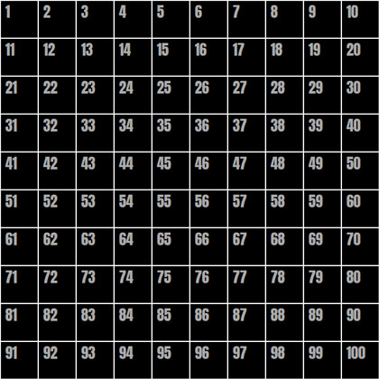
A black ten by ten grid of squares with white borders and numbers in sequential order from left to right.

The numbers in this image represent the numbers of the cell elements in the grid. If we take just a single .cell as an example — let’s say cell 42 — we can select it using :nth-child():

.cell:nth-child(42) { }

But we need to remember a couple of things:

  1. We only want this selector to work when we hover over the cell, so we will attach :hover to it.
  2. We want to select the .content instead of the cell itself, so we’ll use the General Sibling Combinator (~) to do that.

So now, to set --positionX to 1 and --positionY to 3 for .content when the 42nd cell is hovered, we need to do something like this:

.cell:nth-child(42):hover ~ .content {
  --positionX: 1;
  --positionY: 3;
}

But who wants to do that 100 times!? There are a few approaches to make things easier:

  1. Use a Sass @for loop to go through all 100 cells, and do some math to set the proper --positionX and --positionY values for each iteration.
  2. Separate the x- and y-axes to select each row and each column individually with :nth-child’s functional notation.
  3. Combine those two approaches and use a Sass @for loop and :nth-child functional notation.

I thought long and hard about what would be the best and easiest approach to take, and while all of then have pros and cons, I landed on the third approach. The amount of code to write, the quality of the compiled code, and the math complexity all went into my thinking. Don’t agree? Tell my why in the comments!

Setting values with a @for loop

@for $i from 0 to 10 {
 .cell:nth-child(???):hover ~ .content {
    --positionX: #{$i};
  }
  .cell:nth-child(???):hover ~ .content {
    --positionY: #{$i};
  }
}

This is the basic loop. We’re going over it 10 times since we have 10 rows and 10 columns. And we’ve separated the x- and y-axes to set --positionX for each column, and the --positionY for each row. All we need to do now is to replace those ??? things with the proper notation to select each row and column.

Let’s start with the x-axis

Going back to our grid image (the one with numbers),We can see that the numbers of all the cells in the second column are multiples of 10, plus 2. The cells in the third column are multiples of 10 plus 3. And so on.

Now let’s ‘translate’ it into the :nth-child functional notation. Here’s how that looks for the second column:

:nth-child(10n + 2)
  • 10n selects every multiple of 10.
  • 2 is the column number.

And for our loop, we will replace the column number with #{$i + 1} to iterate sequentially:

.cell:nth-child(10n + #{$i + 1}):hover ~ .content {
  --positionX: #{$i};
}

Now lets deal with the y-axis

Look again at the grid image and focus on the fourth row. The cell numbers are somewhere between 41 and 50. The cells in the fifth row are between 51 to 60, and so on. To select each row, we’ll need to define its range. For example, the range for the fourth row is:

.cell:nth-child(n + 41):nth-child(-n + 50)
  • (n + 41) is the start of the range.
  • (-n + 50) is the end of the range.

Now we’ll replace the numbers with some math on the $i value. For the start of the range, we get (n + #{10 * $i + 1}), and for the end of the range we get (-n + #{10 * ($i + 1)}).

So the final @for loop is:

@for $i from 0 to 10 {
 .cell:nth-child(10n + #{$i + 1}):hover ~ .content {
    --positionX: #{$i};
  }
  .cell:nth-child(n + #{10 * $i + 1}):nth-child(-n + #{10 * ($i + 1)}):hover ~ .content {
    --positionY: #{$i};
  }
}

The mapping is done! When we hover over elements, --positionX and --positionY change according to the mouse position. That means we can use them to control the elements inside the .content.

Handling the custom properties

OK, so now we have the mouse position mapped to two custom-properties, The next thing is to use them to control the .square element’s width and height values.

Let’s start with the width and say that we want the minimum width of the .square to be 100px (i.e. when the mouse cursor is at the left side of the screen), and we want it to grow 20px for each step the mouse cursor moves to the right.

Using calc(), we can do that:

.square {
  width: calc(100px + var(--positionX) * 20px);
}

And of course, we’ll do the same for the height, but with --positionY instead:

.square {
  width: calc(100px + var(--positionX) * 20px);
  height: calc(100px + var(--positionY) * 20px);
}

That’s it! Now we have a simple .square element, with a width and height that is controlled by the mouse position. Move your mouse cursor over the window, and see how the square changes its width and height accordingly.

I added a small transition to make the effect smoother. That’s not required, of course. And I’ve also commented out on the .cell border.

Let’s try an alternative method

There might be a case where you want to ‘bypass’ --positionX and --positionY, and set the end value directly inside the @for loop. So, for our example it would look like this:

@for $i from 0 to 10 {
 .cell:nth-child(10n + #{$i + 1}):hover ~ .content {
    --squareWidth: #{100 + $i * 20}px;
  }
  .cell:nth-child(n + #{10 * $i + 1}):nth-child(-n + #{10 * ($i + 1)}):hover ~ .content {
    --squareHeight: #{100 + $i * 20}px;: #{$i};
  }
}

Then the .square would use the custom properties like this:

.square {
  width: var(--squareWidth);
  height: var(--squareHeight);
}

This method is a little more flexible because it allows for more advanced Sass math (and string) functions. That said, the general principle is absolutely the same as what we already covered.

What’s next?

Well, the rest is up to you — and the possibilities are endless! How do you think you’d use it? Can you take it further? Try using this trick in your CSS, and share your work in the comments or let me know about it on Twitter. It will be great to see a collection of these come together.

Here are a few examples to get your hamster wheel turning:


The post How to Map Mouse Position in CSS appeared first on CSS-Tricks.

You can support CSS-Tricks by being an MVP Supporter.


from CSS-Tricks https://ift.tt/3dWx21C
via IFTTT

Featured Snippets Drop to Historic Lows

Posted by Dr-Pete

On February 19, MozCast measured a dramatic drop (40% day-over-day) in SERPs with Featured Snippets, with no immediate signs of recovery. Here's a two-week view (February 10-23):

Here's a 60-day view, highlighting this historic low-point in our 10K-keyword data set:

I could take the graph back further, but let's cut to the chase — this is the lowest prevalence rate of Featured Snippets in our data set since we started collecting reliable data in the summer of 2015.

Are we losing our minds?

After the year we've all had, it's always good to check our sanity. In this case, other data sets showed a drop on the same date, but the severity of the drop varied dramatically. So, I checked our STAT data across desktop queries (en-US only) — over two million daily SERPs — and saw the following:

STAT recorded an 11% day-over-day drop. Interestingly, there's been a 16% total drop since February 10, if we include a second, smaller drop on February 13. While MozCast is desktop-only, STAT has access to mobile data. Here's the desktop/mobile comparison:

While mobile SERPs in STAT showed higher overall prevalence, the pattern was very similar, with a 9% day-over-day-drop on February 19 and a total drop of about 12% since February 10. Note that, while there is considerable overlap, the desktop and mobile data sets may contain different search phrases. While the desktop data set is currently about 2.2M daily SERPs, mobile is closer to 1.7M.

Note that the MozCast 10K keywords are skewed (deliberately) toward shorter, more competitive phrases, whereas STAT includes many more "long-tail" phrases. This explains the overall higher prevalence in STAT, as longer phrases tend to include questions and other natural-language queries that are more likely to drive Featured Snippets.

Why the big difference?

What's driving the 40% drop in MozCast and, presumably, more competitive terms? First things first: we've hand-verified a number of these losses, and there is no evidence of measurement error. One helpful aspect of the 10K MozCast keywords is that they're evenly divided across 20 historical Google Ads categories. While some changes impact industry categories similarly, the Featured Snippet loss showed a dramatic range of impact:

Competitive healthcare terms lost more than two-thirds of their Featured Snippets. It turns out that many of these terms had other prominent features, such as Medical Knowledge Panels. Here are some high-volume terms that lost Featured Snippets in the Health category:

  • diabetes
  • lupus
  • autism
  • fibromyalgia
  • acne

While Finance had a much lower initial prevalence of Featured Snippets, Finance SERPs also saw massive losses on February 19. Some high-volume examples include:

  • pension
  • risk management
  • mutual funds
  • roth ira
  • investment

Like the Health category, these terms have a Knowledge Panel in the right-hand column on desktop, with some basic information (primarily from Wikipedia/Wikidata). Again, these are competitive "head" terms, where Google was displaying multiple SERP features prior to February 19.

Both Health and Finance search phrases align closely with so-called YMYL (Your Money or Your Life) content areas, which, in Google's own words "... could potentially impact a person’s future happiness, health, financial stability, or safety." These are areas where Google is clearly concerned about the quality of the answers they provide.

What about passage indexing?

Could this be tied to the "passage indexing" update that rolled out around February 10? While there's a lot we still don't know about the impact of that update, and while that update impacted rankings and very likely impacted organic snippets of all types, there's no reason to believe that update would impact whether or not a Featured Snippet is displayed for any given query. While the timelines overlap slightly, these events are most likely separate.

Is the snippet sky falling?

While the 40% drop in Featured Snippets in MozCast appears to be real, the impact was primarily on shorter, more competitive terms and specific industry categories. For those in YMYL categories, it certainly makes sense to evaluate the impact on your rankings and search traffic.

Generally speaking, this is a common pattern with SERP features — Google ramps them up over time, then reaches a threshold where quality starts to suffer, and then lowers the volume. As Google becomes more confident in the quality of their Featured Snippet algorithms, they may turn that volume back up. I certainly don't expect Featured Snippets to disappear any time soon, and they're still very prevalent in longer, natural-language queries.

Consider, too, that some of these Featured Snippets may just have been redundant. Prior to February 19, someone searching for "mutual fund" might have seen this Featured Snippet:

Google is assuming a "What is/are ...?" question here, but "mutual fund" is a highly ambiguous search that could have multiple intents. At the same time, Google was already showing a Knowledge Graph entity in the right-hand column (on desktop), presumably from trusted sources:

Why display both, especially if Google has concerns about quality in a category where they're very sensitive to quality issues? At the same time, while it may sting a bit to lose these Featured Snippets, consider whether they were really delivering. While this term may be great for vanity, how often are people at the very beginning of a search journey — who may not even know what a mutual fund is — going to convert into a customer? In many cases, they may be jumping straight to the Knowledge Panel and not even taking the Featured Snippet into account.

For Moz Pro customers, remember that you can easily track Featured Snippets from the "SERP Features" page (under "Rankings" in the left-hand nav) and filter for keywords with Featured Snippets. You'll get a report something like this — look for the scissors icon to see where Featured Snippets are appearing and whether you (blue) or a competitor (red) are capturing them:

Whatever the impact, one thing remains true — Google giveth and Google taketh away. Unlike losing a ranking or losing a Featured Snippet to a competitor, there's very little you can do to reverse this kind of sweeping change. For sites in heavily-impacted verticals, we can only monitor the situation and try to assess our new reality.


Sign up for The Moz Top 10, a semimonthly mailer updating you on the top ten hottest pieces of SEO news, tips, and rad links uncovered by the Moz team. Think of it as your exclusive digest of stuff you don't have time to hunt down but want to read!


from The Moz Blog https://ift.tt/3uFKOf5
via IFTTT

Passkeys: What the Heck and Why?

These things called  passkeys  sure are making the rounds these days. They were a main attraction at  W3C TPAC 2022 , gained support in  Saf...