Tuesday, 5 November 2019

This Is What Happens When You Accidentally De-Index Your Site from Google

Posted by Jeff_Baker

Does reading that title give you a mini-panic attack?

Having gone through exactly as the title suggests, I can guarantee your anxiety is fully warranted.

If you care to relive my nightmare with me — perhaps as equal parts catharsis and SEO study — we will walk through the events chronologically.

Are you ready?

August 4th, 2019

It was a Sunday morning. I was drinking my coffee and screwing around in our SEO tools, like normal, not expecting a damned thing. Then … BAM!

What. The. Hell?

As SEOs, we’re all used to seeing natural fluctuations in rankings. Fluctuations, not disappearances.

Step 1: Denial

Immediately my mind goes to one place: it’s a mistake. So I jumped into some other tools to confirm whether or not Ahrefs was losing its mind.

Google Analytics also showed a corresponding drop in traffic, confirming something was definitely up. So as an SEO, I naturally assumed the worst…

Step 2: Algo panic

Algorithm update. Please, please don’t let it be an algo update.

I jumped into Barracuda’s Panguin Tool to see if our issue coincided with a confirmed update.

No updates. Phew.

Step 3: Diagnosis

Nobody ever thinks clearly when their reptile brain is engaged. You panic, you think irrationally and you make poor decisions. Zero chill.

I finally gathered some presence of mind to think clearly about what happened: It’s highly unusual for keywords rankings to disappear completely. It must be technical.

It must be indexing.

A quick Google search for the pages that lost keyword rankings confirmed that the pages had, in fact, disappeared. Search Console reported the same:

Notice the warning at the bottom:

No: ‘noindex’ detected in ‘robots’ meta tag

Now we were getting somewhere. Next, it was time to confirm this finding in the source code.

Our pages were marked for de-indexing. But how many pages were actually de-indexed so far?

Step 4: Surveying the damage

All of them. After sending a few frantic notes to our developer, he confirmed that a sprint deployed on Thursday evening (August 1, 2019), almost three days prior, had accidentally pushed the code live on every page.

But was the whole site de-indexed?

It’s highly unlikely, because in order for that to happen, Google would have had to crawl every page of the site within three days in order to find the ‘noindex’ markup. Search Console would be no help in this regard, as its data will always be lagging and may never pick up the changes before they are fixed.

Even looking back now, we see that Search Console only picked up a maximum of 249 affected pages, of over 8,000 indexed. Which is impossible, considering our search presence was cut by one-third an entire week after the incident was fixed.

Note: I will never be certain how many pages were fully de-indexed in Google, but what I do know is that EVERY page had ‘noindex’ markup, and I vaguely remember Googling ‘site:brafton.com’ and seeing roughly one-eighth of our pages indexed. Sure wish I had a screenshot. Sorry.

Step 1: Fix the problem

Once the problem was identified, our developer rolled back the update and pushed the site live as it was before the ‘noindex’ markup. Next came the issue of re-indexing our content.

Step 2: Get the site recrawled ASAP

I deleted the old sitemap, built a new one and re-uploaded to Search Console. I also grabbed most of our core product landing pages and manually requested re-indexing (which I don’t fully believe does anything since the most recent SC update).

Step 3: Wait

There was nothing else we could do at this point, other than wait. There were so many questions:

  • Will the pages rank for the same keywords as they did previously?
  • Will they rank in the same positions?
  • Will Google “penalize” the pages in some way for briefly disappearing?

Only time would tell.

August 8th, 2019 (one week) - 33% drop in search presence

In assessing the damage, I’m going to use the date in which the erroring code was fully deployed and populated on live pages (August 2nd) as ground zero. So the first measurement will be seven days completed, August 2nd through August 8th.

Search Console would likely give me the best indication as to how much our search presence had suffered.

We had lost about 33.2% of our search traffic. Ouch.

Fortunately, this would mark the peak level of damage we experienced throughout the entire ordeal.

August 15th, 2019 (two weeks) - 23% drop in traffic

During this period I was keeping an eye on two things: search traffic and indexed pages. Despite re-submitting my sitemap and manually fetching pages in Search Console, many pages were still not being indexed — even core landing pages. This will become a theme throughout this timeline.

As a result of our remaining unindexed pages, our traffic was still suffering.

Two weeks after the incident and we were still 8% down, and our revenue-generating conversions fell with the traffic (despite increased conversion rates).

August 22nd, 2019 (three weeks) - 13% drop in traffic

Our pages were still indexing slowly. Painfully slowly, while I was watching my commercial targets drop through the floor.

At least it was clear that our search presence was recovering. But how it was recovering was of particular interest to me.

Were all the pages re-indexed, but with decreased search presence?

Were only a portion of the pages re-indexed with fully restored search presence?

To answer this question, I took a look at pages that were de-indexed, and re-indexed, individually. Here is an example of one of those pages:

Here’s an example of a page that was de-indexed for a much shorter period of time:

In every instance I could find, each page was fully restored to its original search presence. So it didn’t seem to be a matter of whether or not pages would recover, it was a matter of when pages would be re-indexed.

Speaking of which, Search Console has a new feature in which it will “validate” erroring pages. I started this process on August 26th. After this point, SC slowly recrawled (I presume) these pages to the tune of about 10 pages per week. Is that even faster than a normally scheduled crawl? Do these tools in SC even do anything?

What I knew for certain was there were a number of pages still de-indexed after three weeks, including commercial landing pages that I counted on to drive traffic. More on that later.

August 29th, 2019 (four weeks) - 9% drop in traffic

At this point I was getting very frustrated, because there were only about 150 pages remaining to be re-indexed, and no matter how many times I inspected and requested a new indexing in Search Console, it wouldn’t work.

These pages were fully capable of being indexed (as reported by SC URL inspection), yet they wouldn’t get crawled. As a result, we were still 9% below baseline, after nearly a month.

One particular page simply refused to be re-indexed. This was a high commercial value product page that I counted on for conversions.

In my attempts to force re-indexing, I tried:

  • URL inspection and requesting indexing (15 times over the month).
  • Updating the publish date, then requesting indexing.
  • Updating the content and publish date, then requesting indexing.
  • Resubmitting sitemaps to SC.

Nothing worked. This page would not re-index. Same story for over one hundred other less commercially impactful URLs.

Note: This page would not re-index until October 1st, two full months after it was de-indexed.

By the way, here’s what our overall recovery progress looked like after four weeks:

September 5th, 2019 (five weeks) - 10.4% drop in traffic

The great plateau. At this point we had reindexed all of our pages, save for the ~150 or so supposedly being “validated.”

They weren’t. And they weren’t being recrawled either.

It seemed that we would likely fully recover, but the timing was in Google’s hands, and there was nothing I could do to impact it.

September 12th, 2019 (six weeks) - 5.3% gain in traffic

It took about six weeks before we fully recovered our traffic.

But in truth, we still hadn’t fully recovered our traffic, in that some content overperformed and was overcompensating for a number of pages that were not yet indexed. Notably, our product page that wouldn’t be indexed for another ~2.5 weeks.

On balance, our search presence recovered after six weeks. But our content wasn’t fully re-indexed until eight-plus weeks after fixing the problem.

Conclusion

For starters, definitely don’t de-index your site on accident, for an experiment, or any other reason. It stings. I estimate that we purged about 12% of all organic traffic amounting to an equally proportionate drop on commercial conversions.

What did we learn??

Once pages re-indexed, they were fully restored in terms of search visibility. The biggest issue was getting them re-indexed.

Some main questions we answered with this accidental experiment:

Did we recover?

Yes, we fully recovered and all URLs seem to drive the same search visibility.

How long did it take?

Search visibility returned to baseline after six weeks. All pages re-indexed after about eight to nine weeks.


Sign up for The Moz Top 10, a semimonthly mailer updating you on the top ten hottest pieces of SEO news, tips, and rad links uncovered by the Moz team. Think of it as your exclusive digest of stuff you don't have time to hunt down but want to read!


from The Moz Blog https://ift.tt/36DmwGG
via IFTTT

Monday, 4 November 2019

Float Element in the Middle of a Paragraph

Say you want to have an image (or any other element) visually float left into a paragraph of text. But like... in the middle of the paragraph, not right at the top. It's doable, but it's certainly in the realm of CSS trickery!

One thing you can do is slap the image right in the middle of the paragraph:

<p>
  Lorem ipsum dolor sit amet consectetur, adipisicing 
  <img src="tree.jpg" alt="An oak tree." />
  elit. Similique quibusdam aliquam provident suscipit 
  corporis minima? Voluptatem temporibus nulla
</p>

But that's mega awkward. Note the alt text. We can't have random alt text in the middle of a sentence. It's semantically blech and literally confusing for people using assistive technology.

So what we have to do is put the image before the paragraph.

<img src="tree.jpg" alt="An oak tree." />

<p>
  Lorem ipsum dolor sit amet consectetur, adipisicing 
  elit. Similique quibusdam aliquam provident suscipit 
  corporis minima? Voluptatem temporibus nulla
</p>

But when we do that, we aren't exactly floating the image in the middle of the paragraph anymore. It's right at the top. No margin-top or vertical translate or anything is going to save us here. margin will just extend the height of the floated area and translate will push the image into the text.

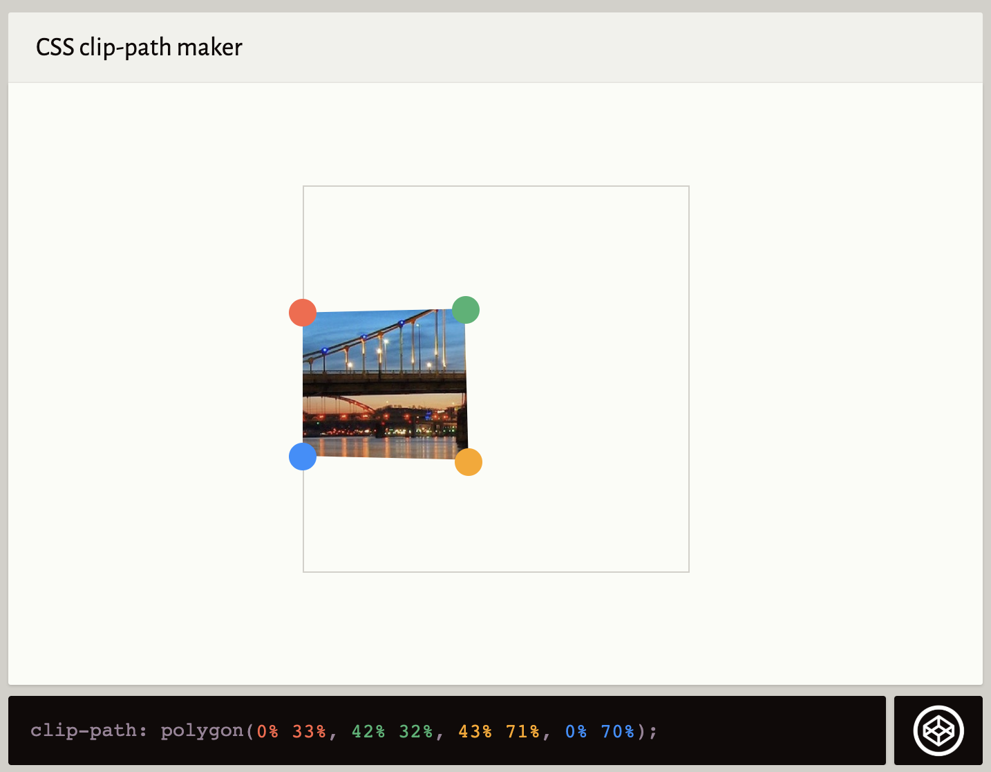
The trick, at least one I've found, is to leverage shape-outside and a polygon() to re-shape the floated area around where you want it. You can skip the top-left part. Using Clippy is a great way to get a start to the polygon:

But instead of the clip-path Clippy gives you by default, you apply that value to shape-outside.

That should be enough if you are just placing a box in that place. But if it's literally an image or needs a background color, you might also need to apply clip-path and perhaps transform things into place. This is where I ended up with some fiddling.

See the Pen
Float cutout in middle of paragraph.
by Chris Coyier (@chriscoyier)
on CodePen.

The post Float Element in the Middle of a Paragraph appeared first on CSS-Tricks.


from CSS-Tricks https://ift.tt/2JPUi1t
via IFTTT

The Trick to Animating the Dot on the Letter “i”

Here’s the trick: by combining the Turkish letter "ı" and the period "." we can create something that looks like the letter "i," but is made from two separate elements. This opens us up to some fun options to style or animate the dot of the letter independently from the stalk. Worried about accessibility? Don’t worry, we’ll cover that the best way we know how.

Let’s look at how to create and style these separate "letters," and find out when they can be used, and when to avoid them.

Check out some examples

Here are some different styles and animations we can do with this idea:

See the Pen
Styles and animations
by Ali C (@alichur)
on CodePen.

Because both parts of the letter are regular Unicode characters, they will respect font changes and page zoom the same as any other text. Here’s some examples of different fonts, styles, and zoom levels:

See the Pen
Different fonts and zoom
by Ali C (@alichur)
on CodePen.

Step-by-step through the technique

Let’s break down how this technique works.

Choose the Unicode characters to combine

We are using the dotless "i" character (ı) and a full stop. And, yes, we could use other characters as well, such as the dotless "j" character (ȷ) or even the accents on characters such as "ñ" (~) or "è" (`).

Stack the characters on top of each other by wrapping them in a span and setting the display property to block.

<span class="character">.</span>
<span class="character">ı</span>
.character {
  display: block;
}

Align the characters

They need to be close to each other. We can do that by adjusting the line heights and removing the margins from them.

.character {
  display: block;
  line-height: 0.5;
  margin-top: 0;
  margin-bottom: 0;
}

Add a CSS animation to the dot element

Something like this bouncing animation:

@keyframes bounce {
  from {
    transform: translate3d(0, 0, 0);
  }

  to {
    transform: translate3d(0, -10px, 0);
  }
}

.bounce {
  animation: bounce 0.4s infinite alternate;
}

There’s more on CSS animations in the CSS-Tricks Almanac.

Checking in, here’s where we are so far:

See the Pen
Creating the letter
by Ali C (@alichur)
on CodePen.

Add any remaining letters of the word

It’s fine to animate the "i" on its own, but perhaps it’s merely one letter in a word, like "Ping." We’ll wrap the animated characters in a span to make sure everything stays on a single line.

<p>
  P
  <span>
    <span class="character">.</span>
    <span class="character>ı</span> 
  </span>
  ng
</p>

There’s an automatic gap between inline-block elements, so be sure to remove that if the spacing looks off.

The final stages:

See the Pen
Adding the letter inside a word
by Ali C (@alichur)
on CodePen.

What about SVG?

The same effect can be achieved by creating a letter from two or more SVG elements. Here's an example where the circle element is animated independently from the rectangle element.

See the Pen
SVG animated i
by Ali C (@alichur)
on CodePen.

Although an SVG letter won’t respond to font changes, it opens up more possibilities for animating sections of letters that aren’t represented by Unicode characters and letter styles that don't exist in any font.

Where would you use this?

Where would you want to use something like this? I mean, it’s not a great use case for body content or any sort of long-form content. Not only would that affect legibility (can you imagine if every "i" in this post was animated?) but it would have a negative impact on assistive technology, like screen readers, which we will touch on next.

Instead, it’s probably best to use this technique where the content is intended for decoration. A logo is a good example of that. Or perhaps in an icon that’s intended to be described, but not interpreted as text by assistive technology.

Let’s talk accessibility

Going back to our "Ping" example, a screen reader will read that as P . ı ng. Not exactly the pronunciation we’re looking for and definitely confusing to anyone listening to it.

Depending on the usage, different ARIA attributes can be added so that text is read differently. For example, we can describe the entire element as an image and add the text as its label:

<div role=img aria-label="Ping">
  <p>P<span>.</span><span>ı</span>ng</p>
</div>

This way, the outer div element describes the meaning of the text which gets read by screen readers. However, we also want assistive technology to skip the inner elements. We can add aria-hidden="true" or role="presentation" to them so that they are also not interpreted as text:

<div role=img aria-label="Ping">
  <p role="presentation">P
    <span>.</span>
    <span>ı</span>
  ng</p>
</div>

This was only tested on a Mac with VoiceOver in Safari. If there are issues in other assistive technology, please let us know in the comments.

More Unicode!

There’s many more "letters" we can create by combining Unicode characters. Here's a full outline of common glyphs, or you can have some fun with the ones below and share your creations in the comments. But remember: no cool effect is worth compromising accessibility on a live site!

First Glyph Second Glyph Combined
ı . i
ȷ . j
n ~ ñ
a e æ
a ` à

The post The Trick to Animating the Dot on the Letter “i” appeared first on CSS-Tricks.


from CSS-Tricks https://ift.tt/33h1fQN
via IFTTT

Have Your Agency’s Clients Considered a Local Product Kiosk? Google Has.

Posted by MiriamEllis

File this under fresh ideas for stagnant clients.

It’s 10:45 at night and I’m out of:

  • Tortillas
  • Avocados
  • Salsa

Maybe I just got off of work, like millions of other non-nine-to-fivers. Maybe I was running around with my family all day and didn’t get my errands done. Maybe I was feeling too sick to appear in a public grocery store wrapped in the ratty throw from my sofa.

And now, most of the local shops are closed for the night and I’m sitting here, taco-less and sad.

But what if it didn’t have to be that way? What if I could search Google and find a kiosk just a couple of blocks away that would vend me solutions, no matter what time of night or day?

Something old is becoming new again, just like home delivery. And for your agency’s local business clients, the opportunity could become an amazing competitive advantage.

What’s up with kiosks?

Something old

The automat was invented in Germany in the late 19th century and took off in the US in the decades following, with industry leader Horn & Hardart’s last New York location only closing in 1991. These famous kiosks fed thousands of Americans on a daily basis with on-demand servings of macaroni, fish cakes, baked beans, and chicory coffee. The demise of the automat is largely blamed on the rise of the fast food industry, with Burger Kings even opening doors at former automat locations.

Something new

A couple of weeks ago, I was watching an episode of my favorite local SEO news roundup in which Ignitor Digital’s Carrie Hill mentioned a meat vending kiosk. I was immediately intrigued and wanted to know more about this. What I learned sparked my imagination on behalf of local businesses which are always benefitted by at least considering fresh ideas, even if those ideas are actually just taking a page from history and editing it a bit.

Something inspirational

What I learned from my research is that the Applestone Meat Company is distinguishing itself from the competition by offering a 24/7 butcher shop via two vending installations in the state of New York. They also have a drive-up service window from 11am–6pm, but for the countless potential customers who are at work or elsewhere during so-called “normal business hours,” the meat kiosks are ever-ready to serve.

CEO Joshua Applestone says he was inspired by the memory of Horn & Hardart and he must be one smart local business owner to have taken this bold plunge. The company has already earned some pretty awesome unstructured citations from the likes of Bloomberg with this product marketing strategy and they’re planning to open ten more kiosks in the near future.

But Applestone isn’t alone. A kiosk can technically just be a fancy vending machine. Check out Chicago startup Farmer’s Fridge. They recently closed a $30 million Series C round led by one-time Google CEO Eric Schmidt’s Innovation Endeavors. Their 200+ midwestern units provide granola, Greek yogurt, pasta, wraps, beverages, and similar on-the-go fare, and they donate leftovers to local food pantries.

Americans have long been accustomed to ATM machines. DVD and game rental stations are old news to us. We are nowhere near Japan, with its sixty-billion-dollar-a-year, national vending machine density of one machine per 23 citizens, and its automated sales of everything from ramen to socks to umbrellas. Geography and economics don’t point to the need to go to such a level in the US, but where convenience is truly absent, opportunity may reside. What might that look like?

Use your imagination

My corner of the world is famous for its sourdough bread. There are hundreds of regional bakeries competing with one another for the crustiest, lightest, most indulgent loaf. But, if you don’t make it to the local stores by early afternoon, your favorite brand is likely to have sold out. And if you’re working the 47-hour American work week, or gigging California night and day but don’t want to live on fast food, you’d likely be quite grateful to have your access to artisan baguettes restored.

Just imagine every bread bakery around the SF Bay Area installing a kiosk outside its front door, and you can hear the satisfied after-hours crunching, can’t you?

Applestone is selling unprepared meat, Farmer’s Fridge is selling prepared meals, and almost anything people nosh could be a candidate for a kiosk, but why should on-demand products be limited to food? I let my imagination meander and jotted down a quick list of things people might buy at various off-hours, if a machine existed outside the storefront:

  • Books/magazines
  • Weather-appropriate basic apparel (sweatshirts, socks, t-shirts)
  • First aid supplies
  • Baby care supplies
  • Emergency electronics (chargers, batteries, flashlights)
  • Basic auto repair supplies (headlight bulbs, wipers, puncture kits)
  • Personal care products (bathroom tissue, toiletries)
  • Office supplies (printer ink, paper, envelopes, stamps)
  • Household goods (lightbulbs, laundry soap, pantry basics)
  • Pet supplies
  • Travel/camping/athletic supplies
  • Basic craft supplies, small games, gifts, etc.

What if customers who do their morning bike ride at 5 AM knew they could stop by your client’s kiosk to fix a punctured tire? What if night workers knew they could pick up a box of light bulbs or bandages or cat food on their way to their shift? Think of the convenience — in some instances even life-saving help — that could be provided to travelers on the road at all hours, members of your community who are housing-insecure, or whole neighborhoods that lack access to basic goods?

Not every local business has the right model for a kiosk, but once I started to think about it, I realized just how many of them could. I’m initially envisioning these machines being installed at the place of business, but, where the scenario is right, a company with the right type of inventory could certainly place additional kiosks in strategic locations around the communities they wish to serve.

Kiosk Local SEO

Clearly, kiosks can generate revenue, but what could they do for clients’ online presence? The guidelines for representing your business on Google already support the creation of local business listings for ATMs, video rental stations, and express mail dropboxes. But I went straight to Google with the Applewood example to ask if this emerging type of kiosk would be permitted to create listings. They were kind enough to reply:

Twitter DM from Google rep: kiosks are able to create listings, as per guidelines

The link in the Twitter DM reply just pointed to the general guidelines, and I can find no reference to the term “Food Kiosk listing” in them. It’s the first time I’ve ever heard this terminology. But, clearly this representative is naming food kiosks as a “thing.” Google, it seems, is already quite aware of this business model. And the proof of their support is in the Maps pudding:

My, my! Talk about having the ability to hyperlocalize your local search marketing to fit Google’s extreme emphasis on user-to-business proximity. Enough to make any local SEO agency see conversions and dollar signs for clients.

Tip #1: Helpline phone numbers

I’ve written about ATM SEO in the past for financial publications, and so I’ll add one important tip for creating eligible Google listings for kiosks: guidelines require that you have a helpline phone number for kiosk users. I would post this number both on the listings and on the units, themselves. Note that this will likely mean you have a shared phone number on multiple listings, which isn’t typically deemed ideal for local search marketing, but if kiosks become your model and you avoid any semblance of creating fake listings, Google can likely handle it.

Tip #2: Unique local landing pages for your kiosks

I can also see value in creating unique location landing pages on client websites for their kiosks, especially if they aren’t stationed at your physical location. These pages could give excellent driving and walking directions for each unit, explain how to use the machine, feature reviews and testimonials for that location, and perhaps highlight new inventory.

Tip #3: Capitalize on your social media

Social media will also be an excellent vehicle for letting particular neighborhoods know about client kiosks and engaging with communities to understand their sentiments. Seek abundant feedback about what is and isn’t working for customers and how inventory could better serve their needs. And, of course, be sure every client is monitoring reviews like a low-flying hawk.

Is there an appetite for kiosks?

Image credit: Ben Chun

I’m a longtime observer of rural local SEO. I’ve learned that being intentional in noticing small things can lead to big ideas, and almost any novel concept is worth floating to clients. The tiny, free book lending kiosks sometimes officially branded “Little Free Libraries” are everywhere in my county, have become a non-profit initiative, and are driving Etsy sales of cute wooden contraptions. Moreover, my region is dotted with unstaffed farm stands that operate on the honor system, trusting neighbors to pay for what they take. I’d say our household purchases about half of our produce from them.

Within recent recall, the milkman and the grocery delivery boy seemed as distant as the phonograph. Now, consumers are showing interest in having whole meal kitsentire wardrobes, and just about everything delivered. The point being: don’t discount anything that renders convenience; not the traveling salesman, not the automat.

The decision to experiment with a kiosk isn’t a simple one. There will be financial aspects, like how to access a unit that works for the inventory being sold. There will be security questions, as most businesses probably won’t feel comfortable operating on the honor system.

But if the question is whether there is an appetite for the right kiosk, selling the right goods, in the right place, I’ll close today with a look at these provocative, illuminating reviews from just one location of Farmer’s Fridge:

Screenshot: Multiple positive five-star Yelp reviews praising existing kiosks

Sign up for The Moz Top 10, a semimonthly mailer updating you on the top ten hottest pieces of SEO news, tips, and rad links uncovered by the Moz team. Think of it as your exclusive digest of stuff you don't have time to hunt down but want to read!


from The Moz Blog https://ift.tt/36xVzEc
via IFTTT

Friday, 1 November 2019

Become a Front-End Master in 2020 With These 10 Project Ideas

This is a little updated cross-post from a quickie article I wrote on DEV. I'm publishing here 'cuz I'm all IndieWeb like that.

I love this post by Simon Holdorf. He's got some ideas for how to level up your skills as a front-end developer next year. Here they are:

  • Build a movie search app using React
  • Build a chat app with Vue
  • Build a weather app with Angular
  • Build a to-do app with Svelte

... and 5 more like that.

All good ideas. All extremely focused on JavaScript frameworks.
I like thinking of being a front-end developer as being someone who is a browser person. You deal with people who use some kind of client to use the web on some kind of device. That's the job.

I love JavaScript frameworks, but knowing them isn't what makes you a good front-end developer. Being performance-focused and accessibility-focused, and thus user-focused is what makes you a front-end master, beyond executing the skills required to get the website built.

In that vein, here's some more ideas.

  • Go find a Dribbble shot that appeals to you. Re-build it in HTML and CSS in the cleanest and most accessible way you can.
  • Find a component you can abstract in your codebase, and abstract it so you can re-use it efficiently. Consider accessibility as you do it. Could you make it more accessible in a way that benefits the entire site? How about your SVG icon component — how's that looking these days?
  • Try out a static site generator (perhaps one that isn't particularly JavaScript focused, just to experience it). What could the data source be? What could you make if you ran the build process on a timed schedule?
  • Install the Axe accessibility plugin for DevTools and run it on an important site you control. Make changes to improve the accessibility as it suggests.
  • Spin up a copy of Fractal. Check out how it can help you think about building front-ends as components, even at the HTML and CSS level.
  • Build a beautiful form in HTML/CSS that does something useful for you, like receive leads for freelance work. Learn all about form validation and see how much you can do in just HTML, then HTML plus some CSS, then with some vanilla JavaScript. Make the form work by using a small dedicated service.
  • Read a bit about Serverless and how it can extend your front-end developer skillset.
  • Figure out how to implement an SVG icon system. So many sites these days need an icon set. Inlining SVG is a great simple solution, but how you can abstract that to easily implement it with your workflow? How can it work with the framework you use?
  • Try to implement a service worker. Read a book about them. Do something very small. Check out a framework centered around them.
  • Let's say you needed to put up a website where the entire thing was the name and address of the company, and a list of hours it is open. What's the absolute minimum amount of work and technical debt you could incur to do it?

The post Become a Front-End Master in 2020 With These 10 Project Ideas appeared first on CSS-Tricks.


from CSS-Tricks https://ift.tt/36spddK
via IFTTT

A Look at JAMstack’s Speed, By the Numbers

People say JAMstack sites are fast — let’s find out why by looking at real performance metrics! We’ll cover common metrics, like Time to First Byte (TTFB) among others, then compare data across a wide section of sites to see how different ways to slice those sites up compare.

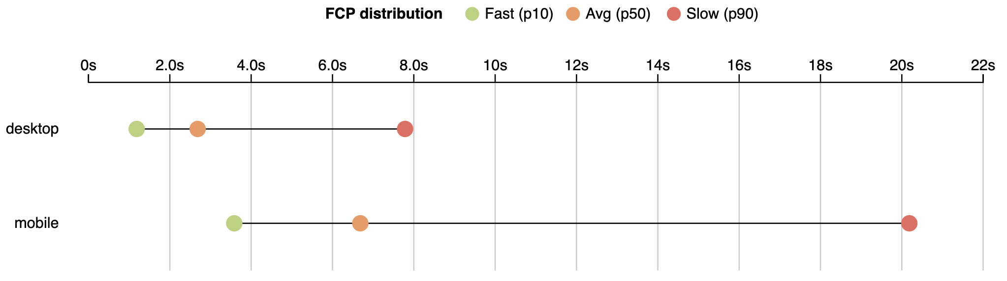
First, I’d like to present a small analysis to provide some background. According to the HTTPArchive metrics report on page loading, users wait an average of 6.7 seconds to see primary content.

First Contentful Paint (FCP) - measures the point at which text or graphics are first rendered to the screen.

The FCP distribution for the 10th, 50th and 90th percentile values as reported on August 1, 2019.

If we are talking about engagement with a page (Time to Interactive), users wait even longer. The average time to interactive is 9.3 seconds.

Time to Interactive (TTI) - a time when user can interact with a page without delay.

TTI distribution for the 10th, 50th and 90th percentile values as reported on August 1, 2019.

State of the real user web performance

The data above is from lab monitoring and doesn't fully represent real user experience. Real users data based taken from the Chrome User Experience Report (CrUX) shows an even wider picture.

​​I’ll use data aggregated from users who use mobile devices. Specifically, we will use metrics like:


Time To First Byte

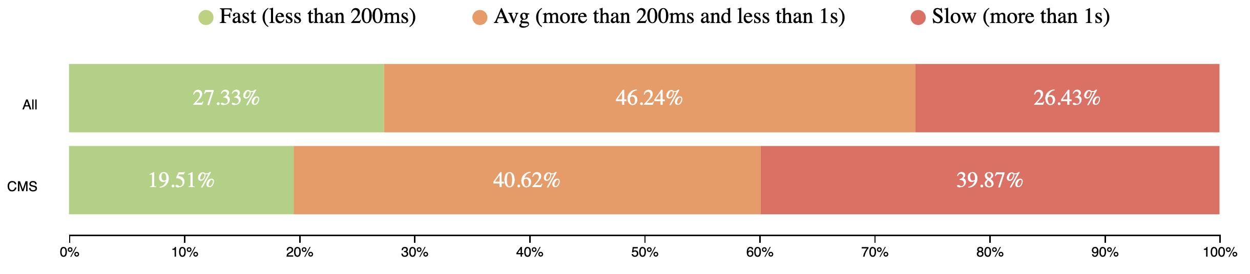
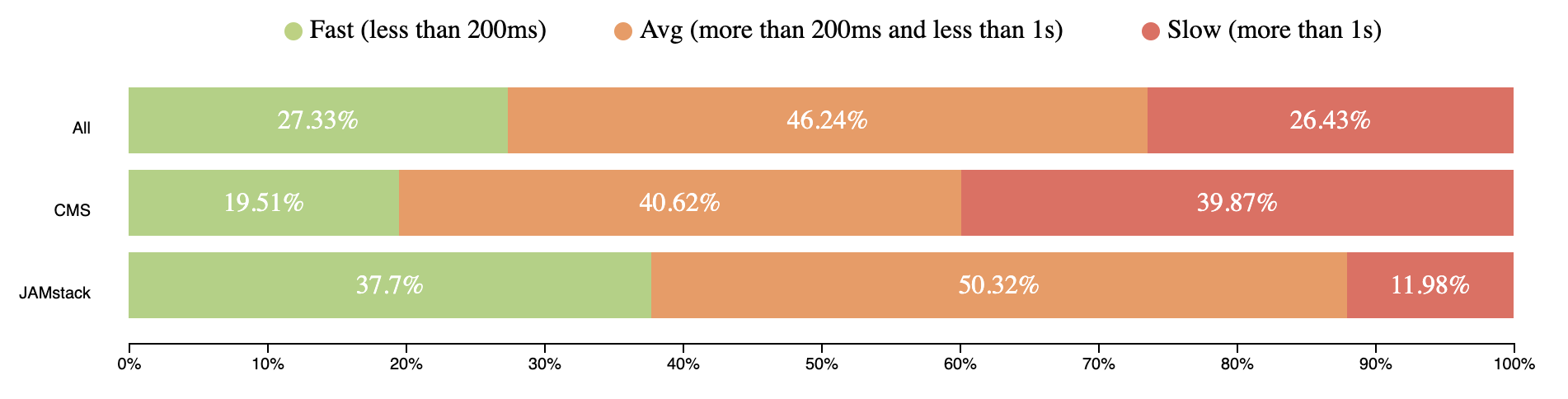
TTFB represents the time browser waits to receive first bytes of the response from server. TTFB takes from 200ms to 1 second for users around the world. It’s a pretty long time to receive the first chunks of the page.

TTFB mobile speed distribution (CrUX, July 2019)

First Contentful Paint

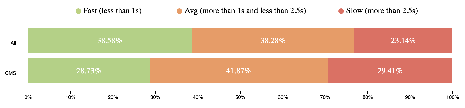
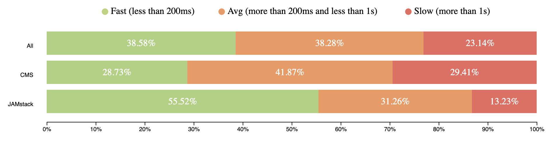
FCP happens after 2.5 seconds for 23% of page views around the world.

FCP mobile speed distribution (CrUX, July 2019)

First Input Delay

FID metrics show how fast web pages respond to user input (e.g. click, scroll, etc.).

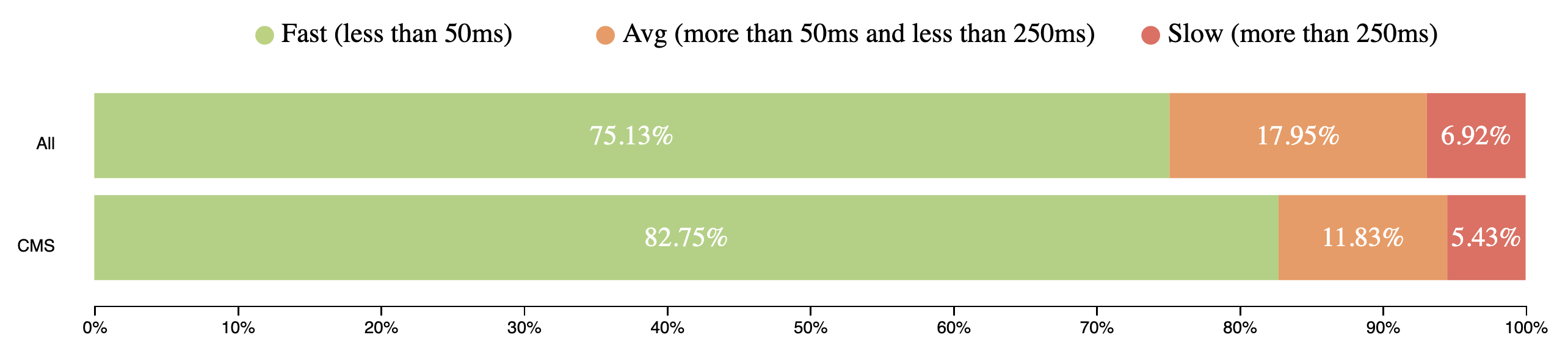
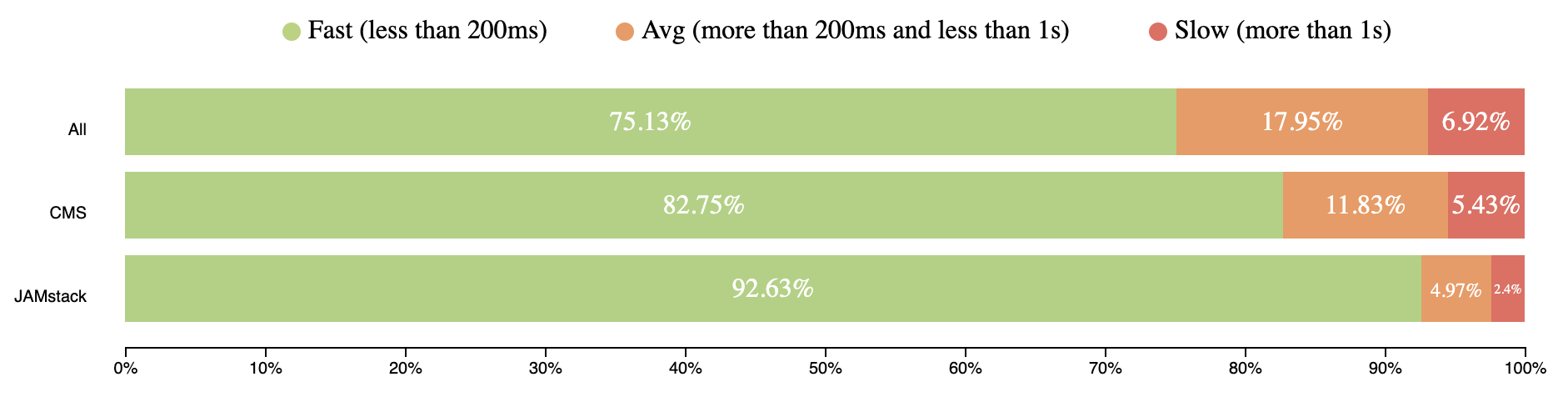
CrUX doesn’t have TTI data due to different restrictions, but has FID, which is even better can reflect page interactivity. Over 75% of mobile user experiences have input delay for 50ms and users didn't experience any jank.

FID mobile speed distribution (CrUX, July 2019)

You can use the queries below and play with them on this site.

Data from July 2019
[
    {
      "date": "2019_07_01",
      "timestamp": "1561939200000",
      "client": "desktop",
      "fastTTFB": "27.33",
      "avgTTFB": "46.24",
      "slowTTFB": "26.43",
      "fastFCP": "48.99",
      "avgFCP": "33.17",
      "slowFCP": "17.84",
      "fastFID": "95.78",
      "avgFID": "2.79",
      "slowFID": "1.43"
    },
    {
      "date": "2019_07_01",
      "timestamp": "1561939200000",
      "client": "mobile",
      "fastTTFB": "23.61",
      "avgTTFB": "46.49",
      "slowTTFB": "29.89",
      "fastFCP": "38.58",
      "avgFCP": "38.28",
      "slowFCP": "23.14",
      "fastFID": "75.13",
      "avgFID": "17.95",
      "slowFID": "6.92"
    }
  ]
BigQuery
#standardSQL
  SELECT
    REGEXP_REPLACE(yyyymm, '(\\d{4})(\\d{2})', '\\1_\\2_01') AS date,
    UNIX_DATE(CAST(REGEXP_REPLACE(yyyymm, '(\\d{4})(\\d{2})', '\\1-\\2-01') AS DATE)) * 1000 * 60 * 60 * 24 AS timestamp,
    IF(device = 'desktop', 'desktop', 'mobile') AS client,
    ROUND(SUM(fast_fcp) * 100 / (SUM(fast_fcp) + SUM(avg_fcp) + SUM(slow_fcp)), 2) AS fastFCP,
    ROUND(SUM(avg_fcp) * 100 / (SUM(fast_fcp) + SUM(avg_fcp) + SUM(slow_fcp)), 2) AS avgFCP,
    ROUND(SUM(slow_fcp) * 100 / (SUM(fast_fcp) + SUM(avg_fcp) + SUM(slow_fcp)), 2) AS slowFCP,
    ROUND(SUM(fast_fid) * 100 / (SUM(fast_fid) + SUM(avg_fid) + SUM(slow_fid)), 2) AS fastFID,
    ROUND(SUM(avg_fid) * 100 / (SUM(fast_fid) + SUM(avg_fid) + SUM(slow_fid)), 2) AS avgFID,
    ROUND(SUM(slow_fid) * 100 / (SUM(fast_fid) + SUM(avg_fid) + SUM(slow_fid)), 2) AS slowFID
  FROM
    `chrome-ux-report.materialized.device_summary`
  WHERE
    yyyymm = '201907'
  GROUP BY
    date,
    timestamp,
    client
  ORDER BY
    date DESC,
    client

State of Content Management Systems (CMS) performance

CMSs should have become our saviors, helping us build faster sites. But looking at the data, that is not the case. The current state of CMS performance around the world is not so great.

TTFB mobile speed distribution comparison between all web and CMS (CrUX, July 2019)
Data from July 2019
[
    {
      "freq": "1548851",
      "fast": "0.1951",
      "avg": "0.4062",
      "slow": "0.3987"
    }
  ]
BigQuery
#standardSQL
  SELECT
    COUNT(DISTINCT origin) AS freq,
      
    ROUND(SUM(IF(ttfb.start < 200, ttfb.density, 0)) / SUM(ttfb.density), 4) AS fastTTFB,
    ROUND(SUM(IF(ttfb.start >= 200 AND ttfb.start < 1000, ttfb.density, 0)) / SUM(ttfb.density), 4) AS avgTTFB,
    ROUND(SUM(IF(ttfb.start >= 1000, ttfb.density, 0)) / SUM(ttfb.density), 4) AS slowTTFB
  
  FROM
    `chrome-ux-report.all.201907`,
    UNNEST(experimental.time_to_first_byte.histogram.bin) AS ttfb
  JOIN (
    SELECT
      url,
      app
    FROM
      `httparchive.technologies.2019_07_01_mobile`
    WHERE
      category = 'CMS'
    )
  ON CONCAT(origin, '/') = url
  ORDER BY
    freq DESC

And here are the FCP results:

FCP mobile speed distribution comparison between all web and CMS (CrUX, July 2019)

At least the FID results are a bit better:

FID mobile speed distribution comparison between all web and CMS (CrUX, July 2019)
Data from July 2019
[
    {
      "freq": "546415",
      "fastFCP": "0.2873",
      "avgFCP": "0.4187",
      "slowFCP": "0.2941",
      "fastFID": "0.8275",
      "avgFID": "0.1183",
      "slowFID": "0.0543"
    }
  ]
BigQuery
#standardSQL
  SELECT
    COUNT(DISTINCT origin) AS freq,
    ROUND(SUM(IF(fcp.start < 1000, fcp.density, 0)) / SUM(fcp.density), 4) AS fastFCP,
    ROUND(SUM(IF(fcp.start >= 1000 AND fcp.start < 2500, fcp.density, 0)) / SUM(fcp.density), 4) AS avgFCP,
    ROUND(SUM(IF(fcp.start >= 2500, fcp.density, 0)) / SUM(fcp.density), 4) AS slowFCP,
    ROUND(SUM(IF(fid.start < 50, fid.density, 0)) / SUM(fid.density), 4) AS fastFID,
    ROUND(SUM(IF(fid.start >= 50 AND fid.start < 250, fid.density, 0)) / SUM(fid.density), 4) AS avgFID,
    ROUND(SUM(IF(fid.start >= 250, fid.density, 0)) / SUM(fid.density), 4) AS slowFID
  FROM
    `chrome-ux-report.all.201907`,
    UNNEST(first_contentful_paint.histogram.bin) AS fcp,
    UNNEST(experimental.first_input_delay.histogram.bin) AS fid
  JOIN (
    SELECT
      url,
      app
    FROM
      `httparchive.technologies.2019_07_01_mobile`
    WHERE
      category = 'CMS'
    )
  ON CONCAT(origin, '/') = url
  ORDER BY
    freq DESC

As you can see, sites built with a CMS perform not much better than the overall performance of sites on web.

You can find performance distribution across different CMSs on this HTTPArchive forum discussion.

E-Commerce websites, a good example of sites that are typically built on a CMS, have really bad stats for page views:

  • ~40% - 1second for TTFB
  • ~30% - more than 1.5 second for FCP
  • ~12% - lag for page interaction.

I faced clients who requested support of IE10-IE11 because the traffic from those users represented 1%, which equalled millions of dollars in revenue. Please, calculate your losses in case 1% of users leave immediately and never came back because of bad performance. If users aren’t happy, business will be unhappy, too.

To get more details about how web performance correlates with revenue, check out WPO Stats. It’s a list of case studies from real companies and their success after improving performance.

JAMstack helps improve web performance

Credit: Snipcart

With JAMstack, developers do as little rendering on the client as possible, instead using server infrastructure for most things. Not to mention, most JAMstack workflows are great at handling deployments, and helping with scalability, among other benefits. Content is stored statically on a static file hosts and provided to the users via CDN.

Read Mathieu Dionne's "New to JAMstack? Everything You Need to Know to Get Started" for a great place to become more familiar with JAMstack.

I had two years of experience working with one of the popular CMSs for e-commerce and we had a lot of problems with deployments, performance, scalability. The team would spend days and fixing them. It’s not what customers want. These are the sorts of big issues JAMstack solves.

Looking at the CrUX data, JAMstack sites performance looks really solid. The following values are based on sites served by Netlify and GitHub. There is some discussion on the HTTPArchive forum where you can participate to make data more accurate.

Here are the results for TTFB:

TTFB mobile speed distribution comparison between all web, CMS and JAMstack sites (CrUX, July 2019)
Data from July 2019
[
  {
    "n": "7627",
    "fastTTFB": "0.377",
    "avgTTFB": "0.5032",
    "slowTTFB": "0.1198"
  }
]
BigQuery
#standardSQL
SELECT
  COUNT(DISTINCT origin) AS n,
  ROUND(SUM(IF(ttfb.start < 200, ttfb.density, 0)) / SUM(ttfb.density), 4) AS fastTTFB,
  ROUND(SUM(IF(ttfb.start >= 200 AND ttfb.start < 1000, ttfb.density, 0)) / SUM(ttfb.density), 4) AS avgTTFB,
  ROUND(SUM(IF(ttfb.start >= 1000, ttfb.density, 0)) / SUM(ttfb.density), 4) AS slowTTFB
FROM
  `chrome-ux-report.all.201907`,
  UNNEST(experimental.time_to_first_byte.histogram.bin) AS ttfb
JOIN
  (SELECT url, REGEXP_EXTRACT(LOWER(CONCAT(respOtherHeaders, resp_x_powered_by, resp_via, resp_server)),
      '(netlify|x-github-request)')
    AS platform
  FROM `httparchive.summary_requests.2019_07_01_mobile`)
ON
  CONCAT(origin, '/') = url
WHERE
  platform IS NOT NULL
ORDER BY
  n DESC

Here's how FCP shook out:

FCP mobile speed distribution comparison between all web, CMS and JAMstack sites (CrUX, July 2019)

Now let's look at FID:

FID mobile speed distribution comparison between all web, CMS and JAMstack sites (CrUX, July 2019)
Data from July 2019
[
    {
      "n": "4136",
      "fastFCP": "0.5552",
      "avgFCP": "0.3126",
      "slowFCP": "0.1323",
      "fastFID": "0.9263",
      "avgFID": "0.0497",
      "slowFID": "0.024"
    }
  ]
BigQuery
#standardSQL
  SELECT
    COUNT(DISTINCT origin) AS n,
    ROUND(SUM(IF(fcp.start < 1000, fcp.density, 0)) / SUM(fcp.density), 4) AS fastFCP,
    ROUND(SUM(IF(fcp.start >= 1000 AND fcp.start < 2500, fcp.density, 0)) / SUM(fcp.density), 4) AS avgFCP,
    ROUND(SUM(IF(fcp.start >= 2500, fcp.density, 0)) / SUM(fcp.density), 4) AS slowFCP,
    ROUND(SUM(IF(fid.start < 50, fid.density, 0)) / SUM(fid.density), 4) AS fastFID,
    ROUND(SUM(IF(fid.start >= 50 AND fid.start < 250, fid.density, 0)) / SUM(fid.density), 4) AS avgFID,
    ROUND(SUM(IF(fid.start >= 250, fid.density, 0)) / SUM(fid.density), 4) AS slowFID
  FROM
    `chrome-ux-report.all.201907`,
    UNNEST(first_contentful_paint.histogram.bin) AS fcp,
    UNNEST(experimental.first_input_delay.histogram.bin) AS fid
  JOIN
    (SELECT url, REGEXP_EXTRACT(LOWER(CONCAT(respOtherHeaders, resp_x_powered_by, resp_via, resp_server)),
        '(netlify|x-github-request)')
      AS platform
    FROM `httparchive.summary_requests.2019_07_01_mobile`)
  ON
    CONCAT(origin, '/') = url
  WHERE
    platform IS NOT NULL
  ORDER BY
    n DESC

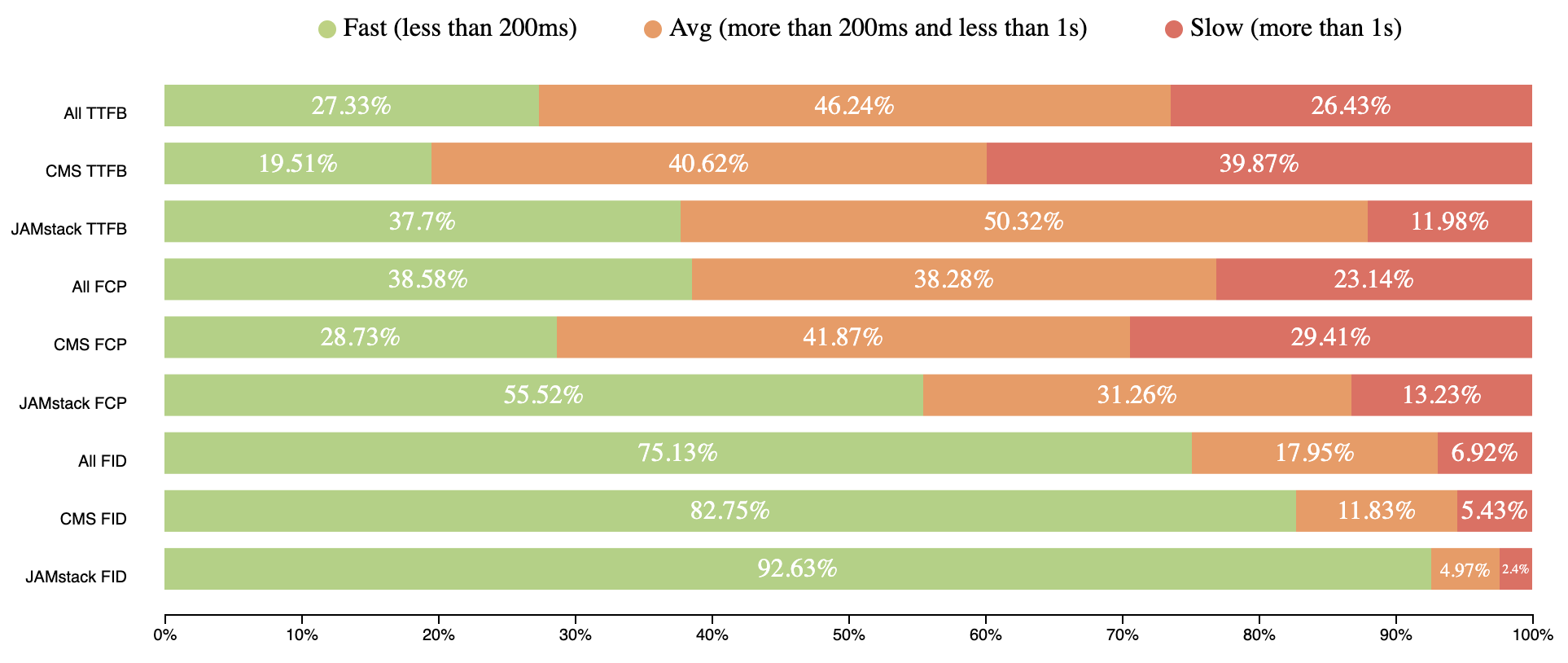
The numbers show the performance of JAMstack sites is the best. The numbers are pretty much the same for mobile and desktop which is even more amazing!

Some highlights from engineering leaders

Let me show you a couple of examples from some prominent folks in the industry:

JAMstack sites are generally CDN-hosted and mitigate TTFB. Since the file hosting is handled by infrastructures like Amazon Web Services or similar, all sites performance can be improved in one fix.

One more real investigation says that it is better to deliver static HTML for better FCP.

Here's a comparison for all results shown above together:

Mobile speed distribution comparison between all web, CMS and JAMstack sites (CrUX, July 2019)

JAMstack brings better performance to the web by statically serving pages with CDNs. This is important because a fast back-end that takes a long time to reach users will be slow, and likewise, a slow back-end that is quick to reach users will also be slow.

JAMstack hasn’t won the perf race yet, because the number of sites built with it not so huge as for example for CMS, but the intention to win it is really great.

Adding these metrics to a performance budget can be one way make sure you are building good performance into your workflow. Something like:

  • TTFB: 200ms
  • FCP: 1s
  • FID: 50ms

Spend it wisely 🙂


Editor’s note: Artem Denysov is from Stackbit, which is a service that helps tremendously with spinning up JAMstack sites and more upcoming tooling to smooth out some of the workflow edges with JAMstack sites and content. Artem told me he’d like to thank Rick Viscomi, Rob Austin, and Aleksey Kulikov for their help in reviewing the article.

The post A Look at JAMstack’s Speed, By the Numbers appeared first on CSS-Tricks.


from CSS-Tricks https://ift.tt/34pcUgO
via IFTTT

Hypothesis Testing in SEO & Statistical Significance - Whiteboard Friday

Posted by Emily.Potter

A/B testing your SEO changes can bring you a competitive edge and dodge the bullet of negative changes that could lower your traffic. In this episode of Whiteboard Friday, Emily Potter shares not only why A/B testing your changes is important, but how to develop a hypothesis, what goes into collecting and analyzing the data, and thoughts around drawing your conclusions.

Click on the whiteboard image above to open a high resolution version in a new tab!

Video Transcription

Howdy, Moz fans. I'm Emily Potter, and I work at Distilled over in our London office. Today I'm going to talk to you about hypothesis testing in SEO and statistical significance.

At Distilled, we use a platform called ODN, which is the Distilled Optimization Delivery Network, to do SEO A/B testing. Now, in that, we use hypothesis testing. You may not be able to deploy ODN, but I still think today that you can learn something valuable from what I'm talking about.

Hypothesis testing

The four main steps of hypothesis testing

So when we're using hypothesis testing, we use four main steps:

  1. First, we formulate a hypothesis.
  2. Then we collect data on that hypothesis.
  3. We analyze the data, and then... 
  4. We draw some conclusions from that at the end.

The most important part of A/B testing is having a strong hypothesis. So up here, I've talked about how to formulate a strong SEO hypothesis.

1. Forming your hypothesis

Three mechanisms to help formulate a hypothesis

Now we need to remember that with SEO we are trying to look to impact three things to increase organic traffic.

  1. We're either trying to improve organic click-through rates. So that's any change you make that makes yours appearance in the SERPs seem more appealing to your competitors and therefore more people will click your ad.
  2. Or you can improve your organic ranking so you're moving higher up.
  3. Or we could also rank for more keywords.

You could also be impacting a mixture of all three of these things. But you just want to make sure that one of these is clearly being targeted or else it's not really an SEO test.

2. Collecting the data

Now next, we collect our data. Again, at Distilled, we use the ODN platform to do this. Now, with the ODN platform, we do A/B testing, and we split pages up into statistically similar buckets. 

A/B test with your control and your variant

So once we do that, we take our variant group and we use a mathematical analysis to decide what we think the variant group would have done had we not made that change.

So up here, we have the black line, and that's what that's doing. It's predicting what our model thought the variant group would do if we had not made any change. This dotted line here is when the test began. So you can see after the test there was a separation. This blue line is actually what happened. 

Now, because there's a difference between these two lines, we can see a change. If we move down here, we've just plotted the difference between those two lines.

Because the blue line is above the black line, we call this a positive test. Now this green part here is our confidence interval, and this one, as a standard, is a 95% confidence interval. Now we use that because we use statistical testing. So when the green lines are all above the zero line, or all below it for a negative test, we can call this a statistically significant test.

For this one, our best estimate is that this would have increased sessions by 12%, and that roughly turns out to be about 7,000 monthly organic sessions. Now, on either side here, you can see I have written 2.5%. That's to make this all add up to 100, and the reason for that is that you never get a 100% confident result. There's always the opportunity that there's a random chance and you have a false negative or positive. That's why we then say we are 97.5% confident this was positive. That's because we have 95 plus 2.5.

Tests without statistical significance

Now, at Distilled, we've found that there are a lot of circumstances where we have tests that are not statistically significant, but there's pretty strong evidence that they had an uplift. If we move down here, I have an example of that. So this is an example of something that wasn't statistically significant, but we saw a strong uplift.

Now you can see our green line still has an area in it that is negative, and that's saying there's still a chance that, at 95% confidence interval, this was a negative test. Now if we drop down again below, I've done our pink again. So we have 5% on both sides, and we can say here that we're 95% confident there was a positive result. That's because this 5% is always above as well.

3. Analyze the data to test hypothesis

Now the reason we do this is to try and be able to implement changes that we have a strong hypothesis with and be able to get those wins from those instead of just rejecting it completely. Now part of the reason for this is also that we say we're doing business and not science.

Here I've created a chart of when we would maybe deploy a test that was not statistically significant, and this is based off how strong or weak the hypothesis is and how cheap or expensive the change is.


Strong hypothesis / cheap change

Now over here, in your top right corner, when we have a strong hypothesis and a cheap change, we'd probably deploy that. For example, we had a test like this recently with one of our clients at Distilled, where they added their main keyword to the H1.

This final result looked something like this graph here. It was a strong hypothesis. It wasn't an expensive change to implement, and we decided to deploy that test because we were pretty confident that that would still be something that would be positive.

Weak hypothesis / cheap change

Now on this other side here, if you have a weak hypothesis but it's still cheap, then maybe evidence of an uplift is still reason to deploy that. You'd have to communicate with your client.

Strong hypothesis / expensive change

On the expensive change with strong hypothesis point, you're going to have to weigh out the benefit that you might get from your return on investment if you calculate your expected revenue based off that percentage change that you're getting there.

Weak hypothesis / cheap change

When it's a weak hypothesis and expensive change, we would only want to deploy that if it's statistically significant.

4. Drawing conclusions

Now we need to remember that when we're doing hypothesis testing, all we're doing is trying to test the null hypothesis. That does not mean that a null result means that there was no effect at all. All that that means is that we cannot accept or reject the hypothesis. We're saying that this was too random for us to say whether this is true or not.

Now 95% confidence interval is being able to accept or reject the hypothesis, and we're saying our data is not noise. When it's less than 95% confidence, like this one over here, we can't claim that we learned something the way that we would with a scientific test, but we could still say we have some pretty strong evidence that this would produce a positive effect on these pages.

The advantages of testing

Now when we talk to our clients about this, it's because we're aiming really here to give a competitive advantage over other people in their verticals. Now the main advantage of testing is to avoid those negative changes.

We want to just make sure that changes we're making are not really plummeting traffic, and we see that a lot. At Distilled, we call that a dodged bullet.

Now this is something I hope that you can bring into your work and to be able to use with your clients or with your own website. Hopefully, you can start formulating hypotheses, and even if you can't deploy something like ODN, you can still use your GA data to try and get a better idea if changes that you're making are helping or hurting your traffic. That's all that I have for you today. Thank you.

Video transcription by Speechpad.com


Sign up for The Moz Top 10, a semimonthly mailer updating you on the top ten hottest pieces of SEO news, tips, and rad links uncovered by the Moz team. Think of it as your exclusive digest of stuff you don't have time to hunt down but want to read!


from The Moz Blog https://ift.tt/2WyTzHi
via IFTTT

Passkeys: What the Heck and Why?

These things called  passkeys  sure are making the rounds these days. They were a main attraction at  W3C TPAC 2022 , gained support in  Saf...